As the deluge of communication around the covid-19 vaccines has shown us, the terminology of pharmacovigilance (the monitoring of drug safety, i.e. safety and tolerability) can lead to confusion and even feed the actors of misinformation. The World Health Organization (WHO) provides clear definitions of specific terms, unfortunately often misused.
Adverse events (événements indésirables in French) are anything that people suffer in the periods following the administration of a treatment (whether prophylactic or therapeutic). The periods involved can vary widely. One of the main tools of pharmacovigilance is the collection of reports of such adverse events. This is, for example, the role of the VAERS (Vaccine Adverse Event Reporting System) of the Centers for Disease Control and Prevention (CDC) and the Food and Drug Administration (FDA) in the United States, of the ANSM (Agence nationale de sécurité du médicament et des produits de santé) in France and of the MHRA (Medicines & Healthcare products Regulatory Agency) in the UK. The occurrence or incidence of these events is not necessarily related to the treatment. For example, in the cases of covid-19 vaccines, the MHRA listed falls, electrocutions, insect bites and car accidents. Although the incidence of these events may be affected by some drugs, this is unlikely to be the case for vaccines.
If the event is life-threatening, it is called a serious adverse event (événement indésirable grave in French). Remember the difference between severe and serious (sévère et grave in French). Severity is linked to the intensity of a phenomenon. Seriousness is related to the consequences of this phenomenon. A symptom or clinical sign can be severe without having significant implications on health and vice versa. We should note that severity depends on the personal and environmental context. Depending on the patient’s history and circumstances, an event may be mild or severe.
When the adverse event is proven to be directly related to the treatment, whether it is caused by the treatment itself or by the circumstances of its administration, it is called a treatment-emergent adverse event (événement indésirable associé aux soins in French)
An adverse effect or adverse reaction (effet indésirable in French) is an undesirable event directly caused by the treatment. Let’s note that not all adverse events of a particular type are caused by the treatment and are therefore adverse reactions. For example, thromboembolic events and myocarditis are relatively common events and are among the main complications of covid-19. Although adenovirus and mRNA vaccines, respectively, have shown an increased incidence in specific populations, further statistical analysis was required
A side effect (effet secondaire en français) is an effect that is directly caused by the treatment but is not necessarily adverse. For example, platelet aggregation inhibition by aspirin is used to prevent blood clots.
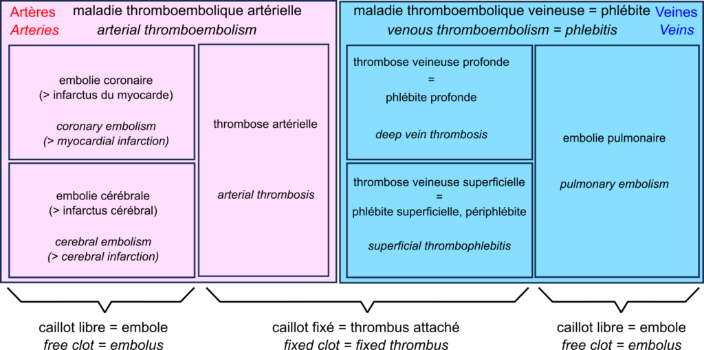
We are all familiar with the words ‘blood clots’, ‘stroke’ and ‘heart attack’. However, before the media deluge devoted to the extremely rare side effects of certain COVID-19 vaccines, few outside the medical community had heard of thromboembolic events.
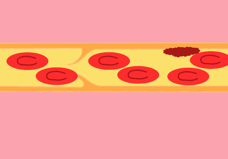
The central player in the drama is the thrombus, also known as blood clot. The blood clot is the product of coagulation. The formation of a clot stops a haemorrhage when the blood vessel wall is damaged. The first step is forming a platelet plug formed by the aggregation of platelets, or thrombocytes. The thrombus is then consolidated by strands of fibrin.
A thrombus can block vessels, especially if they are already narrowed, for example in atherosclerosis. This thrombosis impedes blood flow. Thrombosis occurs mainly when the blood flow is slow and steady (otherwise, the clots are torn off). This is why they are primarily found in the veins, forming deep vein thrombosis, also called deep phlebitis, or superficial thrombophlebitis.
A thrombus can break off, forming an embolus that travels through the vessels following the blood flow. If the vessels become smaller, the embolus is more likely to block them. Such an embolism decreases the blood supply downstream, depriving the tissues of oxygen, something called ischaemia, leading to tissue necrosis or infarction.
In the veins, oxygen-deprived blood flows from the small vessels to the large vessels. Therefore, if a clot breaks loose, it does not block the downstream vessels and travels to the heart. It is then sent by the heart into the pulmonary artery. This artery, in turn, splits into smaller and smaller branches, and the clot can then block the circulation. This is a pulmonary embolism. Deep vein thrombosis and pulmonary embolism are two manifestations of venous thromboembolism or phlebitis.
In the arteries, blood flow is rapid and pulsating. As a result, arterial thrombosis is quite rare. However, as the circulation moves from large to small vessels, embolisms are common. The most common examples are coronary artery embolisms, causing destruction of the heart muscle, a myocardial infarction, and cerebral artery embolisms causing cerebral infarction, one of two types of stroke – the other being cerebral haemorrhage.
This brings us to a very rare complication of COVID-19 vaccination with adenovirus vector vaccines such as Vaxzevria from Oxford University and AstraZeneca, and Ad26.COV2.S from Janssen. This complication is called “vaccine-induced prothrombotic immune thrombocytopenia (VITP)”. Indeed, in extremely rare cases, these vaccines induce antibodies to recognise the protein “platelet factor 4“, which activates platelets and causes their aggregation, leading to thrombosis.
Let’s reiterate that these cases are extremely rare, and their incidence is much lower than that observed after infection with SARS-CoV-2, thromboembolic events being one of the main complications of COVID-19.
Nous sommes tous familiers des mots « caillots sanguins », « AVC » et « infarctus ». Cependant, avant le déluge médiatique consacré aux effets secondaires extrêmement rares de certains vaccins contre la covid-19, bien peu en dehors de la communauté médicale avaient entendu parler des événements thromboemboliques.
L’acteur central du drame est le thrombus, aussi appelé caillot sanguin. Le caillot sanguin est le produit de la coagulation sanguine. La formation d’un caillot permet d’arrêter une hémorragie lorsque la paroi d’un vaisseau sanguin en endommagée. La première étape est la formation d’un clou plaquettaire formé par l’agrégation de plaquettes, ou thrombocytes. Le thrombus est ensuite consolidé par des brins de fibrine.
Un thrombus peut bloquer les vaisseaux, en particulier s’ils sont déjà rétrécis par exemple dans les cas d’athérosclérose. Cette thrombose entrave la circulation sanguine. Les thromboses surviennent principalement lorsque le débit sanguin est lent et régulier (sinon les caillots sont arrachés). C’est pourquoi on les trouve surtout associées aux veines, formant des thromboses veineuses profondes aussi appelés phlébites profondes, ou superficielles, aussi appelées périphlébites.
Un thrombus peut se détacher, formant un embole qui voyage dans les vaisseaux en suivant la circulation sanguine. Si les vaisseaux deviennent plus petits, ces emboles ont plus de chances de les bloquer. Cette embolie diminue l’irrigation en aval, privant les tissues d’oxygène, ce qu’on appelle une ischémie, ce qui entraîne une nécrose des tissus, ou infarctus.
Dans les veines, le sang privé d’oxygène circule des petits vaisseaux vers les grands vaisseaux. De ce fait, si un caillot se détache, ils ne bloquent pas les vaisseaux en aval, et voyage jusqu’au cœur. Il est alors envoyé par le cœur dans l’artère pulmonaire. Cette artère, quant à elle, se divise en branches de plus en plus petites, et le caillot peut alors bloquer la circulation. C’est une embolie pulmonaire. Les thromboses veineuses profondes et les embolies pulmonaires sont les deux manifestations de la la maladie thromboembolique veineuse ou phlébite.
Dans les artères, la circulation sanguine est rapide et pulsée. De ce fait, les thromboses artérielles sont assez rares. En revanche, la circulation allant des gros vaisseaux vers les petits, les embolies sont fréquentes. Les exemples les plus fréquents sont les embolies des artères coronaires, causant une destruction du muscle du cœur, un infarctus du myocarde, et les embolies des artères cérébrales causant un infarctus cérébral, un des deux types d’accidents vasculaires cérébraux (AVC) – l’autre étant constitué par les hémorragies cérébrales.
Ce qui nous amène à une complication très rare de la vaccination contre la covid-19 par des vaccins utilisant des vecteurs adénovirus comme Vaxzevria de l’université d’Oxford et AstraZeneca, et Ad26.COV2.S de Janssen. Cette complication est la « thrombopénie immunitaire prothrombotique induite par le vaccin (TIPIV) ». En effet, dans des cas extrêmement rares, ces vaccins induisent la production d’anticorps reconnaissant la protéine « facteur plaquettaire 4 » qui active les plaquettes et cause leur agrégation, entraînant des thromboses.
Rappelons une fois encore que ces cas sont extrêmement rares, et leur incidence est bien inférieure à celle observée après infection par le virus SARS-CoV-2, les événements thromboemboliques étant une des complications principales de la covid-19.
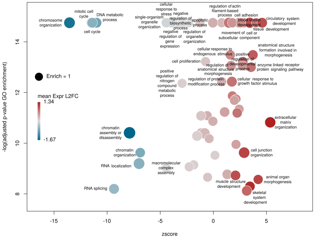
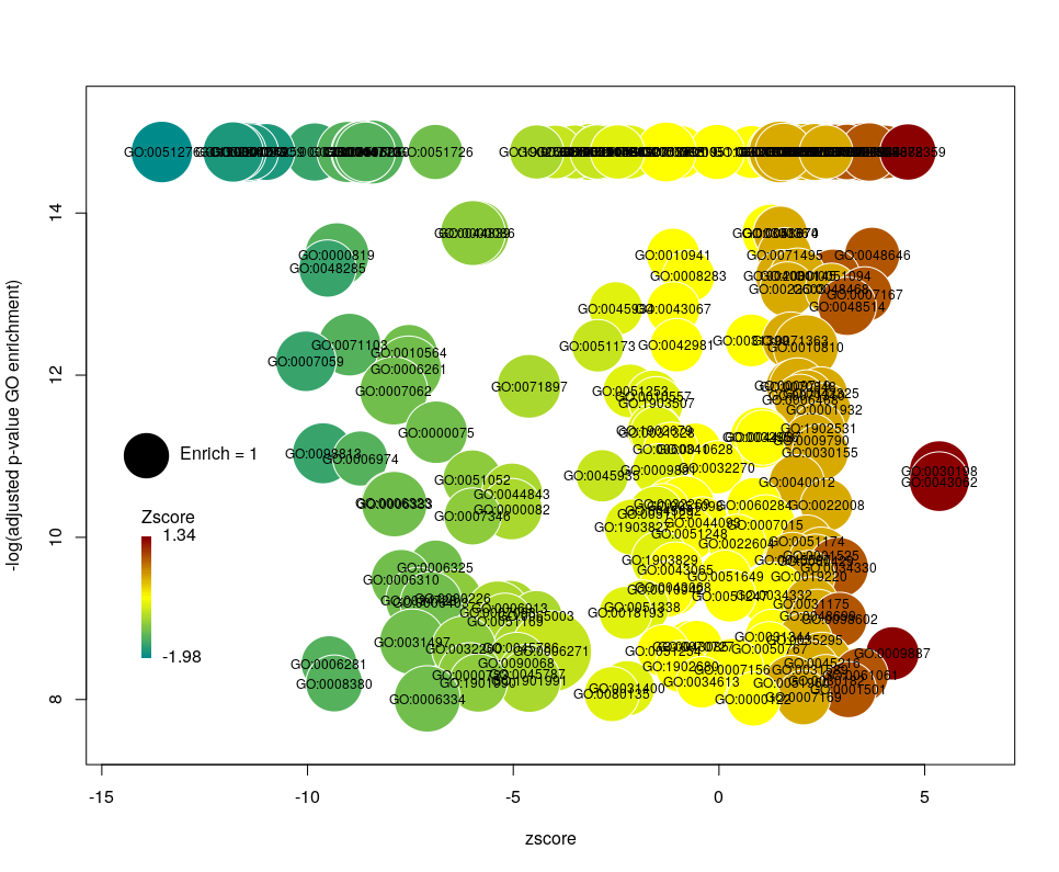
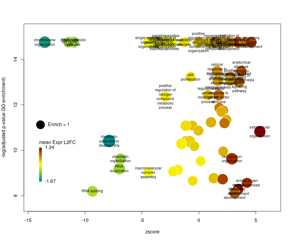
I recently came across the package GOplot by Wencke Walter http://wencke.github.io/. In particular, I liked the function GOBubble. However, I found it difficult to customise the plot. In particular, I wanted to colour the bubbles differently, and to control the plotting area. So I took the idea and extended it. Many aspects of the plot can be configured. It is a work in progress. Not all features of GOBubble are implemented at the moment. For instance, we cannot separate the different branches of Gene Ontology, or add a table listing labelled terms. I also have a few ideas to make the plot more versatile. If you have suggestions, please tell me. The code and the example below can be found at: Main script: plotGODESeq.R Demo script: usePlotGODESeq.R DESeq data used by the script: DESeq-example.csv GO data used by the script: GO-example.csv Help: README.html
What we want to obtain at the end is the following plot:
The function plotGODESeq() takes two mandatory inputs: 1) a file containing Gene Ontology enrichment data, 2) a file containing differential gene expression data. Note that the function works better if the dataset is limited, in particular the number of GO terms. It is useful to analyse the effect of a perturbation, chemical or genetic, or to compare two cell types that are not too dissimilar. Comparing samples that exhibit several thousands of differentially expressed genes, resulting in thousands of enriched GO terms, will not only slow the function to a halt, it is also useless (GO enrichment should not be used in these conditions anyway. The results always show things like “neuronal transmission” enriched in neurons versus “immune process” enriched in leucocytes). A large variety of other arguments can be used to customise the plot, but none are mandatory.
To use the function, you need to source the script from where it is; In this example, it is located in the session directory. (I know I should make a package of the function. On my ToDo list)
source('plotGODESeq.R')
Input
The Gene Ontology enrichment data must be a data frame containing at least the columns: ID – the identifier of the GO term, description– the description of the term, Enrich – the ratio of observed over expected enriched genes annotated with the GO term, FDR – the False Discovery Rate (a.k.a. adjusted p-value), computed e.g. with the Benjamini-Hochberg correction, and genes – the list of observed genes annotated with the GO term. Any other column can be present. It will not be taken into account. The order of columns does not matter. Here we will load results coming from and analysis run on the server WebGestalt. Feel free to use whatever Gene Ontology enrichment tool you want, as far as the format of the input fits.
# load results from WebGestalt
goenrich_data <- read.table("GO-example.csv",
                            sep="\t",fill=T,quote="\"",header=T)

# rename the columns to make them less weird
# and compatible with the GOPlot package
colnames(goenrich_data)[
colnames(goenrich_data) %in% c("geneset","R","OverlapGene_UserID")
] <- c("ID","Enrich","genes")

# remove commas from GO term descriptions, because they suck
goenrich_data$description <- gsub(',',"",goenrich_data$description)
The differential expression data must be a data frame in which rownames are the gene symbols, from the same namespace as the genes column of the GO enrichment data above. In addition, one column must be namedlog2FoldChange, containing the quantitative difference of expression between two conditions. Any other column can be present. It will not be taken into account. The order of columns does not matter.
# Load results from DESeq2
deseq_data <- read.table("DESeq-example.csv",
                         sep=",",fill=T,header=T,row.names=1)
Now we can create the plot.
plotGODESeq(goenrich_data,deseq_data)
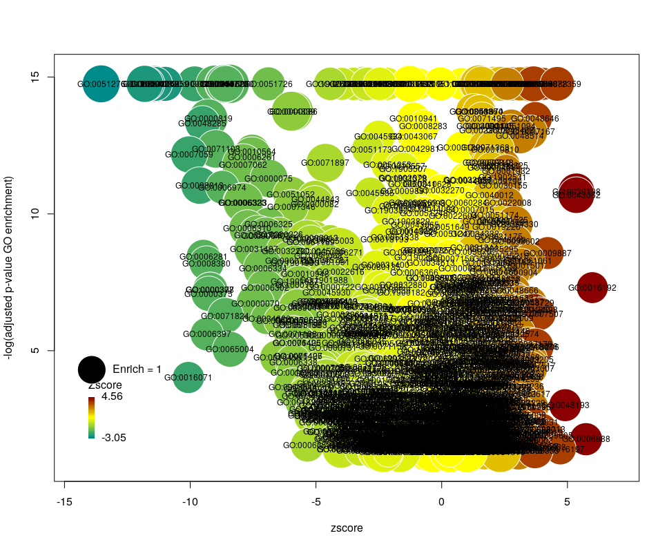
The y-axis is the negative log of the FDR (adjusted p-value). The x-axis is the zscore, that is for a given GO term:
The genes associated with each GO term are taken from the GO enrichment input, while the up or down nature of each gene is taken from the differential expression input file. The area of each bubble is proportional to the enrichment (number of observed genes divided by number of expected genes). This is the proper way of doing it, rather than using the radius, although of course, the visual impact is less important.
Choosing what to plot
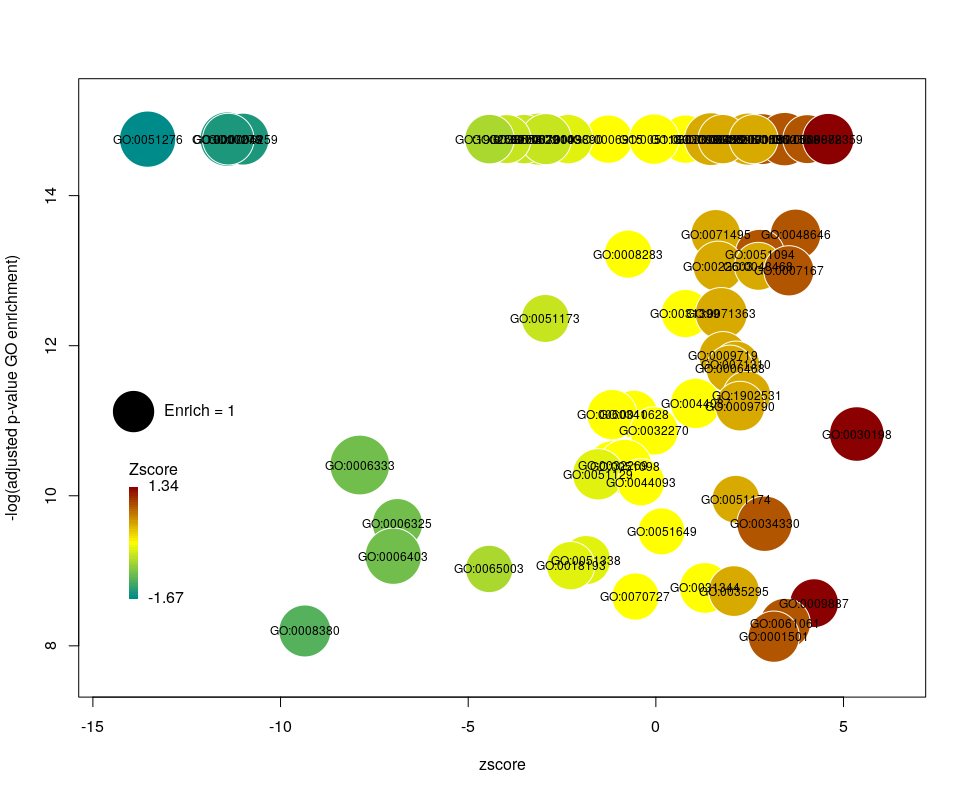
The console output tells us that we plotted 1431 bubbles. That is not very pretty or informative … The first thing we can note is that we have a big mess at the bottom of the plot, which corresponds to the highest values of FDR. Let’s restrict ourselves to the most significant results, by setting the argument maxFDR to 10-8.
This is better. We now plot only 181 GO terms. Note the large number of terms aligned at the top of the plot. Those are terms with an FDR of 0. The Y axis being logarithmic, we plot them by setting their FDR to a tenth of the smallest non-0 value. GO over-representation results are often very redundant. We can use GOplot’s function reduce_overlap by setting the argument collapse to the proportion of genes that needs to be identical so that GO terms are merged in one bubble. Let’s use collapse=0.9 (GO terms are merged if 90% of the annotated genes are identical).
Now we only plot 62 bubbles, i.e. two-third of the terms are now “hidden”. Use this procedure with caution. Note how the plot now looks distorted towards one condition. More “green” terms have been hidden than “red” terms.
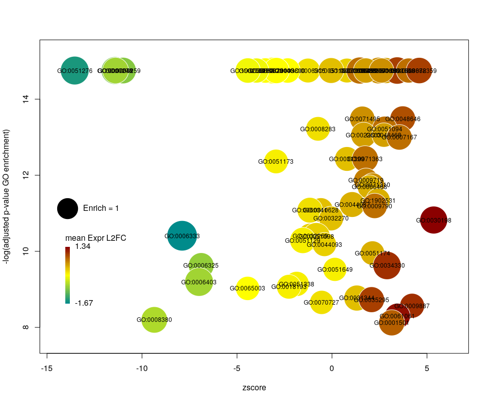
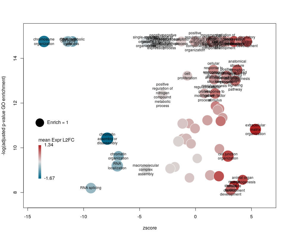
The colour used by default for the bubbles is the zscore. It is kind of redundant with the x-axis. Also, the zscore only considers the number of genes up or down-regulated. It does not take into account the amplitude of the change. By setting the argument color to l2fc, we can use the average fold change of all the genes annotated with the GO term instead.
Now we can see that while the proportion of genes annotated by GO:0006333 that are down-regulated is lower than for GO:0008380, the amplitude of their average down-regulation is larger.
WARNING: The current code does not work if the color scheme chosen for the bubbles is based on a variable, l2fc or zscore, that do not contain negative and positive values. Sometimes, the “collapsing” can cause this situation, if there is an initial unbalance between zscores and/or l2fc. It is a bug, I know. On the ToDo list …
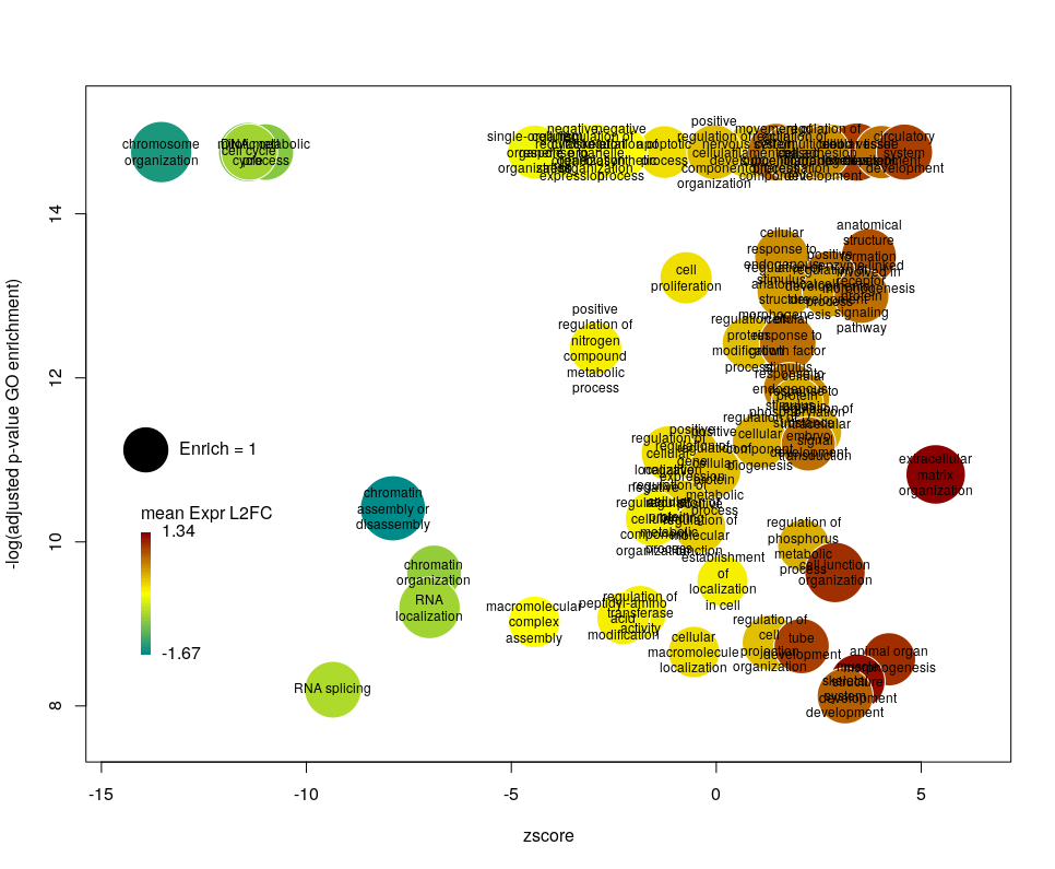
Using GO identifiers is handy and terse, but since I do not know GO by heart, it makes the plot hard to interpret. We can use the full description of each term instead, by setting the argument label to description.
Customising the bubbles
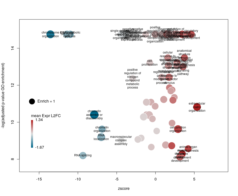
The width of the labels can be modified by setting the argument wrap to the maximum number of characters (the default used here is 15). Depending on the breadth of values for FDR and zscore, the buble size can be an issue, either by overlapping too much or on the contrary by being tiny. We can change that by the argument scale which scales the radius of the bubbles. Let’s fix it to 0.7, to decrease the size of each bubble by a third (the radius, not the area!).
There is often a big crowd of terms at the bottom and centre of the plot. This is not so clear here, with the harsh FDR threshold, but look at the first plot of the post. These terms are generally the least interesting, since they have a lower significance (higher FDR) and mild zscore. We can decide to label the bubbles only under a certain FDR with the argument maxFDRLab and/or above a certain absolute zscore with the argument minZscoreLab. Let’s fix them to 1e-12 and 2 respectively.
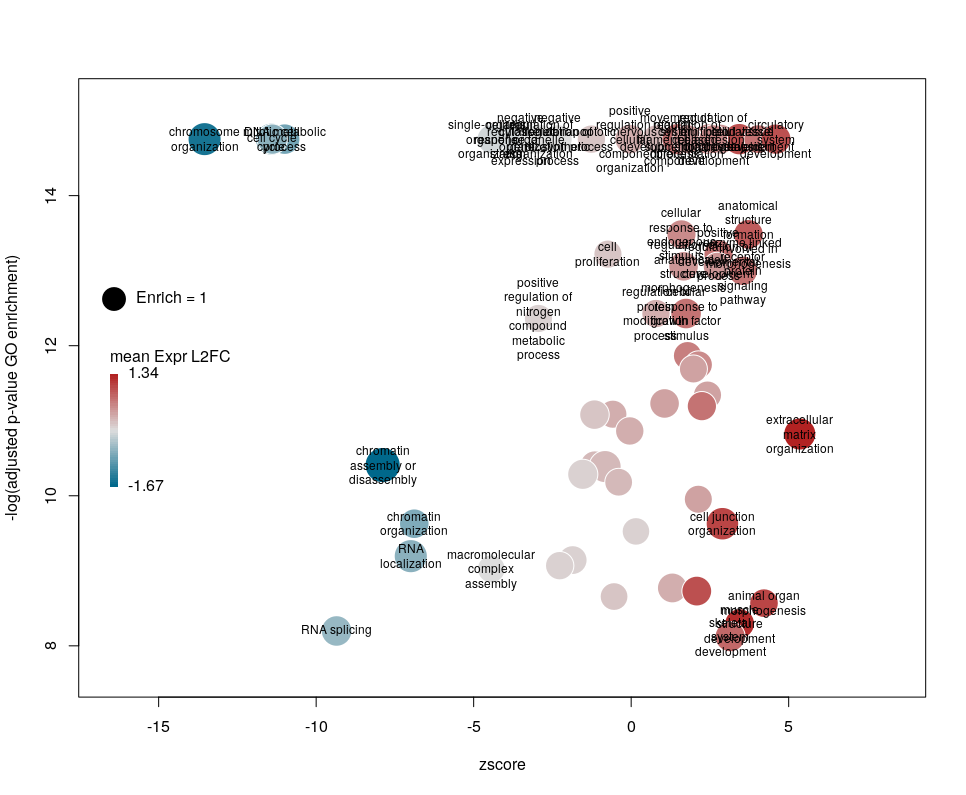
Finally, you are perhaps not too fond of the default color scheme. This can be changed with the arguments lowCol, midCol, highCol. Let’s set them to “deepskyblue4”, “#DDDDDD” and “firebrick”,
Customising the plotting area
The first modifications my collaborators asked me to introduce were to centre the plot on a zscore of 0 and to add space around so they could annotate the plot. One can centre the plot by declaring centered = TRUE (the default is FALSE). Since our example is extremely skewed towards negative zscores, this would not be a good idea. However, adding some space on both sides will come in handy in the last step of beautification. We can do that by declaring extrawidth=3 (default is 1).
The legend position can be optimised with the arguments leghoffset and legvoffset. Setting them to {-0.5,1.5}
Les dernières statistiques d’Israël et du Royaume-Uni sur la covid-19 dans les populations vaccinées et non vaccinées sont devenues virales. L’une des principales raisons de ce succès dans certains milieux est qu’elles montrent apparemment que les vaccins contre le virus de la covid ne sont plus efficaces ! Ce n’est bien entendu pas le cas. Si les anticorps circulants produits par une vaccination complète semblent diminuer avec une demi-vie d’environ six mois, la protection reste très forte contre la maladie, qu’elle soit modérée ou sévère. La protection contre l’infection reste également robuste pendant les premiers mois suivant la vaccination, quel que soit le variant. Comment expliquer dès lors le résultat apparemment paradoxal selon lequel le taux de mortalité par covid est le même dans les populations vaccinées et non vaccinées ? Plusieurs facteurs peuvent être mis en cause. Par exemple, dans la plupart des ensembles de données utilisés pour calculer l’efficacité, les personnes pré-infectées non vaccinées ne sont pas retirées. Cependant, je voudrais aujourd’hui mettre en avant une autre raison car je pense qu’il s’agit d’un piège dans lequel les apprentis analystes de données tombent très fréquemment : Le paradoxe de Simpson.
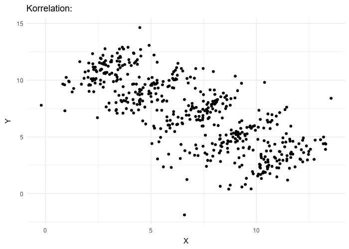
Le paradoxe de Simpson se produit quand une tendance présente dans plusieurs sous-populations disparaît, voire s’inverse, lorsque toutes ces populations sont aggrégées. Cela est souvent dû à des facteurs de confusion cachés. La situation est bien illustrée dans la figure suivante obtenue de Wikimedia commons. Alors que la corrélation entre Y et X est positive dans chacune des cinq sous-populations, cette corrélation devient négative si l’on ne distingue pas les sous-populations.
Qu’en est-il de la vaccination contre le SRAS-CoV-2 ? Jeffrey Morris explique sur son blog l’impact du paradoxe de Simpson sur l’analyse des données d’Israël de manière précise et éclairante, bien mieux que je ne pourrais le faire. Cependant, son excellente explication est assez longue et détaillée, et en anglais. J’ai donc pensé que je pourrais en donner une version courte ici, avec une population imaginaire, simplifiée, bien que réaliste.
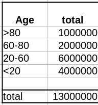
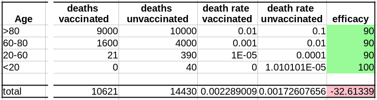
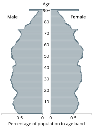
Comme évoqué dans un précédent billet, la donnée cruciale ici est la structure de la population par classe d’âge . Pour simplifier, nous prendrons une pyramide des âges assez simple, proche de ce que l’on observe dans les pays développés, c’est-à-dire homogène avec seulement une diminution au sommet, ici 1 million de personnes par décennie, et 1 million pour toutes les personnes de plus de 80 ans.
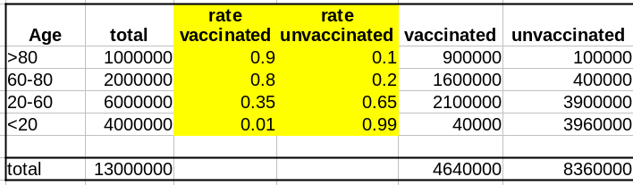
La première variable importante est le taux de vaccination. Comme les campagnes de vaccination ont commencé avec les populations âgées et que l’hésitation vaccinale diminue fortement avec l’âge, le taux de vaccination est beaucoup plus faible dans les populations plus jeunes.
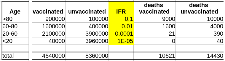
La deuxième variable importante est le taux de létalité de la maladie (Infection Fatality Rate, IFR) pour chaque tranche d’âge. Là aussi, l’IFR est beaucoup plus faible dans les populations les les plus jeunes. Et c’est là que se trouve le nœud du problème : taux de vaccination et taux de létalité ne sont pas des variables indépendantes ; les deux sont liées à l’âge.
Supposons que notre vaccin ait une efficacité absolue de 90 % et que, pour simplifier, cette efficacité ne dépende pas de l’âge. Le nombre de décès dans la population non vaccinée est :
Deaths unvaccinated = round(unvaccinated * IFR)
La fonction arrondi est pour éviter les fractions de personnes mortes. Le nombre de décès dans la population vaccinée est de :
Deaths vaccinated = round(vaccinated * IFR * 0.1)
où 0.1 = (100 – efficacy)/100
Maintenant que nous avons le nombre de décès dans chacune de nos populations, vaccinées ou non, nous pouvons calculer les taux de mortalité, c’est-à-dire décès/population, et calculer l’efficacité comme suit :
(death rate unvaccinated – death rate vaccinated)/(death rate unvaccinated)*100
Sans surprise, l’efficacité pour toutes les tranches d’âge est de 90%. Les 100% pour les <20 ans viennent du fait que 0,04 décès est arrondi à 0.
Cependant, si l’on fusionne toutes les tranches d’âge, l’efficacité disparaît complètement ! De plus, il semblerait que le vaccin augmente le taux de mortalité ! Le fait de ne pas être vacciné présente une protection contre le décès de 32% !
Il s’agit bien sûr d’un résultat erroné (nous le savons ; nous avons créé l’ensemble de données avec une efficacité vaccinale réelle de 90% !). Cet exemple utilise l’efficacité d’un vaccin. Cependant, le paradoxe de Simpson guette souvent l’apprenti analyste de données au tournant. Les facteurs de confusion doivent être recherchés avant toute analyse statistique, et les populations doivent être stratifiées en conséquence.
The latest statistics from Israel and the UK on COVID-19 in vaccinated and unvaccinated populations are getting viral. One of the main reasons for this success in some circles is that they apparently show that the vaccines against the COVID-19 virus are no longer effective! This is, of course, not the case. While the circulating antibodies triggered by a vaccination course seem to decline with a half-life of about six months, the protection remains very strong against disease, mild or severe. The protection against infection is also still robust during the first months after vaccination, whatever the variant. What could then explain the apparent paradoxical result that people die from COVID-19 as frequently in vaccinated populations as in unvaccinated ones? Several factors might be involved. For instance, in most datasets used to compute effectiveness, unvaccinated pre-infected people are not removed. However, today I would like to highlight another reason because I think it is a trap in which casual data analysts fall very frequently: The Simpson’s paradox.
The Simpson’s paradox is a situation where a trend present in several subpopulations disappears or even reverts when all those populations are pulled together. This is often due to hidden confounding variables. The situation is well illustrated in the following figure obtained from Wikimedia commons. While the correlation between Y and X is positive in each of the five subpopulations, this correlation becomes negative if we do not distinguish the subpopulations.
What about the vaccination against SARS-CoV-2? Jeffrey Morris explains on his blog the impact of Simpson’s paradox on the analysis of Israel data in a precise and enlighting manner, way better than I could. However, his excellent explanation is relatively long and detailed. So I thought I could give a short version here, with an imaginary, simplified, albeit realistic population.
As discussed in a past post, the crucial data here is the age structure of the population. To simplify, we’ll take a pretty simple age pyramid, close to what we observe in developed countries, i.e., homogenous with only a decrease on top, here 1 million people per decade, and 1 million for everyone over 80.
The first important variable is the rate of vaccination. Because vaccination campaigns started with the elderly populations, and that vaccine hesitancy strongly decreases with age, the vaccination rate is much lower in younger populations.
The second important variable is the disease’s lethality – the Infection Fatality Rate – for each age group. Here as well, the IFR is much lower in the younger group. And here lies the crux of the problem: rate of vaccination and IFR are not independent variables; both are linked to age.
Let’s assume that our vaccine has an absolute efficacy of 90%, and for simplicity, this efficacy does not change with age. The number of deaths in the unvaccinated population is:
Deaths unvaccinated = round(unvaccinated * IFR)
The “round” function is to avoid half-dead people. The number of deaths in the vaccinated population is:
Deaths vaccinated = round(vaccinated * IFR * 0.1)
where 0.1 = (100 – efficacy)/100
Now that we have the number of deaths in each of our populations, vaccinated or not, we can calculate the death rates, i.e. deaths/population, and compute the efficacy as:
(death rate unvaccinated – death rate vaccinated)/(death rate unvaccinated)*100
Unsurprisingly, the efficacy for all age groups is 90%. The 100% for the <20 comes from the fact that 0.04 death is 0.
HOWEVER, if we merge all the age groups together, the efficacy completely disappears! Not only that, it seems that the vaccine actually increases the death rate!!! Being unvaccinated presents an efficacy of 32% against death!
This is of course an artefact (we know that; we created the dataset with an actual vaccine efficacy of 90%!). This example used vaccine efficacy. However, Simpson’s paradox is awaiting the casual data analyst behind any corner. Confounding variables must be tracked down before doing any statistical analysis, and populations must be stratified accordingly.
There are many discussions on classical and social media about the quality of datasets reporting deaths by COVID-19. Of course, depending on the density of healthcare systems and the reporting structures, the reported toll will represent a certain proportion of actual deaths (60% in Mexico, 30% in Russia, between 10 and 20% in India, according to the health authorities of these countries). Moreover, most countries maintain two tallies, one based on deaths within a certain period of a positive test for infection by SARS-CoV-2 and one based on death certificates mentioning COVID-19 as the cause of death. That said, both factors should proportionally affect the numbers and are beyond human intervention. Now, can we detect if datasets have been tampered with or even entirely made up?
One way to do so is to look at how the variability evolves over time and depending on absolute numbers. Below, I used the dataset from Our World in Data (as of 11 September 2021) to look at the reported COVID-19 death tolls for a specific set of countries. In most countries, the main variability comes from the reporting system. As such it should be proportional to the daily deaths (basically a percentage of the reports are coming late). On top of it, we should find an intrinsic variability, which should increase as the square root of the daily deaths. So, the variability should be relatively higher outside the waves.
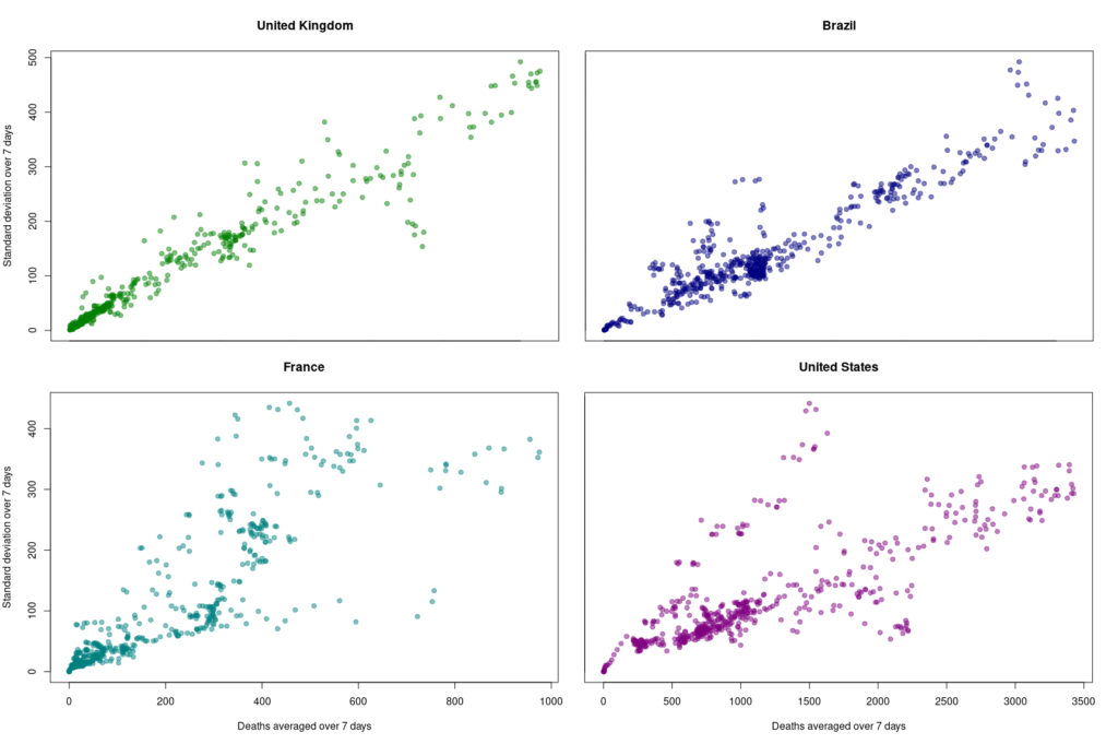
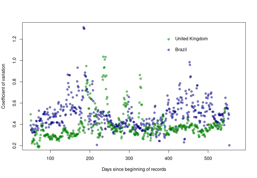
First, let’s look at the datasets from countries with well-developed and accurate healthcare systems. Below are plotted the standard deviation of the daily death count over seven days against the daily amount of deaths (averaged over seven days) in the United Kingdom, Brazil, France, and the United States.
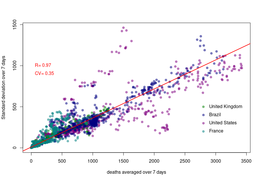
Although we see that the variability of… the variability is more important in the USA and France, there is a clear linear relationship between the absolute daily number of deaths and its standard deviation. The Pearson correlation coefficient for the UK is 0.97 (Brazil = 0.93, France=0.85, USA = 0.77). If we combine the four datasets, we can see that the relationship is incredibly similar in those five countries. The slope of the curve, representing the coefficient of variation, i.e., the standard deviation divided by the mean, throughout the scale is: UK = 0.35, Brazil = 0.35, France=0.48, USA = 0.26).
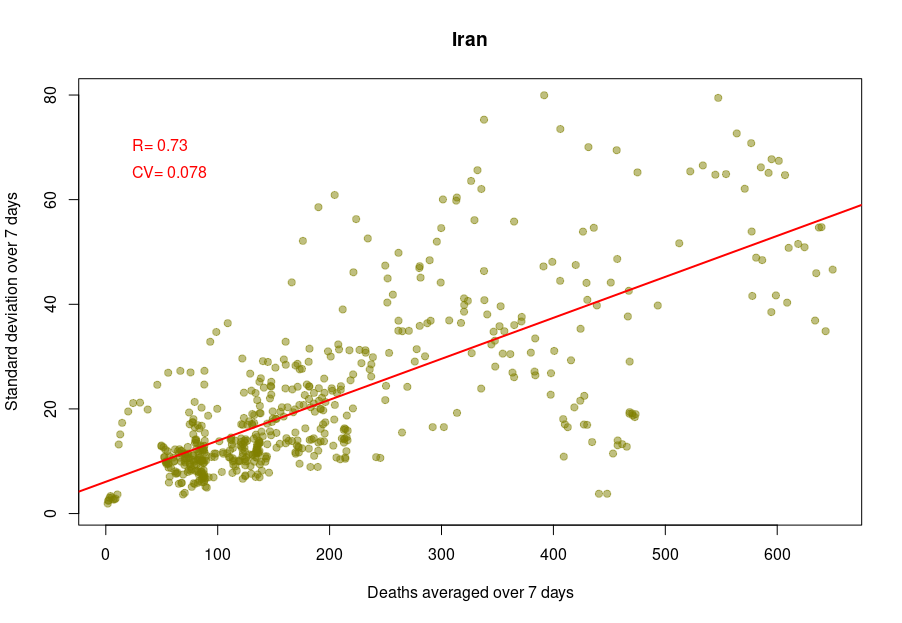
Some countries exhibit a different coefficient of variation, meaning a higher reproducibility of reporting. Iran’s reported deaths always looked very smooth to me. Indeed, the CV is 0.078, which indicates a whopping 4.5 more precise reporting. Although I am certain that Iran’s healthcare system is excellent, this figure looks suspiciously low.
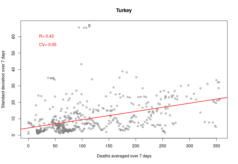
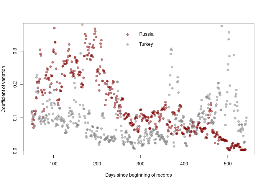
When it becomes interesting is when the linear relationship is lost. Turkey’s daily death reports are also very smooth. However, the linearity between the variability is now mostly lost, with a standard deviation that remains almost constant no matter the absolute amount of deaths. If I had to guess, I would say that the data is massaged, albeit by people who did not really think about the reason underpinning the variability and what structure it should have to look natural.
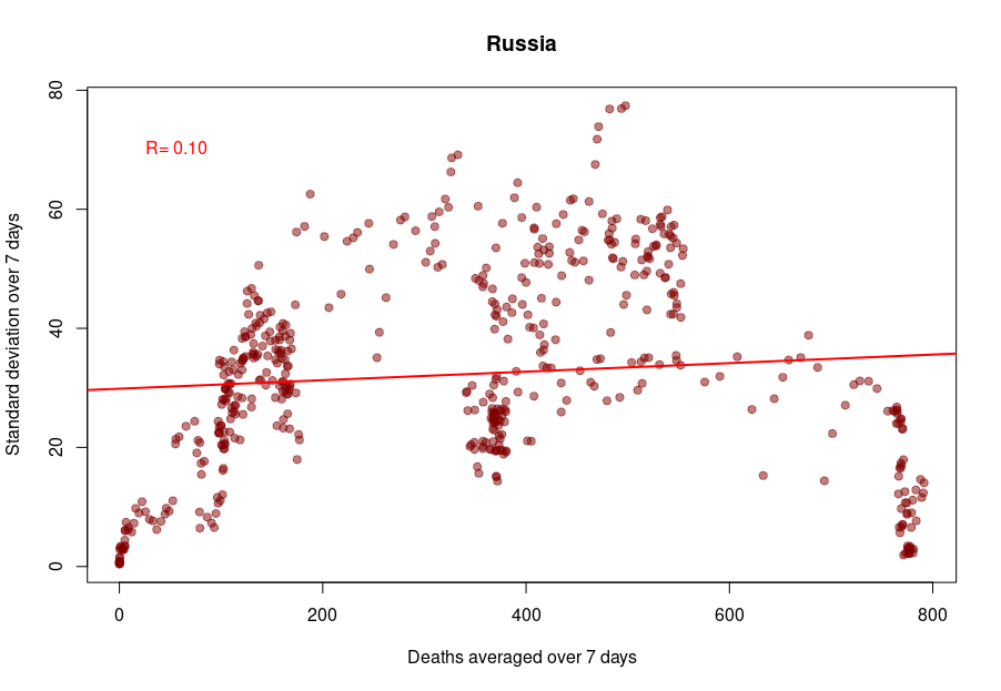
And finally, we reach Russia. From the Russian statistics agency itself, we know that the official death toll from the government bears no relationship whatsoever with reality. What is interesting is that the people producing the daily reporting went further than the Turkish ones and did not even try to produce realistically looking data. On the contrary, the variability was smoothed out even more for the highest absolute death tolls, generating a ridiculous bridge-shaped curve.
Was this always the case? How did the coefficient of variation evolve since the beginning of the pandemics? Looking again at the UK and Brazil, we can see that the average CV stays pretty much steady over time with an increased variability between the big waves. We see nicely that the CV peaks and troughs alternate between Brazil and the UK, corresponding to the offset between waves.
The situation is a bit different for Turkey and Russia. The Turkish dataset shows a CV collapsing after the first six months of the pandemics. And indeed, the daily death reporting between October 2020 and March 2021 is ridiculously smooth. However, it seems someone decided that it was a bit too much and started to add some noise (that was, unfortunately for them, not adequately scaled up.)
Russia followed the opposite path. While during the pandemics’ initial months, the CV was on par with those of western datasets, all that quickly stopped, and the CV collapsed. This trend culminated with the current preposterous death tools, between 780 and 800 deaths every single day for the past two months. The Russian government is basically showing the world the numerical finger.
This is a post I could have written thirty years ago. The tendency of scientists (or any specialist really) to write texts assuming a similar level of background knowledge from their audience has always been a curse. However, with the advent of open access and open data, the consequences have become dearer. Recently, in what is probably one of the worst communication exercises of the COVID-19 pandemics, the CDC published an online message ominously entitled:
“Lab Alert: Changes to CDC RT-PCR for SARS-CoV-2 Testing”
Of course, this text meant to target a particular audience, as specified on the web page:
However, the text was accessible to everyone; including many people who could not properly understand it. What did this message say?
“After December 31, 2021, CDC will withdraw the request to the U.S. Food and Drug Administration (FDA) for Emergency Use Authorization (EUA) of the CDC 2019-Novel Coronavirus (2019-nCoV) Real-Time RT-PCR Diagnostic Panel, the assay first introduced in February 2020 for detection of SARS-CoV-2 only. CDC is providing this advance notice for clinical laboratories to have adequate time to select and implement one of the many FDA-authorized alternatives.”
This sent people already questioning the tests into overdrive. “We’ve always told you. PCR tests do not work. This entire pandemic is a lie. We’ve been termed conspiracy theorists, but we were right all this time.” The CDC message is currently circulated all over the social networks to demonstrate their point.
Of course, this is not at all what the CDC meant. The explanation comes in the subsequent paragraph.
“In preparation for this change, CDC recommends clinical laboratories and testing sites that have been using the CDC 2019-nCoV RT-PCR assay select and begin their transition to another FDA-authorized COVID-19 test. CDC encourages laboratories to consider adoption of a multiplexed method that can facilitate detection and differentiation of SARS-CoV-2 and influenza viruses. Such assays can facilitate continued testing for both influenza and SARS-CoV-2 and can save both time and resources as we head into influenza season.”
The CDC really means that rather than using separate tests to detect SAR-COV-2 and influenza virus infections, the labs should use a single test that detects both simultaneously, hence the name “multiplex”.
I have to confess that it took me a couple of readings to properly understand what they meant. What did the CDC do wrong?
First, calling those messages “Lab Alert”. For any regular citizen fed by Stephen King’s The Stand and movies like Contagion, the words “Lab Alert” mean “Pay attention, this is an apocalypse-class message”. What about “New recommendation” or “Lab communication”?
Second, the CDC should not have been assumed that everyone knew what the “CDC 2019-nCoV RT-PCR assay” was. Out there, people understood that the CDC was talking about all the RT-PCR assays meant to detect the presence of SARS-CoV-2, not just the specific test previously recommended by the CDC*.
Third, the authors should have clarified that “the many FDA-authorized alternatives” included other PCR tests, and the message was not meant to say that the CDC recommended ditching the RT-PCR tests altogether.
Finally, they should have clarified what a “multiplexed method” was. I received messages from people who believed a “multiplexed method” was an alternative to a PCR test, while it is just a PCR that detects several things simultaneously (in this example SARS-CoV-2 and flu viruses).
In conclusion, you can, of course, and should, think about your intended audience. However, you should not neglect the unintended audiences. This is more important than you think and not restricted to general communications. Whether a research article or a grant application, whatever scientific piece you write will reach three audience types.
The first comprises the tiny circle sharing the same knowledge background, typically reviewers (if the editors do their job properly…).
The second will be made up of the population at large, who will not understand a word, and frankly, are not interested in whatever you are babbling about.
The third is the dangerous one. It is made of people who have a certain scientific background, sufficient to globally understand the context of your text but lack the advanced knowledge to precisely grasp your idea, its novelty, its consequences. These people will read your text and believe they understood your points. The risk is that they did not. Misunderstand your point might be worse than not understanding it.
It is always good to get your texts read by someone belonging to this third population before submitting them to the journals of funding agencies.
*There is actually another very interesting story related to this topic when, at the beginning of the pandemic, many labs proposed to use their own PCR tests but could not because only the CDC-recommended test could be used, delaying the implementation of mass testing by many weeks.
Combien de fois voit-on ces jours-ci passer le commentaire suivant sur les réseaux sociaux : « La plupart des cas de covid-19 sont maintenant chez des personnes vaccinées. C’est la preuve que les vaccins ne fonctionnent pas. »
Pas vraiment, non.
Tout dépend des populations relatives de vaccinés et de non-vaccinés. Dans un précédent billet, j’ai présenté un résumé de l’efficacité des vaccins sur les différentes variantes du SARS-CoV-2. Chaque figure représentait l’efficacité globale. Cependant, les taux de vaccination dépendent de l’âge, car la plupart des pays ont commencé à vacciner les personnes âgées en premier. Voyons donc si nous pouvons être plus précis.
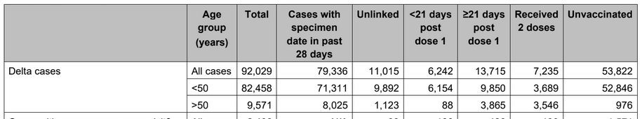
Mais, mais, mais… chez les personnes de plus de 50 ans, seuls 976 cas ont été recensés chez les non-vaccinés, tandis que 3953 personnes ayant reçu une dose et 3546 personnes entièrement vaccinées ont été infectées ! Ce vaccin n’offre donc aucune protection, CQFD ?
Pas si vite. Voyons si nous pouvons calculer l’efficacité du vaccin, d’accord ? Pour cela, nous avons d’abord besoin du taux de vaccination par tranche d’âge. Heureusement, ce taux est publié chaque semaine par Public Health England. Comme le tableau porte sur les cas déclarés jusqu’au 21 juin, nous utiliserons les données publiées le 24 juin, qui comprenaient les vaccinations jusqu’au 20 juin. Bien sûr, tous les cas Delta ne sont pas apparus le 20 juin. Cependant, la plupart d’entre eux sont apparus au cours des derniers mois. De plus, l’administration de la 2e dose a atteint un plateau pour la population âgée.
Ensuite, nous devons savoir combien de personnes appartiennent à chacune de ces tranches d’âge. Pour cela, nous pouvons utiliser la population de 2020 prévue par l’Office for National Statistics sur la base des chiffres de 2018 (la pyramide des âges indique des pourcentages pour chaque année, mais nous pouvons télécharger les chiffres réels pour chaque tranche de 5 ans d’âge).
Nous pouvons maintenant calculer, pour chaque tranche d’âge, combien de personnes ont reçu deux doses, une seule dose ou ne sont toujours pas vaccinées (j’additionne les hommes et les femmes).
Âge
1 dose
2 doses
non-vaccinés
0-17
56230
56584
14033150
18-24
605991
726010
4318151
25-29
837303
728416
2924493
30-34
1587417
847650
2100138
35-39
1786373
1003080
1628239
40-44
1702290
1268632
1127652
45-49
1583028
1838131
890384
50-54
548632
3378858
690501
55-59
396658
3567857
549185
60-64
202651
3272462
387171
65-69
95785
2998587
268383
70-74
59031
3118291
191577
75-79
41180
2259096
111907
80+
84457
3159787
164372
total
9587027
28223441
29385301
Ces chiffres font apparaître 24118034 personnes de plus de 50 ans, 21754937 avec deux doses et 2363096 non vaccinées, dix fois plus de personnes complètement vaccinées ! Ainsi, les 3546 et 976 cas représentent 0,0163 % et 0,0413 % des populations respectives. En d’autres termes, la vaccination complète offre une protection de 60,5 % contre le variant Delta.
Le même calcul sur les moins de 50 ans montre une protection encore meilleure, à 70,8 % (ce qui montre encore qu’il faut vacciner les plus jeunes si nous voulons protéger les plus vieux et se débarrasser de ce virus).
Plus la couverture vaccinale est bonne, plus on observera de cas dans la population vaccinée. Cela ne signifie pas que le vaccin n’est pas efficace !
How many times are we seeing the following comment on social media those days: “Most covid-19 cases are now in vaccinated people. This is the proof that vaccines don’t work”.
Not quite.
It all depends on the relative populations of vaccinated versus unvaccinated. In a previous post, I presented a summary of vaccine effectiveness on different SARS-CoV-2 variants. Each figure represented the global effectiveness. However, vaccination rates depend on age since most countries started to vaccinate the elderly first. So let’s see if we can be more precise.
Whaaaat? In people over 50 years of age, 0nly 976 cases in unvaccinated, while 3953 people with one dose and 3546 fully vaccinated people were infected! Surely this vaccine does not offer any protection, right?
Let’s see if we can compute the vaccine effectiveness, shall we? For that, we need first the vaccination rate per age. Fortunately, this is published by Public Health England every week. Since the table about report cases up to June 21, we will use the vaccinations data published on June 24, including vaccinations up to June 20. Of course, not all the Delta cases have appeared on June 20. However, most of them have appeared in the past few months. Moreover, administration of the 2nd dose has plateaued for the elderly population.
Then, we need to know how many people belong to each of those age groups. For that, we can use the 2020 population predicted by the Office for National Statistics based on the 2018 figure (the age pyramid shows percentages for each year, but we can download actual numbers for each 5-years age group).
We can now compute for each age group how many people had two doses, only one dose, or are still unvaccinated (I sum up males and females).
Age
1 dose
2 doses
unvaccinated
0-17
56230
56584
14033150
18-24
605991
726010
4318151
25-29
837303
728416
2924493
30-34
1587417
847650
2100138
35-39
1786373
1003080
1628239
40-44
1702290
1268632
1127652
45-49
1583028
1838131
890384
50-54
548632
3378858
690501
55-59
396658
3567857
549185
60-64
202651
3272462
387171
65-69
95785
2998587
268383
70-74
59031
3118291
191577
75-79
41180
2259096
111907
80+
84457
3159787
164372
total
9587027
28223441
29385301
These numbers show 24118034 people over 50, 21754937 with two doses and 2363096 unvaccinated, tenfold more fully vaccinated! Thus, the 3546 and 976 cases represent 0.0163% and 0.0413% of the respective populations. In other words, the full vaccination offers 60.5% protection against the Delta variant.
The same calculation on under-50 shows even better protection at 70.8% (This, again, shows that we must vaccinate young people if we want to protect the older ones and get rid of this virus.
The better the vaccine coverage, the more cases will be observed in the vaccinated population. This does not mean the vaccine is not effective!


