By Nicolas Gambardella
There are many discussions on classical and social media about the quality of datasets reporting deaths by COVID-19. Of course, depending on the density of healthcare systems and the reporting structures, the reported toll will represent a certain proportion of actual deaths (60% in Mexico, 30% in Russia, between 10 and 20% in India, according to the health authorities of these countries). Moreover, most countries maintain two tallies, one based on deaths within a certain period of a positive test for infection by SARS-CoV-2 and one based on death certificates mentioning COVID-19 as the cause of death. That said, both factors should proportionally affect the numbers and are beyond human intervention. Now, can we detect if datasets have been tampered with or even entirely made up?
One way to do so is to look at how the variability evolves over time and depending on absolute numbers. Below, I used the dataset from Our World in Data (as of 11 September 2021) to look at the reported COVID-19 death tolls for a specific set of countries. In most countries, the main variability comes from the reporting system. As such it should be proportional to the daily deaths (basically a percentage of the reports are coming late). On top of it, we should find an intrinsic variability, which should increase as the square root of the daily deaths. So, the variability should be relatively higher outside the waves.
First, let’s look at the datasets from countries with well-developed and accurate healthcare systems. Below are plotted the standard deviation of the daily death count over seven days against the daily amount of deaths (averaged over seven days) in the United Kingdom, Brazil, France, and the United States.
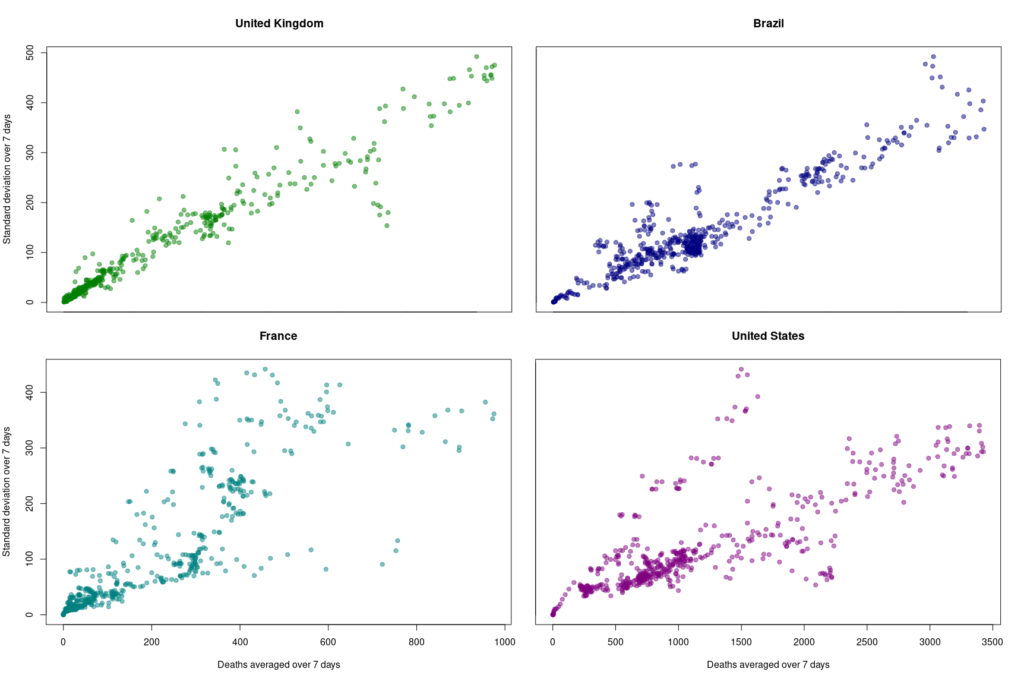
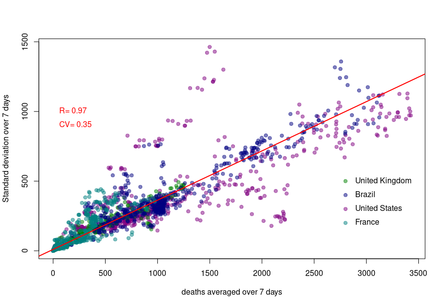
Although we see that the variability of… the variability is more important in the USA and France, there is a clear linear relationship between the absolute daily number of deaths and its standard deviation. The Pearson correlation coefficient for the UK is 0.97 (Brazil = 0.93, France=0.85, USA = 0.77). If we combine the four datasets, we can see that the relationship is incredibly similar in those five countries. The slope of the curve, representing the coefficient of variation, i.e., the standard deviation divided by the mean, throughout the scale is: UK = 0.35, Brazil = 0.35, France=0.48, USA = 0.26).
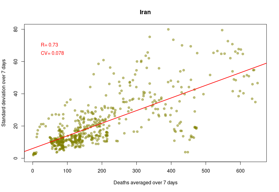
Some countries exhibit a different coefficient of variation, meaning a higher reproducibility of reporting. Iran’s reported deaths always looked very smooth to me. Indeed, the CV is 0.078, which indicates a whopping 4.5 more precise reporting. Although I am certain that Iran’s healthcare system is excellent, this figure looks suspiciously low.
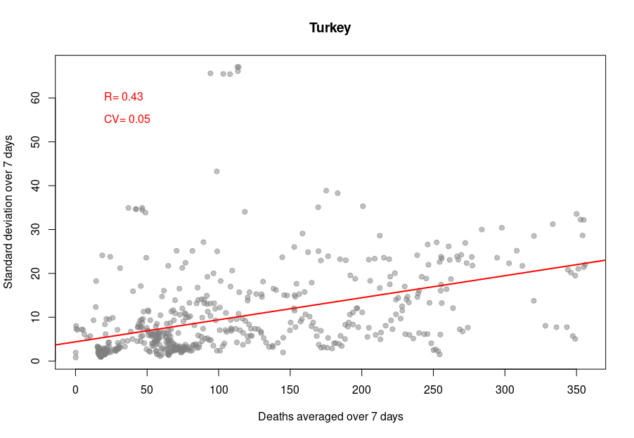
When it becomes interesting is when the linear relationship is lost. Turkey’s daily death reports are also very smooth. However, the linearity between the variability is now mostly lost, with a standard deviation that remains almost constant no matter the absolute amount of deaths. If I had to guess, I would say that the data is massaged, albeit by people who did not really think about the reason underpinning the variability and what structure it should have to look natural.
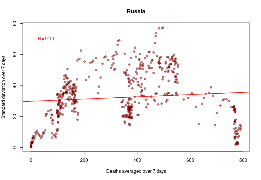
And finally, we reach Russia. From the Russian statistics agency itself, we know that the official death toll from the government bears no relationship whatsoever with reality. What is interesting is that the people producing the daily reporting went further than the Turkish ones and did not even try to produce realistically looking data. On the contrary, the variability was smoothed out even more for the highest absolute death tolls, generating a ridiculous bridge-shaped curve.
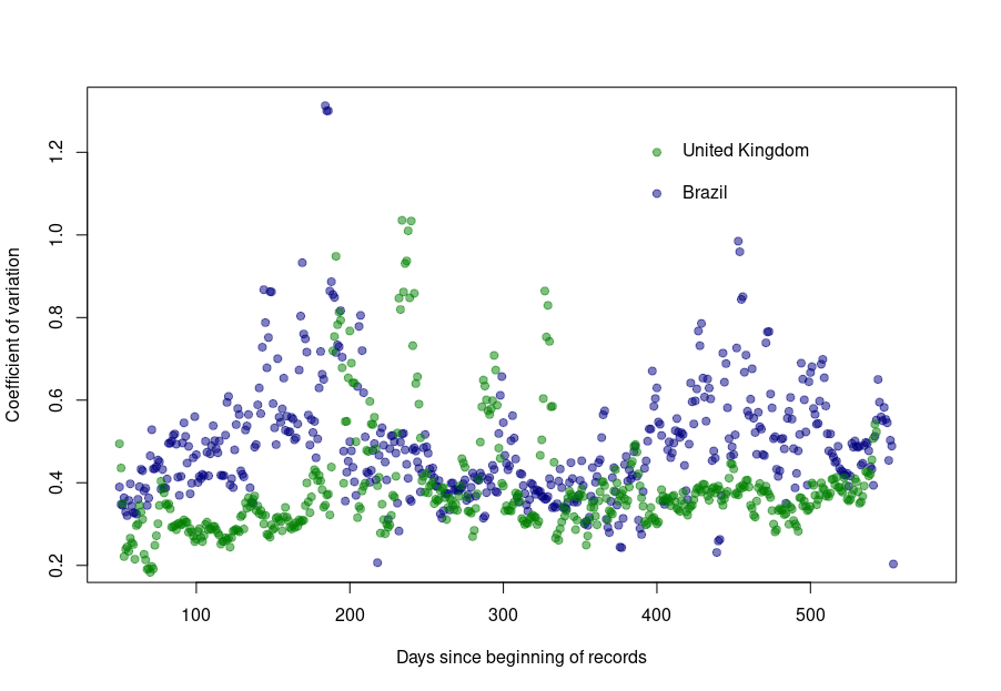
Was this always the case? How did the coefficient of variation evolve since the beginning of the pandemics? Looking again at the UK and Brazil, we can see that the average CV stays pretty much steady over time with an increased variability between the big waves. We see nicely that the CV peaks and troughs alternate between Brazil and the UK, corresponding to the offset between waves.
The situation is a bit different for Turkey and Russia. The Turkish dataset shows a CV collapsing after the first six months of the pandemics. And indeed, the daily death reporting between October 2020 and March 2021 is ridiculously smooth. However, it seems someone decided that it was a bit too much and started to add some noise (that was, unfortunately for them, not adequately scaled up.)
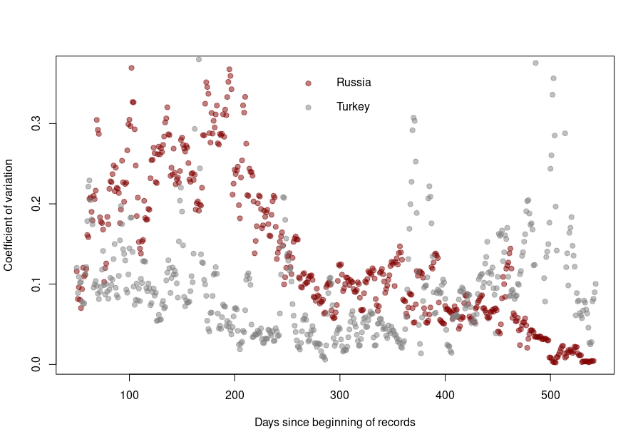
Russia followed the opposite path. While during the pandemics’ initial months, the CV was on par with those of western datasets, all that quickly stopped, and the CV collapsed. This trend culminated with the current preposterous death tools, between 780 and 800 deaths every single day for the past two months. The Russian government is basically showing the world the numerical finger.