When I receive manuscripts to edit, I am often surprised to see how poor the figures are, particularly the plots. They are confusing, lack colours (and when in colour are not colour-blind-friendly), the font size is too small, etc. Your figures convey much more than the results. For better or worse, they will bias the reader’s mind about your results’ quality and affect their confidence in your conclusions.
It is not hard to improve our plots, though. We must think about the readers and what we like in other people’s plots. Let’s take the example of a histogram. I’ll use the single cell RNAseq data already presented in my post about medians and means. We want to see if the distribution of gene expressions across many single cells corresponds to a lognormal law. We will plot the expression of four genes, their calculated mean and median, a fitted lognormal distribution and the mean and median of the latter. (NB: We know gene expression does not really follow a lognormal distribution, and comparing distributions is not the proper way to determine if a dataset corresponds to a distribution. If you are interested, have a look at Q-Q plots and the Shapiro-Wilk test.)
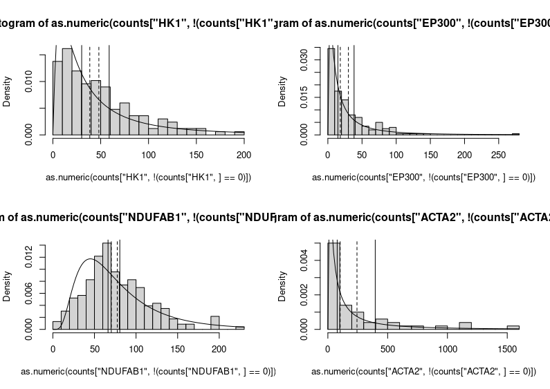
Here we go.
Yikes!
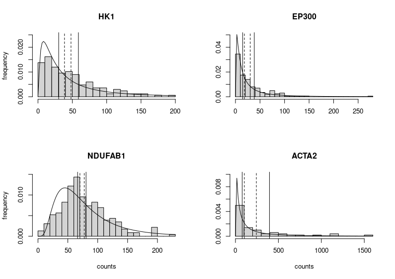
This is horrendous. The fitted distributions are cut, legends are unreadable, and all that grey, so depressing. Let’s improve the figure by choosing different limits for the Y axes to make the entire fitted distributions visible. We can also improve each plot’s title and the labels of the axes. We do not need the latter on each subplot (we can also change the label “density” produced by plotting the fitted distribution into “frequency”, the label we would get by plotting only the histograms. Indeed, the height of the boxes represents the fraction of cells presenting the expression plotted on the X axis.
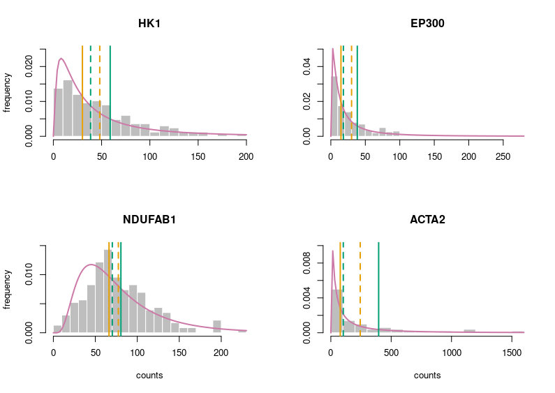
Better. But still very grey. Let’s put some colours on this plot. Those colours are colour-blind-friendly (thanks to the “Colour universal design” of Masataka Okabe and Kei, Ito).
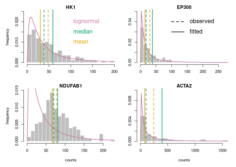
Now, this looks publication-grade. I feel there is still too much white space, so let’s tighten that a bit and add legends.
Of course, for this blog post, I voluntarily started with base R. Using ggplot2 in the first place would have provided a much better starting point. I just wanted to make a point. Here is the code:
# counts is a dataframe with genes in rows and cells in columns

# fitting the counts of hexokinase across all cells to a lognormal law; only consider non-zero values
# (the other four genes are fitted using the same code)
fit_params_HK1 <- fitdistr(as.numeric(counts["HK1",!(counts["HK1",]==0)]),"lognormal")

# to get a 2 by 2 figure without too much empty white space
par(mfrow=c(2,2),
    oma = c(1,1,1,1) + 0.0,
    mar = c(4,4,1,0) + 0.0)

# plot for the hexokinase (the other four genes are plotted using the same code)
# histogram of cell counts
hist(as.numeric(counts["HK1",!(counts["HK1",]==0)]),breaks=20,prob=TRUE,
     col="gray", border = "white",
     main="HK1",xlab=NULL,ylab="frequency",ylim=c(0,0.025))
# lognormal distribution fitted on the counts
curve(dlnorm(x, fit_params_HK1$estimate[1], fit_params_HK1$estimate[2]), col=rgb(204/255,121/255,167/255), lwd=2, add=T)

# observed median and mean
abline(v=median(as.numeric(counts["HK1",!(counts["HK1",]==0)])), col=rgb(0/255,158/255,115/255),lwd=2,lty=2)
abline(v=mean(as.numeric(counts["HK1",!(counts["HK1",]==0)])), col=rgb(230/255,159/255,0/255),lwd=2,lty=2)

# median and mean of the fitted law. remember that the median of a lognormal distributed variable is the mean
# of the log of the variable (meanlog), and its mean is meanlog+sdlog^2/2
abline(v=exp(fit_params_HK1$estimate[1]+(fit_params_HK1$estimate[2])^2/2), col=rgb(0/255,158/255,115/255),lwd=2)
abline(v=exp(fit_params_HK1$estimate[1]), col=rgb(230/255,159/255,0/255),lwd=2)

# plotting the legends for the colours
text(100, 0.02, labels = "lognormal", pos = 4, cex = 1.5, col=rgb(204/255,121/255,167/255))
text(100, 0.015, labels = "median", pos = 4, cex = 1.5, col=rgb(0/255,158/255,115/255))
text(100, 0.01, labels = "mean", pos = 4, cex = 1.5, col=rgb(230/255,159/255,0/255))

# plotting the legend located on the histone acetylase EP300
segments(100,0.04, 140,0.04,col = "black", lty = 2,lwd=2)
segments(100,0.03, 140, 0.03,col = "black", lty = 1,lwd=2)
text(150, 0.04, labels = "observed", pos = 4, cex = 1.5, col="black")
text(150, 0.03, labels = "fitted", pos = 4, cex = 1.5, col="black")
Slides are ubiquitous visual supports for scientific presentations, whether to present results in conferences, report progresses for periodic reviews, or apply to a position or funding. While science is (should be?) paramount, the quality of the slides bears a disproportionate effect on the audience. Here, I will present ten beginner tips – or ten mistakes to avoid – to improve the delivery of your presentation. They aim to improve understanding by making your message clearer, faster, and easier to grasp.
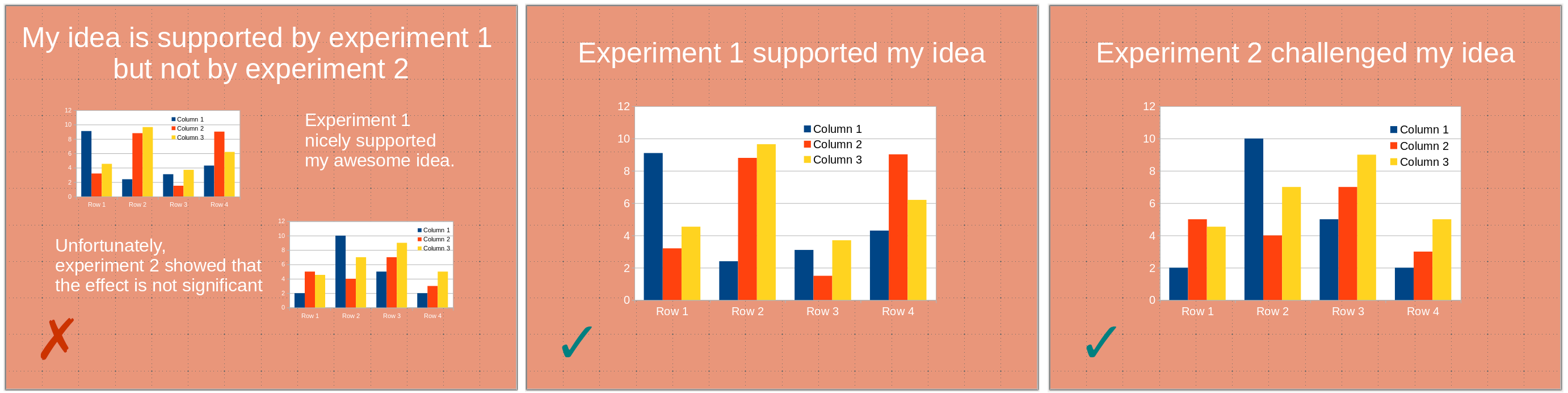
1) One slide should present one point (one idea, one experiment). A slide is not a poster. You might use several panels to illustrate a given point. However, the slide should be entirely dedicated to this one point. A point you are trying to make might be obfuscated by unrelated visuals presenting themselves to the audience’s attention. This might even create confusion if the visuals present related – albeit different –points or experiments, the audience being able to see illustrations that differ from what you are discussing.
2) Avoid slides with only textual content. In particular, except for quotes, do not write down what you are saying. The audience will be torn between listening to you and reading the slide content. Moreover, slightly changing how you express a point might create dissonance, generating confusion.
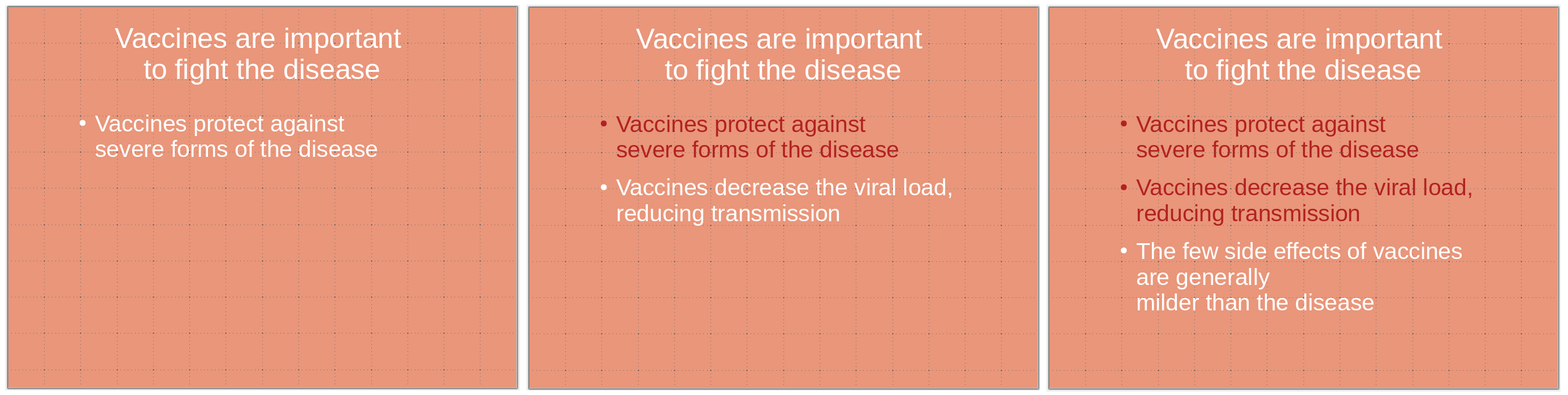
3) Bullet points constitute an exception to the tip above since they can be the sole content of a slide. If you use bullet points, highlight the current point while keeping the previous ones visible. Some people might need time to process them. Depending on the presentation, it can also maintain the logic of the demonstration in everyone’s mind.
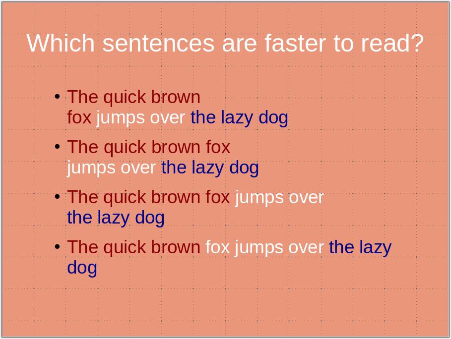
4) Use carriage returns wisely and do not cut expressions or statements. This would slow down the reader, who focuses on the odd break instead of the message. (Also, for the sake of future processing, do not use hard return [new paragraphs ¶] within a sentence or a statement. Use soft returns [line break ↵] instead).
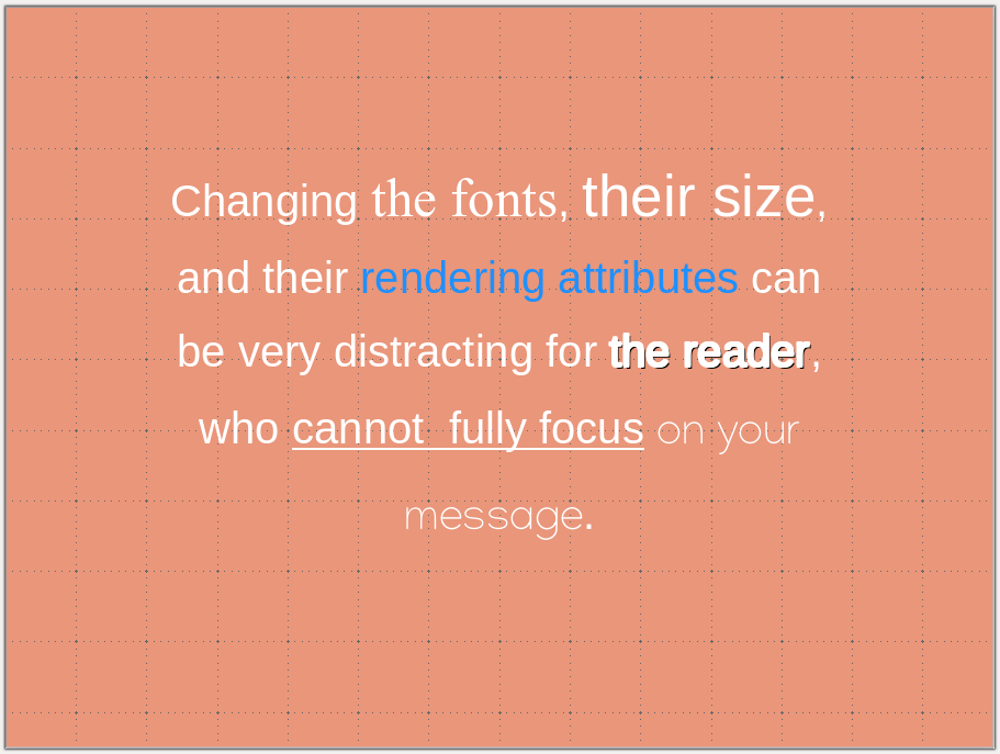
5) Maintain a consistent visual style, including colour codes and fonts. Changing the style distracts the audience. You want all their attention focused on your message rather than following meaningless visual cues. If possible, use the same font size in the same context. If you cannot, it might signal that you have too much text on the slide.
6) Use colour-blind-friendly palettes. About 5% of the population presents some form of colour-blindness, most often red-green. Showing images with green and red fluorescences or a PCA/tSNE/UMAP with red and green points might be a significant strategic error. Not only could your message be lost, but you might also aggravate some audience members (particularly critical in case of a job interview or grant application). There are many resources available providing advice and palettes, such as https://davidmathlogic.com/colorblind https://thenode.biologists.com/data-visualization-with-flying-colors/research/ http://mkweb.bcgsc.ca/colorblind/
Note that changing an image’s hue is perfectly acceptable as it does not alter the signal’s dynamic range or add or remove information. The colours of most biological imaging are artificially added by the acquisition software anyway.
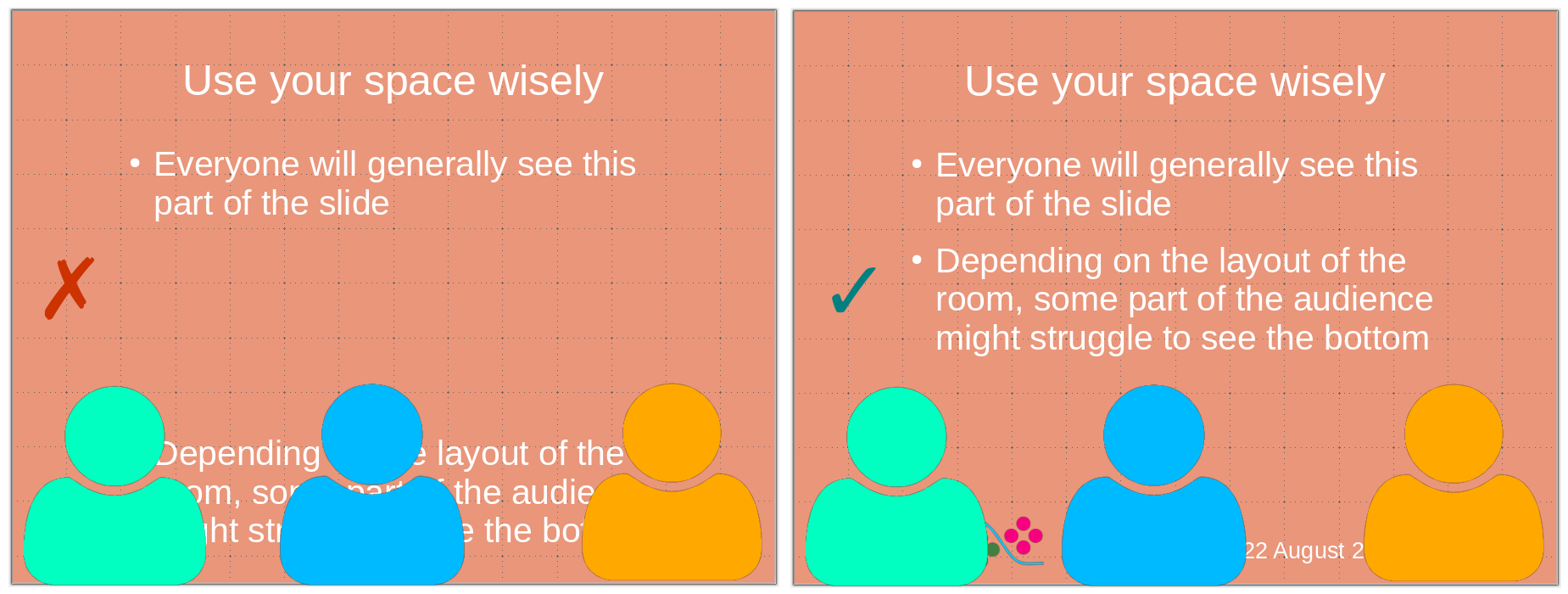
8) Do not put critical information at the bottom of the slide. Depending on the settings of the room where you give the presentation, the bottom of the slide might be hard to see or even masked by the heads of people in the front rows. Use the bottom part of the slide to put logos, date, etc.
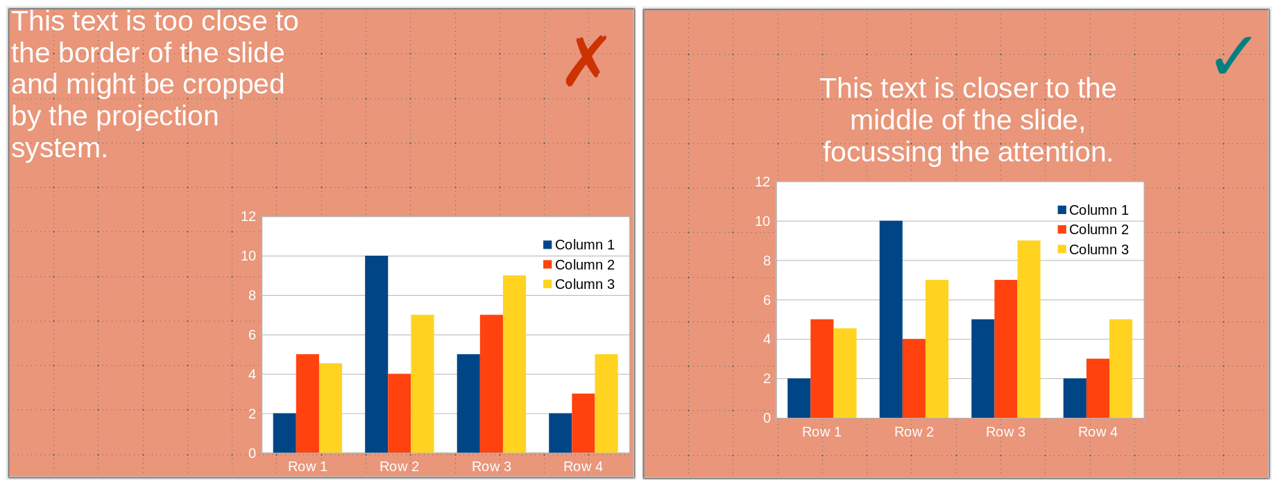
9) Do not put information close to the borders. Some projectors might crop your slides, and you will lose information. Margins also focus the vision, insulating your visual from the surroundings.
10) Finally, and most importantly, proofread, debug, and test your presentation. Test it yourself, trying very hard to be in the position of an audience not knowing its content, and test it with critical friends who are not too familiar with its content but can understand it.
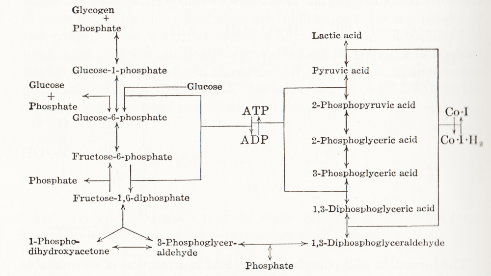
Visual representation of biochemical pathways has been a critical tool for understanding the cellular and molecular systems for a long time. Any knowledge integration project involves a jigsaw puzzle step, where different pieces must be put together. When Feynman cheekily wrote on his blackboard just before his death, “What I cannot create I do not understand”, he meant that he only fully understood a system once he derived a (mathematical) model for it; and interestingly, Feynman is also famous for one of the earliest standard graphical representations of reaction networks, namely the Feynman diagrams to represent models of subatomic particle interactions. The earliest metabolic “map” I possess comes from the 3rd edition of “Outlines of Biochemistry” by Gortner published in 1949. I would be happy to hear if you have older ones.
(I let you find out all the inconsistencies, confusing bits, and error-generating features in this map. This might be food for another text, but I believe this to be a great example to support the creation of standards, best practices, and software tools!)
Until recently, those diagrams were drawn mainly by hand, initially on paper, then using drawing software. There was little thought spent on consistency, visual semantics, or interoperability. This state of affairs changed in the 1990s as part of Systems Biology’s revival. The other thing that changed in the 1990s was the widespread use of computers and software tools to build and analyse models. The child of both trends was the development of standard computer-readable formats to represent biological networks.
When drawing a knowledge representation map, one can divide the decision-making process, and therefore the things we need to encode in order to share the map, into three parts:
What – How can people identify what I represent? A biochemical map is a network built up from nodes linked by arcs. The network may contain only one type of node, for instance, a protein-protein interaction network or an influence network, or be a bipartite graph, like a reaction network – one type of node representing the pools involved in the reactions, the other representing the reactions themselves. One decision is the shape to use for each node so that it carries visual information about the nature of what it represents. Another concerns the arcs linking the nodes, which can also contain visual clues, such as directionality, sign, type of influence, and more. All this must be encoded in some way, either semantically (a code identifying the type of glyphs from an agreed-up list of codes) or graphical (embedding an image or describing the node).
Where – After choosing the glyphs, one needs to place them. The relative position of the information should not always carry much information, but there are some cases where it must, e.g. members of complexes, inclusion in compartments, etc. Furthermore, there is no denying that the relative position of glyphs is also used to convey more subjective information. For instance, a linear chain of reactions induces the idea of a flow, much better than a set of reactions going randomly up and down, right and left. Another unwritten convention is to represent membrane signal transduction on the top of the maps, with the “end-result” – often effect on gene expression – at the bottom, with the idea of a cascading flux of information. The coordinates of the glyphs must then be shared as well.
How – Finally, the impact of a visual representation also depends on aesthetic factors. The relative size of glyphs and labels, the thickness of arcs, the colours, shades and textures, all influence the facility with which viewers absorb the information contained in a map. Relying on such aspects to interpret the meaning of a map should be avoided, particularly if the map is to be shared between different media, where rendering could affect the final aspect. Nevertheless, wanting to keep this aspect as close as possible makes sense.
A bit of history
Different formats have been developed over the years to cover these different aspects with different accuracy and constraints. In order to understand why we have such a variety of description formats on offer, a bit of history might be helpful. Being able to encode the graphical representation of models in SBML was mentioned as early as 2000 (Andrew Finney. Possible Extensions to the Systems Biology Markup Language. 27 November 2000).
In 2002, the group of Hiroaki Kitano presented a graphical editor for the Systems Biology Markup Language (SBML, Hucka et al 2003, Keating et al 2020), called SBedit, and proposed extensions to SBML necessary for encoding maps (Tanimura et al. Proposal for SBEdit’s extension of SBML-Level-1. 8 July 2002). This software later became CellDesigner (Funahashi et al 2003), a full-featured modelling developing environment using SBML as its native format. All graphical information is encoded in CellDesigner-specific annotations using the SBML extension system. In addition to the layout (the where), CellDesigner proposed a set of standardised glyphs to use for representing different types of molecular entities and different relationships (the what) (Kitano et al 2003). At the same time, Herbert Sauro developed an extension to SBML to encode the maps designed in the software JDesigner (Herbert Sauro. JDesigner SBMLAnnotation. 8 January 2003). Both CellDesigner and JDesigner annotations could also encode the appearance of glyphs (the how).
Once the SBML Layout annotations were finalised, the SBML and BioPAX communities came together to standardise visual representations for biochemical pathways. This led to the Systems Biology Graphical Notation, a set of three standard graphical languages with agreed-upon symbols and rules to assemble them (the what, Le Novère et al 2009). While the shape of SBGN glyphs determines their meaning, neither their placement in the map nor their graphical attributes (colour, texture, edge thickness, the how) affect the map semantics. SBGN maps are ultimately images and can be exchanged as such, either in bitmaps or vector graphics. They are also graphs and can be exchanged using graph formats like GraphML. However, sharing and editing SBGN maps would be much easier if more semantics were encoded than graphical details. This feeling led to the development of SBGN-ML (van Iersel et al 2012), which encodes not only the SBGN part of SBGN maps but also the layout and size of graph elements.
So we have at least three solutions to encode biochemical maps using XML standards from the COMBINE community (Hucka et al 2015):
1) SBGN-ML,
2) SBML with Layout extension (controlled Layout annotations in Level 2 and Layout package in Level 3), and
3) SBML with proprietary extensions.
Regarding the latter, we will only consider the CellDesigner variant for two reasons. Firstly, CellDesigner is the most used graphical model designer in systems biology (at the time of writing, the articles describing the software have been cited over 1000 times). Secondly, CellDesigner’s SBML extensions are used in other software tools. These three solutions are not equivalent; they present different advantages and disadvantages, and round-tripping is generally impossible.
SBGN-ML
Curiously, despite its name, SBGN-ML does not explicitly describe the SBGN part of the maps (the what). Since the shape of nodes is a standard, it is only necessary to mention their type, and any supporting software will know which symbol to use. For instance, SBGN-ML will not specify that a protein X must be represented with a round-corner rectangle. It will only say that there is a macromolecule X at a particular position with given width and height. Any SBGN-supporting software must know that a round-corner rectangle represents a macromolecule. The consequence is that SBGN-ML cannot be used to encode maps using non-SBGN symbols. However, software tools can decide to use different symbols attributed to a given class of SBGN objects while rendering the maps. For example, instead of using a round-corner rectangle each time a glyph’s class is macromolecule, it could use a star. The resulting image would not be an SBGN map. However, if modified and saved back in SBGN-ML, it could be recognised by another supporting software. Such behaviour is not to be encouraged if we want people to get used to SBGN symbols, but it provides a certain level of interoperability.
What SBGN-ML explicitly describes instead are the parts that SBGN itself does not regulate but are specific to the map. That includes the size of the glyphs (bounding box), the textual labels, as well as the positions of glyphs (the where). SBGN-ML currently does not encode rendering properties such as text size, colours and textures (the how). However, the language provides an element extension, analogous to the SBML annotation, that allows augmenting the language. One can use this element to extend each glyph or encode style, and the community started to do so in an agreed-upon manner.
Note that SBGN-ML only encodes the graph. While it contains a certain amount of biological semantics – linked to the identity of the glyphs – it is not a general-purpose format that would encode advanced semantics of regulatory features such as BioPAX (Demir et al. 2010), or mathematical relationships such as SBML. However, users can distribute SBML files along with SBGN-ML files, for instance, in a COMBINE Archive (Bergmann et al 2014). Unfortunately, there is currently no blessed way to map an SBML element, such as a particular species, to a given SBGN-ML glyph.
SBML Level 3 + Layout and Render packages
As we mentioned before, SBML Level 3 provides two packages helping with the visual representations of networks: Layout (the where) and Render (the how). Contrarily to SBGN-ML, which is meant to describe maps in a standard graphical notation, the SBML Level 3 packages do not restrict the way one represents biochemical networks. This provides more flexibility to the user but decreases the “stand-alone” semantics content of the representations. I.e. if non-standard symbols are used, their meaning must be defined in an external legend. It is, of course, possible to use only SBGN glyphs to encode maps. The visual rendering of such a file will be SBGN, but the automatic analysis of the underlying format will be more challenging.
The SBML Layout package permits encoding the position of objects, points, curves and bounding boxes. Curves can have complex shapes encoded as Béziers curves. The package allows distinguishing between different general types of nodes such as compartments, molecular species, reactions and text. However, there is little biological semantics encoded by the shapes, either regarding the nodes (e.g. nothing distinguishes a simple chemical from a protein) or the edges (one cannot distinguish an inhibition from a stimulation). In addition, the SBML Render package permits to define styles that can be applied to types of glyphs. This includes colours and gradients, geometric shapes, properties of text, lines, line-endings etc. Render can encode a wide variety of graphical properties, and pave the gap to generic graphical formats such as SVG.
If we are trying to visualise a model, one advantage of using SBML packages is that all the information is included in a single file, providing a straightforward mapping between the model constructs and their representation. This goes a long way to solve the issue of the biological semantics mentioned above since it can be retrieved from the SBML Core elements linked to the Layout elements. Let us note that while SBML Layout+Render do not encode the nature of the objects represented by the glyphs (the what) using specific structures, this can be retrieved via the attributes sboTerm of the corresponding SBML Core elements, using the appropriate values from the Systems Biology Ontology (Courtot et al 2011).
CellDesigner notation
CellDesigner uses SBML (currently Level 2) as its native language. However, it extended it with its own proprietary annotation, keeping the SBML perfectly valid (which is also the way software tools such as JDesigner operate). Visually, the CellDesigner notation is close to SBGN Process Descriptions, having been the strongest inspiration for the community effort. CellDesigner offers an SBGN-View mode, that produces graphs closer to pure SBGN PD.
CellDesigner’s SBML extensions increase the semantics of SBML elements such as molecular species or regulatory arcs in a way not dissimilar to SBGN-ML. In addition, it provides a description of each glyph linked to the SBML elements, covering the ground of SBML Layout and Render. The SBML extensions being specific to CellDesigner, they do not offer the flexibility of SBML Render. However, the limited spectrum of possibilities might make the support easier.
CellDesigner notation
SBML Layout+Render
SBGN-ML
Encodes the what
✓
✓
✓
Encodes the where
✓
✓
✓
Encodes the how
✓
✓
✓
Contains the mathematical model part
✓
✓
✗
Writing supported by more than 1 tool
✗
✓
✓
Reading supported by more than 1 tool
✓
✓
✓
Is a community standard
✗
✓
✓
Examples of usages and conversions
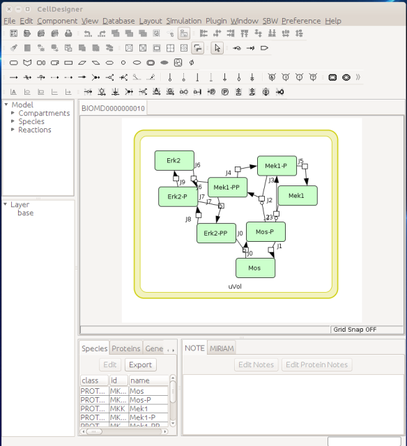
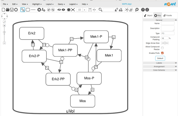
Now let us see the three formats in action. We start with SBGN-ML. First, we can load a model – for instance from BioModels (Chelliah et al 2015 ) – in CellDesigner (version 4.4 at the time of writing). Here we will use the model BIOMD0000000010, an SBML version of the MAP kinase model described in Kholodenko et al (2000).
From an SBML file that does not contain any visual representation, CellDesigner created one using its auto-layout functions. One can then export an SBGN-ML file. This SBGN-ML file can be imported, for instance, in Cytoscape (Shannon et al. 2003) 2.8 using the CySBGN plugin (Gonçalves et al 2013).
The position and size of nodes are conserved, but edges have different sizes (and the catalysis glyph is wrong). The same SBGN-ML file can be open in the online SBGN editor Newt.
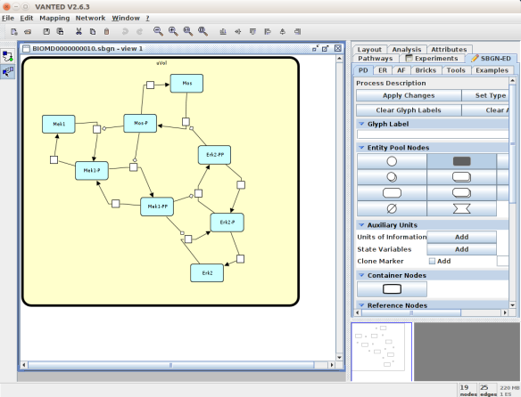
An alternative to CellDesigner to produce the SBGN-ML map could be Vanted (Junker et al 2006, version 2.6.4 at the time of writing). Using the same model from BioModels, we can auto-layout the map (we used the organic layout here) and then convert the graph to SBGN using the SBGN-ED plugin (Czauderna et al 2010).
The map can then be saved as SBGN-ML and as before, opened in Newt.
The positions of the nodes are conserved. However, the connection of edges is a bit different. In that case, Newt is slightly more SBGN compliant.
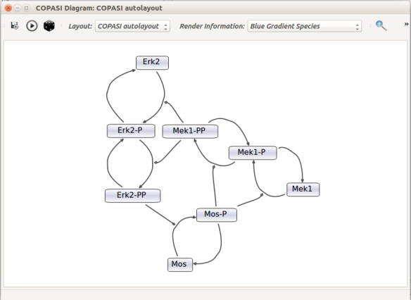
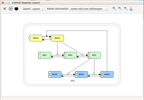
Then, let us start with a vanilla SBML file. We can import our BIOMD0000000010 model in COPASI (Hoops et al 2006, version 4.22 at the time of writing). COPASI now offers auto-layout capabilities, with the possibility of manually editing the resulting maps.
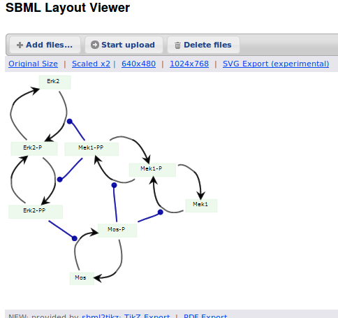
When we export the model in SBML, it will now contain the map encoded with the Layout and Render packages. When the model is uploaded in any software tool supporting the packages, we will retrieve the map. For instance, we can use the SBML Layout Viewer. Note that if the layout is conserved, it is not the case with the rendering.
Alternatively, we can load the model to CellDesigner, and manually generate a nice map (NB: a CellDesigner plugin that can read SBML Layout was implemented during Google Summer of Code 2014 . It is part of the JSBML project).
We can create an SBML Layout using the CellDesigner layout converter. Then, when we import the model in COPASI, we can visualise the map encoded in Layout. NB: here, the difference in appearance is due to a problem in the CellDesigner converter, not COPASI.
The same model can be loaded in the SBML Layout Viewer.
How do I choose between the formats?
There is, unfortunately, no unique solution at the moment. The main question one has to ask is what do we want to do with the visual maps?
Are they meant to be a visual representation of an underlying model, the model being the critical part that needs to be exchanged? If that is the case, SBML packages or CellDesigner notation should be used.
Does the project mostly/only involves graphical representations, and those must be exchanged? CellDesigner or SBGN-ML would therefore be better.
Does the rendering of graphical elements matter? In that case, SBML packages or CellDesigner notations are currently better (but that is going to change soon).
Is standardisation important for the project, in addition to immediate interoperability? If yes, SBML packages or SBGN-ML would be the way to go.
All those questions and more have to be clearly spelt out at the beginning of a project. The answer will quickly emerge from the answers.
Acknowledgements
Thanks to Frank Bergmann, Andreas Dräger, Akira Funahashi, Sarah Keating, Herbert Sauro for help and corrections.
References
Bergmann FT, Adams R, Moodie S, Cooper J, Glont M, Golebiewski M, Hucka M, Laibe C, Miller AK, Nickerson DP, Olivier BG, Rodriguez N, Sauro HM, Scharm M, Soiland-Reyes S, Waltemath D, Yvon F, Le Novère N (2015) COMBINE archive and OMEX format: one file to share all information to reproduce a modeling project. BMC Syst Biol 15, 369. doi:10.1186/s12859-014-0369-z
Chelliah V, Juty N, Ajmera I, Raza A, Dumousseau M, Glont M, Hucka M, Jalowicki G, Keating S, Knight-Schrijver V, Lloret-Villas A, Natarajan K, Pettit J-B, Rodriguez N, Schubert M, Wimalaratne S, Zhou Y, Hermjakob H, Le Novère N, Laibe C (2015) BioModels: ten year anniversary. Nucleic Acids Res 43(D1), D542-D548. doi:10.1093/nar/gku1181
Courtot M, Juty N, Knüpfer C, Waltemath D, Zhukova A, Dräger A, Dumontier M, Finney A, Golebiewski M, Hastings J, Hoops S, Keating S, Kell DB, Kerrien S, Lawson J, Lister A, Lu J, Machne R, Mendes P, Pocock M, Rodriguez N, Villeger A, Wilkinson DJ, Wimalaratne S, Laibe C, Hucka M, Le Novère N. Controlled vocabularies and semantics in Systems Biology. Mol Syst Biol 7, 543. doi:10.1038/msb.2011.77
Czauderna T, Klukas C, Schreiber F (2010) Editing, validating and translating of SBGN maps. Bioinformatics 26(18), 2340-2341. doi:10.1093/bioinformatics/btq407
Demir E, Cary MP, Paley S, Fukuda K, Lemer C, Vastrik I, Wu G, D’Eustachio P, Schaefer C, Luciano J, Schacherer F, Martinez-Flores I, Hu Z, Jimenez-Jacinto V, Joshi-Tope G, Kandasamy K, Lopez-Fuentes AC, Mi H, Pichler E, Rodchenkov I, Splendiani A, Tkachev S, Zucker J, Gopinathrao G, Rajasimha H, Ramakrishnan R, Shah I, Syed M, Anwar N, Babur O, Blinov M, Brauner E, Corwin D, Donaldson S, Gibbons F, Goldberg R, Hornbeck P, Luna A, Murray-Rust P, Neumann E, Ruebenacker O, Samwald M, van Iersel M, Wimalaratne S, Allen K, Braun B, Carrillo M, Cheung KH, Dahlquist K, Finney A, Gillespie M, Glass E, Gong L, Haw R, Honig M, Hubaut O, Kane D, Krupa S, Kutmon M, Leonard J, Marks D, Merberg D, Petri V, Pico A, Ravenscroft D, Ren L, Shah N, Sunshine M, Tang R, Whaley R, Letovksy S, Buetow KH, Rzhetsky A, Schachter V, Sobral BS, Dogrusoz U, McWeeney S, Aladjem M, Birney E, Collado-Vides J, Goto S, Hucka M, Le Novère N, Maltsev N, Pandey A, Thomas P, Wingender E, Karp PD, Sander C, Bader GD (2010) The BioPAX Community Standard for Pathway Data Sharing. Nat Biotechnol, 28, 935–942. doi:10.1038/nbt.1666
Funahashi A, Morohashi M, Kitano H, Tanimura N (2003) CellDesigner: a process diagram editor for gene-regulatory and biochemical networks. Biosilico 1 (5), 159-162
Gauges R, Rost U, Sahle S, Wegner K (2006) A model diagram layout extension for SBML. Bioinformatics 22(15), 1879-1885. doi:10.1093/bioinformatics/btl195
Gauges R, Rost U, Sahle S, Wengler K, Bergmann FT (2015) The Systems Biology Markup Language (SBML) Level 3 Package: Layout, Version 1 Core. J Integr Bioinform 12(2), 267. doi:10.2390/biecoll-jib-2015-267
Gonçalves E, van Iersel M, Saez-Rodriguez J (2013) CySBGN: A Cytoscape plug-in to integrate SBGN maps. BMC Bioinfo 14, 17. doi:10.1186/1471-2105-14-17
Hoops S, Sahle S, Gauges R, Lee C, Pahle J, Simus N, Singhal M, Xu L, Mendes P, Kummer U (2006) COPASI-a COmplex PAthway SImulator. Bioinformatics 22(24), 3067-3074. doi:10.1093/bioinformatics/btl485
Hucka M, Bolouri H, Finney A, Sauro HM, Doyle JC, Kitano H, Arkin AP, Bornstein BJ, Bray D, Cornish-Bowden A, Cuellar AA, Dronov S, Ginkel M, Gor V, Goryanin II, Hedley WJ, Hodgman TC, Hunter PJ, Juty NS, Kasberger JL, Kremling A, Kummer U, Le Novère N, Loew LM, Lucio D, Mendes P, Mjolsness ED, Nakayama Y, Nelson MR, Nielsen PF, Sakurada T, Schaff JC, Shapiro BE, Shimizu TS, Spence HD, Stelling J, Takahashi K, Tomita M, Wagner J, Wang J (2003) The Systems Biology Markup Language (SBML): A Medium for Representation and Exchange of Biochemical Network Models. Bioinformatics, 19, 524-531. doi:10.1093/bioinformatics/btg015
Hucka M, Nickerson DP, Bader G, Bergmann FT, Cooper J, Demir E, Garny A, Golebiewski M, Myers CJ, Schreiber F, Waltemath D, Le Novère N (2015) Promoting coordinated development of community-based information standards for modeling in biology: the COMBINE initiative. Frontiers Bioeng Biotechnol 3, 19. doi:10.3389/fbioe.2015.00019
Junker BH, Klukas C, Schreiber F (2006) VANTED: A system for advanced data analysis and visualization in the context of biological networks. BMC Bioinfo 7, 109. doi:10.1186/1471-2105-7-109
Sarah M Keating, Dagmar Waltemath, Matthias König, Fengkai Zhang, Andreas Dräger, Claudine Chaouiya, Frank T Bergmann, Andrew Finney, Colin S Gillespie, Tomáš Helikar, Stefan Hoops, Rahuman S Malik-Sheriff, Stuart L Moodie, Ion I Moraru, Chris J Myers, Aurélien Naldi, Brett G Olivier, Sven Sahle, James C Schaff, Lucian P Smith, Maciej J Swat,Denis Thieffry, Leandro Watanabe, Darren J Wilkinson, Michael L Blinov, Kimberly Begley, James R Faeder, Harold F Gómez, Thomas M Hamm, Yuichiro Inagaki, Wolfram Liebermeister, Allyson L Lister, Daniel Lucio, Eric Mjolsness, Carole J Proctor, Karthik Raman, Nicolas Rodriguez, Clifford A Shaffer, Bruce E Shapiro, Joerg Stelling, Neil Swainston, Naoki Tanimura, John Wagner, Martin Meier-Schellersheim, Herbert M Sauro, Bernhard Palsson, Hamid Bolouri, Hiroaki Kitano, Akira Funahashi, Henning Hermjakob, John C Doyle, Michael Hucka, and the SBML Level3Community members: Richard R Adams,Nicholas A Allen,Bastian R Angermann,Marco Antoniotti,Gary D Bader,Jan Červený,Mélanie Courtot,Chris D Cox,Piero Dalle Pezze,Emek Demir,William S Denney,Harish Dharuri,Julien Dorier,Dirk Drasdo,Ali Ebrahim,Johannes Eichner,Johan Elf,Lukas Endler,Chris T Evelo,Christoph Flamm,Ronan MT Fleming,Martina Fröhlich,Mihai Glont,Emanuel Gonçalves,Martin Golebiewski,Hovakim Grabski,Alex Gutteridge,Damon Hachmeister,Leonard A Harris,Benjamin D Heavner,Ron Henkel,William S Hlavacek,Bin Hu,Daniel R Hyduke,Hidde Jong,Nick Juty,Peter D Karp,Jonathan R Karr,Douglas B Kell,Roland Keller,Ilya Kiselev,Steffen Klamt,Edda Klipp,Christian Knüpfer,Fedor Kolpakov,Falko Krause,Martina Kutmon,Camille Laibe,Conor Lawless,Lu Li,Leslie M Loew,Rainer Machne,Yukiko Matsuoka,Pedro Mendes,Huaiyu Mi,Florian Mittag,Pedro T Monteiro,Kedar Nath Natarajan,Poul MF Nielsen,Tramy Nguyen,Alida Palmisano,Jean-Baptiste Pettit,Thomas Pfau,Robert D Phair,Tomas Radivoyevitch,Johann M Rohwer,Oliver A Ruebenacker,Julio Saez-Rodriguez,Martin Scharm,Henning Schmidt,Falk Schreiber,Michael Schubert,Roman Schulte,Stuart C Sealfon,Kieran Smallbone,Sylvain Soliman,Melanie I Stefan,Devin P Sullivan,Koichi Takahashi,Bas Teusink,David Tolnay,Ibrahim Vazirabad,Axel Kamp,Ulrike Wittig,Clemens Wrzodek,Finja Wrzodek,Ioannis Xenarios,Anna Zhukova andJeremy Zucker (2020) SBML Level 3: an extensible format for the exchange and reuse of biological models. Mol Syst Biol 16, e9110. doi:10.15252/msb.20199110
Kholodenko BN (2000) Negative feedback and ultrasensitivity can bring about oscillations in the mitogen-activated protein kinase cascades. Eur J Biochem.267(6), 1583-1588. doi:10.1046/j.1432-1327.2000.01197.x
Le Novère N, Hucka M, Mi H, Moodie S, Shreiber F, Sorokin A, Demir E, Wegner K, Aladjem M, Wimalaratne S, Bergman FT, Gauges R, Ghazal P, Kawaji H, Li L, Matsuoka Y, Villéger A, Boyd SE, Calzone L, Courtot M, Dogrusoz U, Freeman T, Funahashi A, Ghosh S, Jouraku A, Kim S, Kolpakov F, Luna A, Sahle S, Schmidt E, Watterson S, Goryanin I, Kell DB, Sander C, Sauro H, Snoep JL, Kohn K, Kitano H (2009) The Systems Biology Graphical Notation. Nat Biotechnol 27, 735-741. doi:10.1038/nbt.1558
Shannon P, Markiel A, Ozier O, Baliga NS, Wang JT, Ramge D, Amin N, Schwikowski B, Ideker T (2003) Cytoscape: a software environment for integrated models of biomolecular interaction networks. Bioinformatics 13, 2498-2504. doi:10.1101/gr.1239303
van Iersel MP, Villéger AC, Czauderna T, Boyd SE, Bergmann FT, Luna A, Demir E, Sorokin A, Dogrusoz U, Matsuoka Y, Funahashi A, Aladjem MI, Mi H, Moodie SL, Kitano H, Le Novère N, Schreiber F (2012) Software support for SBGN maps: SBGN-ML and LibSBGN. Bioinformatics 28, 2016-2021. doi:10.1093/bioinformatics/bts270
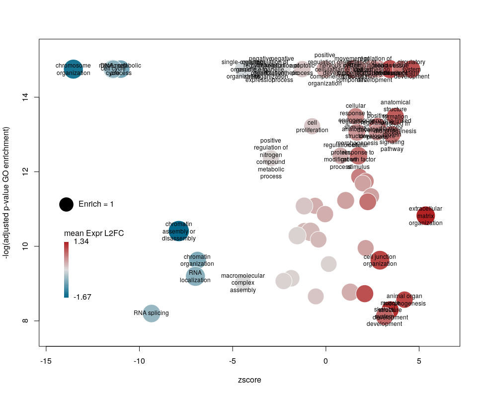
I recently came across the package GOplot by Wencke Walter http://wencke.github.io/. In particular, I liked the function GOBubble. However, I found it difficult to customise the plot. In particular, I wanted to colour the bubbles differently, and to control the plotting area. So I took the idea and extended it. Many aspects of the plot can be configured. It is a work in progress. Not all features of GOBubble are implemented at the moment. For instance, we cannot separate the different branches of Gene Ontology, or add a table listing labelled terms. I also have a few ideas to make the plot more versatile. If you have suggestions, please tell me. The code and the example below can be found at: Main script: plotGODESeq.R Demo script: usePlotGODESeq.R DESeq data used by the script: DESeq-example.csv GO data used by the script: GO-example.csv Help: README.html
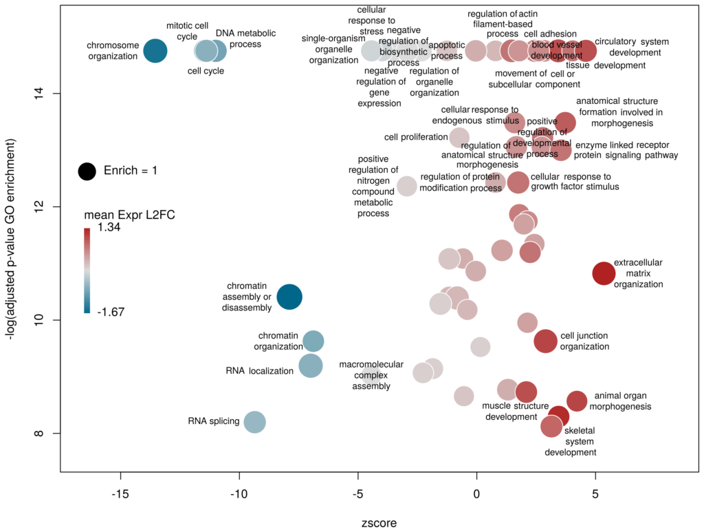
What we want to obtain at the end is the following plot:
The function plotGODESeq() takes two mandatory inputs: 1) a file containing Gene Ontology enrichment data, 2) a file containing differential gene expression data. Note that the function works better if the dataset is limited, in particular the number of GO terms. It is useful to analyse the effect of a perturbation, chemical or genetic, or to compare two cell types that are not too dissimilar. Comparing samples that exhibit several thousands of differentially expressed genes, resulting in thousands of enriched GO terms, will not only slow the function to a halt, it is also useless (GO enrichment should not be used in these conditions anyway. The results always show things like “neuronal transmission” enriched in neurons versus “immune process” enriched in leucocytes). A large variety of other arguments can be used to customise the plot, but none are mandatory.
To use the function, you need to source the script from where it is; In this example, it is located in the session directory. (I know I should make a package of the function. On my ToDo list)
source('plotGODESeq.R')
Input
The Gene Ontology enrichment data must be a data frame containing at least the columns: ID – the identifier of the GO term, description– the description of the term, Enrich – the ratio of observed over expected enriched genes annotated with the GO term, FDR – the False Discovery Rate (a.k.a. adjusted p-value), computed e.g. with the Benjamini-Hochberg correction, and genes – the list of observed genes annotated with the GO term. Any other column can be present. It will not be taken into account. The order of columns does not matter. Here we will load results coming from and analysis run on the server WebGestalt. Feel free to use whatever Gene Ontology enrichment tool you want, as far as the format of the input fits.
# load results from WebGestalt
goenrich_data <- read.table("GO-example.csv",
                            sep="\t",fill=T,quote="\"",header=T)

# rename the columns to make them less weird
# and compatible with the GOPlot package
colnames(goenrich_data)[
colnames(goenrich_data) %in% c("geneset","R","OverlapGene_UserID")
] <- c("ID","Enrich","genes")

# remove commas from GO term descriptions, because they suck
goenrich_data$description <- gsub(',',"",goenrich_data$description)
The differential expression data must be a data frame in which rownames are the gene symbols, from the same namespace as the genes column of the GO enrichment data above. In addition, one column must be namedlog2FoldChange, containing the quantitative difference of expression between two conditions. Any other column can be present. It will not be taken into account. The order of columns does not matter.
# Load results from DESeq2
deseq_data <- read.table("DESeq-example.csv",
                         sep=",",fill=T,header=T,row.names=1)
Now we can create the plot.
plotGODESeq(goenrich_data,deseq_data)
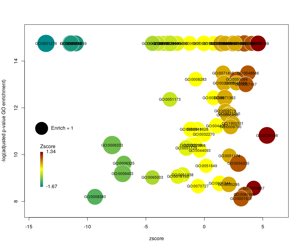
The y-axis is the negative log of the FDR (adjusted p-value). The x-axis is the zscore, that is for a given GO term:
The genes associated with each GO term are taken from the GO enrichment input, while the up or down nature of each gene is taken from the differential expression input file. The area of each bubble is proportional to the enrichment (number of observed genes divided by number of expected genes). This is the proper way of doing it, rather than using the radius, although of course, the visual impact is less important.
Choosing what to plot
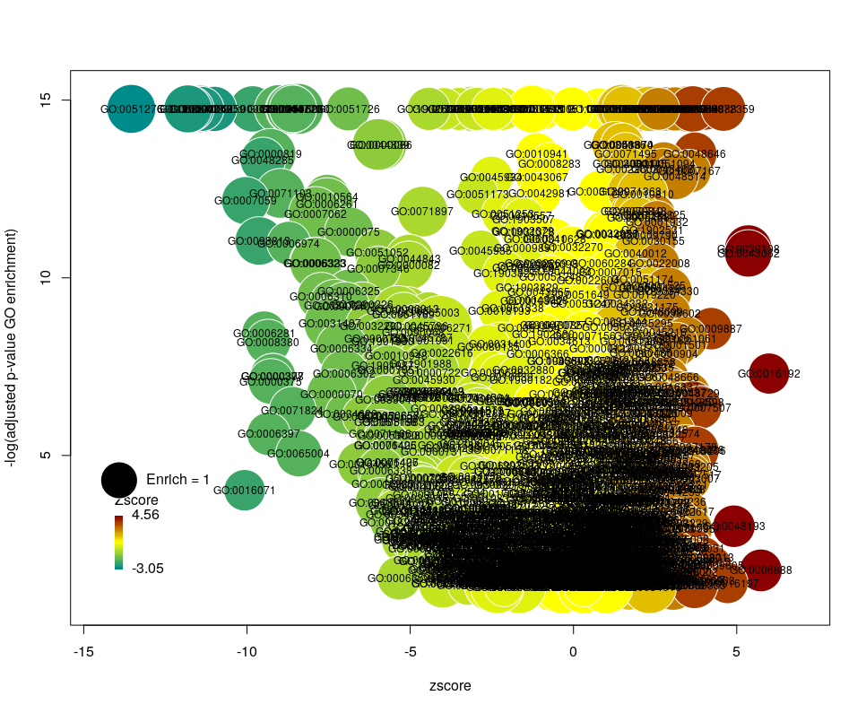
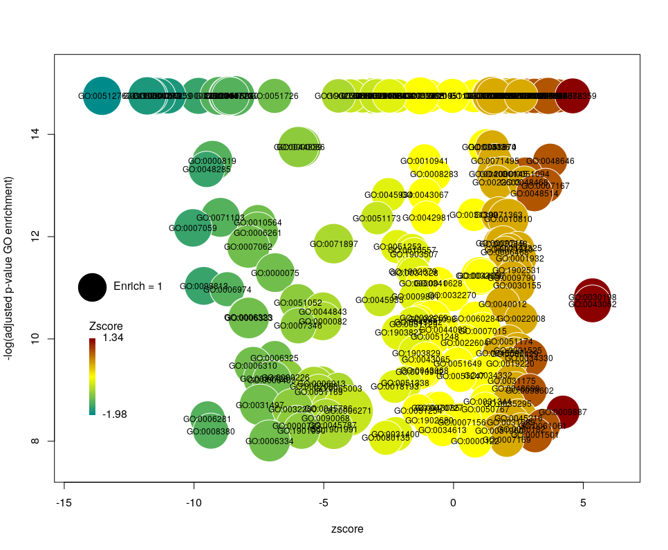
The console output tells us that we plotted 1431 bubbles. That is not very pretty or informative … The first thing we can note is that we have a big mess at the bottom of the plot, which corresponds to the highest values of FDR. Let’s restrict ourselves to the most significant results, by setting the argument maxFDR to 10-8.
This is better. We now plot only 181 GO terms. Note the large number of terms aligned at the top of the plot. Those are terms with an FDR of 0. The Y axis being logarithmic, we plot them by setting their FDR to a tenth of the smallest non-0 value. GO over-representation results are often very redundant. We can use GOplot’s function reduce_overlap by setting the argument collapse to the proportion of genes that needs to be identical so that GO terms are merged in one bubble. Let’s use collapse=0.9 (GO terms are merged if 90% of the annotated genes are identical).
Now we only plot 62 bubbles, i.e. two-third of the terms are now “hidden”. Use this procedure with caution. Note how the plot now looks distorted towards one condition. More “green” terms have been hidden than “red” terms.
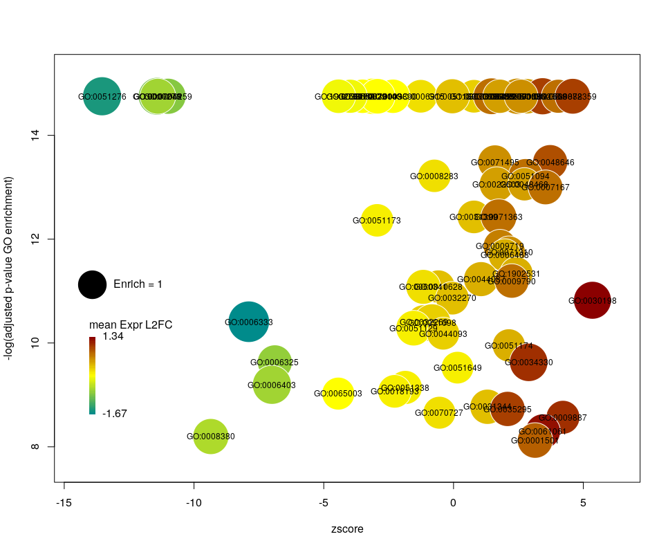
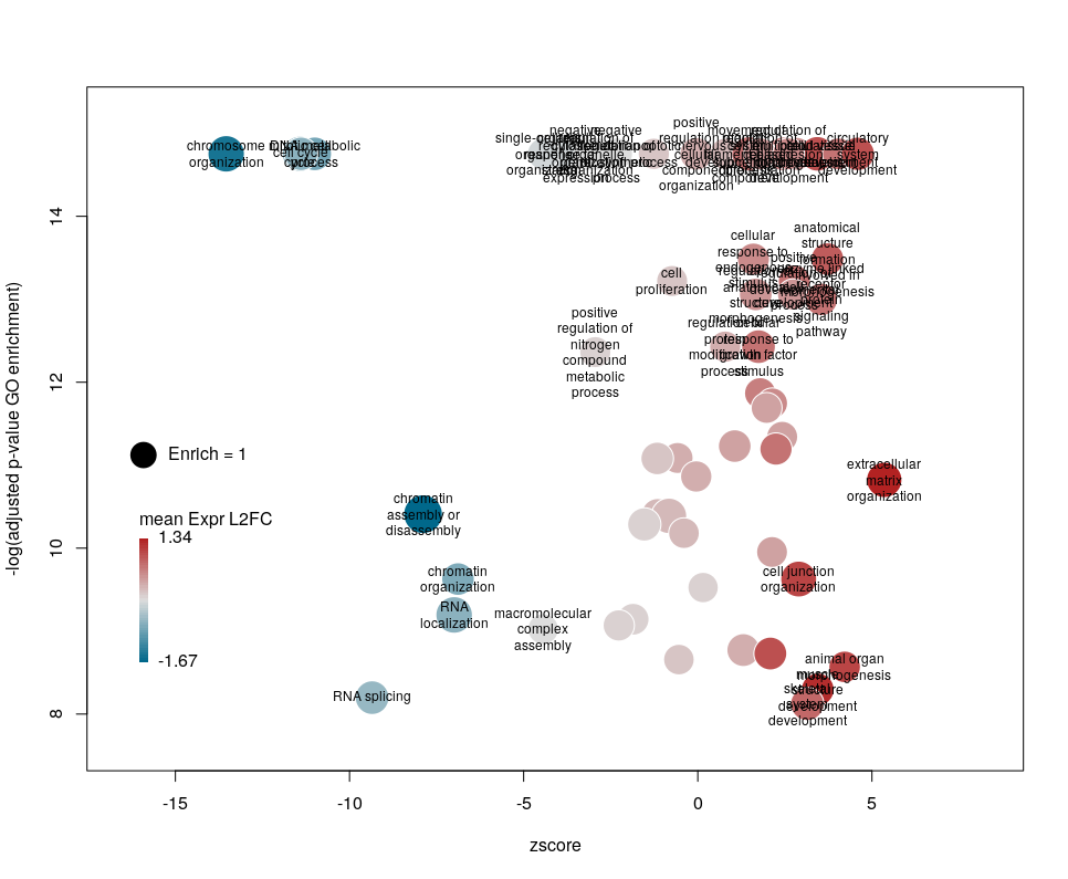
The colour used by default for the bubbles is the zscore. It is kind of redundant with the x-axis. Also, the zscore only considers the number of genes up or down-regulated. It does not take into account the amplitude of the change. By setting the argument color to l2fc, we can use the average fold change of all the genes annotated with the GO term instead.
Now we can see that while the proportion of genes annotated by GO:0006333 that are down-regulated is lower than for GO:0008380, the amplitude of their average down-regulation is larger.
WARNING: The current code does not work if the color scheme chosen for the bubbles is based on a variable, l2fc or zscore, that do not contain negative and positive values. Sometimes, the “collapsing” can cause this situation, if there is an initial unbalance between zscores and/or l2fc. It is a bug, I know. On the ToDo list …
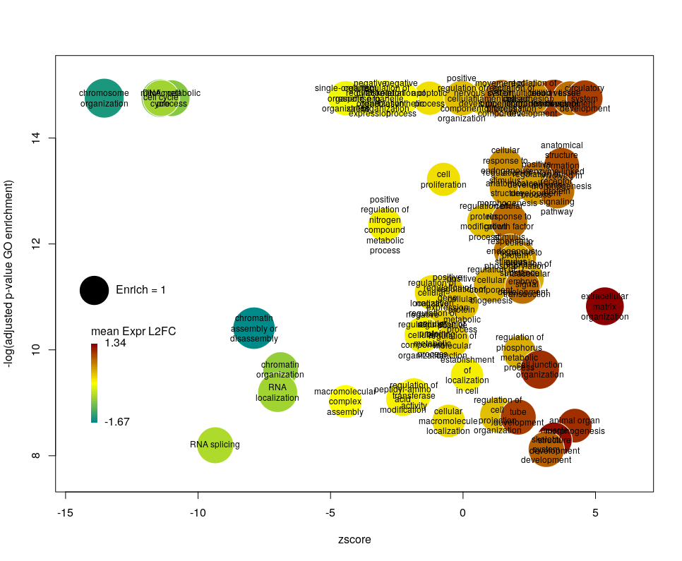
Using GO identifiers is handy and terse, but since I do not know GO by heart, it makes the plot hard to interpret. We can use the full description of each term instead, by setting the argument label to description.
Customising the bubbles
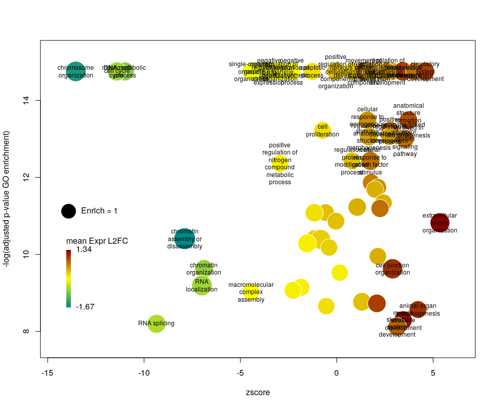
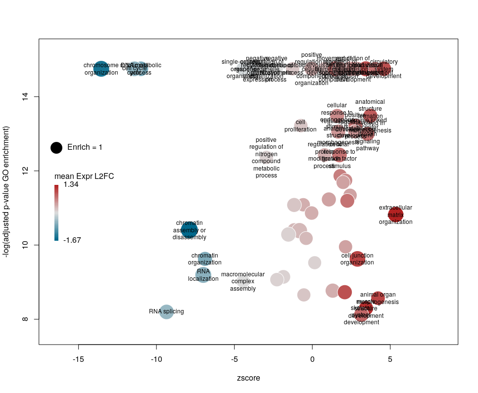
The width of the labels can be modified by setting the argument wrap to the maximum number of characters (the default used here is 15). Depending on the breadth of values for FDR and zscore, the buble size can be an issue, either by overlapping too much or on the contrary by being tiny. We can change that by the argument scale which scales the radius of the bubbles. Let’s fix it to 0.7, to decrease the size of each bubble by a third (the radius, not the area!).
There is often a big crowd of terms at the bottom and centre of the plot. This is not so clear here, with the harsh FDR threshold, but look at the first plot of the post. These terms are generally the least interesting, since they have a lower significance (higher FDR) and mild zscore. We can decide to label the bubbles only under a certain FDR with the argument maxFDRLab and/or above a certain absolute zscore with the argument minZscoreLab. Let’s fix them to 1e-12 and 2 respectively.
Finally, you are perhaps not too fond of the default color scheme. This can be changed with the arguments lowCol, midCol, highCol. Let’s set them to “deepskyblue4”, “#DDDDDD” and “firebrick”,
Customising the plotting area
The first modifications my collaborators asked me to introduce were to centre the plot on a zscore of 0 and to add space around so they could annotate the plot. One can centre the plot by declaring centered = TRUE (the default is FALSE). Since our example is extremely skewed towards negative zscores, this would not be a good idea. However, adding some space on both sides will come in handy in the last step of beautification. We can do that by declaring extrawidth=3 (default is 1).
The legend position can be optimised with the arguments leghoffset and legvoffset. Setting them to {-0.5,1.5}
Depuis le développement des premiers vaccins contre le SARS-CoV-2, j’ai collectionné les données sur leur efficacité. Cette efficacité est continuellement remise en cause par l’apparition de virus variants, c’est-à-dire de nouvelles souches porteuses d’un groupe caractéristique de mutations. Avec autant de vaccins et autant de variants, il devient difficile de rester à jour. Ce problème est aggravé par l’abondance de publications présentant des types d’évaluations différents. Ainsi, bien qu’il soit très important de garder trace de toutes les valeurs et de leurs intervalles de confiance, j’ai pensé qu’il serait bon d’avoir une vue d’ensemble simplifiée de la situation actuelle.
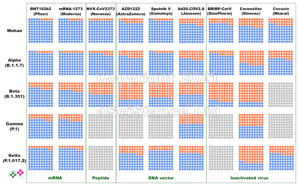
La figure ci-dessous représente l’efficacité globale des principaux vaccins contre les principaux variants sous forme de pourcentages visuels. Les points bleus représentent les personnes protégées qui auraient été infectées sans vaccination. Les points gris représentent les paires {vaccin, variant} pour lesquelles on ne dispose pas de suffisamment de données. Ces nombres représentent la protection contre l’infection, et non la protection contre la maladie ou le décès (pour lesquels la protection est probablement plus élevée). De plus, ils sont obtenus après le protocole de dosage recommandé pour chaque vaccin. NB: Dans certains cas, « Wuhan » signifie « aucun des variants ci-dessous ».
Ces données sont les estimations les meilleures et les plus fiables au moment où j’écris ce billet (mise à jour le 12 novembre 2021). J’ai privilégié les données de vie réelle aux essais cliniques, l’efficacité directement mesurée à l’efficacité déduite des tests de neutralisation (où le sérum de personnes vaccinées est utilisé in vitro sur des virus ou des protéines recombinantes), et les données indépendantes aux données fournies par les fabricants de vaccins. J’ai omis certains vaccins autorisés en raison de la rareté des données (et de leur faible utilisation). Certaines des données utilisées pour faire la figure sont connues pour leur « particularité » et ont fait l’objet de critiques. Cependant, il n’existe rien de mieux. Espérons que ces graphiques deviendront plus précis à mesure que d’autres études seront publiées.
Since the development of the first vaccines against SARS-CoV-2, I have gathered data about their efficacy. Unfortunately, this efficacy is continuously challenged by the appearance of variant viruses, i.e., novel strains carrying a bunch of mutations. With so many vaccines and so many variants, it becomes difficult to keep track of the data. This is compounded by the abundance of publications presenting different types of evaluations. So, while keeping track of all the values and their confidence intervals is very important, I thought it would be nice to have a single overview of where we stand.
The figure below represents the overall efficacy of the main vaccines for the main variants as visual percentages. The blue dots represent protected people who would have been infected without the vaccines. Grey dots represent pair {vaccine, variant} for which not enough data is available. This figure represents the protection from infection, not the protection from disease or death (which are likely higher). The figures are those achieved after the recommended dosing protocol for each vaccine. NB: in some plots, “Wuhan” means “none of the variants listed below”.
These numbers are the best and most reliable estimates as I write this post (updated 02 October 2021). I privileged real world data over clinical trials, directly measured efficacy over efficacy inferred from neutralisation assays (where the serum of vaccinated individuals is used in vitro with viruses or recombinant proteins), and independent data over data provided by vaccine manufacturers. I omitted some authorised vaccines because of data scarcity (and low usage). Some of the data used to plot the graph are known to present peculiarities and raised issues. However, nothing better is available. Hopefully, these plots will become more accurate as more studies are published.
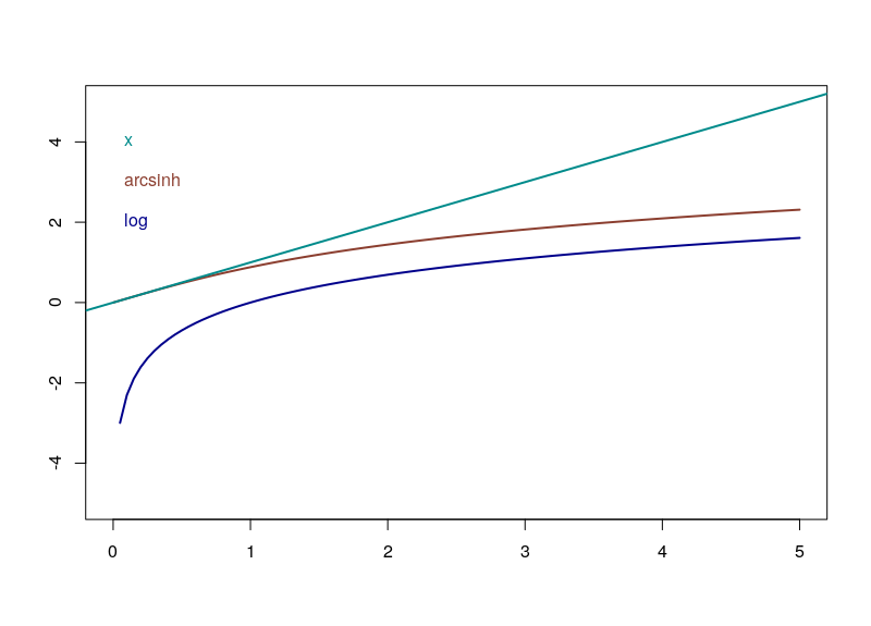
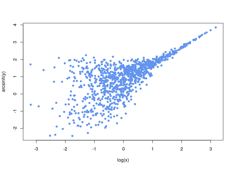
Do you need to normalize data quickly but are bothered by null or negative values? You can use the Inverse hyperbolic sine, Arsinh, function instead of a simple log function. This approach also allows for treating differently small and high values. Arsinh is defined as:
Firstly, since x+sqrt(x²+1) is always strictly positive, arsinh is defined for all real values, contrary to log, which is only defined for strictly positive numbers. Furthermore, as can easily be seen, for small values of x, the function tends to ln(x+1), something often used to overcome the 0 measurements. For large values of x, arsinh(x) progresses as log(x).
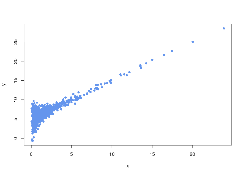
Let’s say we have a dataset that is quite noisy, with unevenly spread sampling, and that includes an unwanted baseline. Here is a made-up dataset:
To create it, we generated 1000 lognormal-distributed sampling values x. The variable value is equal to the sampling value, plus a random noise in which the standard deviation varies as the ratio of sqrt(x)/x (biological noise), plus a noisy constant technical baseline (5 plus a normal noise with SD=0.01).
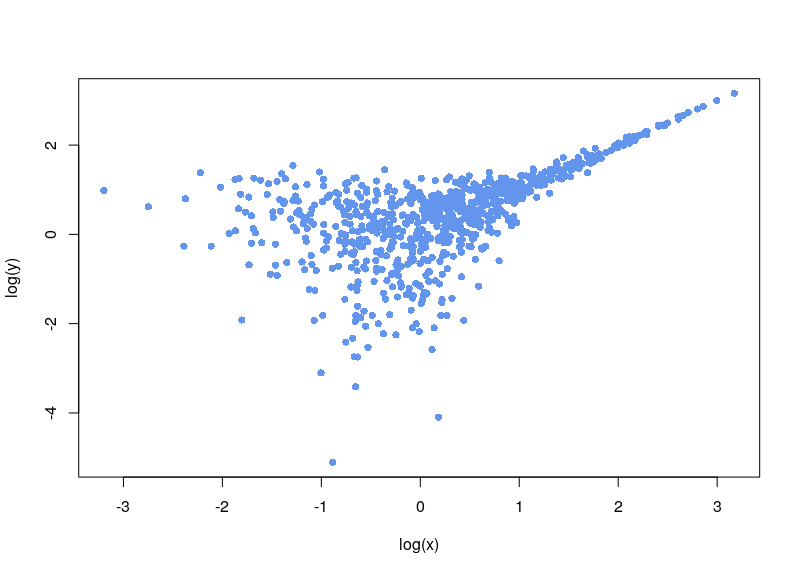
We are clever, and notice the background noise, so we subtract it:
Now, the first issue is that plenty of values are negative. In some cases, your normalization will fail. Sometimes, the normalization will proceed, ditching values (as R says, “Warning message: NaNs produced”). As can be seen below, there is a large area sparsely populated on the left for low values of x.
If, on the contrary, we use arsinh, we rescue all those values.
In the absence of information regarding the structure of variability (whether intrinsic noise, technical error or biological variation), one very often assumes, consciously or not, a normal distribution, i.e. a “bell curve”. This is probably due to an intuitive application of the central limit theorem which stipulates that when independent random variables are added, their normalized sum tends toward such a normal distribution, even if the original variables themselves are not normally distributed. The reasoning then goes that any biological process is the sum of many sub-processes, each with its own variability structure, therefore its “noise” should be Gaussian.
Although that sounds almost common sense, alarm bells start ringing when we use such distributions with molecular measurements. Firstly, a normal distribution ranges from -∞ to +∞. And there is no such things as negative amounts. So, at most, the variability would follow a truncated normal distribution, starting at 0. Secondly, the normal distribution is symmetrical. However, in everyday conversation, the biologists will talk of a variability “reaching twofold”. For a molecular measurement, a two-fold increase and a two-fold decrease do not represent the same amount. So there is an asymmetric notion here. We are talking about linking the addition and removal of the same “quantum of variability” to a multiplication or division by a same number. Immediately logarithms come to mind. And log2 fold changes are indeed one of the most used method to quantify differences. Populations of molecular measurements can also be – sometimes reasonably – fitted with log-normal distributions. Of course, several other distributions have been used to fit better cellular contents of RNA and protein, including the gamma, Poisson and negative binomial distributions, as well as more complicated mix.
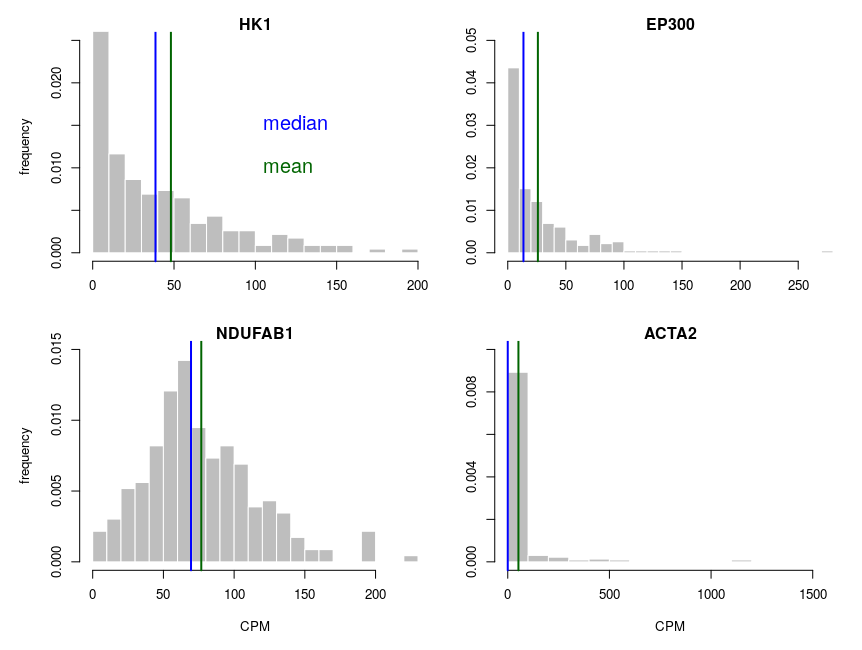
Let’s look at some single-cell gene expression measurements. Below, I plotted the distribution of read counts (read counts per million reads to be accurate) for four genes in 232 cells. The asymmetry is obvious, even for NDUFAB1 (the acyl carrier protein, central to lipid metabolism). This dataset was generated using a SmartSeq approach and Illumina HiSeq sequencing. It is therefore likely that many of the observed 0 are “dropouts”, possibly due to the reverse transcriptase stochastically missing the mRNAs. This problem is probably even amplified with methods such as Chromium, that are known to detect less genes per cell. Nevertheless, even if we remove all 0, we observe extremely similar distributions.
One of the important consequences of the normal distribution’s symmetry, is that mean and median of the distribution are identical. In a population, we should have the same amounts of samples presenting less and presenting more substance than the mean. In other words, a “typical” sample, representative of the population, should display the mean amount of the substance measured. It is easy to see that this is not the case at all for our single cell gene expressions. The numbers of cells expressing more than the mean of the population are 99 for ACP (not hugely far from the 116 of the median), 86 for hexokinase, 78 for histone acetyl transferase P300 and 30 for actin 2. In fact, in the latter case, the median is 0, mRNAs having been detected in only 50 of the 232 cells ! So, if we take a cell randomly in the population, most of the time it presents a count of 0 CPM of actin 2. The mean expression of 52.5 CPM is certainly not representative!
If we want to model the cell type, and provide initial concentrations for some messenger RNAs, we must use the median of the measurements, not the mean (of course, the best route of action would be to build an ensemble model, cf below). The situation would be different if we wanted to model the tissue, that is a sum of non individualised cells representative of the population.
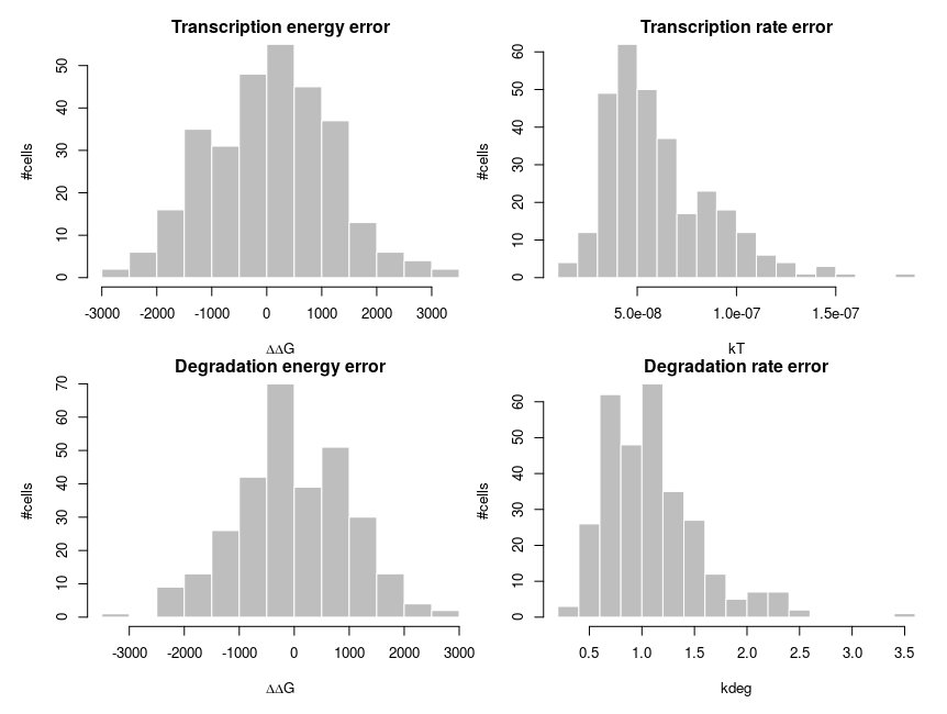
To explain how such asymmetric distributions can arise from noise following normal distributions, we can build a small model of gene expression. mRNA is transcribed at a constant flux, with a rate constant kT. It is then degraded following a unimolecular decay with rate kdeg (chosen to be 1 on average, for convenience). Both rate constants are computed from energies, following the Arrhenius equation, k = Ae-(E/RT), where R is the gas constant, 8.314 and T is the temperature, that we set at 310 K (37 deg C). To simplify we’ll just set the scaling factor A to 1, assuming it is included in the reference energy. E is 0 for degradation, and we modulate the reference transcription energy to control the level of transcript. Both transcription and degradation energy will be affected by normally distributed noises that represent differences between cells (e.g. concentration and state of enzymes). So Ei = E + noise. Because of Arrhenius equation, the normal distributions of energy are transformed into lognormal distributions of rates. Below I plot the distributions of the noises in the cells and the resulting rates.
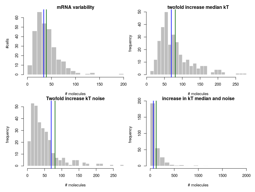
The equilibrium concentration of the mRNA is then kdeg/kT (we could run stochastic simulations to add temporal fluctuations, but that would not change the message). The number of molecules is obtained by multiplying by volume (1e-15 l) and Avogadro number. Each panel presents 300 cells. The distribution on the top-left looks kind of intermediate between those of hexokinase and ACP above. To get the values on the top-right panel, we simulate an overall increase of the transcription rate by twofold, using a decrease of the energy by 8.314*310*ln(2). In this specific case, the observed ratios between the two medians and between the two means are both about 2.04, close to the “truth”. So we could correctly infer a twofold increase by looking at the means. In the bottom panels, we increase the variability of the systems by doubling the standard deviation of the energy noises. Now the ratio of the median is 1.8, inferring a 80% increase while the ratio of the means is 2.53, inferring an increase of 153%!
In summary:
Means of single cell molecular measurements are not a good way of getting a value representing the population;
Comparing the means of single measurements in two populations does not provide an accurate estimation of the underlying changes;
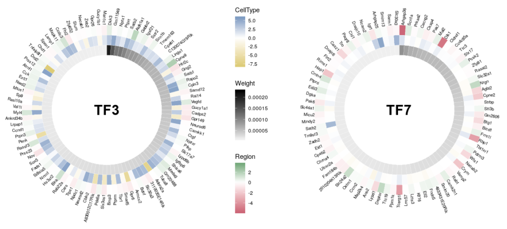
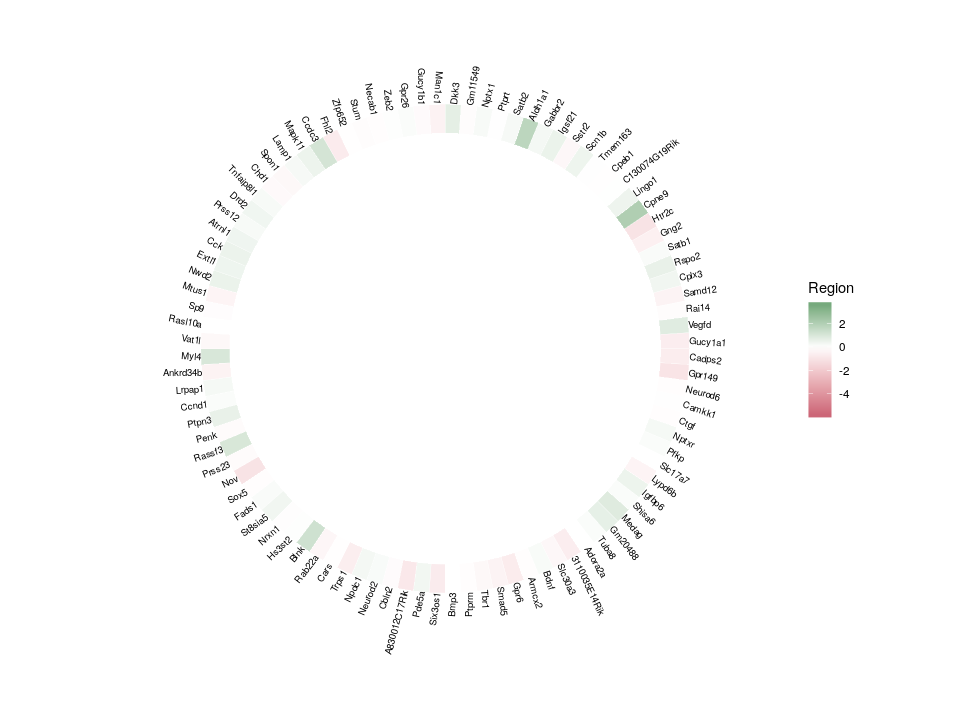
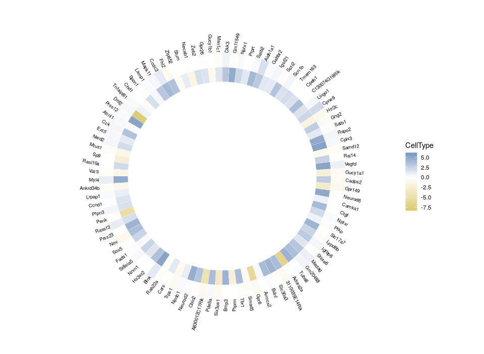
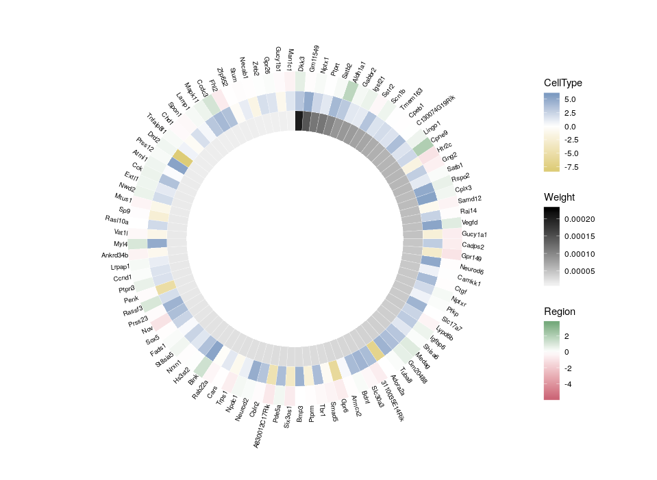
A frequent outcome of network inference based on gene expression data is the discovery of “hubs”, that possibly represent master regulators of our system of interest. Analyzing and comparing those hubs is often at the core of new biological insights. A problem of visualizing network “hubs” is the sheer number of neighbours, that make identification of interesting nodes difficult, and might mask the overall message. The overlay of several features on a nodes, using for instance several colouring or size contributes to the general confusion. Here, we propose to go back from the hub to the wheel, representing each neighbour as a tile in a 360 degree heatmap. In addition, we will used several concentric heatmaps to enable a quick integration of different features. Insight will then come from the comparison of several such wheels.
Of course, tools already exist to represent complex datasets in exquisite circular representations, such as Circos or the R package circlize. But here we will only use ggplot2 and a bit of magic.
Here is the final figure, showing two transcription factors with their targets, characterised by their expression in cell types, brain regions and the strength of interaction with the hub TFs:
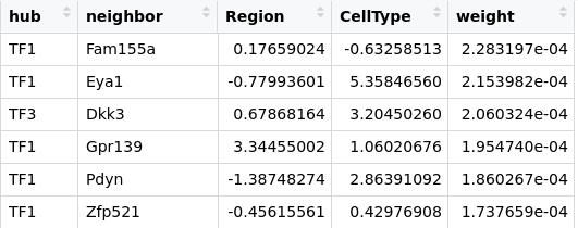
First, we need some data. Using a transcriptomics dataset, we inferred a gene regulatory network (this part of the work is beyond this blog post). The dataset was composed of two cells types coming from two different regions of the brain. For each gene, we computed the log fold difference between regions and between cell types. Our initial edges data table looks like:
TFx are the hub transcription factors that we identified as of interest. neighbor list the top interactors for each hub, weight is a dimensionless factor that represents the significativity of the edge. The higher the more probabl an actual inference exists. The table is ordered by decreasing edge weights.
We will need a few packages.
library(reshape)
library(ggplot2)
library(ggnewscale)   ## The magic
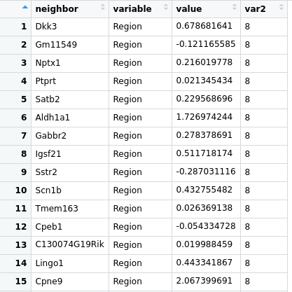
Then we will generate a wheel for a given transcriptions factor (we can, of course, generate a whole bunch of wheels in one go). We extract the information for all its neighbors, and we recast the table using the melt function of the package reshape. We then add an index (var2 below) that will decide where each data will be positioned on the concentric rings..
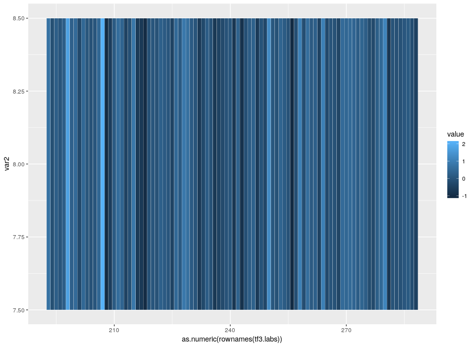
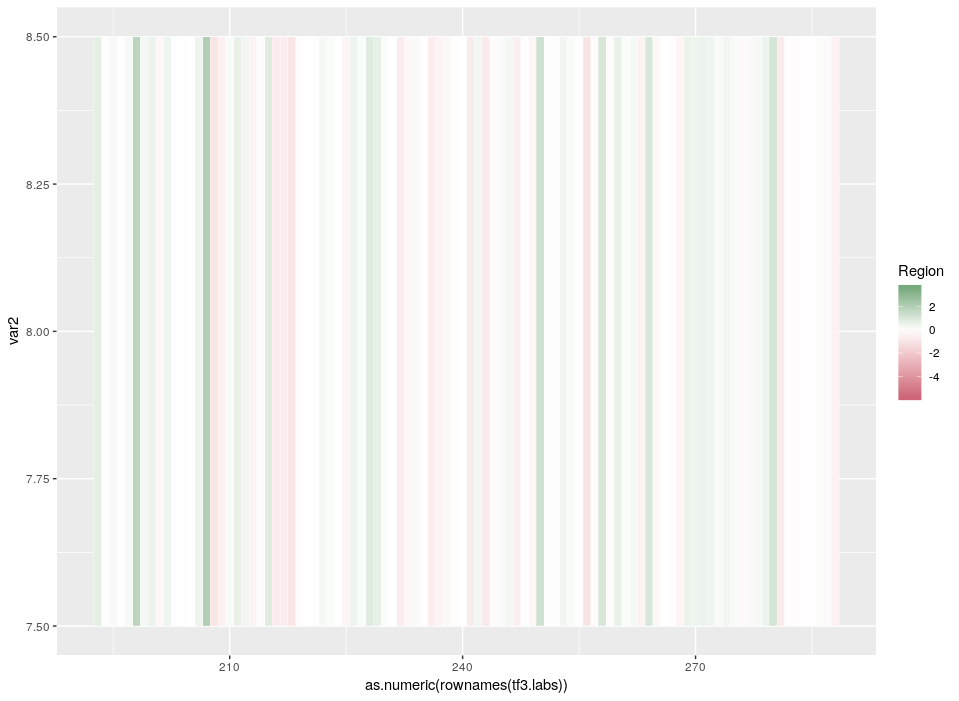
The index starts at 6 so that we have an empty space in the centre corresponding to 5 rings. Now, let’s see the beauty of ggplot2 layered approach in action. We will start with what will be our external ring, the relative expression in different regions.
The default colours are not so nice. Since we want to emphasize the extreme differences of expression, a divergent palette is better suited. Moreover, as we mention above, we want to compare this hub with others. Therefore, the colours must be scaled according to the values across the whole dataset (the initial table edges).
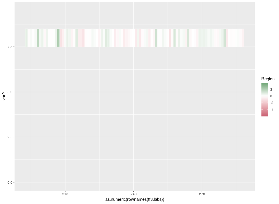
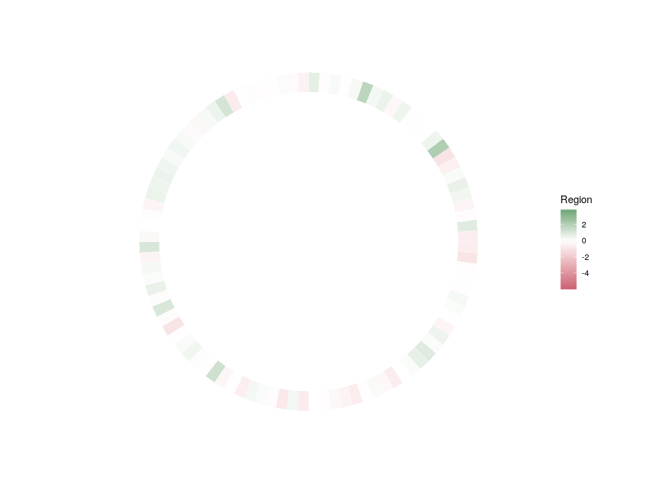
Now, let’s get rid of the useless graphical features that only serve to dilute the main message.
ptf3 <- ptf3 +
theme(panel.background = element_blank(), # bg of the panel
panel.grid.major = element_blank(), # get rid of major grid
panel.grid.minor = element_blank(), # get rid of minor grid
axis.title=element_blank(),
panel.grid=element_blank(),
axis.text.x=element_blank(),
axis.ticks=element_blank(),
axis.text.y=element_text(size=0))
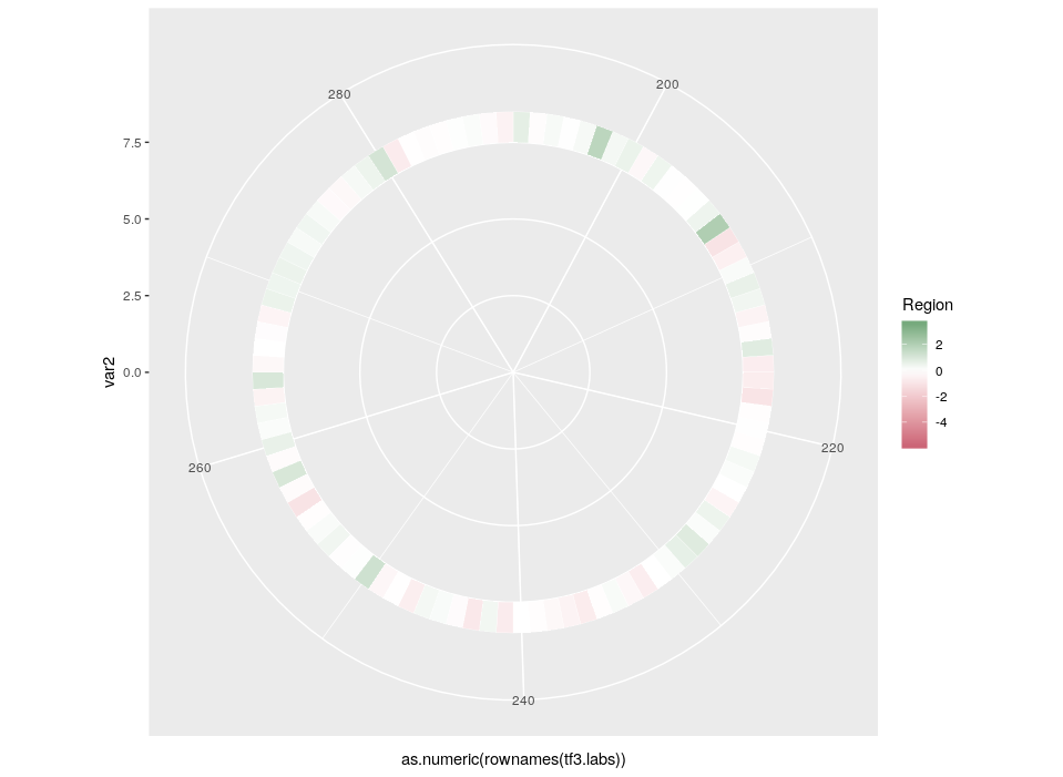
plot(ptf3)
Finally, we can plot the gene names. In order to optimize the readability and use of space, we will plot the names in a radial fashion, but try to make them upright as much as possible. To do so, we need first to compute an angle that depends on the position in the ring. And then, we will compute the required “horizontal” justification, which, when use in conjunction with polar coordinates, produces something quite non-intuitive.
All good. Now that we have plotted the relative expression in different regions, let’s plot the relative expression in different cell types. The first intuitive idea would be to just add a new heatmap inside the previous one. However, since we are talking about a different feature, we want a different colour scale.
Arrgh! First we get an error “Scale for ‘fill’ is already present. Adding another scale for ‘fill’, which will replace the existing scale.” And indeed, the CellType colour scale replaced the Region one for the outer ring. This is because we can only use a single colour scale within a given ggplot2 plot. But not all is lost, thanks to the package ggnewscale which allows us to redefine the colour scale.
NB: Packages like ComplexHeatmap allow to use different colorRamps for different heatmaps. However, they do not allow the use of polar coordinates.
So, here is what we are going to do. We will redefine the scale twice, in order to plot three features on three different concentric heatmaps.
Now we can compare the differential expression of our hub’s neighbours between cell types and between regions. We can do that for several hubs, and compare them, which brings us to our complete figure below. We can see that while the expression of TF3’s neighbours tend to differ strongly between cell types (vivid blues and yellows), they do not differ much between regions (pale greens and magentas). We observe the opposite pattern for TF7, suggesting that TF3 could be regulating spatial-independent cell identity and TF7 could be regulating spatial-dependent cell features.
We are grateful to the following sources that benefited much to this blog post: