By Nicolas Gambardella
I recently came across the package GOplot by Wencke Walter http://wencke.github.io/. In particular, I liked the function GOBubble. However, I found it difficult to customise the plot. In particular, I wanted to colour the bubbles differently, and to control the plotting area. So I took the idea and extended it. Many aspects of the plot can be configured. It is a work in progress. Not all features of GOBubble are implemented at the moment. For instance, we cannot separate the different branches of Gene Ontology, or add a table listing labelled terms. I also have a few ideas to make the plot more versatile. If you have suggestions, please tell me. The code and the example below can be found at:
Main script: plotGODESeq.R
Demo script: usePlotGODESeq.R
DESeq data used by the script: DESeq-example.csv
GO data used by the script: GO-example.csv
Help: README.html
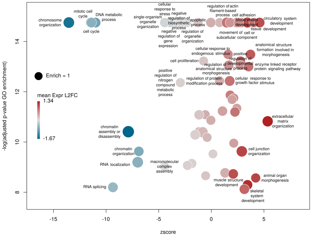
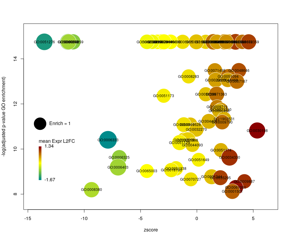
What we want to obtain at the end is the following plot:
The function plotGODESeq() takes two mandatory inputs: 1) a file containing Gene Ontology enrichment data, 2) a file containing differential gene expression data. Note that the function works better if the dataset is limited, in particular the number of GO terms. It is useful to analyse the effect of a perturbation, chemical or genetic, or to compare two cell types that are not too dissimilar. Comparing samples that exhibit several thousands of differentially expressed genes, resulting in thousands of enriched GO terms, will not only slow the function to a halt, it is also useless (GO enrichment should not be used in these conditions anyway. The results always show things like “neuronal transmission” enriched in neurons versus “immune process” enriched in leucocytes). A large variety of other arguments can be used to customise the plot, but none are mandatory.
To use the function, you need to source the script from where it is; In this example, it is located in the session directory. (I know I should make a package of the function. On my ToDo list)
source('plotGODESeq.R')Input
The Gene Ontology enrichment data must be a data frame containing at least the columns: ID – the identifier of the GO term, description– the description of the term, Enrich – the ratio of observed over expected enriched genes annotated with the GO term, FDR – the False Discovery Rate (a.k.a. adjusted p-value), computed e.g. with the Benjamini-Hochberg correction, and genes – the list of observed genes annotated with the GO term. Any other column can be present. It will not be taken into account. The order of columns does not matter. Here we will load results coming from and analysis run on the server WebGestalt. Feel free to use whatever Gene Ontology enrichment tool you want, as far as the format of the input fits.
# load results from WebGestalt
goenrich_data <- read.table("GO-example.csv",
                            sep="\t",fill=T,quote="\"",header=T)

# rename the columns to make them less weird
# and compatible with the GOPlot package
colnames(goenrich_data)[
colnames(goenrich_data) %in% c("geneset","R","OverlapGene_UserID")
] <- c("ID","Enrich","genes")

# remove commas from GO term descriptions, because they suck
goenrich_data$description <- gsub(',',"",goenrich_data$description)
The differential expression data must be a data frame in which rownames are the gene symbols, from the same namespace as the genes column of the GO enrichment data above. In addition, one column must be namedlog2FoldChange, containing the quantitative difference of expression between two conditions. Any other column can be present. It will not be taken into account. The order of columns does not matter.
# Load results from DESeq2
deseq_data <- read.table("DESeq-example.csv",
                         sep=",",fill=T,header=T,row.names=1)
Now we can create the plot.
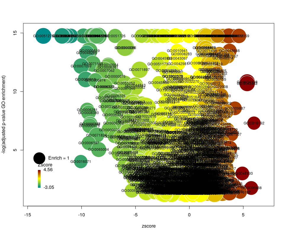
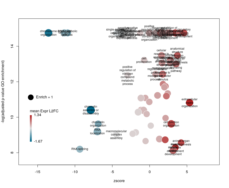
plotGODESeq(goenrich_data,deseq_data)The y-axis is the negative log of the FDR (adjusted p-value). The x-axis is the zscore, that is for a given GO term:
(nb(genes up) – nb(genes down))/sqrt(nb(genes up) + nb(genes down))
The genes associated with each GO term are taken from the GO enrichment input, while the up or down nature of each gene is taken from the differential expression input file. The area of each bubble is proportional to the enrichment (number of observed genes divided by number of expected genes). This is the proper way of doing it, rather than using the radius, although of course, the visual impact is less important.
Choosing what to plot
The console output tells us that we plotted 1431 bubbles. That is not very pretty or informative … The first thing we can note is that we have a big mess at the bottom of the plot, which corresponds to the highest values of FDR. Let’s restrict ourselves to the most significant results, by setting the argument maxFDR to 10-8.
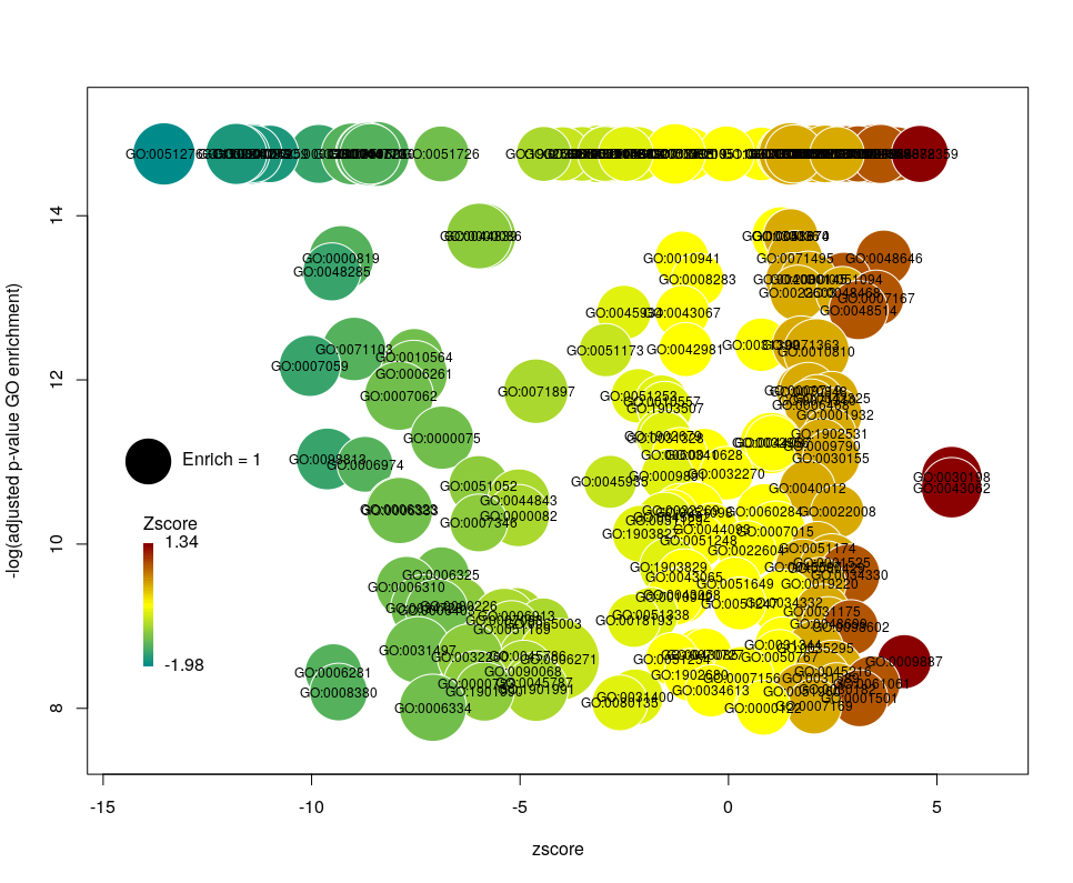
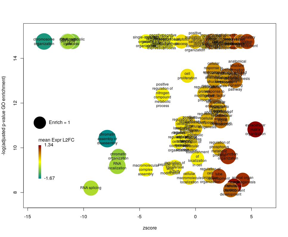
This is better. We now plot only 181 GO terms. Note the large number of terms aligned at the top of the plot. Those are terms with an FDR of 0. The Y axis being logarithmic, we plot them by setting their FDR to a tenth of the smallest non-0 value. GO over-representation results are often very redundant. We can use GOplot’s function reduce_overlap by setting the argument collapse to the proportion of genes that needs to be identical so that GO terms are merged in one bubble. Let’s use collapse=0.9 (GO terms are merged if 90% of the annotated genes are identical).
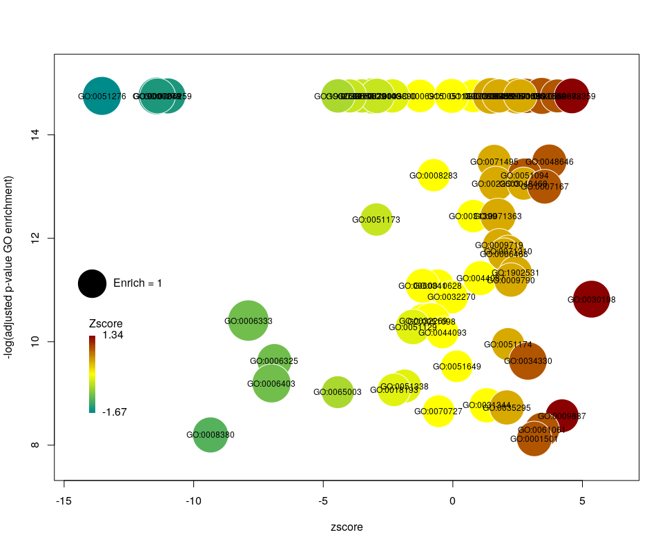
Now we only plot 62 bubbles, i.e. two-third of the terms are now “hidden”. Use this procedure with caution. Note how the plot now looks distorted towards one condition. More “green” terms have been hidden than “red” terms.
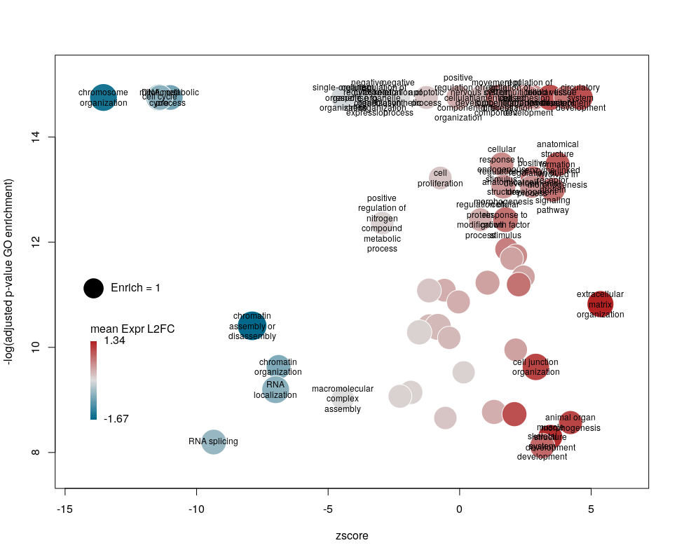
The colour used by default for the bubbles is the zscore. It is kind of redundant with the x-axis. Also, the zscore only considers the number of genes up or down-regulated. It does not take into account the amplitude of the change. By setting the argument color to l2fc, we can use the average fold change of all the genes annotated with the GO term instead.
Now we can see that while the proportion of genes annotated by GO:0006333 that are down-regulated is lower than for GO:0008380, the amplitude of their average down-regulation is larger.
WARNING: The current code does not work if the color scheme chosen for the bubbles is based on a variable, l2fc or zscore, that do not contain negative and positive values. Sometimes, the “collapsing” can cause this situation, if there is an initial unbalance between zscores and/or l2fc. It is a bug, I know. On the ToDo list …
Using GO identifiers is handy and terse, but since I do not know GO by heart, it makes the plot hard to interpret. We can use the full description of each term instead, by setting the argument label to description.
Customising the bubbles
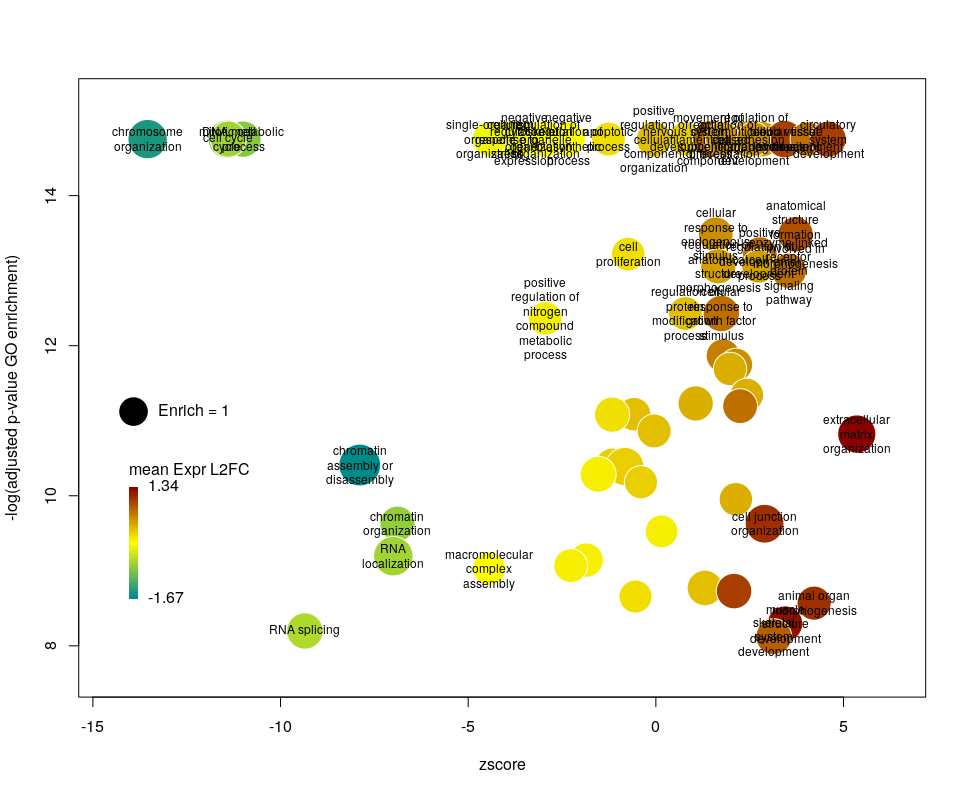
The width of the labels can be modified by setting the argument wrap to the maximum number of characters (the default used here is 15). Depending on the breadth of values for FDR and zscore, the buble size can be an issue, either by overlapping too much or on the contrary by being tiny. We can change that by the argument scale which scales the radius of the bubbles. Let’s fix it to 0.7, to decrease the size of each bubble by a third (the radius, not the area!).

There is often a big crowd of terms at the bottom and centre of the plot. This is not so clear here, with the harsh FDR threshold, but look at the first plot of the post. These terms are generally the least interesting, since they have a lower significance (higher FDR) and mild zscore. We can decide to label the bubbles only under a certain FDR with the argument maxFDRLab and/or above a certain absolute zscore with the argument minZscoreLab. Let’s fix them to 1e-12 and 2 respectively.
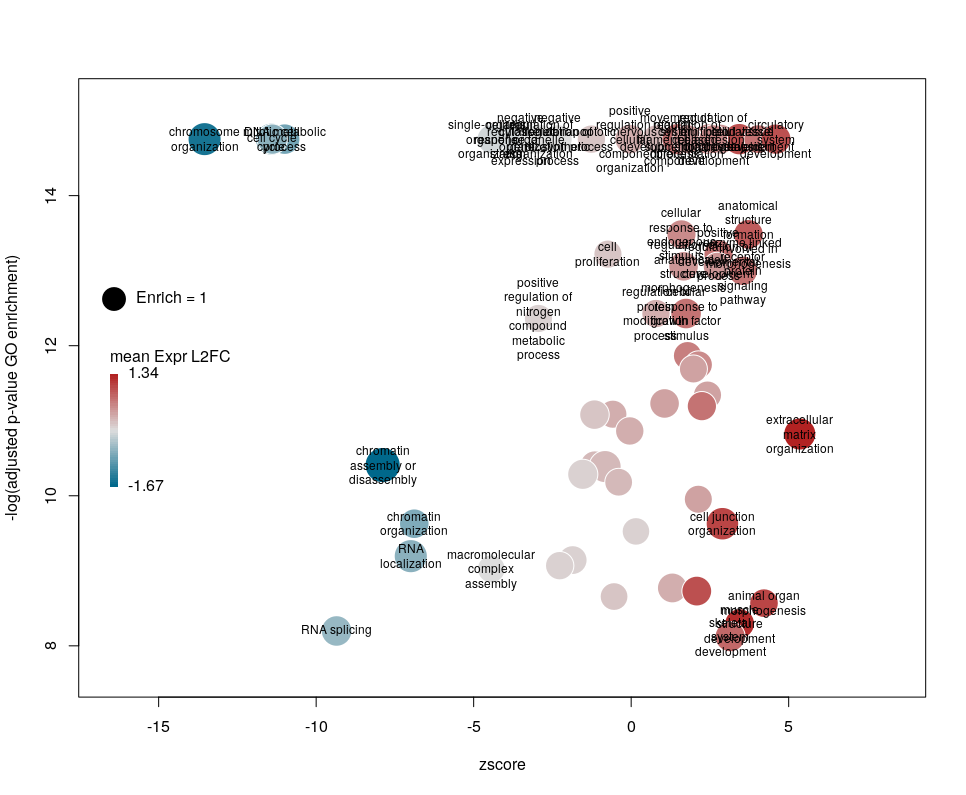
Finally, you are perhaps not too fond of the default color scheme. This can be changed with the arguments lowCol, midCol, highCol. Let’s set them to “deepskyblue4”, “#DDDDDD” and “firebrick”,
Customising the plotting area
The first modifications my collaborators asked me to introduce were to centre the plot on a zscore of 0 and to add space around so they could annotate the plot. One can centre the plot by declaring centered = TRUE (the default is FALSE). Since our example is extremely skewed towards negative zscores, this would not be a good idea. However, adding some space on both sides will come in handy in the last step of beautification. We can do that by declaring extrawidth=3 (default is 1).
The legend position can be optimised with the arguments leghoffset and legvoffset. Setting them to {-0.5,1.5}
plotGODESeq(goenrich_data,
            deseq_data,
            maxFDR = 1e-8,
            collapse = 0.9,
            color="l2fc",
            lowCol = "deepskyblue4",
            midCol = "#DDDDDD",
            highCol = "firebrick",
            extrawidth=3,
            centered=FALSE,
            leghoffset=-0.5,
            legvoffset=1.5,
            label = "description",
            scale = 0.7,
            maxFDRLab = 1e-12,
            minZscoreLab = 2.5,
            wrap = 15)
Now we can export an SVG version and play with the labels in Inkscape. This part is unfortunately the most demanding …
