COVID-19 pandemics put mathematical models of biological relevance all over daily newspapers and TV news, raising their profile for the non-scientists. In the life sciences, while mathematical models have always been at the core of some disciplines, such as genetics, they really became mainstream with the rebirth of systems biology a couple of decades ago. However, there are many different modelling approaches, and even specialists often ignore methods they do not use regularly or have not been taught.
After a historical overview, this blog post will then attempt to classify the main types of models used in systems biology according to their principal modalities.
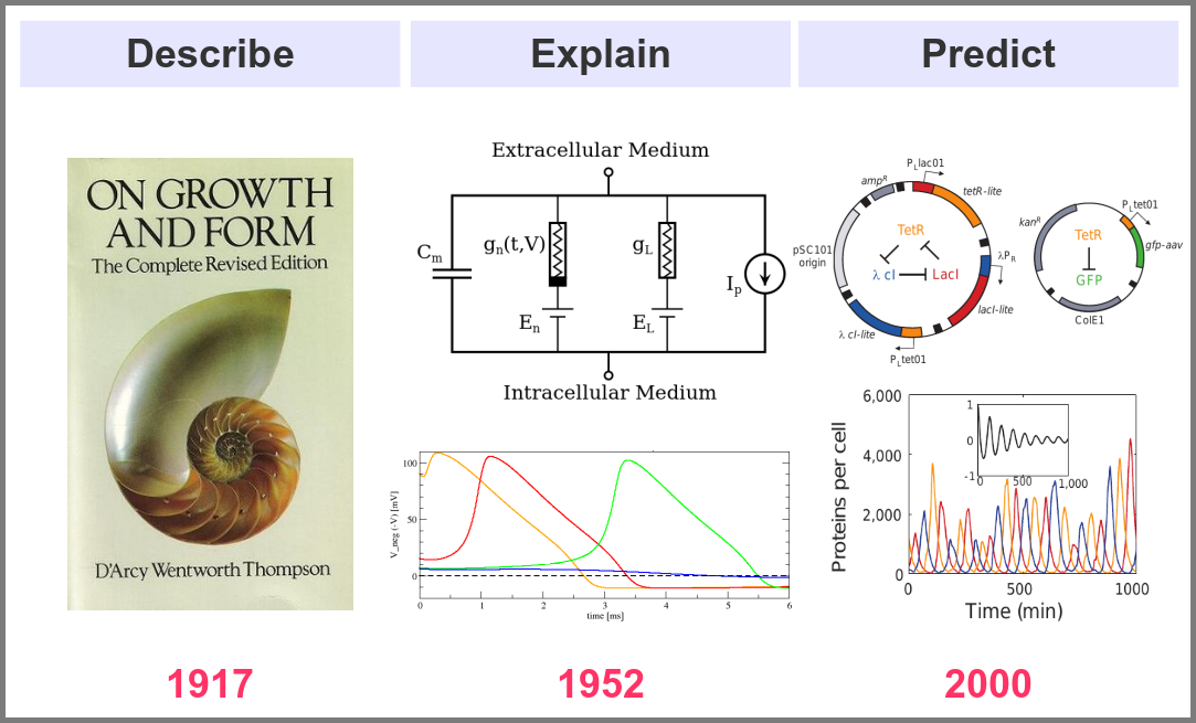
What is the goal of using mathematical models in the life sciences in the first place? Three main aims came out roughly sequentially during the XX century, following the path physics followed over the past two millennia. First, mathematics helps describe the structure and dynamics of living forms and their productions. These models may rely on supposed underlying laws, be purely descriptives, such as the allometric laws. A great example is the famous book “On Growth and Form” by D’Arcy Thompson, attempting to understand living forms based on physical laws.
The second aim is to explain the shape and function of living forms. How do the properties of life’s building blocks explain what we can observe? In their masterwork, Alan Hodgkin and Andrew Huxley predicted the existence of ionic channels within the cell membrane and, using a mathematical model, explained how neurons generate action potentials (a work for which they got the Nobel prize).
Finally, can we predict how a system will behave, and can we invent new systems that will behave the way we want them to? This is the purpose of synthetic biology, exemplified in the figure below by the pioneering work of Michael Elowitz and Stanislas Leibler, who built the “repressilator”, a synthetic construct exhibiting sustained oscillations maintained through generations of bacteria.
Obviously, there are no strict boundaries between the three aims, and most models seek to describe, explain, and predict the structures and behaviours of living systems.
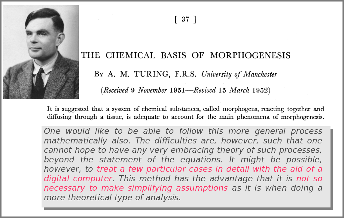
A major shift in the use of mathematical models was the introduction of numerical simulations, made feasible by the invention of computers. The benefits have been laid out by one of the inventors of such computers in an article that indeed contained complex mathematical models but no simulations. In his famous 1952 paper introducing morphogens, Alan Turing suggested that using a digital computer to simulate specific cases of a biological system would allow avoiding the oversimplifications required by analytic solutions.
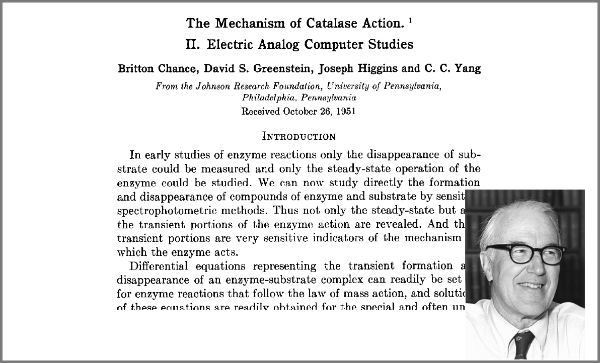
This wish was granted the very same year first by Britton Chance, who built a computer (an analogue one at the time) specifically to solve a differential equation model of a small biochemical pathway.
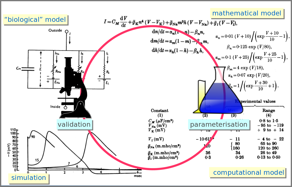
1952 was also when Hodgkin and Huxley published the action potential model mentioned above, a real Annus Mirabilis for computational modelling in the life sciences.
Before going further, we should ask ourselves, “what is a mathematical model”? According to Wikipedia (as of 4th July 2022), Amathematical model is a description of a system using mathematical concepts and language. I consider that three essential categories of components form mathematical models in systems biology.
Variables represent what we want to know or what we want to compare with the observations. They can characterise a physical entity, e.g., the concentration of a substance, the length of an object or the duration of an event, or be derived from the model itself, for instance, the maximum velocity of an enzymatic reaction.
Relationships mathematically link variables together and represent what we know or what we want to test. They can be static, an affinity constant linked to concentrations or dynamic, such as a rate of change depending on concentrations. Relationships are not necessarily equations. For instance, a sampling might link a variable to a statistical distribution, and logic models use logical statements to attribute values to variables.
Finally, a much-underestimated category is formed by constraints put on the model. Those represent the context of the modelling project or what we consciously decide to ignore. Some constraints are properties of the world, e.g., a concentration must always be positive, the total energy is conserved, and some are properties of the model, such as boundary conditions and objective functions for optimisation procedures. Initial conditions – the values of variables before starting a numerical simulation – are also crucial since a given model might behave differently with different initial conditions, even if neither variables nor relationships are changed.
However, the mathematical model itself is only one brick of a systems biology’s modelling and simulation project as in any natural science domain. Since these models aim to be mechanistic, i.e., anchored in underlying molecular, cellular, tissular, and physiological processes, the first step is to conceptualise a “biological model”. For instance, a biochemical pathway will be a collection of chemical reactions. In the case of Hodgkin and Huxley, who did not know the underlying molecules, the mechanism was based on an electrical analogy, ionic channels being represented by electrical conductances. The “mathematical model” is made up of mathematical relationships linking the variables and constraints. A “computational model”, using the “mathematical model” in conjunction with observed or estimated values, is then simulated. The result is compared with observations, and the loop is iterated.
Now let’s explore the different facets of models used in systems biology, and marvel at their diversity
The variables of a model can represent biological reality at different granularities. In some logical models (often wrongly called Boolean networks), a variable can represent a state, such as presence or absence, 1, 2, 3. Detailed models at the “mesoscopic scale” might represent individual molecules, where a separate variable represents every single particle. Variables can also represent discrete populations of molecules, for instance, the number of molecules of a given chemical class, whose evolution is simulated by stochastic algorithms. In chemical kinetics, the variables whose change is determined using ordinary differential equations often represent continuous concentrations. Finally, some models gloss over the physical parts altogether and use fields to represent what could happen to them.
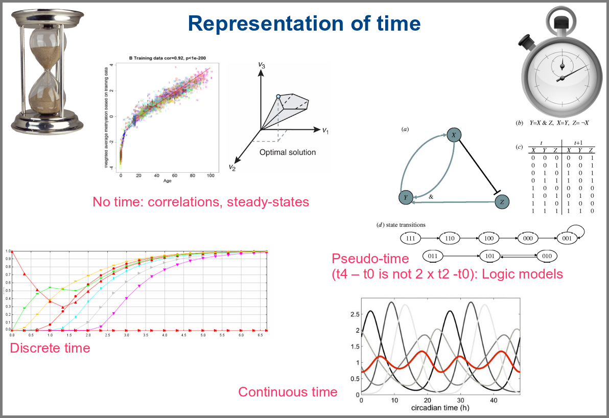
Numerical simulations most often represent the evolution of variable values over “time”. However, the granularity of this “time” may vary. At an extreme, we have models with no representation of time, such as regression models, or implicit representation of time, such as steady-states models. In logical models, as in Petri Net, simulations usually progress along a pseudo-time, where one cannot compare numbers of steps. Time can be discrete, numerical simulations computing a system’s state at fixed intervals, for instance, one second. Finally, models can consider time as continuous, simulations being iterated at various timepoints decided by numerical solvers (note that software might still return results at fixed intervals).
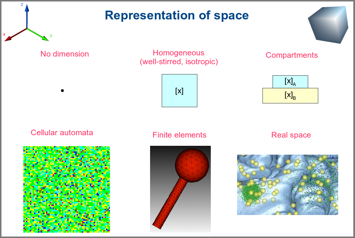
Spacetime being a thing, we also have as many different representations of space. Starting with no space at all, for instance, in noncompartmental analyses of pharmacokinetic models. Space can also be represented by a single homogenous (well-stirred) and isotropic compartment or several of them connected by variables and relationships (multi-compartment models, a.k.a. bathtub models). Cellular automata constitute a particular case, where each compartment is also a model variable whose status depends on its neighbours’. An extension of the multi-compartment modelling represents realistic biological structures using finite elements, each considered homogeneous and isotropic. Finally, space might be represented by continuous variables, where the trajectory of each molecule can be simulated.
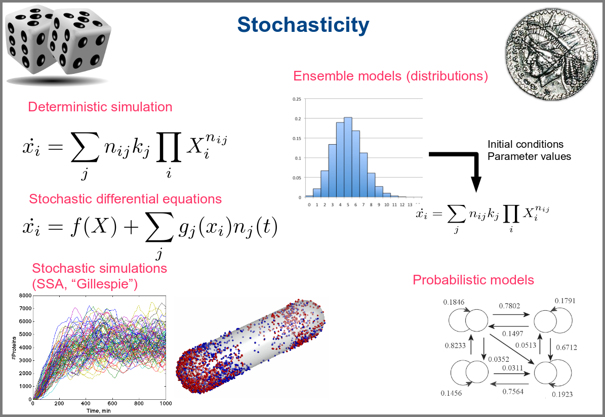
Variability and noise are unavoidable parts of any observation of the natural world, including living systems. Variability can be extrinsic (e.g., due to technical variability), or intrinsic (e.g., actual differences between cells or samples). True noise depends on the size of the system. Taking all those into account in the models can thus be important, and different approaches present different levels and types of stochasticity. As with the other modalities above, stochasticity might be entirely absent, models and simulations being deterministic. One can add different and arbitrary types of noise to simulations with stochastic differential equations. The stochastic aspect might instead emerge directly from the structure of the model, as with the Stochastic Simulation Algorithms (a.k.a. algorithms of the “Gillespie” type). Variability can also be taken into account prior to the simulations, for instance, by sampling initial conditions from distributions, as with ensemble modelling. Finally, in probabilistic models such as Markov models, the entire iteration of the system is based on the probabilities of switching states.
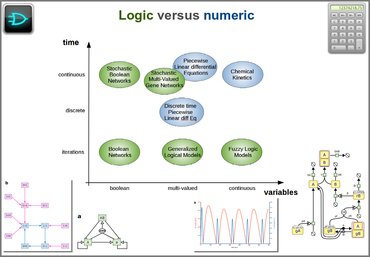
Finally, there are two large families of models based on the type of algorithms used to update the variables. One can compute a variable’s new value by calculating its value either using numerical combinations of previous variables’ values or logic rules taking into account other variable states. Contrary to widespread belief, not all logic models use pseudo-time and Boolean variables. Stochastic Boolean networks can use continuous time, and fuzzy logic models can base their decision on continuous variable values.
Those modalities can be combined in many ways to produce an extremely rich toolkit of modelling approaches. One of the most frequent sources of pain when modelling biological systems is to start with a methodological a priori, often because we are comfortable with an approach, we have the necessary software, or we don’t know better. Doing so can result in under-determined models, endless iterations and failure to get any result. The choice of a modelling approach should be first and foremost based on: 1) the question asked, and 2) the data available to build and validate the model.
References
Chance, B., Greenstein, D. S., Higgins, J. & Yang, C. C. (1952) The mechanism of catalase action. II. Electric analog computer studies. Arch. Biochem. Biophys.37: 322–339. doi:10.1016/0003-9861(52)90195-1
Hodgkin, A.L., Huxley, A.F. (1952). A quantitative description of membrane current and its application to conduction and excitation in nerve. The Journal of Physiology. 117 (4): 500–44. doi:10.1113/jphysiol.1952.sp004764
Stanislas Leibler; Elowitz, Michael B. (2000-01-20). “A synthetic oscillatory network of transcriptional regulators”. Nature403 (6767): 335–338. doi:10.1038/35002125.
Thompson, D. W., 1917. On Growth and Form. Cambridge University Press.
Turing, A. M. (1952). “The chemical basis of morphogenesis”. Philosophical Transactions of the Royal Society of London B. 237 (641): 37–72. doi:10.1098/rstb.1952.0012.
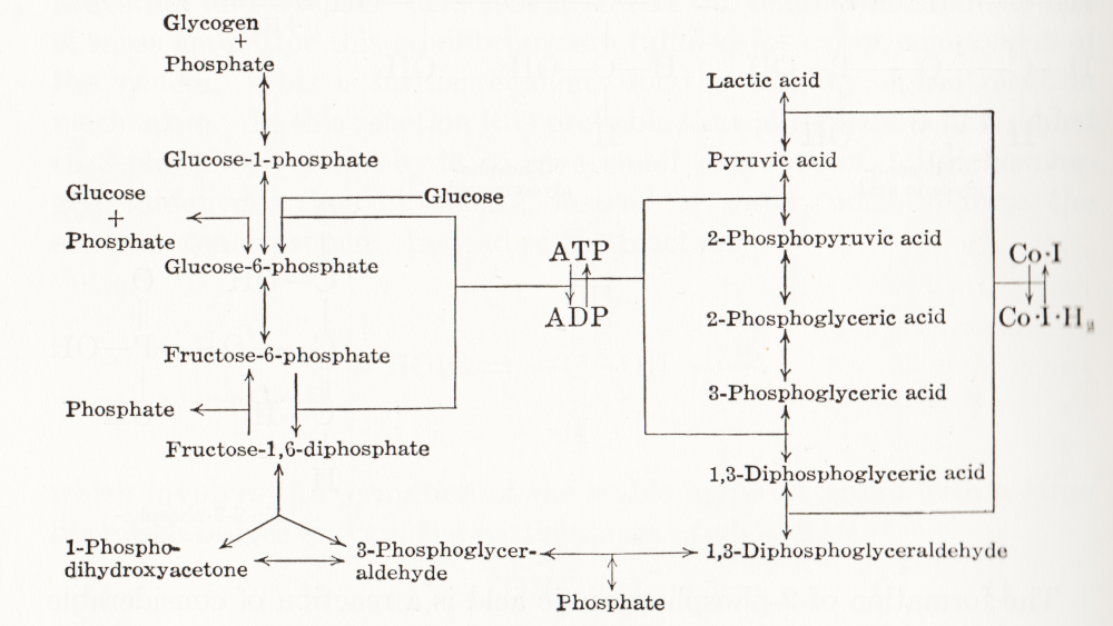
Visual representation of biochemical pathways has been a critical tool for understanding the cellular and molecular systems for a long time. Any knowledge integration project involves a jigsaw puzzle step, where different pieces must be put together. When Feynman cheekily wrote on his blackboard just before his death, “What I cannot create I do not understand”, he meant that he only fully understood a system once he derived a (mathematical) model for it; and interestingly, Feynman is also famous for one of the earliest standard graphical representations of reaction networks, namely the Feynman diagrams to represent models of subatomic particle interactions. The earliest metabolic “map” I possess comes from the 3rd edition of “Outlines of Biochemistry” by Gortner published in 1949. I would be happy to hear if you have older ones.
(I let you find out all the inconsistencies, confusing bits, and error-generating features in this map. This might be food for another text, but I believe this to be a great example to support the creation of standards, best practices, and software tools!)
Until recently, those diagrams were drawn mainly by hand, initially on paper, then using drawing software. There was little thought spent on consistency, visual semantics, or interoperability. This state of affairs changed in the 1990s as part of Systems Biology’s revival. The other thing that changed in the 1990s was the widespread use of computers and software tools to build and analyse models. The child of both trends was the development of standard computer-readable formats to represent biological networks.
When drawing a knowledge representation map, one can divide the decision-making process, and therefore the things we need to encode in order to share the map, into three parts:
What – How can people identify what I represent? A biochemical map is a network built up from nodes linked by arcs. The network may contain only one type of node, for instance, a protein-protein interaction network or an influence network, or be a bipartite graph, like a reaction network – one type of node representing the pools involved in the reactions, the other representing the reactions themselves. One decision is the shape to use for each node so that it carries visual information about the nature of what it represents. Another concerns the arcs linking the nodes, which can also contain visual clues, such as directionality, sign, type of influence, and more. All this must be encoded in some way, either semantically (a code identifying the type of glyphs from an agreed-up list of codes) or graphical (embedding an image or describing the node).
Where – After choosing the glyphs, one needs to place them. The relative position of the information should not always carry much information, but there are some cases where it must, e.g. members of complexes, inclusion in compartments, etc. Furthermore, there is no denying that the relative position of glyphs is also used to convey more subjective information. For instance, a linear chain of reactions induces the idea of a flow, much better than a set of reactions going randomly up and down, right and left. Another unwritten convention is to represent membrane signal transduction on the top of the maps, with the “end-result” – often effect on gene expression – at the bottom, with the idea of a cascading flux of information. The coordinates of the glyphs must then be shared as well.
How – Finally, the impact of a visual representation also depends on aesthetic factors. The relative size of glyphs and labels, the thickness of arcs, the colours, shades and textures, all influence the facility with which viewers absorb the information contained in a map. Relying on such aspects to interpret the meaning of a map should be avoided, particularly if the map is to be shared between different media, where rendering could affect the final aspect. Nevertheless, wanting to keep this aspect as close as possible makes sense.
A bit of history
Different formats have been developed over the years to cover these different aspects with different accuracy and constraints. In order to understand why we have such a variety of description formats on offer, a bit of history might be helpful. Being able to encode the graphical representation of models in SBML was mentioned as early as 2000 (Andrew Finney. Possible Extensions to the Systems Biology Markup Language. 27 November 2000).
In 2002, the group of Hiroaki Kitano presented a graphical editor for the Systems Biology Markup Language (SBML, Hucka et al 2003, Keating et al 2020), called SBedit, and proposed extensions to SBML necessary for encoding maps (Tanimura et al. Proposal for SBEdit’s extension of SBML-Level-1. 8 July 2002). This software later became CellDesigner (Funahashi et al 2003), a full-featured modelling developing environment using SBML as its native format. All graphical information is encoded in CellDesigner-specific annotations using the SBML extension system. In addition to the layout (the where), CellDesigner proposed a set of standardised glyphs to use for representing different types of molecular entities and different relationships (the what) (Kitano et al 2003). At the same time, Herbert Sauro developed an extension to SBML to encode the maps designed in the software JDesigner (Herbert Sauro. JDesigner SBMLAnnotation. 8 January 2003). Both CellDesigner and JDesigner annotations could also encode the appearance of glyphs (the how).
Once the SBML Layout annotations were finalised, the SBML and BioPAX communities came together to standardise visual representations for biochemical pathways. This led to the Systems Biology Graphical Notation, a set of three standard graphical languages with agreed-upon symbols and rules to assemble them (the what, Le Novère et al 2009). While the shape of SBGN glyphs determines their meaning, neither their placement in the map nor their graphical attributes (colour, texture, edge thickness, the how) affect the map semantics. SBGN maps are ultimately images and can be exchanged as such, either in bitmaps or vector graphics. They are also graphs and can be exchanged using graph formats like GraphML. However, sharing and editing SBGN maps would be much easier if more semantics were encoded than graphical details. This feeling led to the development of SBGN-ML (van Iersel et al 2012), which encodes not only the SBGN part of SBGN maps but also the layout and size of graph elements.
So we have at least three solutions to encode biochemical maps using XML standards from the COMBINE community (Hucka et al 2015):
1) SBGN-ML,
2) SBML with Layout extension (controlled Layout annotations in Level 2 and Layout package in Level 3), and
3) SBML with proprietary extensions.
Regarding the latter, we will only consider the CellDesigner variant for two reasons. Firstly, CellDesigner is the most used graphical model designer in systems biology (at the time of writing, the articles describing the software have been cited over 1000 times). Secondly, CellDesigner’s SBML extensions are used in other software tools. These three solutions are not equivalent; they present different advantages and disadvantages, and round-tripping is generally impossible.
SBGN-ML
Curiously, despite its name, SBGN-ML does not explicitly describe the SBGN part of the maps (the what). Since the shape of nodes is a standard, it is only necessary to mention their type, and any supporting software will know which symbol to use. For instance, SBGN-ML will not specify that a protein X must be represented with a round-corner rectangle. It will only say that there is a macromolecule X at a particular position with given width and height. Any SBGN-supporting software must know that a round-corner rectangle represents a macromolecule. The consequence is that SBGN-ML cannot be used to encode maps using non-SBGN symbols. However, software tools can decide to use different symbols attributed to a given class of SBGN objects while rendering the maps. For example, instead of using a round-corner rectangle each time a glyph’s class is macromolecule, it could use a star. The resulting image would not be an SBGN map. However, if modified and saved back in SBGN-ML, it could be recognised by another supporting software. Such behaviour is not to be encouraged if we want people to get used to SBGN symbols, but it provides a certain level of interoperability.
What SBGN-ML explicitly describes instead are the parts that SBGN itself does not regulate but are specific to the map. That includes the size of the glyphs (bounding box), the textual labels, as well as the positions of glyphs (the where). SBGN-ML currently does not encode rendering properties such as text size, colours and textures (the how). However, the language provides an element extension, analogous to the SBML annotation, that allows augmenting the language. One can use this element to extend each glyph or encode style, and the community started to do so in an agreed-upon manner.
Note that SBGN-ML only encodes the graph. While it contains a certain amount of biological semantics – linked to the identity of the glyphs – it is not a general-purpose format that would encode advanced semantics of regulatory features such as BioPAX (Demir et al. 2010), or mathematical relationships such as SBML. However, users can distribute SBML files along with SBGN-ML files, for instance, in a COMBINE Archive (Bergmann et al 2014). Unfortunately, there is currently no blessed way to map an SBML element, such as a particular species, to a given SBGN-ML glyph.
SBML Level 3 + Layout and Render packages
As we mentioned before, SBML Level 3 provides two packages helping with the visual representations of networks: Layout (the where) and Render (the how). Contrarily to SBGN-ML, which is meant to describe maps in a standard graphical notation, the SBML Level 3 packages do not restrict the way one represents biochemical networks. This provides more flexibility to the user but decreases the “stand-alone” semantics content of the representations. I.e. if non-standard symbols are used, their meaning must be defined in an external legend. It is, of course, possible to use only SBGN glyphs to encode maps. The visual rendering of such a file will be SBGN, but the automatic analysis of the underlying format will be more challenging.
The SBML Layout package permits encoding the position of objects, points, curves and bounding boxes. Curves can have complex shapes encoded as Béziers curves. The package allows distinguishing between different general types of nodes such as compartments, molecular species, reactions and text. However, there is little biological semantics encoded by the shapes, either regarding the nodes (e.g. nothing distinguishes a simple chemical from a protein) or the edges (one cannot distinguish an inhibition from a stimulation). In addition, the SBML Render package permits to define styles that can be applied to types of glyphs. This includes colours and gradients, geometric shapes, properties of text, lines, line-endings etc. Render can encode a wide variety of graphical properties, and pave the gap to generic graphical formats such as SVG.
If we are trying to visualise a model, one advantage of using SBML packages is that all the information is included in a single file, providing a straightforward mapping between the model constructs and their representation. This goes a long way to solve the issue of the biological semantics mentioned above since it can be retrieved from the SBML Core elements linked to the Layout elements. Let us note that while SBML Layout+Render do not encode the nature of the objects represented by the glyphs (the what) using specific structures, this can be retrieved via the attributes sboTerm of the corresponding SBML Core elements, using the appropriate values from the Systems Biology Ontology (Courtot et al 2011).
CellDesigner notation
CellDesigner uses SBML (currently Level 2) as its native language. However, it extended it with its own proprietary annotation, keeping the SBML perfectly valid (which is also the way software tools such as JDesigner operate). Visually, the CellDesigner notation is close to SBGN Process Descriptions, having been the strongest inspiration for the community effort. CellDesigner offers an SBGN-View mode, that produces graphs closer to pure SBGN PD.
CellDesigner’s SBML extensions increase the semantics of SBML elements such as molecular species or regulatory arcs in a way not dissimilar to SBGN-ML. In addition, it provides a description of each glyph linked to the SBML elements, covering the ground of SBML Layout and Render. The SBML extensions being specific to CellDesigner, they do not offer the flexibility of SBML Render. However, the limited spectrum of possibilities might make the support easier.
CellDesigner notation
SBML Layout+Render
SBGN-ML
Encodes the what
✓
✓
✓
Encodes the where
✓
✓
✓
Encodes the how
✓
✓
✓
Contains the mathematical model part
✓
✓
✗
Writing supported by more than 1 tool
✗
✓
✓
Reading supported by more than 1 tool
✓
✓
✓
Is a community standard
✗
✓
✓
Examples of usages and conversions
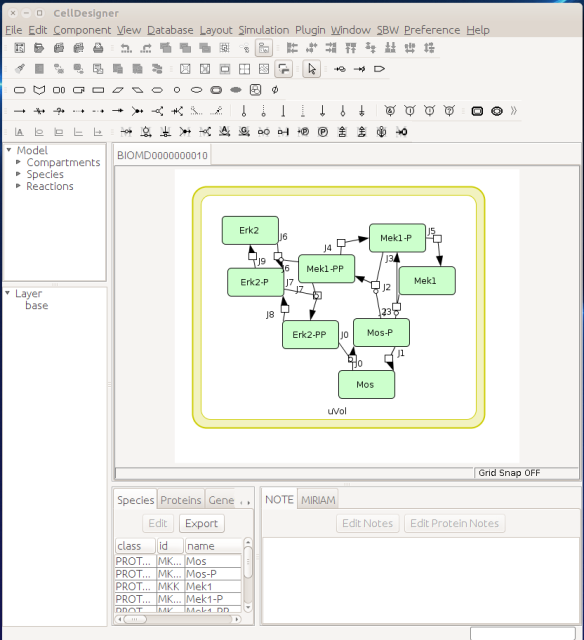
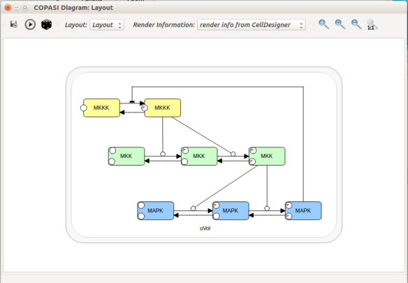
Now let us see the three formats in action. We start with SBGN-ML. First, we can load a model – for instance from BioModels (Chelliah et al 2015 ) – in CellDesigner (version 4.4 at the time of writing). Here we will use the model BIOMD0000000010, an SBML version of the MAP kinase model described in Kholodenko et al (2000).
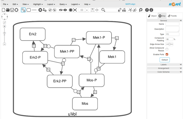
From an SBML file that does not contain any visual representation, CellDesigner created one using its auto-layout functions. One can then export an SBGN-ML file. This SBGN-ML file can be imported, for instance, in Cytoscape (Shannon et al. 2003) 2.8 using the CySBGN plugin (Gonçalves et al 2013).
The position and size of nodes are conserved, but edges have different sizes (and the catalysis glyph is wrong). The same SBGN-ML file can be open in the online SBGN editor Newt.
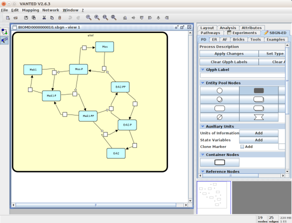
An alternative to CellDesigner to produce the SBGN-ML map could be Vanted (Junker et al 2006, version 2.6.4 at the time of writing). Using the same model from BioModels, we can auto-layout the map (we used the organic layout here) and then convert the graph to SBGN using the SBGN-ED plugin (Czauderna et al 2010).
The map can then be saved as SBGN-ML and as before, opened in Newt.
The positions of the nodes are conserved. However, the connection of edges is a bit different. In that case, Newt is slightly more SBGN compliant.
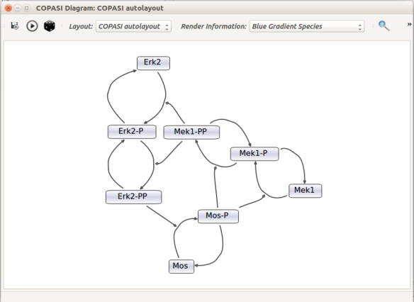
Then, let us start with a vanilla SBML file. We can import our BIOMD0000000010 model in COPASI (Hoops et al 2006, version 4.22 at the time of writing). COPASI now offers auto-layout capabilities, with the possibility of manually editing the resulting maps.
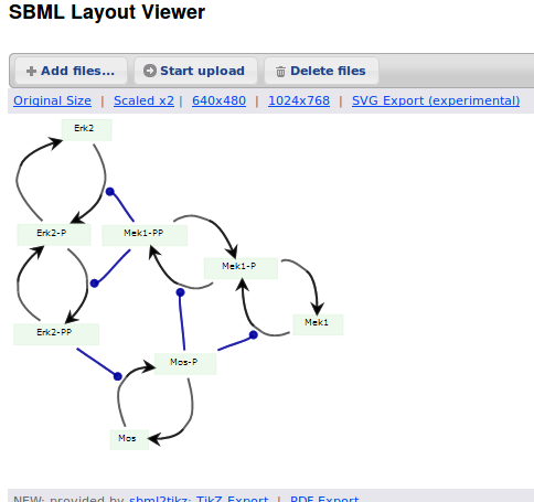
When we export the model in SBML, it will now contain the map encoded with the Layout and Render packages. When the model is uploaded in any software tool supporting the packages, we will retrieve the map. For instance, we can use the SBML Layout Viewer. Note that if the layout is conserved, it is not the case with the rendering.
Alternatively, we can load the model to CellDesigner, and manually generate a nice map (NB: a CellDesigner plugin that can read SBML Layout was implemented during Google Summer of Code 2014 . It is part of the JSBML project).
We can create an SBML Layout using the CellDesigner layout converter. Then, when we import the model in COPASI, we can visualise the map encoded in Layout. NB: here, the difference in appearance is due to a problem in the CellDesigner converter, not COPASI.
The same model can be loaded in the SBML Layout Viewer.
How do I choose between the formats?
There is, unfortunately, no unique solution at the moment. The main question one has to ask is what do we want to do with the visual maps?
Are they meant to be a visual representation of an underlying model, the model being the critical part that needs to be exchanged? If that is the case, SBML packages or CellDesigner notation should be used.
Does the project mostly/only involves graphical representations, and those must be exchanged? CellDesigner or SBGN-ML would therefore be better.
Does the rendering of graphical elements matter? In that case, SBML packages or CellDesigner notations are currently better (but that is going to change soon).
Is standardisation important for the project, in addition to immediate interoperability? If yes, SBML packages or SBGN-ML would be the way to go.
All those questions and more have to be clearly spelt out at the beginning of a project. The answer will quickly emerge from the answers.
Acknowledgements
Thanks to Frank Bergmann, Andreas Dräger, Akira Funahashi, Sarah Keating, Herbert Sauro for help and corrections.
References
Bergmann FT, Adams R, Moodie S, Cooper J, Glont M, Golebiewski M, Hucka M, Laibe C, Miller AK, Nickerson DP, Olivier BG, Rodriguez N, Sauro HM, Scharm M, Soiland-Reyes S, Waltemath D, Yvon F, Le Novère N (2015) COMBINE archive and OMEX format: one file to share all information to reproduce a modeling project. BMC Syst Biol 15, 369. doi:10.1186/s12859-014-0369-z
Chelliah V, Juty N, Ajmera I, Raza A, Dumousseau M, Glont M, Hucka M, Jalowicki G, Keating S, Knight-Schrijver V, Lloret-Villas A, Natarajan K, Pettit J-B, Rodriguez N, Schubert M, Wimalaratne S, Zhou Y, Hermjakob H, Le Novère N, Laibe C (2015) BioModels: ten year anniversary. Nucleic Acids Res 43(D1), D542-D548. doi:10.1093/nar/gku1181
Courtot M, Juty N, Knüpfer C, Waltemath D, Zhukova A, Dräger A, Dumontier M, Finney A, Golebiewski M, Hastings J, Hoops S, Keating S, Kell DB, Kerrien S, Lawson J, Lister A, Lu J, Machne R, Mendes P, Pocock M, Rodriguez N, Villeger A, Wilkinson DJ, Wimalaratne S, Laibe C, Hucka M, Le Novère N. Controlled vocabularies and semantics in Systems Biology. Mol Syst Biol 7, 543. doi:10.1038/msb.2011.77
Czauderna T, Klukas C, Schreiber F (2010) Editing, validating and translating of SBGN maps. Bioinformatics 26(18), 2340-2341. doi:10.1093/bioinformatics/btq407
Demir E, Cary MP, Paley S, Fukuda K, Lemer C, Vastrik I, Wu G, D’Eustachio P, Schaefer C, Luciano J, Schacherer F, Martinez-Flores I, Hu Z, Jimenez-Jacinto V, Joshi-Tope G, Kandasamy K, Lopez-Fuentes AC, Mi H, Pichler E, Rodchenkov I, Splendiani A, Tkachev S, Zucker J, Gopinathrao G, Rajasimha H, Ramakrishnan R, Shah I, Syed M, Anwar N, Babur O, Blinov M, Brauner E, Corwin D, Donaldson S, Gibbons F, Goldberg R, Hornbeck P, Luna A, Murray-Rust P, Neumann E, Ruebenacker O, Samwald M, van Iersel M, Wimalaratne S, Allen K, Braun B, Carrillo M, Cheung KH, Dahlquist K, Finney A, Gillespie M, Glass E, Gong L, Haw R, Honig M, Hubaut O, Kane D, Krupa S, Kutmon M, Leonard J, Marks D, Merberg D, Petri V, Pico A, Ravenscroft D, Ren L, Shah N, Sunshine M, Tang R, Whaley R, Letovksy S, Buetow KH, Rzhetsky A, Schachter V, Sobral BS, Dogrusoz U, McWeeney S, Aladjem M, Birney E, Collado-Vides J, Goto S, Hucka M, Le Novère N, Maltsev N, Pandey A, Thomas P, Wingender E, Karp PD, Sander C, Bader GD (2010) The BioPAX Community Standard for Pathway Data Sharing. Nat Biotechnol, 28, 935–942. doi:10.1038/nbt.1666
Funahashi A, Morohashi M, Kitano H, Tanimura N (2003) CellDesigner: a process diagram editor for gene-regulatory and biochemical networks. Biosilico 1 (5), 159-162
Gauges R, Rost U, Sahle S, Wegner K (2006) A model diagram layout extension for SBML. Bioinformatics 22(15), 1879-1885. doi:10.1093/bioinformatics/btl195
Gauges R, Rost U, Sahle S, Wengler K, Bergmann FT (2015) The Systems Biology Markup Language (SBML) Level 3 Package: Layout, Version 1 Core. J Integr Bioinform 12(2), 267. doi:10.2390/biecoll-jib-2015-267
Gonçalves E, van Iersel M, Saez-Rodriguez J (2013) CySBGN: A Cytoscape plug-in to integrate SBGN maps. BMC Bioinfo 14, 17. doi:10.1186/1471-2105-14-17
Hoops S, Sahle S, Gauges R, Lee C, Pahle J, Simus N, Singhal M, Xu L, Mendes P, Kummer U (2006) COPASI-a COmplex PAthway SImulator. Bioinformatics 22(24), 3067-3074. doi:10.1093/bioinformatics/btl485
Hucka M, Bolouri H, Finney A, Sauro HM, Doyle JC, Kitano H, Arkin AP, Bornstein BJ, Bray D, Cornish-Bowden A, Cuellar AA, Dronov S, Ginkel M, Gor V, Goryanin II, Hedley WJ, Hodgman TC, Hunter PJ, Juty NS, Kasberger JL, Kremling A, Kummer U, Le Novère N, Loew LM, Lucio D, Mendes P, Mjolsness ED, Nakayama Y, Nelson MR, Nielsen PF, Sakurada T, Schaff JC, Shapiro BE, Shimizu TS, Spence HD, Stelling J, Takahashi K, Tomita M, Wagner J, Wang J (2003) The Systems Biology Markup Language (SBML): A Medium for Representation and Exchange of Biochemical Network Models. Bioinformatics, 19, 524-531. doi:10.1093/bioinformatics/btg015
Hucka M, Nickerson DP, Bader G, Bergmann FT, Cooper J, Demir E, Garny A, Golebiewski M, Myers CJ, Schreiber F, Waltemath D, Le Novère N (2015) Promoting coordinated development of community-based information standards for modeling in biology: the COMBINE initiative. Frontiers Bioeng Biotechnol 3, 19. doi:10.3389/fbioe.2015.00019
Junker BH, Klukas C, Schreiber F (2006) VANTED: A system for advanced data analysis and visualization in the context of biological networks. BMC Bioinfo 7, 109. doi:10.1186/1471-2105-7-109
Sarah M Keating, Dagmar Waltemath, Matthias König, Fengkai Zhang, Andreas Dräger, Claudine Chaouiya, Frank T Bergmann, Andrew Finney, Colin S Gillespie, Tomáš Helikar, Stefan Hoops, Rahuman S Malik-Sheriff, Stuart L Moodie, Ion I Moraru, Chris J Myers, Aurélien Naldi, Brett G Olivier, Sven Sahle, James C Schaff, Lucian P Smith, Maciej J Swat,Denis Thieffry, Leandro Watanabe, Darren J Wilkinson, Michael L Blinov, Kimberly Begley, James R Faeder, Harold F Gómez, Thomas M Hamm, Yuichiro Inagaki, Wolfram Liebermeister, Allyson L Lister, Daniel Lucio, Eric Mjolsness, Carole J Proctor, Karthik Raman, Nicolas Rodriguez, Clifford A Shaffer, Bruce E Shapiro, Joerg Stelling, Neil Swainston, Naoki Tanimura, John Wagner, Martin Meier-Schellersheim, Herbert M Sauro, Bernhard Palsson, Hamid Bolouri, Hiroaki Kitano, Akira Funahashi, Henning Hermjakob, John C Doyle, Michael Hucka, and the SBML Level3Community members: Richard R Adams,Nicholas A Allen,Bastian R Angermann,Marco Antoniotti,Gary D Bader,Jan Červený,Mélanie Courtot,Chris D Cox,Piero Dalle Pezze,Emek Demir,William S Denney,Harish Dharuri,Julien Dorier,Dirk Drasdo,Ali Ebrahim,Johannes Eichner,Johan Elf,Lukas Endler,Chris T Evelo,Christoph Flamm,Ronan MT Fleming,Martina Fröhlich,Mihai Glont,Emanuel Gonçalves,Martin Golebiewski,Hovakim Grabski,Alex Gutteridge,Damon Hachmeister,Leonard A Harris,Benjamin D Heavner,Ron Henkel,William S Hlavacek,Bin Hu,Daniel R Hyduke,Hidde Jong,Nick Juty,Peter D Karp,Jonathan R Karr,Douglas B Kell,Roland Keller,Ilya Kiselev,Steffen Klamt,Edda Klipp,Christian Knüpfer,Fedor Kolpakov,Falko Krause,Martina Kutmon,Camille Laibe,Conor Lawless,Lu Li,Leslie M Loew,Rainer Machne,Yukiko Matsuoka,Pedro Mendes,Huaiyu Mi,Florian Mittag,Pedro T Monteiro,Kedar Nath Natarajan,Poul MF Nielsen,Tramy Nguyen,Alida Palmisano,Jean-Baptiste Pettit,Thomas Pfau,Robert D Phair,Tomas Radivoyevitch,Johann M Rohwer,Oliver A Ruebenacker,Julio Saez-Rodriguez,Martin Scharm,Henning Schmidt,Falk Schreiber,Michael Schubert,Roman Schulte,Stuart C Sealfon,Kieran Smallbone,Sylvain Soliman,Melanie I Stefan,Devin P Sullivan,Koichi Takahashi,Bas Teusink,David Tolnay,Ibrahim Vazirabad,Axel Kamp,Ulrike Wittig,Clemens Wrzodek,Finja Wrzodek,Ioannis Xenarios,Anna Zhukova andJeremy Zucker (2020) SBML Level 3: an extensible format for the exchange and reuse of biological models. Mol Syst Biol 16, e9110. doi:10.15252/msb.20199110
Kholodenko BN (2000) Negative feedback and ultrasensitivity can bring about oscillations in the mitogen-activated protein kinase cascades. Eur J Biochem.267(6), 1583-1588. doi:10.1046/j.1432-1327.2000.01197.x
Le Novère N, Hucka M, Mi H, Moodie S, Shreiber F, Sorokin A, Demir E, Wegner K, Aladjem M, Wimalaratne S, Bergman FT, Gauges R, Ghazal P, Kawaji H, Li L, Matsuoka Y, Villéger A, Boyd SE, Calzone L, Courtot M, Dogrusoz U, Freeman T, Funahashi A, Ghosh S, Jouraku A, Kim S, Kolpakov F, Luna A, Sahle S, Schmidt E, Watterson S, Goryanin I, Kell DB, Sander C, Sauro H, Snoep JL, Kohn K, Kitano H (2009) The Systems Biology Graphical Notation. Nat Biotechnol 27, 735-741. doi:10.1038/nbt.1558
Shannon P, Markiel A, Ozier O, Baliga NS, Wang JT, Ramge D, Amin N, Schwikowski B, Ideker T (2003) Cytoscape: a software environment for integrated models of biomolecular interaction networks. Bioinformatics 13, 2498-2504. doi:10.1101/gr.1239303
van Iersel MP, Villéger AC, Czauderna T, Boyd SE, Bergmann FT, Luna A, Demir E, Sorokin A, Dogrusoz U, Matsuoka Y, Funahashi A, Aladjem MI, Mi H, Moodie SL, Kitano H, Le Novère N, Schreiber F (2012) Software support for SBGN maps: SBGN-ML and LibSBGN. Bioinformatics 28, 2016-2021. doi:10.1093/bioinformatics/bts270
Comme nous l’a montré le déluge de communication autour des vaccins contre la covid-19, la terminologie de pharmacovigilance (le suivi de la sécurité des médicaments, à savoir leur innocuité et leur tolérabilité) peut entraîner de la confusion, voire nourrir les acteurs de la désinformation. l’Organisation mondiale de la santé (OMS) fournit des définitions claires de termes précis qui sont malheureusement souvent détournés de leur sens premier.
Les événements indésirables (adverse event en anglais) recouvrent tout ce dont souffrent les personnes dans les périodes suivant l’administration d’un traitement (qu’il soit prophylactique ou thérapeutique). Les périodes concernées peuvent varier très largement. Un des principaux outils de pharmacovigilance est le recueil des signalements de tels événements indésirable. C’est par exemple le rôle du VAERS (Vaccine Adverse Event Reporting System) des Centers for Disease Control and Prevention (CDC) et de la Food and Drug Administration (FDA) aux États-unis, de l’ANSM (Agence nationale de sécurité du médicament et des produits de santé) en France, ou encore de la MHRA (Medicines & Healthcare products Regulatory Agency) au Royaume-Uni. La survenue ou l’incidence de ces événements ne sont pas nécessairement liées au traitement. Par exemple, dans les cas des vaccins contre la covid-19, la MHRA répertoriait les chutes, les électrocutions, les morsures d’insectes et les accidents de voitures. Bien que l’incidence de ces événements puisse être affectée par certains médicaments, il est peu probable que ce soit le cas pour des vaccins.
Si l’événement peut engager le pronostic vital, on parle d’événement indésirable grave (serious adverse event en anglais). Rappelons la différence entre sévère et grave (severe et serious en anglais). La sévérité est liée à l’intensité d’un phénomène. La gravité est liée aux conséquences de ce phénomène. Un symptôme ou un signe clinique peut être sévère sans être avoir de conséquences majeurs sur la santé et vice-versa. À noter que la gravité dépend du contexte personnel et environnemental. Selon les antécédents du patient et ses circonstances, un événement peut être bénin ou grave.
Quand l’événement indésirable est prouvé être directement en rapport avec le traitement, qu’il soit entraîné par le traitement lui-même ou par les circonstances de son administration, on parle d’événement indésirable associé aux soins (treatment-emergent adverse event en anglais)
Un effet indésirable (adverse effect ou adverse reaction en anglais) est un événement indésirable directement causé par le traitement. Il est à noter que tous les événements indésirables d’un certain type ne sont pas dus au traitement et donc des effets indésirable. Par exemple, les événements thromboemboliques et les myocardites sont des événements relativement fréquents et qui sont parmi les complications principales de la covid-19. Bien que les vaccins à adénovirus et à ARNm, respectivement, aient montré un accroissement de leur incidence dans certaines populations, des analyses statistiques poussées ont été nécessaires
Un effet secondaire (side effect en anglais) est un effet directement dû au traitement, mais qui n’est pas nécessairement indésirable. Par exemple, l’inhibition de l’agrégation plaquettaire par l’aspirine est utilisée pour prévenir la formation de caillots sanguins.
As the deluge of communication around the covid-19 vaccines has shown us, the terminology of pharmacovigilance (the monitoring of drug safety, i.e. safety and tolerability) can lead to confusion and even feed the actors of misinformation. The World Health Organization (WHO) provides clear definitions of specific terms, unfortunately often misused.
Adverse events (événements indésirables in French) are anything that people suffer in the periods following the administration of a treatment (whether prophylactic or therapeutic). The periods involved can vary widely. One of the main tools of pharmacovigilance is the collection of reports of such adverse events. This is, for example, the role of the VAERS (Vaccine Adverse Event Reporting System) of the Centers for Disease Control and Prevention (CDC) and the Food and Drug Administration (FDA) in the United States, of the ANSM (Agence nationale de sécurité du médicament et des produits de santé) in France and of the MHRA (Medicines & Healthcare products Regulatory Agency) in the UK. The occurrence or incidence of these events is not necessarily related to the treatment. For example, in the cases of covid-19 vaccines, the MHRA listed falls, electrocutions, insect bites and car accidents. Although the incidence of these events may be affected by some drugs, this is unlikely to be the case for vaccines.
If the event is life-threatening, it is called a serious adverse event (événement indésirable grave in French). Remember the difference between severe and serious (sévère et grave in French). Severity is linked to the intensity of a phenomenon. Seriousness is related to the consequences of this phenomenon. A symptom or clinical sign can be severe without having significant implications on health and vice versa. We should note that severity depends on the personal and environmental context. Depending on the patient’s history and circumstances, an event may be mild or severe.
When the adverse event is proven to be directly related to the treatment, whether it is caused by the treatment itself or by the circumstances of its administration, it is called a treatment-emergent adverse event (événement indésirable associé aux soins in French)
An adverse effect or adverse reaction (effet indésirable in French) is an undesirable event directly caused by the treatment. Let’s note that not all adverse events of a particular type are caused by the treatment and are therefore adverse reactions. For example, thromboembolic events and myocarditis are relatively common events and are among the main complications of covid-19. Although adenovirus and mRNA vaccines, respectively, have shown an increased incidence in specific populations, further statistical analysis was required
A side effect (effet secondaire en français) is an effect that is directly caused by the treatment but is not necessarily adverse. For example, platelet aggregation inhibition by aspirin is used to prevent blood clots.
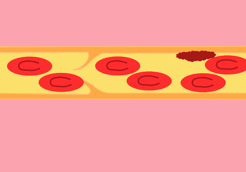
We are all familiar with the words ‘blood clots’, ‘stroke’ and ‘heart attack’. However, before the media deluge devoted to the extremely rare side effects of certain COVID-19 vaccines, few outside the medical community had heard of thromboembolic events.
The central player in the drama is the thrombus, also known as blood clot. The blood clot is the product of coagulation. The formation of a clot stops a haemorrhage when the blood vessel wall is damaged. The first step is forming a platelet plug formed by the aggregation of platelets, or thrombocytes. The thrombus is then consolidated by strands of fibrin.
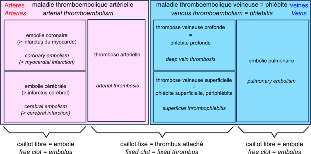
A thrombus can block vessels, especially if they are already narrowed, for example in atherosclerosis. This thrombosis impedes blood flow. Thrombosis occurs mainly when the blood flow is slow and steady (otherwise, the clots are torn off). This is why they are primarily found in the veins, forming deep vein thrombosis, also called deep phlebitis, or superficial thrombophlebitis.
A thrombus can break off, forming an embolus that travels through the vessels following the blood flow. If the vessels become smaller, the embolus is more likely to block them. Such an embolism decreases the blood supply downstream, depriving the tissues of oxygen, something called ischaemia, leading to tissue necrosis or infarction.
In the veins, oxygen-deprived blood flows from the small vessels to the large vessels. Therefore, if a clot breaks loose, it does not block the downstream vessels and travels to the heart. It is then sent by the heart into the pulmonary artery. This artery, in turn, splits into smaller and smaller branches, and the clot can then block the circulation. This is a pulmonary embolism. Deep vein thrombosis and pulmonary embolism are two manifestations of venous thromboembolism or phlebitis.
In the arteries, blood flow is rapid and pulsating. As a result, arterial thrombosis is quite rare. However, as the circulation moves from large to small vessels, embolisms are common. The most common examples are coronary artery embolisms, causing destruction of the heart muscle, a myocardial infarction, and cerebral artery embolisms causing cerebral infarction, one of two types of stroke – the other being cerebral haemorrhage.
This brings us to a very rare complication of COVID-19 vaccination with adenovirus vector vaccines such as Vaxzevria from Oxford University and AstraZeneca, and Ad26.COV2.S from Janssen. This complication is called “vaccine-induced prothrombotic immune thrombocytopenia (VITP)”. Indeed, in extremely rare cases, these vaccines induce antibodies to recognise the protein “platelet factor 4“, which activates platelets and causes their aggregation, leading to thrombosis.
Let’s reiterate that these cases are extremely rare, and their incidence is much lower than that observed after infection with SARS-CoV-2, thromboembolic events being one of the main complications of COVID-19.
Nous sommes tous familiers des mots « caillots sanguins », « AVC » et « infarctus ». Cependant, avant le déluge médiatique consacré aux effets secondaires extrêmement rares de certains vaccins contre la covid-19, bien peu en dehors de la communauté médicale avaient entendu parler des événements thromboemboliques.
L’acteur central du drame est le thrombus, aussi appelé caillot sanguin. Le caillot sanguin est le produit de la coagulation sanguine. La formation d’un caillot permet d’arrêter une hémorragie lorsque la paroi d’un vaisseau sanguin en endommagée. La première étape est la formation d’un clou plaquettaire formé par l’agrégation de plaquettes, ou thrombocytes. Le thrombus est ensuite consolidé par des brins de fibrine.
Un thrombus peut bloquer les vaisseaux, en particulier s’ils sont déjà rétrécis par exemple dans les cas d’athérosclérose. Cette thrombose entrave la circulation sanguine. Les thromboses surviennent principalement lorsque le débit sanguin est lent et régulier (sinon les caillots sont arrachés). C’est pourquoi on les trouve surtout associées aux veines, formant des thromboses veineuses profondes aussi appelés phlébites profondes, ou superficielles, aussi appelées périphlébites.
Un thrombus peut se détacher, formant un embole qui voyage dans les vaisseaux en suivant la circulation sanguine. Si les vaisseaux deviennent plus petits, ces emboles ont plus de chances de les bloquer. Cette embolie diminue l’irrigation en aval, privant les tissues d’oxygène, ce qu’on appelle une ischémie, ce qui entraîne une nécrose des tissus, ou infarctus.
Dans les veines, le sang privé d’oxygène circule des petits vaisseaux vers les grands vaisseaux. De ce fait, si un caillot se détache, ils ne bloquent pas les vaisseaux en aval, et voyage jusqu’au cœur. Il est alors envoyé par le cœur dans l’artère pulmonaire. Cette artère, quant à elle, se divise en branches de plus en plus petites, et le caillot peut alors bloquer la circulation. C’est une embolie pulmonaire. Les thromboses veineuses profondes et les embolies pulmonaires sont les deux manifestations de la la maladie thromboembolique veineuse ou phlébite.
Dans les artères, la circulation sanguine est rapide et pulsée. De ce fait, les thromboses artérielles sont assez rares. En revanche, la circulation allant des gros vaisseaux vers les petits, les embolies sont fréquentes. Les exemples les plus fréquents sont les embolies des artères coronaires, causant une destruction du muscle du cœur, un infarctus du myocarde, et les embolies des artères cérébrales causant un infarctus cérébral, un des deux types d’accidents vasculaires cérébraux (AVC) – l’autre étant constitué par les hémorragies cérébrales.
Ce qui nous amène à une complication très rare de la vaccination contre la covid-19 par des vaccins utilisant des vecteurs adénovirus comme Vaxzevria de l’université d’Oxford et AstraZeneca, et Ad26.COV2.S de Janssen. Cette complication est la « thrombopénie immunitaire prothrombotique induite par le vaccin (TIPIV) ». En effet, dans des cas extrêmement rares, ces vaccins induisent la production d’anticorps reconnaissant la protéine « facteur plaquettaire 4 » qui active les plaquettes et cause leur agrégation, entraînant des thromboses.
Rappelons une fois encore que ces cas sont extrêmement rares, et leur incidence est bien inférieure à celle observée après infection par le virus SARS-CoV-2, les événements thromboemboliques étant une des complications principales de la covid-19.
Les dernières statistiques d’Israël et du Royaume-Uni sur la covid-19 dans les populations vaccinées et non vaccinées sont devenues virales. L’une des principales raisons de ce succès dans certains milieux est qu’elles montrent apparemment que les vaccins contre le virus de la covid ne sont plus efficaces ! Ce n’est bien entendu pas le cas. Si les anticorps circulants produits par une vaccination complète semblent diminuer avec une demi-vie d’environ six mois, la protection reste très forte contre la maladie, qu’elle soit modérée ou sévère. La protection contre l’infection reste également robuste pendant les premiers mois suivant la vaccination, quel que soit le variant. Comment expliquer dès lors le résultat apparemment paradoxal selon lequel le taux de mortalité par covid est le même dans les populations vaccinées et non vaccinées ? Plusieurs facteurs peuvent être mis en cause. Par exemple, dans la plupart des ensembles de données utilisés pour calculer l’efficacité, les personnes pré-infectées non vaccinées ne sont pas retirées. Cependant, je voudrais aujourd’hui mettre en avant une autre raison car je pense qu’il s’agit d’un piège dans lequel les apprentis analystes de données tombent très fréquemment : Le paradoxe de Simpson.
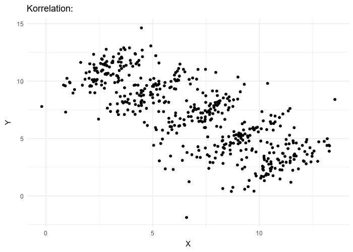
Le paradoxe de Simpson se produit quand une tendance présente dans plusieurs sous-populations disparaît, voire s’inverse, lorsque toutes ces populations sont aggrégées. Cela est souvent dû à des facteurs de confusion cachés. La situation est bien illustrée dans la figure suivante obtenue de Wikimedia commons. Alors que la corrélation entre Y et X est positive dans chacune des cinq sous-populations, cette corrélation devient négative si l’on ne distingue pas les sous-populations.
Qu’en est-il de la vaccination contre le SRAS-CoV-2 ? Jeffrey Morris explique sur son blog l’impact du paradoxe de Simpson sur l’analyse des données d’Israël de manière précise et éclairante, bien mieux que je ne pourrais le faire. Cependant, son excellente explication est assez longue et détaillée, et en anglais. J’ai donc pensé que je pourrais en donner une version courte ici, avec une population imaginaire, simplifiée, bien que réaliste.
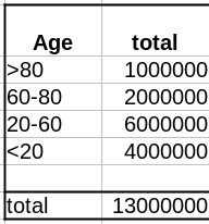
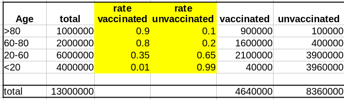
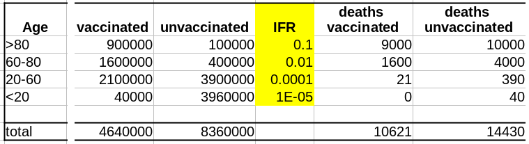
Comme évoqué dans un précédent billet, la donnée cruciale ici est la structure de la population par classe d’âge . Pour simplifier, nous prendrons une pyramide des âges assez simple, proche de ce que l’on observe dans les pays développés, c’est-à-dire homogène avec seulement une diminution au sommet, ici 1 million de personnes par décennie, et 1 million pour toutes les personnes de plus de 80 ans.
La première variable importante est le taux de vaccination. Comme les campagnes de vaccination ont commencé avec les populations âgées et que l’hésitation vaccinale diminue fortement avec l’âge, le taux de vaccination est beaucoup plus faible dans les populations plus jeunes.
La deuxième variable importante est le taux de létalité de la maladie (Infection Fatality Rate, IFR) pour chaque tranche d’âge. Là aussi, l’IFR est beaucoup plus faible dans les populations les les plus jeunes. Et c’est là que se trouve le nœud du problème : taux de vaccination et taux de létalité ne sont pas des variables indépendantes ; les deux sont liées à l’âge.
Supposons que notre vaccin ait une efficacité absolue de 90 % et que, pour simplifier, cette efficacité ne dépende pas de l’âge. Le nombre de décès dans la population non vaccinée est :
Deaths unvaccinated = round(unvaccinated * IFR)
La fonction arrondi est pour éviter les fractions de personnes mortes. Le nombre de décès dans la population vaccinée est de :
Deaths vaccinated = round(vaccinated * IFR * 0.1)
où 0.1 = (100 – efficacy)/100
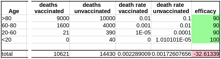
Maintenant que nous avons le nombre de décès dans chacune de nos populations, vaccinées ou non, nous pouvons calculer les taux de mortalité, c’est-à-dire décès/population, et calculer l’efficacité comme suit :
(death rate unvaccinated – death rate vaccinated)/(death rate unvaccinated)*100
Sans surprise, l’efficacité pour toutes les tranches d’âge est de 90%. Les 100% pour les <20 ans viennent du fait que 0,04 décès est arrondi à 0.
Cependant, si l’on fusionne toutes les tranches d’âge, l’efficacité disparaît complètement ! De plus, il semblerait que le vaccin augmente le taux de mortalité ! Le fait de ne pas être vacciné présente une protection contre le décès de 32% !
Il s’agit bien sûr d’un résultat erroné (nous le savons ; nous avons créé l’ensemble de données avec une efficacité vaccinale réelle de 90% !). Cet exemple utilise l’efficacité d’un vaccin. Cependant, le paradoxe de Simpson guette souvent l’apprenti analyste de données au tournant. Les facteurs de confusion doivent être recherchés avant toute analyse statistique, et les populations doivent être stratifiées en conséquence.
The latest statistics from Israel and the UK on COVID-19 in vaccinated and unvaccinated populations are getting viral. One of the main reasons for this success in some circles is that they apparently show that the vaccines against the COVID-19 virus are no longer effective! This is, of course, not the case. While the circulating antibodies triggered by a vaccination course seem to decline with a half-life of about six months, the protection remains very strong against disease, mild or severe. The protection against infection is also still robust during the first months after vaccination, whatever the variant. What could then explain the apparent paradoxical result that people die from COVID-19 as frequently in vaccinated populations as in unvaccinated ones? Several factors might be involved. For instance, in most datasets used to compute effectiveness, unvaccinated pre-infected people are not removed. However, today I would like to highlight another reason because I think it is a trap in which casual data analysts fall very frequently: The Simpson’s paradox.
The Simpson’s paradox is a situation where a trend present in several subpopulations disappears or even reverts when all those populations are pulled together. This is often due to hidden confounding variables. The situation is well illustrated in the following figure obtained from Wikimedia commons. While the correlation between Y and X is positive in each of the five subpopulations, this correlation becomes negative if we do not distinguish the subpopulations.
What about the vaccination against SARS-CoV-2? Jeffrey Morris explains on his blog the impact of Simpson’s paradox on the analysis of Israel data in a precise and enlighting manner, way better than I could. However, his excellent explanation is relatively long and detailed. So I thought I could give a short version here, with an imaginary, simplified, albeit realistic population.
As discussed in a past post, the crucial data here is the age structure of the population. To simplify, we’ll take a pretty simple age pyramid, close to what we observe in developed countries, i.e., homogenous with only a decrease on top, here 1 million people per decade, and 1 million for everyone over 80.
The first important variable is the rate of vaccination. Because vaccination campaigns started with the elderly populations, and that vaccine hesitancy strongly decreases with age, the vaccination rate is much lower in younger populations.
The second important variable is the disease’s lethality – the Infection Fatality Rate – for each age group. Here as well, the IFR is much lower in the younger group. And here lies the crux of the problem: rate of vaccination and IFR are not independent variables; both are linked to age.
Let’s assume that our vaccine has an absolute efficacy of 90%, and for simplicity, this efficacy does not change with age. The number of deaths in the unvaccinated population is:
Deaths unvaccinated = round(unvaccinated * IFR)
The “round” function is to avoid half-dead people. The number of deaths in the vaccinated population is:
Deaths vaccinated = round(vaccinated * IFR * 0.1)
where 0.1 = (100 – efficacy)/100
Now that we have the number of deaths in each of our populations, vaccinated or not, we can calculate the death rates, i.e. deaths/population, and compute the efficacy as:
(death rate unvaccinated – death rate vaccinated)/(death rate unvaccinated)*100
Unsurprisingly, the efficacy for all age groups is 90%. The 100% for the <20 comes from the fact that 0.04 death is 0.
HOWEVER, if we merge all the age groups together, the efficacy completely disappears! Not only that, it seems that the vaccine actually increases the death rate!!! Being unvaccinated presents an efficacy of 32% against death!
This is of course an artefact (we know that; we created the dataset with an actual vaccine efficacy of 90%!). This example used vaccine efficacy. However, Simpson’s paradox is awaiting the casual data analyst behind any corner. Confounding variables must be tracked down before doing any statistical analysis, and populations must be stratified accordingly.
There are many discussions on classical and social media about the quality of datasets reporting deaths by COVID-19. Of course, depending on the density of healthcare systems and the reporting structures, the reported toll will represent a certain proportion of actual deaths (60% in Mexico, 30% in Russia, between 10 and 20% in India, according to the health authorities of these countries). Moreover, most countries maintain two tallies, one based on deaths within a certain period of a positive test for infection by SARS-CoV-2 and one based on death certificates mentioning COVID-19 as the cause of death. That said, both factors should proportionally affect the numbers and are beyond human intervention. Now, can we detect if datasets have been tampered with or even entirely made up?
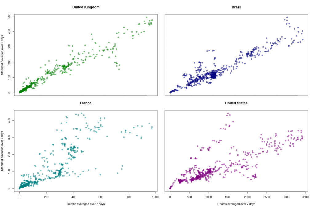
One way to do so is to look at how the variability evolves over time and depending on absolute numbers. Below, I used the dataset from Our World in Data (as of 11 September 2021) to look at the reported COVID-19 death tolls for a specific set of countries. In most countries, the main variability comes from the reporting system. As such it should be proportional to the daily deaths (basically a percentage of the reports are coming late). On top of it, we should find an intrinsic variability, which should increase as the square root of the daily deaths. So, the variability should be relatively higher outside the waves.
First, let’s look at the datasets from countries with well-developed and accurate healthcare systems. Below are plotted the standard deviation of the daily death count over seven days against the daily amount of deaths (averaged over seven days) in the United Kingdom, Brazil, France, and the United States.
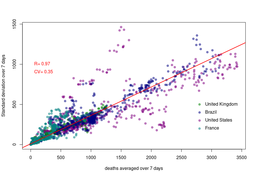
Although we see that the variability of… the variability is more important in the USA and France, there is a clear linear relationship between the absolute daily number of deaths and its standard deviation. The Pearson correlation coefficient for the UK is 0.97 (Brazil = 0.93, France=0.85, USA = 0.77). If we combine the four datasets, we can see that the relationship is incredibly similar in those five countries. The slope of the curve, representing the coefficient of variation, i.e., the standard deviation divided by the mean, throughout the scale is: UK = 0.35, Brazil = 0.35, France=0.48, USA = 0.26).
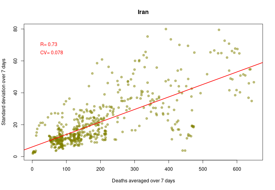
Some countries exhibit a different coefficient of variation, meaning a higher reproducibility of reporting. Iran’s reported deaths always looked very smooth to me. Indeed, the CV is 0.078, which indicates a whopping 4.5 more precise reporting. Although I am certain that Iran’s healthcare system is excellent, this figure looks suspiciously low.
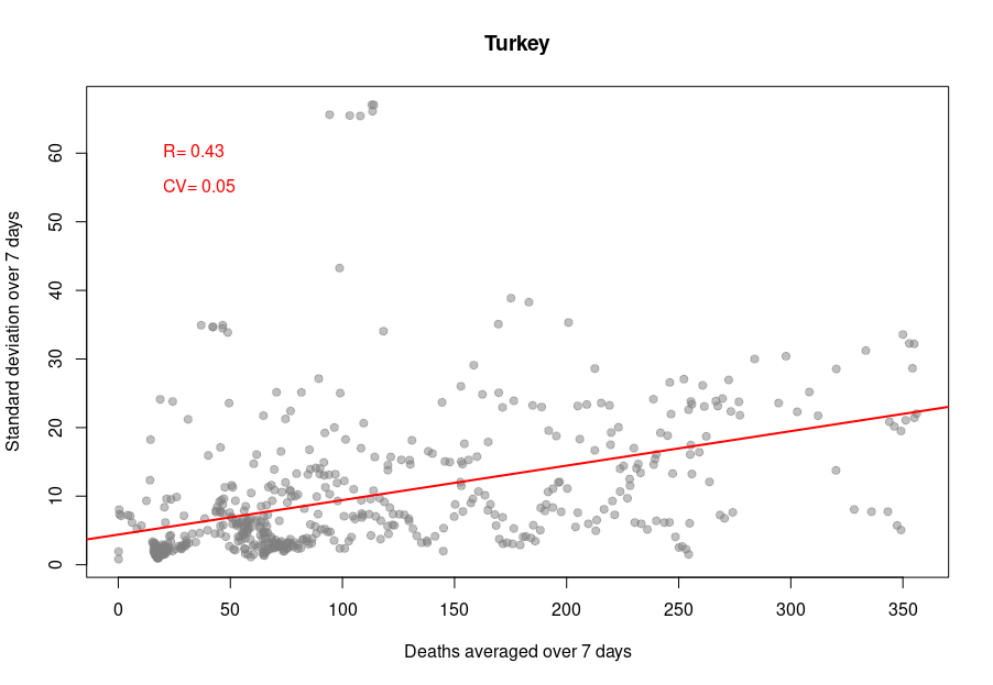
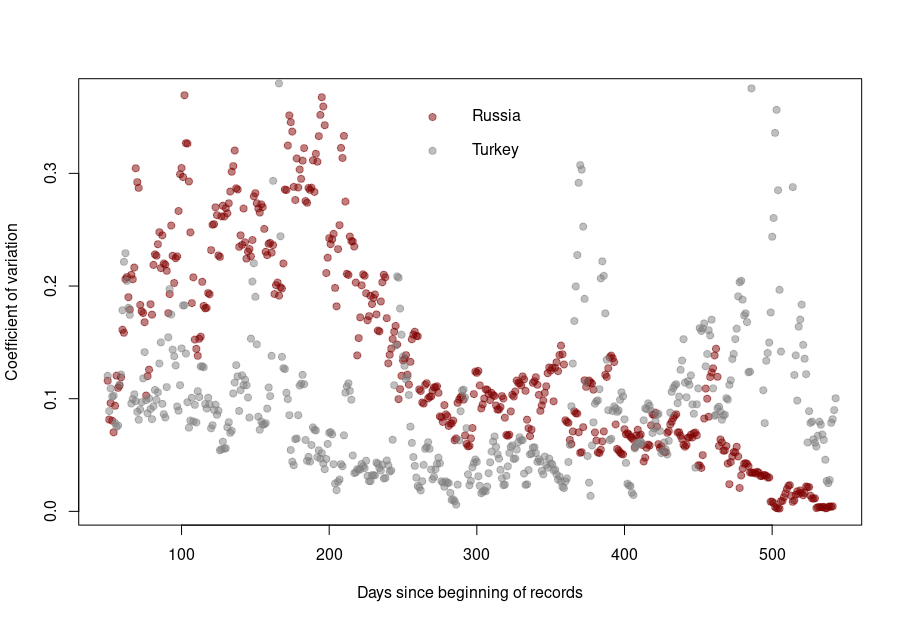
When it becomes interesting is when the linear relationship is lost. Turkey’s daily death reports are also very smooth. However, the linearity between the variability is now mostly lost, with a standard deviation that remains almost constant no matter the absolute amount of deaths. If I had to guess, I would say that the data is massaged, albeit by people who did not really think about the reason underpinning the variability and what structure it should have to look natural.
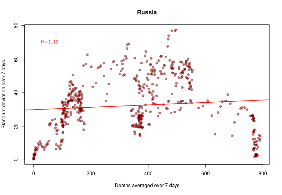
And finally, we reach Russia. From the Russian statistics agency itself, we know that the official death toll from the government bears no relationship whatsoever with reality. What is interesting is that the people producing the daily reporting went further than the Turkish ones and did not even try to produce realistically looking data. On the contrary, the variability was smoothed out even more for the highest absolute death tolls, generating a ridiculous bridge-shaped curve.
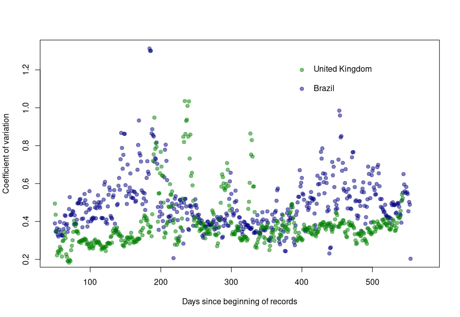
Was this always the case? How did the coefficient of variation evolve since the beginning of the pandemics? Looking again at the UK and Brazil, we can see that the average CV stays pretty much steady over time with an increased variability between the big waves. We see nicely that the CV peaks and troughs alternate between Brazil and the UK, corresponding to the offset between waves.
The situation is a bit different for Turkey and Russia. The Turkish dataset shows a CV collapsing after the first six months of the pandemics. And indeed, the daily death reporting between October 2020 and March 2021 is ridiculously smooth. However, it seems someone decided that it was a bit too much and started to add some noise (that was, unfortunately for them, not adequately scaled up.)
Russia followed the opposite path. While during the pandemics’ initial months, the CV was on par with those of western datasets, all that quickly stopped, and the CV collapsed. This trend culminated with the current preposterous death tools, between 780 and 800 deaths every single day for the past two months. The Russian government is basically showing the world the numerical finger.
This is a post I could have written thirty years ago. The tendency of scientists (or any specialist really) to write texts assuming a similar level of background knowledge from their audience has always been a curse. However, with the advent of open access and open data, the consequences have become dearer. Recently, in what is probably one of the worst communication exercises of the COVID-19 pandemics, the CDC published an online message ominously entitled:
“Lab Alert: Changes to CDC RT-PCR for SARS-CoV-2 Testing”
Of course, this text meant to target a particular audience, as specified on the web page:
However, the text was accessible to everyone; including many people who could not properly understand it. What did this message say?
“After December 31, 2021, CDC will withdraw the request to the U.S. Food and Drug Administration (FDA) for Emergency Use Authorization (EUA) of the CDC 2019-Novel Coronavirus (2019-nCoV) Real-Time RT-PCR Diagnostic Panel, the assay first introduced in February 2020 for detection of SARS-CoV-2 only. CDC is providing this advance notice for clinical laboratories to have adequate time to select and implement one of the many FDA-authorized alternatives.”
This sent people already questioning the tests into overdrive. “We’ve always told you. PCR tests do not work. This entire pandemic is a lie. We’ve been termed conspiracy theorists, but we were right all this time.” The CDC message is currently circulated all over the social networks to demonstrate their point.
Of course, this is not at all what the CDC meant. The explanation comes in the subsequent paragraph.
“In preparation for this change, CDC recommends clinical laboratories and testing sites that have been using the CDC 2019-nCoV RT-PCR assay select and begin their transition to another FDA-authorized COVID-19 test. CDC encourages laboratories to consider adoption of a multiplexed method that can facilitate detection and differentiation of SARS-CoV-2 and influenza viruses. Such assays can facilitate continued testing for both influenza and SARS-CoV-2 and can save both time and resources as we head into influenza season.”
The CDC really means that rather than using separate tests to detect SAR-COV-2 and influenza virus infections, the labs should use a single test that detects both simultaneously, hence the name “multiplex”.
I have to confess that it took me a couple of readings to properly understand what they meant. What did the CDC do wrong?
First, calling those messages “Lab Alert”. For any regular citizen fed by Stephen King’s The Stand and movies like Contagion, the words “Lab Alert” mean “Pay attention, this is an apocalypse-class message”. What about “New recommendation” or “Lab communication”?
Second, the CDC should not have been assumed that everyone knew what the “CDC 2019-nCoV RT-PCR assay” was. Out there, people understood that the CDC was talking about all the RT-PCR assays meant to detect the presence of SARS-CoV-2, not just the specific test previously recommended by the CDC*.
Third, the authors should have clarified that “the many FDA-authorized alternatives” included other PCR tests, and the message was not meant to say that the CDC recommended ditching the RT-PCR tests altogether.
Finally, they should have clarified what a “multiplexed method” was. I received messages from people who believed a “multiplexed method” was an alternative to a PCR test, while it is just a PCR that detects several things simultaneously (in this example SARS-CoV-2 and flu viruses).
In conclusion, you can, of course, and should, think about your intended audience. However, you should not neglect the unintended audiences. This is more important than you think and not restricted to general communications. Whether a research article or a grant application, whatever scientific piece you write will reach three audience types.
The first comprises the tiny circle sharing the same knowledge background, typically reviewers (if the editors do their job properly…).
The second will be made up of the population at large, who will not understand a word, and frankly, are not interested in whatever you are babbling about.
The third is the dangerous one. It is made of people who have a certain scientific background, sufficient to globally understand the context of your text but lack the advanced knowledge to precisely grasp your idea, its novelty, its consequences. These people will read your text and believe they understood your points. The risk is that they did not. Misunderstand your point might be worse than not understanding it.
It is always good to get your texts read by someone belonging to this third population before submitting them to the journals of funding agencies.
*There is actually another very interesting story related to this topic when, at the beginning of the pandemic, many labs proposed to use their own PCR tests but could not because only the CDC-recommended test could be used, delaying the implementation of mass testing by many weeks.


