10 tips to improve your research articles

By Nicolas Gambardella

Since an important part of our activity is to assist researchers by improving their documents, whether grant applications, research publications or project reports, this blog will come back to this topic on a regular basis. We will write in depth about every aspects of scientific writing in turn. In this initial post let’s go wide and list a few general rules to improve research papers (although most of those apply to grant applications too).

1) Find your message

Of course, any body of scientific research brings about multiple results, that in turns affect the way we understand several aspects of reality, or can lead to a few technical developments. However, in order to maximize the impact of your account, you must choose an angle. What is the main point you want people to remember? What would be the sentence accompanying a tweet linking to your paper?

2) Know your audience

Once you have settled on your message, you need to select the population you want to “sell it too”, on which you expect the maximum impact. By audience, we mean first and foremost the editor and the reviewers. Yes, your ultimate aim is to spread the news through your community. But the paper needs to be published first … Knowing who you are talking to will help you structure the paper, as much as the instructions to authors. What will you put in the main body of the paper and what will you demote to supplementary materials? What should you present in detail or on the contrary gloss over? How will you present the methods and the results? Experimental biologists tend to dislike equations. Biochemists do not care much about the illustrating experiment, but want quantitative tables. Molecular biologists love histograms, and they like to have one illustrating experiment such as a a western blot or a microscopy field.

3) Build a storyline

Keeping in mind both the message you chose and the audience you want to sell it to, create a progressive demonstration that brings the reader to the same conclusions as yours, keeping them focused until the final bang. This is not necessarily how things really happened, in particular chronologically. We all know that scientific research is a complex process, that includes iterative explorations, validations and controls, explode dead ends etc. There is no need to list everything path you explored, every experiment you did. A paper is not a laboratory notebook. However, as you progress towards in your narrative, each step need to naturally lead to the next, while the controls you describe preclude wandering off-path.

4) Keep facts and ideas where they belong

Do not mix Introduction, Materials and Methods, Results and Discussion (in some article structures, the last two can be included in the same section, but the relevant bits are generally in different paragraph). The Introduction should only present and discuss what was known before your work, and only what is needed to understand your work and its context. Similarly, the Materials and Methods section should not describe new techniques or materials. And finally, all your results should be in the Results section (if separate from the Discussion). As a rule, if you remove everything but the Results section, you should not affect the storyline described above. Our advice is to start writing the Results, the add the necessary Materials and Methods as you go, write the Discussion, and finish by the Introduction. You cannot write an effective introduction if you do not know what you want to introduce. Moreover, writing the introduction is often used as a procrastination device …

5) Build modules

Use one paragraph for one idea, if possible linked to one experiment, and illustrated by one figure (whether the figure ends up in the main body or in supplementary materials does not matter). This is sometime challenging when the idea or the experiment are complex. But even if, in the end, paragraphs are merged or split, adopting this approach is useful during the initial writing stage. This will help building the storyline and will enable easy restructuring later. Give a title to each module. Try drawing a flowchart representing your results, and annotate it with experiments and figures.

6) Do not assume knowledge but do not state the obvious

Moving from the structure to the style now. It is always difficult to decide what is common knowledge and therefore should not be explicit, and what is specialized knowledge required to understand your story and accept your message. Do not rely on your own knowledge. Go back to point 2), and make a real effort to put yourself in the shoes of the intended readership. Then a guideline can be to introduce factual knowledge but not common – in your audience’s domain – technical knowledge. For instance, if you write for biologists, you should not assume that people know the Kd between PKA and cAMP is 0.1 micromolar. However, you may assume that readers know increased affinity means lower Kd.

7) Do not repeat information

Building your text following 5) should preclude the description of the same information twice. When you refer to a piece of information described before, you do not need to restate it. This goes for details of experiments as well. If you already stated that an experiment took place in a chemical reactor, there is no need to mention it all the time, as “the solution in the chemical reactor” “the temperature in the chemical reactor” etc.

8) Write clearly, concisely and elegantly

I strongly recommend reading, and keeping a copy at hand, “Style: Lessons in Clarity and Grace“. There are many simple habits you can use to improve the readability of a text. Avoid passive forms. Keep verbs for actions and nouns for what perform or is affected by such actions. Try to stick to one proposition per sentence, twice at most (and well articulated). Do not add words needlessly. Instead of writing “the oxidation of the metal”, write “metal oxidation”. A shorter text is read faster and is easier to memorize.

9) Avoid casual writing

A scientific article is not a diary (or a blog post …). Your reader is neither your mate nor your student. Avoid talking to them directly, e.g. “you can do this” or indirectly as “let’s consider this first”. This is not a huge deal, but it might be irritating for some people. In general, adopt the style commonly used in the most respectable journals of the community you are targeting.

10) Chase grammatical errors and spelling mistakes

They are less important than the scientific facts, and hopefully they will disappear during the proof-reading stage. However, they give a hint of sloppiness, and they will annoy the reviewers. Even if those reviewers do not belong to the type focusing on such things, unconscious biases can taint even the fairer person. So read your manuscript again and again, slowly and aloud. More importantly ask someone else, if possible not a co-author, to read it as well.
Concentric heatmaps to compare gene network features

By Nicolas Gambardella

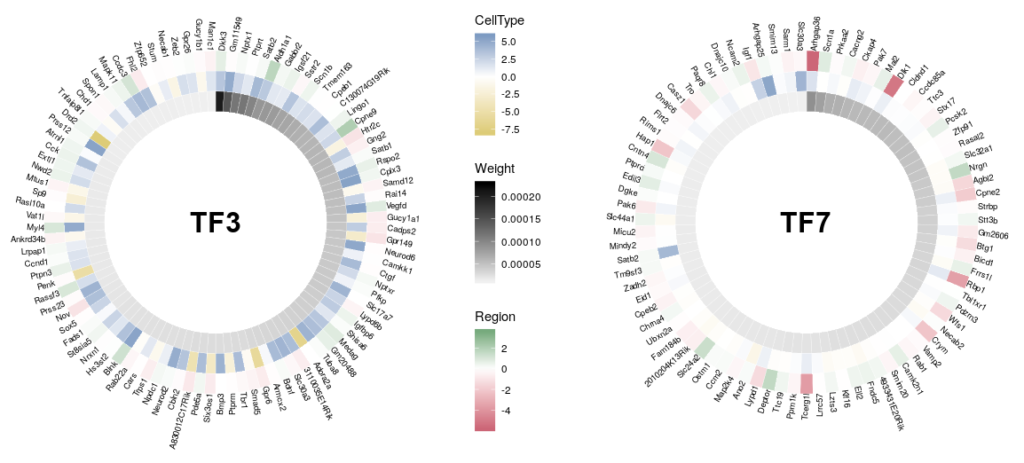
A frequent outcome of network inference based on gene expression data is the discovery of “hubs”, that possibly represent master regulators of our system of interest. Analyzing and comparing those hubs is often at the core of new biological insights. A problem of visualizing network “hubs” is the sheer number of neighbours, that make identification of interesting nodes difficult, and might mask the overall message. The overlay of several features on a nodes, using for instance several colouring or size contributes to the general confusion. Here, we propose to go back from the hub to the wheel, representing each neighbour as a tile in a 360 degree heatmap. In addition, we will used several concentric heatmaps to enable a quick integration of different features. Insight will then come from the comparison of several such wheels.

Of course, tools already exist to represent complex datasets in exquisite circular representations, such as Circos or the R package circlize. But here we will only use ggplot2 and a bit of magic.

Here is the final figure, showing two transcription factors with their targets, characterised by their expression in cell types, brain regions and the strength of interaction with the hub TFs:

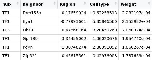
First, we need some data. Using a transcriptomics dataset, we inferred a gene regulatory network (this part of the work is beyond this blog post). The dataset was composed of two cells types coming from two different regions of the brain. For each gene, we computed the log fold difference between regions and between cell types. Our initial edges data table looks like:

TFx are the hub transcription factors that we identified as of interest. neighbor list the top interactors for each hub, weight is a dimensionless factor that represents the significativity of the edge. The higher the more probabl an actual inference exists. The table is ordered by decreasing edge weights.

We will need a few packages.

library(reshape)
library(ggplot2)
library(ggnewscale)   ## The magic

Then we will generate a wheel for a given transcriptions factor (we can, of course, generate a whole bunch of wheels in one go). We extract the information for all its neighbors, and we recast the table using the melt function of the package reshape. We then add an index (var2 below) that will decide where each data will be positioned on the concentric rings..

tf3 <- subset(edges,edges$hub == "TF3")[,-1]
tf3.m <- melt(tf3)
tf3.m$var2<-NA
tf3.m[tf3.m$variable == "weight",]$var2 <- 6
tf3.m[tf3.m$variable == "CellType",]$var2 <- 7
tf3.m[tf3.m$variable == "Region",]$var2 <- 8

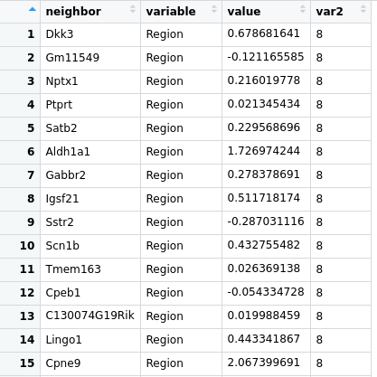
Here is what the new table looks like:

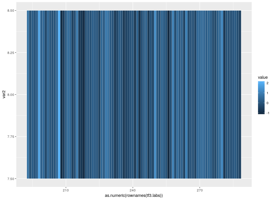
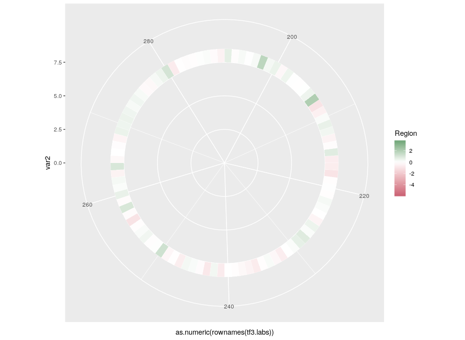
The index starts at 6 so that we have an empty space in the centre corresponding to 5 rings. Now, let’s see the beauty of ggplot2 layered approach in action. We will start with what will be our external ring, the relative expression in different regions.

ptf3 <- ggplot( ) +
  geom_tile(data=tf3.m[tf3.m$variable == "Region",],
            aes(x=as.numeric(rownames(tf3.labs)),y=var2, fill=value),
            colour="white")
plot(ptf3)

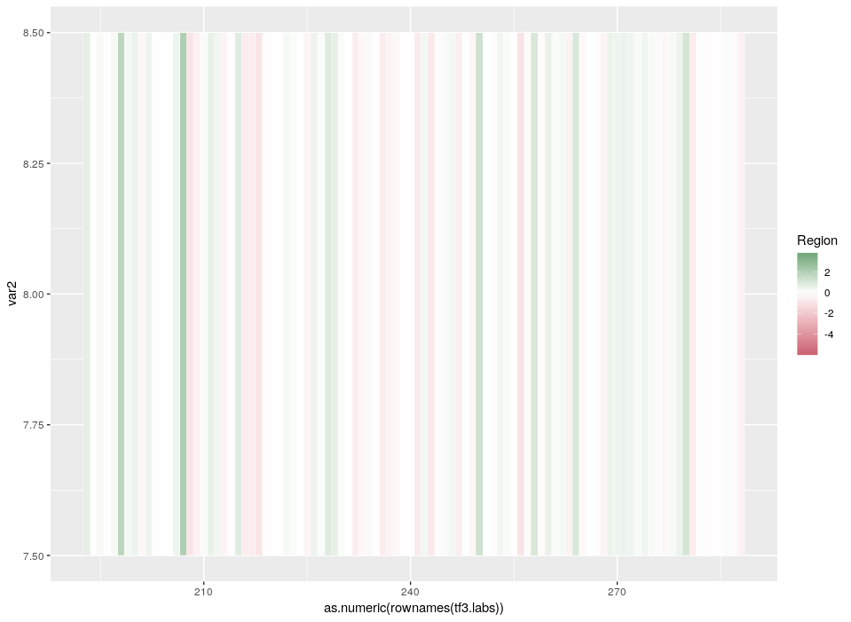
The default colours are not so nice. Since we want to emphasize the extreme differences of expression, a divergent palette is better suited. Moreover, as we mention above, we want to compare this hub with others. Therefore, the colours must be scaled according to the values across the whole dataset (the initial table edges).

 ptf3 <- ptf3 +
  scale_fill_gradient2(midpoint=0, mid="white",
                       low=rgb(204/255,102/255,119/255),
                       high=rgb(17/255p,119/255,51/255),
                       limits = c(min(edges$Region),max(edges$Region)), name="Region" )
plot(ptf3)

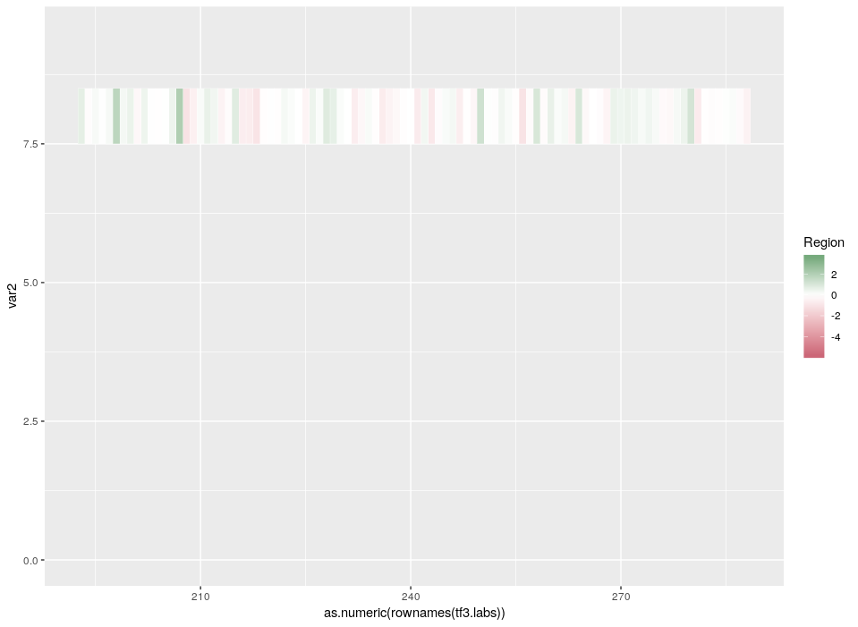
We said above we wanted space in the middle. We also want space outside for further labelling.

ptf3 <- ptf3 +
  ylim(c(0, max(tf3.m$var2) + 1.5)) 
plot(ptf3)

Did we mention we wanted a circular plot?

ptf3 <- ptf3 +
  coord_polar(theta="x")
plot(ptf3) 

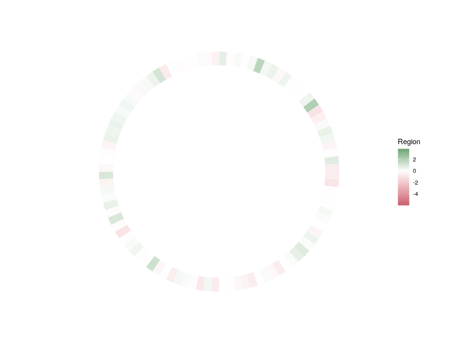
Now, let’s get rid of the useless graphical features that only serve to dilute the main message.

ptf3 <- ptf3 +
  theme(panel.background = element_blank(), # bg of the panel
        panel.grid.major = element_blank(), # get rid of major grid
        panel.grid.minor = element_blank(), # get rid of minor grid
        axis.title=element_blank(),
        panel.grid=element_blank(),
        axis.text.x=element_blank(),
        axis.ticks=element_blank(),
        axis.text.y=element_text(size=0))
plot(ptf3) 

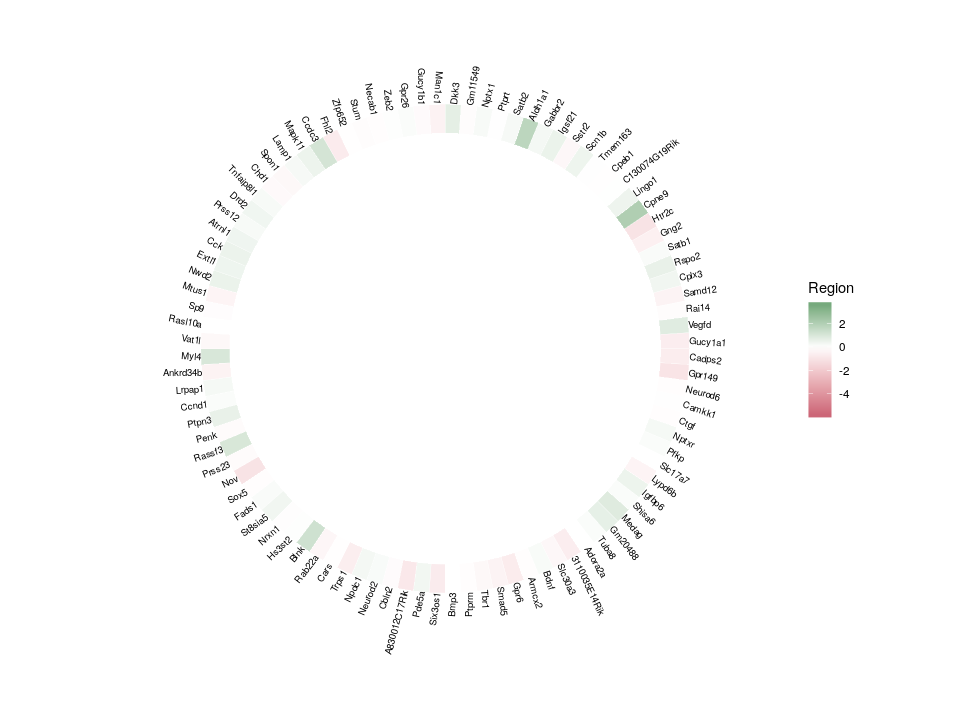
Finally, we can plot the gene names. In order to optimize the readability and use of space, we will plot the names in a radial fashion, but try to make them upright as much as possible. To do so, we need first to compute an angle that depends on the position in the ring. And then, we will compute the required “horizontal” justification, which, when use in conjunction with polar coordinates, produces something quite non-intuitive.

tf3.labs <- subset(tf3.m, variable == "weight")
tf3.labs$ang <- seq(from=(360/nrow(tf3.labs))/1.5, 
                    to=(1.5* (360/nrow(tf3.labs)))-360, 
                    length.out=nrow(tf3.labs))+80

tf3.labs$hjust <- 0
tf3.labs$hjust[which(tf3.labs$ang < -90)] <- 1
tf3.labs$ang[which(tf3.labs$ang < -90)] <- (180+tf3.labs$ang)[which(tf3.labs$ang < -90)]

Now we can add the labels to the plot. Now the use of extra space around the ring becomes clear.

ptf3 <- ptf3 +
  geom_text(data=tf3.labs, 
            aes(x=as.numeric(rownames(tf3.labs)), 
                y=var2+2.5, 
                label=neighbor, angle=ang, hjust=hjust), 
            size=2.5)
plot(ptf3) 

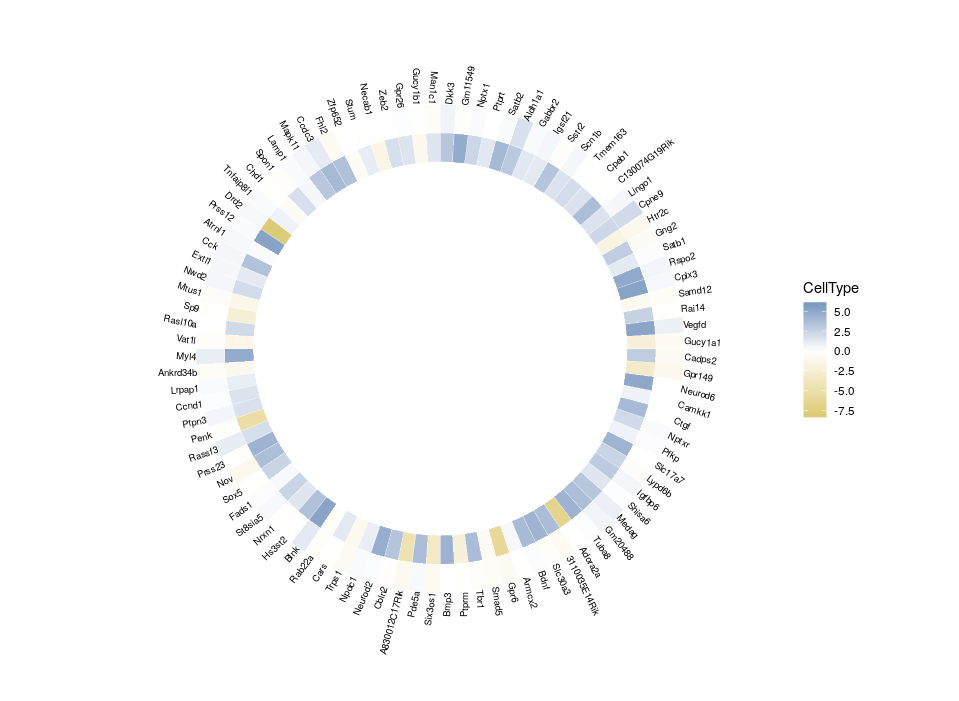
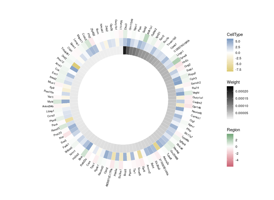
All good. Now that we have plotted the relative expression in different regions, let’s plot the relative expression in different cell types. The first intuitive idea would be to just add a new heatmap inside the previous one. However, since we are talking about a different feature, we want a different colour scale.

ptf3 <- ptf3 + 
  geom_tile(data=tf3.m[tf3.m$variable == "CellType",],
            aes(x=as.numeric(rownames(tf3.labs)),y=var2, fill=value),
            colour="white") +
  scale_fill_gradient2(midpoint=0, mid="white",
                       low=rgb(221/255,204/255,119/255),
                       high=rgb(68/255,119/255,170/255),
                       limits = c(min(edges$CellType),max(edges$CellType)), name="CellType" )
plot(ptf3)

Arrgh! First we get an error “Scale for ‘fill’ is already present. Adding another scale for ‘fill’, which will replace the existing scale.” And indeed, the CellType colour scale replaced the Region one for the outer ring. This is because we can only use a single colour scale within a given ggplot2 plot. But not all is lost, thanks to the package ggnewscale which allows us to redefine the colour scale.

NB: Packages like ComplexHeatmap allow to use different colorRamps for different heatmaps. However, they do not allow the use of polar coordinates.

So, here is what we are going to do. We will redefine the scale twice, in order to plot three features on three different concentric heatmaps.

ptf3<-ggplot( ) +
  geom_tile(data=tf3.m[tf3.m$variable == "Region",],
            aes(x=as.numeric(rownames(tf3.labs)),y=var2, fill=value),
            colour="white") +
  scale_fill_gradient2(midpoint=0, mid="white",
                       low=rgb(204/255,102/255,119/255),
                       high=rgb(17/255,119/255,51/255),
                       limits = c(min(edges$Region),max(edges$Region)), name="Region" )+
  new_scale("fill") +   #### MAGIC
  geom_tile(data=tf3.m[tf3.m$variable == "CellType",],
            aes(x=as.numeric(rownames(tf3.labs)),y=var2, fill=value),
            colour="white") +
  scale_fill_gradient2(midpoint=0, mid="white",
                       low=rgb(221/255,204/255,119/255),
                       high=rgb(68/255,119/255,170/255),
                       limits = c(min(edges$CellType),max(edges$CellType)), name="CellType" )+
  new_scale("fill") +   #### MAGIC
  geom_tile(data=tf3.m[tf3.m$variable == "weight",],
            aes(x=as.numeric(rownames(tf3.labs)),y=var2, fill=value),
            colour="white") +
  scale_fill_gradient2(midpoint=0, mid="white",
                       low=rgb(250/255,250/255,250/255),
                       high=rgb(0/255,0/255,0/255),
                       limits = c(min(edges$weight),max(edges$weight)), name="Weight" )+
  ylim(c(0, max(tf3.m$var2) + 1.5)) +
  coord_polar(theta="x") +
  theme(panel.background = element_blank(), # bg of the panel
        panel.grid.major = element_blank(), # get rid of major grid
        panel.grid.minor = element_blank(), # get rid of minor grid
        axis.title=element_blank(),
        panel.grid=element_blank(),
        axis.text.x=element_blank(),
        axis.ticks=element_blank(),
        axis.text.y=element_text(size=0))+
  geom_text(data=tf3.labs, 
            aes(x=as.numeric(rownames(tf3.labs)), 
                y=var2+2.5, 
                label=neighbor, angle=ang, hjust=hjust), 
            size=2.5)
plot(ptf3)

Now we can compare the differential expression of our hub’s neighbours between cell types and between regions. We can do that for several hubs, and compare them, which brings us to our complete figure below. We can see that while the expression of TF3’s neighbours tend to differ strongly between cell types (vivid blues and yellows), they do not differ much between regions (pale greens and magentas). We observe the opposite pattern for TF7, suggesting that TF3 could be regulating spatial-independent cell identity and TF7 could be regulating spatial-dependent cell features.

We are grateful to the following sources that benefited much to this blog post:

  • https://stackoverflow.com/questions/13887365/circular-heatmap-that-looks-like-a-donut
  • https://eliocamp.github.io/codigo-r/2018/09/multiple-color-fill-scales-ggplot2/