By Nicolas Gambardella
When I receive manuscripts to edit, I am often surprised to see how poor the figures are, particularly the plots. They are confusing, lack colours (and when in colour are not colour-blind-friendly), the font size is too small, etc. Your figures convey much more than the results. For better or worse, they will bias the reader’s mind about your results’ quality and affect their confidence in your conclusions.
It is not hard to improve our plots, though. We must think about the readers and what we like in other people’s plots. Let’s take the example of a histogram. I’ll use the single cell RNAseq data already presented in my post about medians and means. We want to see if the distribution of gene expressions across many single cells corresponds to a lognormal law. We will plot the expression of four genes, their calculated mean and median, a fitted lognormal distribution and the mean and median of the latter. (NB: We know gene expression does not really follow a lognormal distribution, and comparing distributions is not the proper way to determine if a dataset corresponds to a distribution. If you are interested, have a look at Q-Q plots and the Shapiro-Wilk test.)
Here we go.
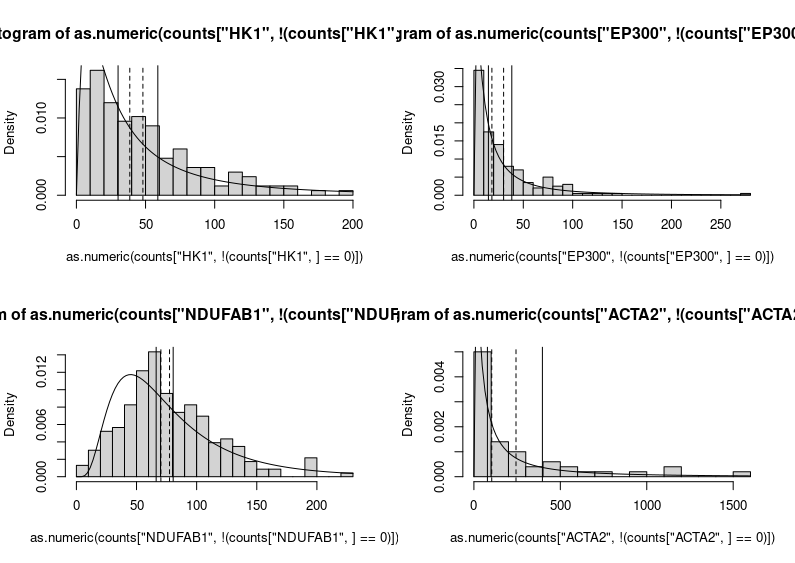
Yikes!
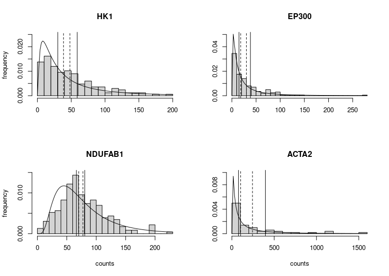
This is horrendous. The fitted distributions are cut, legends are unreadable, and all that grey, so depressing. Let’s improve the figure by choosing different limits for the Y axes to make the entire fitted distributions visible. We can also improve each plot’s title and the labels of the axes. We do not need the latter on each subplot (we can also change the label “density” produced by plotting the fitted distribution into “frequency”, the label we would get by plotting only the histograms. Indeed, the height of the boxes represents the fraction of cells presenting the expression plotted on the X axis.
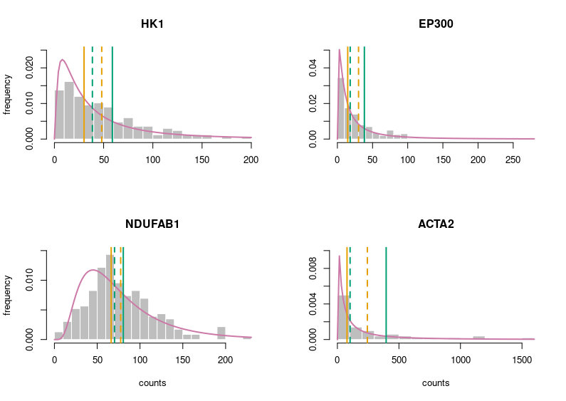
Better. But still very grey. Let’s put some colours on this plot. Those colours are colour-blind-friendly (thanks to the “Colour universal design” of Masataka Okabe and Kei, Ito).
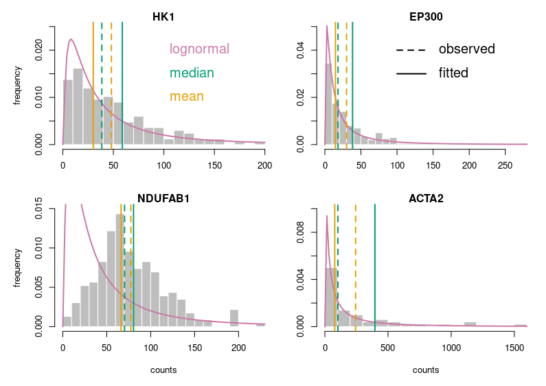
Now, this looks publication-grade. I feel there is still too much white space, so let’s tighten that a bit and add legends.
Of course, for this blog post, I voluntarily started with base R. Using ggplot2 in the first place would have provided a much better starting point. I just wanted to make a point.
Here is the code:
# counts is a dataframe with genes in rows and cells in columns

# fitting the counts of hexokinase across all cells to a lognormal law; only consider non-zero values
# (the other four genes are fitted using the same code)
fit_params_HK1 <- fitdistr(as.numeric(counts["HK1",!(counts["HK1",]==0)]),"lognormal")

# to get a 2 by 2 figure without too much empty white space
par(mfrow=c(2,2),
    oma = c(1,1,1,1) + 0.0,
    mar = c(4,4,1,0) + 0.0)

# plot for the hexokinase (the other four genes are plotted using the same code)
# histogram of cell counts
hist(as.numeric(counts["HK1",!(counts["HK1",]==0)]),breaks=20,prob=TRUE,
     col="gray", border = "white",
     main="HK1",xlab=NULL,ylab="frequency",ylim=c(0,0.025))
# lognormal distribution fitted on the counts
curve(dlnorm(x, fit_params_HK1$estimate[1], fit_params_HK1$estimate[2]), col=rgb(204/255,121/255,167/255), lwd=2, add=T)

# observed median and mean
abline(v=median(as.numeric(counts["HK1",!(counts["HK1",]==0)])), col=rgb(0/255,158/255,115/255),lwd=2,lty=2)
abline(v=mean(as.numeric(counts["HK1",!(counts["HK1",]==0)])), col=rgb(230/255,159/255,0/255),lwd=2,lty=2)

# median and mean of the fitted law. remember that the median of a lognormal distributed variable is the mean
# of the log of the variable (meanlog), and its mean is meanlog+sdlog^2/2
abline(v=exp(fit_params_HK1$estimate[1]+(fit_params_HK1$estimate[2])^2/2), col=rgb(0/255,158/255,115/255),lwd=2)
abline(v=exp(fit_params_HK1$estimate[1]), col=rgb(230/255,159/255,0/255),lwd=2)

# plotting the legends for the colours
text(100, 0.02, labels = "lognormal", pos = 4, cex = 1.5, col=rgb(204/255,121/255,167/255))
text(100, 0.015, labels = "median", pos = 4, cex = 1.5, col=rgb(0/255,158/255,115/255))
text(100, 0.01, labels = "mean", pos = 4, cex = 1.5, col=rgb(230/255,159/255,0/255))

# plotting the legend located on the histone acetylase EP300
segments(100,0.04, 140,0.04,col = "black", lty = 2,lwd=2)
segments(100,0.03, 140, 0.03,col = "black", lty = 1,lwd=2)
text(150, 0.04, labels = "observed", pos = 4, cex = 1.5, col="black")
text(150, 0.03, labels = "fitted", pos = 4, cex = 1.5, col="black")