Vaccin efficace sur toutes les sous-populations mais apparemment pas sur l’ensemble de la population – le paradoxe de Simpson

Par Nicolas Gambardella

Les dernières statistiques d’Israël et du Royaume-Uni sur la covid-19 dans les populations vaccinées et non vaccinées sont devenues virales. L’une des principales raisons de ce succès dans certains milieux est qu’elles montrent apparemment que les vaccins contre le virus de la covid ne sont plus efficaces ! Ce n’est bien entendu pas le cas. Si les anticorps circulants produits par une vaccination complète semblent diminuer avec une demi-vie d’environ six mois, la protection reste très forte contre la maladie, qu’elle soit modérée ou sévère. La protection contre l’infection reste également robuste pendant les premiers mois suivant la vaccination, quel que soit le variant. Comment expliquer dès lors le résultat apparemment paradoxal selon lequel le taux de mortalité par covid est le même dans les populations vaccinées et non vaccinées ? Plusieurs facteurs peuvent être mis en cause. Par exemple, dans la plupart des ensembles de données utilisés pour calculer l’efficacité, les personnes pré-infectées non vaccinées ne sont pas retirées. Cependant, je voudrais aujourd’hui mettre en avant une autre raison car je pense qu’il s’agit d’un piège dans lequel les apprentis analystes de données tombent très fréquemment : Le paradoxe de Simpson.

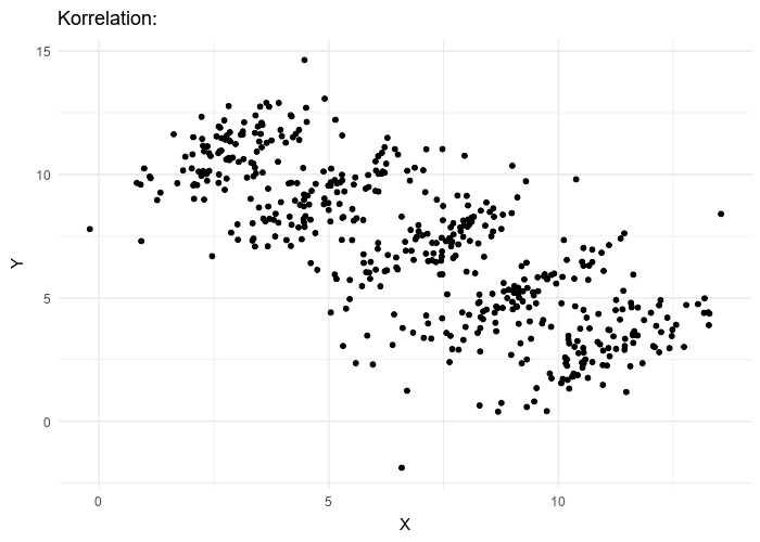
Le paradoxe de Simpson se produit quand une tendance présente dans plusieurs sous-populations disparaît, voire s’inverse, lorsque toutes ces populations sont aggrégées. Cela est souvent dû à des facteurs de confusion cachés. La situation est bien illustrée dans la figure suivante obtenue de Wikimedia commons. Alors que la corrélation entre Y et X est positive dans chacune des cinq sous-populations, cette corrélation devient négative si l’on ne distingue pas les sous-populations.

Qu’en est-il de la vaccination contre le SRAS-CoV-2 ? Jeffrey Morris explique sur son blog l’impact du paradoxe de Simpson sur l’analyse des données d’Israël de manière précise et éclairante, bien mieux que je ne pourrais le faire. Cependant, son excellente explication est assez longue et détaillée, et en anglais. J’ai donc pensé que je pourrais en donner une version courte ici, avec une population imaginaire, simplifiée, bien que réaliste.

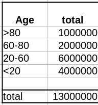
Comme évoqué dans un précédent billet, la donnée cruciale ici est la structure de la population par classe d’âge . Pour simplifier, nous prendrons une pyramide des âges assez simple, proche de ce que l’on observe dans les pays développés, c’est-à-dire homogène avec seulement une diminution au sommet, ici 1 million de personnes par décennie, et 1 million pour toutes les personnes de plus de 80 ans.

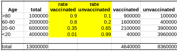
La première variable importante est le taux de vaccination. Comme les campagnes de vaccination ont commencé avec les populations âgées et que l’hésitation vaccinale diminue fortement avec l’âge, le taux de vaccination est beaucoup plus faible dans les populations plus jeunes.

La deuxième variable importante est le taux de létalité de la maladie (Infection Fatality Rate, IFR) pour chaque tranche d’âge. Là aussi, l’IFR est beaucoup plus faible dans les populations les les plus jeunes. Et c’est là que se trouve le nœud du problème : taux de vaccination et taux de létalité ne sont pas des variables indépendantes ; les deux sont liées à l’âge.

Supposons que notre vaccin ait une efficacité absolue de 90 % et que, pour simplifier, cette efficacité ne dépende pas de l’âge. Le nombre de décès dans la population non vaccinée est :

Deaths unvaccinated = round(unvaccinated * IFR)

La fonction arrondi est pour éviter les fractions de personnes mortes. Le nombre de décès dans la population vaccinée est de :

Deaths vaccinated = round(vaccinated * IFR * 0.1)

0.1 = (100 – efficacy)/100

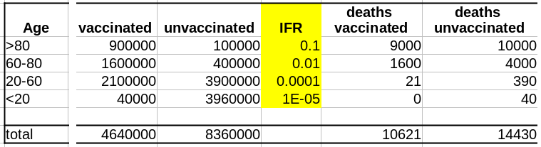
Maintenant que nous avons le nombre de décès dans chacune de nos populations, vaccinées ou non, nous pouvons calculer les taux de mortalité, c’est-à-dire décès/population, et calculer l’efficacité comme suit :

(death rate unvaccinated – death rate vaccinated)/(death rate unvaccinated)*100

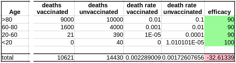
Sans surprise, l’efficacité pour toutes les tranches d’âge est de 90%. Les 100% pour les <20 ans viennent du fait que 0,04 décès est arrondi à 0.

Cependant, si l’on fusionne toutes les tranches d’âge, l’efficacité disparaît complètement ! De plus, il semblerait que le vaccin augmente le taux de mortalité ! Le fait de ne pas être vacciné présente une protection contre le décès de 32% !

Il s’agit bien sûr d’un résultat erroné (nous le savons ; nous avons créé l’ensemble de données avec une efficacité vaccinale réelle de 90% !). Cet exemple utilise l’efficacité d’un vaccin. Cependant, le paradoxe de Simpson guette souvent l’apprenti analyste de données au tournant. Les facteurs de confusion doivent être recherchés avant toute analyse statistique, et les populations doivent être stratifiées en conséquence.

A vaccine effective on all subpopulations but apparently not on the entire population – the Simpson’s paradox

By Nicolas Gambardella

The latest statistics from Israel and the UK on COVID-19 in vaccinated and unvaccinated populations are getting viral. One of the main reasons for this success in some circles is that they apparently show that the vaccines against the COVID-19 virus are no longer effective! This is, of course, not the case. While the circulating antibodies triggered by a vaccination course seem to decline with a half-life of about six months, the protection remains very strong against disease, mild or severe. The protection against infection is also still robust during the first months after vaccination, whatever the variant. What could then explain the apparent paradoxical result that people die from COVID-19 as frequently in vaccinated populations as in unvaccinated ones? Several factors might be involved. For instance, in most datasets used to compute effectiveness, unvaccinated pre-infected people are not removed. However, today I would like to highlight another reason because I think it is a trap in which casual data analysts fall very frequently: The Simpson’s paradox.

The Simpson’s paradox is a situation where a trend present in several subpopulations disappears or even reverts when all those populations are pulled together. This is often due to hidden confounding variables. The situation is well illustrated in the following figure obtained from Wikimedia commons. While the correlation between Y and X is positive in each of the five subpopulations, this correlation becomes negative if we do not distinguish the subpopulations.

What about the vaccination against SARS-CoV-2? Jeffrey Morris explains on his blog the impact of Simpson’s paradox on the analysis of Israel data in a precise and enlighting manner, way better than I could. However, his excellent explanation is relatively long and detailed. So I thought I could give a short version here, with an imaginary, simplified, albeit realistic population.

As discussed in a past post, the crucial data here is the age structure of the population. To simplify, we’ll take a pretty simple age pyramid, close to what we observe in developed countries, i.e., homogenous with only a decrease on top, here 1 million people per decade, and 1 million for everyone over 80.

The first important variable is the rate of vaccination. Because vaccination campaigns started with the elderly populations, and that vaccine hesitancy strongly decreases with age, the vaccination rate is much lower in younger populations.

The second important variable is the disease’s lethality – the Infection Fatality Rate – for each age group. Here as well, the IFR is much lower in the younger group. And here lies the crux of the problem: rate of vaccination and IFR are not independent variables; both are linked to age.

Let’s assume that our vaccine has an absolute efficacy of 90%, and for simplicity, this efficacy does not change with age. The number of deaths in the unvaccinated population is:

Deaths unvaccinated = round(unvaccinated * IFR)

The “round” function is to avoid half-dead people. The number of deaths in the vaccinated population is:

Deaths vaccinated = round(vaccinated * IFR * 0.1)

where 0.1 = (100 – efficacy)/100

Now that we have the number of deaths in each of our populations, vaccinated or not, we can calculate the death rates, i.e. deaths/population, and compute the efficacy as:

(death rate unvaccinated – death rate vaccinated)/(death rate unvaccinated)*100

Unsurprisingly, the efficacy for all age groups is 90%. The 100% for the <20 comes from the fact that 0.04 death is 0.

HOWEVER, if we merge all the age groups together, the efficacy completely disappears! Not only that, it seems that the vaccine actually increases the death rate!!! Being unvaccinated presents an efficacy of 32% against death!

This is of course an artefact (we know that; we created the dataset with an actual vaccine efficacy of 90%!). This example used vaccine efficacy. However, Simpson’s paradox is awaiting the casual data analyst behind any corner. Confounding variables must be tracked down before doing any statistical analysis, and populations must be stratified accordingly.

Variability structure to assess dataset quality – the case of COVID-19 deaths

By Nicolas Gambardella

There are many discussions on classical and social media about the quality of datasets reporting deaths by COVID-19. Of course, depending on the density of healthcare systems and the reporting structures, the reported toll will represent a certain proportion of actual deaths (60% in Mexico, 30% in Russia, between 10 and 20% in India, according to the health authorities of these countries). Moreover, most countries maintain two tallies, one based on deaths within a certain period of a positive test for infection by SARS-CoV-2 and one based on death certificates mentioning COVID-19 as the cause of death. That said, both factors should proportionally affect the numbers and are beyond human intervention. Now, can we detect if datasets have been tampered with or even entirely made up?

One way to do so is to look at how the variability evolves over time and depending on absolute numbers. Below, I used the dataset from Our World in Data (as of 11 September 2021) to look at the reported COVID-19 death tolls for a specific set of countries. In most countries, the main variability comes from the reporting system. As such it should be proportional to the daily deaths (basically a percentage of the reports are coming late). On top of it, we should find an intrinsic variability, which should increase as the square root of the daily deaths. So, the variability should be relatively higher outside the waves.

First, let’s look at the datasets from countries with well-developed and accurate healthcare systems. Below are plotted the standard deviation of the daily death count over seven days against the daily amount of deaths (averaged over seven days) in the United Kingdom, Brazil, France, and the United States.

Although we see that the variability of… the variability is more important in the USA and France, there is a clear linear relationship between the absolute daily number of deaths and its standard deviation. The Pearson correlation coefficient for the UK is 0.97 (Brazil = 0.93, France=0.85, USA = 0.77). If we combine the four datasets, we can see that the relationship is incredibly similar in those five countries. The slope of the curve, representing the coefficient of variation, i.e., the standard deviation divided by the mean, throughout the scale is: UK = 0.35, Brazil = 0.35, France=0.48, USA = 0.26).

Some countries exhibit a different coefficient of variation, meaning a higher reproducibility of reporting. Iran’s reported deaths always looked very smooth to me. Indeed, the CV is 0.078, which indicates a whopping 4.5 more precise reporting. Although I am certain that Iran’s healthcare system is excellent, this figure looks suspiciously low.

When it becomes interesting is when the linear relationship is lost. Turkey’s daily death reports are also very smooth. However, the linearity between the variability is now mostly lost, with a standard deviation that remains almost constant no matter the absolute amount of deaths. If I had to guess, I would say that the data is massaged, albeit by people who did not really think about the reason underpinning the variability and what structure it should have to look natural.

And finally, we reach Russia. From the Russian statistics agency itself, we know that the official death toll from the government bears no relationship whatsoever with reality. What is interesting is that the people producing the daily reporting went further than the Turkish ones and did not even try to produce realistically looking data. On the contrary, the variability was smoothed out even more for the highest absolute death tolls, generating a ridiculous bridge-shaped curve.

Was this always the case? How did the coefficient of variation evolve since the beginning of the pandemics? Looking again at the UK and Brazil, we can see that the average CV stays pretty much steady over time with an increased variability between the big waves. We see nicely that the CV peaks and troughs alternate between Brazil and the UK, corresponding to the offset between waves.

The situation is a bit different for Turkey and Russia. The Turkish dataset shows a CV collapsing after the first six months of the pandemics. And indeed, the daily death reporting between October 2020 and March 2021 is ridiculously smooth. However, it seems someone decided that it was a bit too much and started to add some noise (that was, unfortunately for them, not adequately scaled up.)

Russia followed the opposite path. While during the pandemics’ initial months, the CV was on par with those of western datasets, all that quickly stopped, and the CV collapsed. This trend culminated with the current preposterous death tools, between 780 and 800 deaths every single day for the past two months. The Russian government is basically showing the world the numerical finger.