Scientists, do not make assumptions about your audience!

This is a post I could have written thirty years ago. The tendency of scientists (or any specialist really) to write texts assuming a similar level of background knowledge from their audience has always been a curse. However, with the advent of open access and open data, the consequences have become dearer. Recently, in what is probably one of the worst communication exercises of the COVID-19 pandemics, the CDC published an online message ominously entitled:

“Lab Alert: Changes to CDC RT-PCR for SARS-CoV-2 Testing”

Of course, this text meant to target a particular audience, as specified on the web page:

“Audience: Individuals Performing COVID-19 Testing”

However, the text was accessible to everyone; including many people who could not properly understand it. What did this message say?

“After December 31, 2021, CDC will withdraw the request to the U.S. Food and Drug Administration (FDA) for Emergency Use Authorization (EUA) of the CDC 2019-Novel Coronavirus (2019-nCoV) Real-Time RT-PCR Diagnostic Panel, the assay first introduced in February 2020 for detection of SARS-CoV-2 only. CDC is providing this advance notice for clinical laboratories to have adequate time to select and implement one of the many FDA-authorized alternatives.”

This sent people already questioning the tests into overdrive. “We’ve always told you. PCR tests do not work. This entire pandemic is a lie. We’ve been termed conspiracy theorists, but we were right all this time.” The CDC message is currently circulated all over the social networks to demonstrate their point.

Of course, this is not at all what the CDC meant. The explanation comes in the subsequent paragraph.

“In preparation for this change, CDC recommends clinical laboratories and testing sites that have been using the CDC 2019-nCoV RT-PCR assay select and begin their transition to another FDA-authorized COVID-19 test. CDC encourages laboratories to consider adoption of a multiplexed method that can facilitate detection and differentiation of SARS-CoV-2 and influenza viruses. Such assays can facilitate continued testing for both influenza and SARS-CoV-2 and can save both time and resources as we head into influenza season.”

The CDC really means that rather than using separate tests to detect SAR-COV-2 and influenza virus infections, the labs should use a single test that detects both simultaneously, hence the name “multiplex”. 

I have to confess that it took me a couple of readings to properly understand what they meant. What did the CDC do wrong?

First, calling those messages “Lab Alert”. For any regular citizen fed by Stephen King’s The Stand and movies like Contagion, the words “Lab Alert” mean “Pay attention, this is an apocalypse-class message”. What about “New recommendation” or “Lab communication”?

Second, the CDC should not have been assumed that everyone knew what the “CDC 2019-nCoV RT-PCR assay” was. Out there, people understood that the CDC was talking about all the RT-PCR assays meant to detect the presence of SARS-CoV-2, not just the specific test previously recommended by the CDC*.

Third, the authors should have clarified that “the many FDA-authorized alternatives” included other PCR tests, and the message was not meant to say that the CDC recommended ditching the RT-PCR tests altogether.

Finally, they should have clarified what a “multiplexed method” was. I received messages from people who believed a “multiplexed method” was an alternative to a PCR test, while it is just a PCR that detects several things simultaneously (in this example SARS-CoV-2 and flu viruses).

In conclusion, you can, of course, and should, think about your intended audience. However, you should not neglect the unintended audiences. This is more important than you think and not restricted to general communications. Whether a research article or a grant application, whatever scientific piece you write will reach three audience types. 

  • The first comprises the tiny circle sharing the same knowledge background, typically reviewers (if the editors do their job properly…). 
  • The second will be made up of the population at large, who will not understand a word, and frankly, are not interested in whatever you are babbling about.
  • The third is the dangerous one. It is made of people who have a certain scientific background, sufficient to globally understand the context of your text but lack the advanced knowledge to precisely grasp your idea, its novelty, its consequences. These people will read your text and believe they understood your points. The risk is that they did not. Misunderstand your point might be worse than not understanding it.

It is always good to get your texts read by someone belonging to this third population before submitting them to the journals of funding agencies.

*There is actually another very interesting story related to this topic when, at the beginning of the pandemic, many labs proposed to use their own PCR tests but could not because only the CDC-recommended test could be used, delaying the implementation of mass testing by many weeks.

Âges, vaccination et infections

Par Nicolas Gambardella

Combien de fois voit-on ces jours-ci passer le commentaire suivant sur les réseaux sociaux : « La plupart des cas de covid-19 sont maintenant chez des personnes vaccinées. C’est la preuve que les vaccins ne fonctionnent pas. »

Pas vraiment, non.

Tout dépend des populations relatives de vaccinés et de non-vaccinés. Dans un précédent billet, j’ai présenté un résumé de l’efficacité des vaccins sur les différentes variantes du SARS-CoV-2. Chaque figure représentait l’efficacité globale. Cependant, les taux de vaccination dépendent de l’âge, car la plupart des pays ont commencé à vacciner les personnes âgées en premier. Voyons donc si nous pouvons être plus précis.

Public Health England a récemment publié la dernière version de son SARS-CoV-2 variants of concern and variants under investigation in England. Il présente les détails des infections par les variants identifiés chez les personnes vaccinées et non vaccinées. Concentrons-nous sur le variant Delta.

Mais, mais, mais… chez les personnes de plus de 50 ans, seuls 976 cas ont été recensés chez les non-vaccinés, tandis que 3953 personnes ayant reçu une dose et 3546 personnes entièrement vaccinées ont été infectées ! Ce vaccin n’offre donc aucune protection, CQFD ?

Pas si vite. Voyons si nous pouvons calculer l’efficacité du vaccin, d’accord ? Pour cela, nous avons d’abord besoin du taux de vaccination par tranche d’âge. Heureusement, ce taux est publié chaque semaine par Public Health England. Comme le tableau porte sur les cas déclarés jusqu’au 21 juin, nous utiliserons les données publiées le 24 juin, qui comprenaient les vaccinations jusqu’au 20 juin. Bien sûr, tous les cas Delta ne sont pas apparus le 20 juin. Cependant, la plupart d’entre eux sont apparus au cours des derniers mois. De plus, l’administration de la 2e dose a atteint un plateau pour la population âgée.

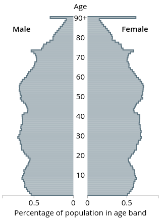
Ensuite, nous devons savoir combien de personnes appartiennent à chacune de ces tranches d’âge. Pour cela, nous pouvons utiliser la population de 2020 prévue par l’Office for National Statistics sur la base des chiffres de 2018 (la pyramide des âges indique des pourcentages pour chaque année, mais nous pouvons télécharger les chiffres réels pour chaque tranche de 5 ans d’âge).

Nous pouvons maintenant calculer, pour chaque tranche d’âge, combien de personnes ont reçu deux doses, une seule dose ou ne sont toujours pas vaccinées (j’additionne les hommes et les femmes).

Âge1 dose2 dosesnon-vaccinés
0-17 56230 56584 14033150
18-24605991 726010 4318151
25-29 837303 728416 2924493
30-341587417 847650 2100138
35-39 1786373 10030801628239
40-44 1702290 1268632 1127652
45-491583028 1838131 890384
50-54548632 3378858 690501
55-59 396658 3567857 549185
60-64202651 3272462 387171
65-6995785 2998587 268383
70-7459031 3118291 191577
75-79 41180 2259096 111907
80+84457 3159787 164372
total9587027 28223441 29385301

Ces chiffres font apparaître 24118034 personnes de plus de 50 ans, 21754937 avec deux doses et 2363096 non vaccinées, dix fois plus de personnes complètement vaccinées ! Ainsi, les 3546 et 976 cas représentent 0,0163 % et 0,0413 % des populations respectives. En d’autres termes, la vaccination complète offre une protection de 60,5 % contre le variant Delta.

Le même calcul sur les moins de 50 ans montre une protection encore meilleure, à 70,8 % (ce qui montre encore qu’il faut vacciner les plus jeunes si nous voulons protéger les plus vieux et se débarrasser de ce virus).

Plus la couverture vaccinale est bonne, plus on observera de cas dans la population vaccinée. Cela ne signifie pas que le vaccin n’est pas efficace !

Ages, vaccination and infections

By Nicolas Gambardella

How many times are we seeing the following comment on social media those days: “Most covid-19 cases are now in vaccinated people. This is the proof that vaccines don’t work”.

Not quite.

It all depends on the relative populations of vaccinated versus unvaccinated. In a previous post, I presented a summary of vaccine effectiveness on different SARS-CoV-2 variants. Each figure represented the global effectiveness. However, vaccination rates depend on age since most countries started to vaccinate the elderly first. So let’s see if we can be more precise.

Public Health England recently published its latest SARS-CoV-2 variants of concern and variants under investigation in England. It contains the details of infections by identified variants in vaccinated and unvaccinated people. Let’s focus on the Delta variant.

Whaaaat? In people over 50 years of age, 0nly 976 cases in unvaccinated, while 3953 people with one dose and 3546 fully vaccinated people were infected! Surely this vaccine does not offer any protection, right?

Let’s see if we can compute the vaccine effectiveness, shall we? For that, we need first the vaccination rate per age. Fortunately, this is published by Public Health England every week. Since the table about report cases up to June 21, we will use the vaccinations data published on June 24, including vaccinations up to June 20. Of course, not all the Delta cases have appeared on June 20. However, most of them have appeared in the past few months. Moreover, administration of the 2nd dose has plateaued for the elderly population.

Then, we need to know how many people belong to each of those age groups. For that, we can use the 2020 population predicted by the Office for National Statistics based on the 2018 figure (the age pyramid shows percentages for each year, but we can download actual numbers for each 5-years age group).

We can now compute for each age group how many people had two doses, only one dose, or are still unvaccinated (I sum up males and females).

Age1 dose2 dosesunvaccinated
0-17 56230 56584 14033150
18-24605991 726010 4318151
25-29 837303 728416 2924493
30-341587417 847650 2100138
35-39 1786373 10030801628239
40-44 1702290 1268632 1127652
45-491583028 1838131 890384
50-54548632 3378858 690501
55-59 396658 3567857 549185
60-64202651 3272462 387171
65-6995785 2998587 268383
70-7459031 3118291 191577
75-79 41180 2259096 111907
80+84457 3159787 164372
total9587027 28223441 29385301

These numbers show 24118034 people over 50, 21754937 with two doses and 2363096 unvaccinated, tenfold more fully vaccinated! Thus, the 3546 and 976 cases represent 0.0163% and 0.0413% of the respective populations. In other words, the full vaccination offers 60.5% protection against the Delta variant.

The same calculation on under-50 shows even better protection at 70.8% (This, again, shows that we must vaccinate young people if we want to protect the older ones and get rid of this virus.

The better the vaccine coverage, the more cases will be observed in the vaccinated population. This does not mean the vaccine is not effective!

Des vaccins et des variants

Par Nicolas Gambardella

Depuis le développement des premiers vaccins contre le SARS-CoV-2, j’ai collectionné les données sur leur efficacité. Cette efficacité est continuellement remise en cause par l’apparition de virus variants, c’est-à-dire de nouvelles souches porteuses d’un groupe caractéristique de mutations. Avec autant de vaccins et autant de variants, il devient difficile de rester à jour. Ce problème est aggravé par l’abondance de publications présentant des types d’évaluations différents. Ainsi, bien qu’il soit très important de garder trace de toutes les valeurs et de leurs intervalles de confiance, j’ai pensé qu’il serait bon d’avoir une vue d’ensemble simplifiée de la situation actuelle.

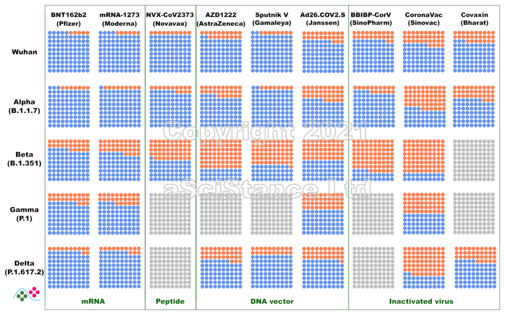
La figure ci-dessous représente l’efficacité globale des principaux vaccins contre les principaux variants sous forme de pourcentages visuels. Les points bleus représentent les personnes protégées qui auraient été infectées sans vaccination. Les points gris représentent les paires {vaccin, variant} pour lesquelles on ne dispose pas de suffisamment de données. Ces nombres représentent la protection contre l’infection, et non la protection contre la maladie ou le décès (pour lesquels la protection est probablement plus élevée). De plus, ils sont obtenus après le protocole de dosage recommandé pour chaque vaccin. NB: Dans certains cas, « Wuhan » signifie « aucun des variants ci-dessous ».

Ces données sont les estimations les meilleures et les plus fiables au moment où j’écris ce billet (mise à jour le 12 novembre 2021). J’ai privilégié les données de vie réelle aux essais cliniques, l’efficacité directement mesurée à l’efficacité déduite des tests de neutralisation (où le sérum de personnes vaccinées est utilisé in vitro sur des virus ou des protéines recombinantes), et les données indépendantes aux données fournies par les fabricants de vaccins. J’ai omis certains vaccins autorisés en raison de la rareté des données (et de leur faible utilisation). Certaines des données utilisées pour faire la figure sont connues pour leur « particularité » et ont fait l’objet de critiques. Cependant, il n’existe rien de mieux. Espérons que ces graphiques deviendront plus précis à mesure que d’autres études seront publiées.

On vaccines and variants

By Nicolas Gambardella

Since the development of the first vaccines against SARS-CoV-2, I have gathered data about their efficacy. Unfortunately, this efficacy is continuously challenged by the appearance of variant viruses, i.e., novel strains carrying a bunch of mutations. With so many vaccines and so many variants, it becomes difficult to keep track of the data. This is compounded by the abundance of publications presenting different types of evaluations. So, while keeping track of all the values and their confidence intervals is very important, I thought it would be nice to have a single overview of where we stand.

The figure below represents the overall efficacy of the main vaccines for the main variants as visual percentages. The blue dots represent protected people who would have been infected without the vaccines. Grey dots represent pair {vaccine, variant} for which not enough data is available. This figure represents the protection from infection, not the protection from disease or death (which are likely higher). The figures are those achieved after the recommended dosing protocol for each vaccine. NB: in some plots, “Wuhan” means “none of the variants listed below”.

These numbers are the best and most reliable estimates as I write this post (updated 02 October 2021). I privileged real world data over clinical trials, directly measured efficacy over efficacy inferred from neutralisation assays (where the serum of vaccinated individuals is used in vitro with viruses or recombinant proteins), and independent data over data provided by vaccine manufacturers. I omitted some authorised vaccines because of data scarcity (and low usage). Some of the data used to plot the graph are known to present peculiarities and raised issues. However, nothing better is available. Hopefully, these plots will become more accurate as more studies are published.