By Nicolas Gambardella
Slides are ubiquitous visual supports for scientific presentations, whether to present results in conferences, report progresses for periodic reviews, or apply to a position or funding. While science is (should be?) paramount, the quality of the slides bears a disproportionate effect on the audience. Here, I will present ten beginner tips – or ten mistakes to avoid – to improve the delivery of your presentation. They aim to improve understanding by making your message clearer, faster, and easier to grasp.
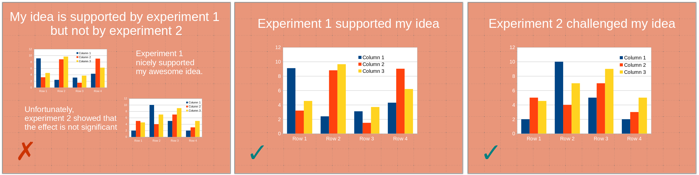
1) One slide should present one point (one idea, one experiment). A slide is not a poster. You might use several panels to illustrate a given point. However, the slide should be entirely dedicated to this one point. A point you are trying to make might be obfuscated by unrelated visuals presenting themselves to the audience’s attention. This might even create confusion if the visuals present related – albeit different –points or experiments, the audience being able to see illustrations that differ from what you are discussing.
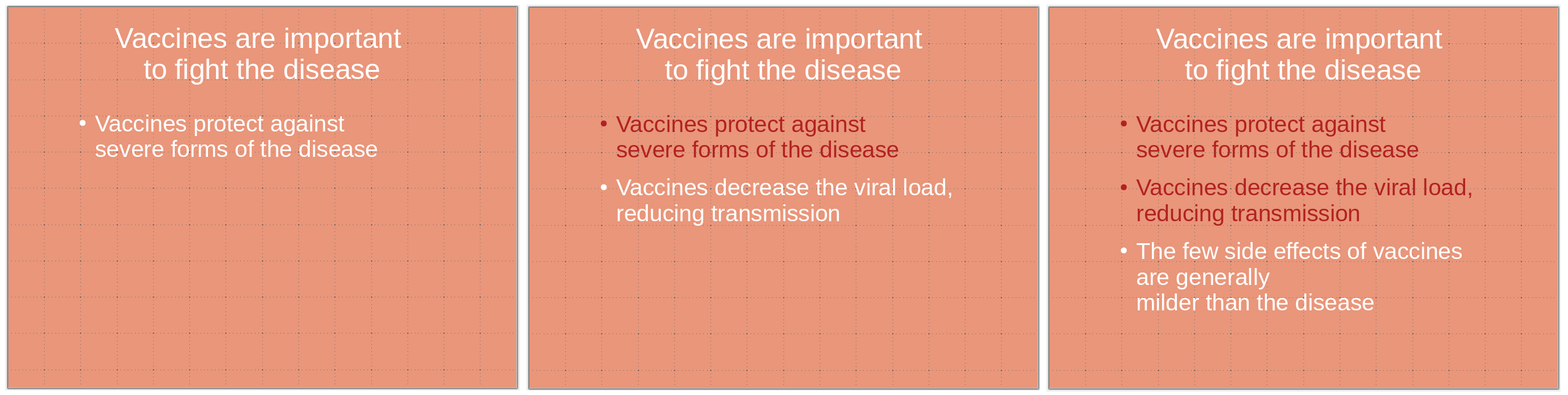
2) Avoid slides with only textual content. In particular, except for quotes, do not write down what you are saying. The audience will be torn between listening to you and reading the slide content. Moreover, slightly changing how you express a point might create dissonance, generating confusion.
3) Bullet points constitute an exception to the tip above since they can be the sole content of a slide. If you use bullet points, highlight the current point while keeping the previous ones visible. Some people might need time to process them. Depending on the presentation, it can also maintain the logic of the demonstration in everyone’s mind.
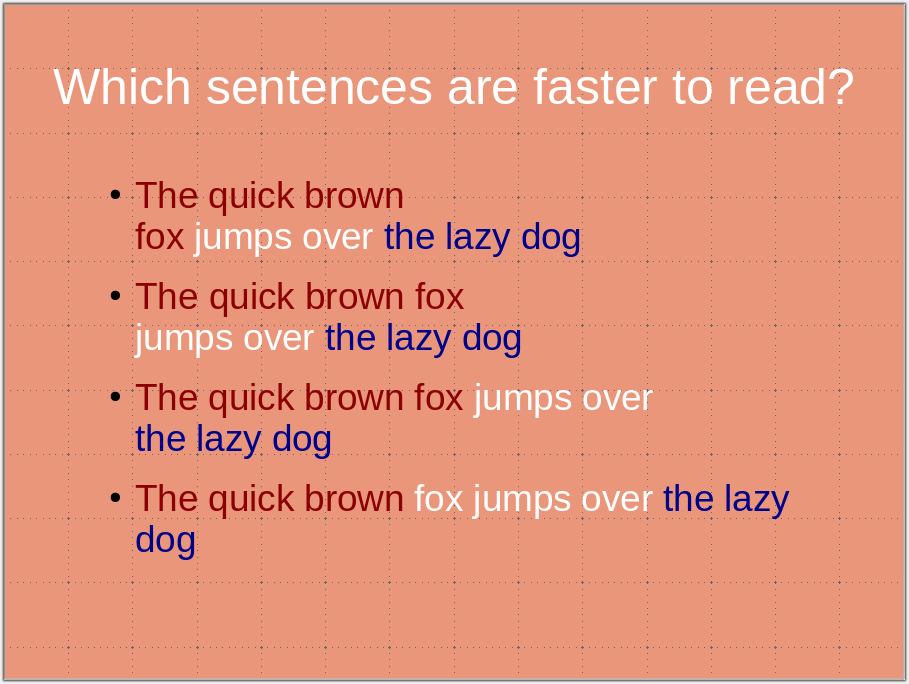
4) Use carriage returns wisely and do not cut expressions or statements. This would slow down the reader, who focuses on the odd break instead of the message. (Also, for the sake of future processing, do not use hard return [new paragraphs ¶] within a sentence or a statement. Use soft returns [line break ↵] instead).
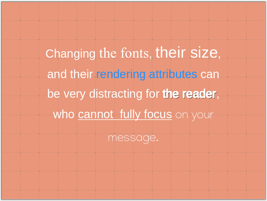
5) Maintain a consistent visual style, including colour codes and fonts. Changing the style distracts the audience. You want all their attention focused on your message rather than following meaningless visual cues. If possible, use the same font size in the same context. If you cannot, it might signal that you have too much text on the slide.
6) Use colour-blind-friendly palettes. About 5% of the population presents some form of colour-blindness, most often red-green. Showing images with green and red fluorescences or a PCA/tSNE/UMAP with red and green points might be a significant strategic error. Not only could your message be lost, but you might also aggravate some audience members (particularly critical in case of a job interview or grant application). There are many resources available providing advice and palettes, such as
https://davidmathlogic.com/colorblind
https://thenode.biologists.com/data-visualization-with-flying-colors/research/
http://mkweb.bcgsc.ca/colorblind/
Note that changing an image’s hue is perfectly acceptable as it does not alter the signal’s dynamic range or add or remove information. The colours of most biological imaging are artificially added by the acquisition software anyway.
7) Use sans-serif fonts. While serif fonts (Palatino, Times new roman, Computer modern) are still quite frequent in text documents. However, sans-serif versions (Arial, Helvetica, Calibri) are crispier and easier to read in presentations.
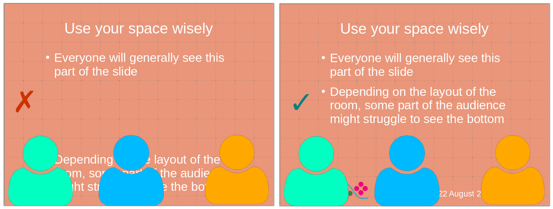
8) Do not put critical information at the bottom of the slide. Depending on the settings of the room where you give the presentation, the bottom of the slide might be hard to see or even masked by the heads of people in the front rows. Use the bottom part of the slide to put logos, date, etc.
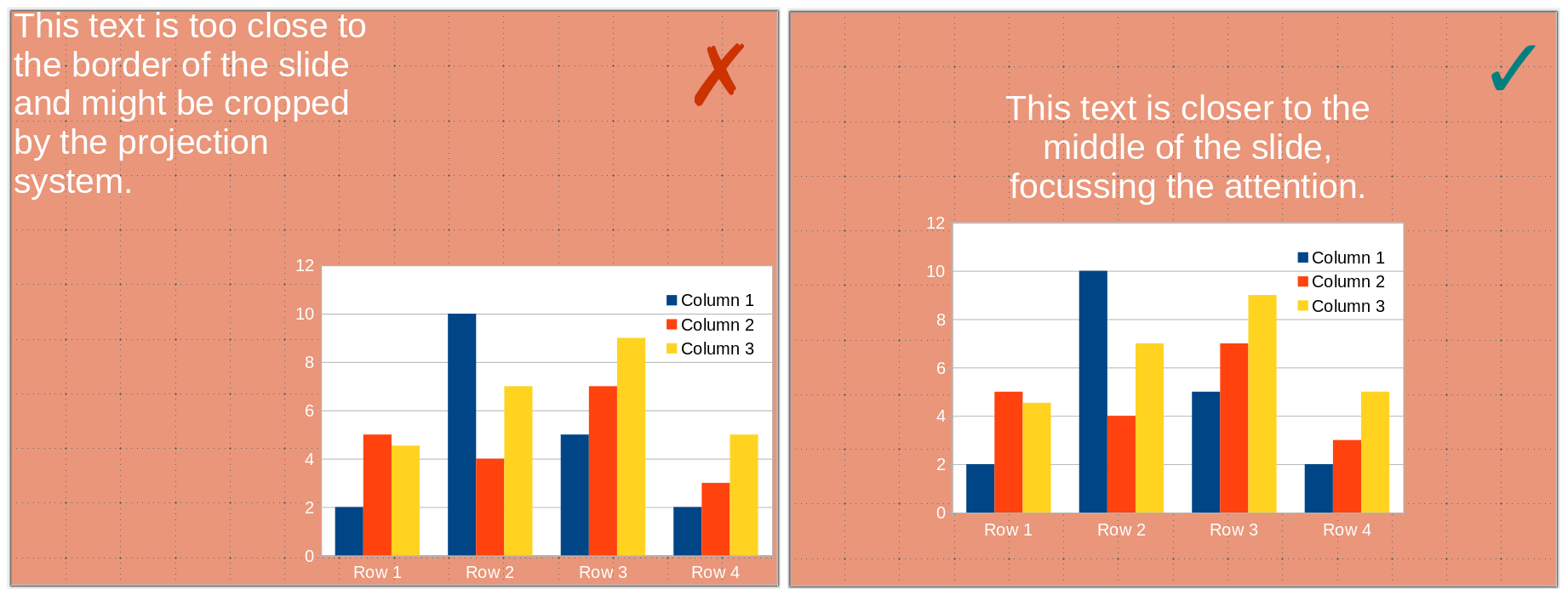
9) Do not put information close to the borders. Some projectors might crop your slides, and you will lose information. Margins also focus the vision, insulating your visual from the surroundings.
10) Finally, and most importantly, proofread, debug, and test your presentation. Test it yourself, trying very hard to be in the position of an audience not knowing its content, and test it with critical friends who are not too familiar with its content but can understand it.