The many faces of modelling in systems biology

By Nicolas Gambardella

COVID-19 pandemics put mathematical models of biological relevance all over daily newspapers and TV news, raising their profile for the non-scientists. In the life sciences, while mathematical models have always been at the core of some disciplines, such as genetics, they really became mainstream with the rebirth of systems biology a couple of decades ago. However, there are many different modelling approaches, and even specialists often ignore methods they do not use regularly or have not been taught.

After a historical overview, this blog post will then attempt to classify the main types of models used in systems biology according to their principal modalities.

What is the goal of using mathematical models in the life sciences in the first place? Three main aims came out roughly sequentially during the XX century, following the path physics followed over the past two millennia. First, mathematics helps describe the structure and dynamics of living forms and their productions. These models may rely on supposed underlying laws, be purely descriptives, such as the allometric laws. A great example is the famous book “On Growth and Form” by D’Arcy Thompson, attempting to understand living forms based on physical laws.

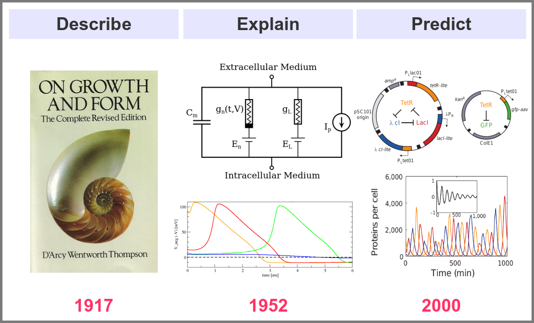
The second aim is to explain the shape and function of living forms. How do the properties of life’s building blocks explain what we can observe? In their masterwork, Alan Hodgkin and Andrew Huxley predicted the existence of ionic channels within the cell membrane and, using a mathematical model, explained how neurons generate action potentials (a work for which they got the Nobel prize).

Finally, can we predict how a system will behave, and can we invent new systems that will behave the way we want them to? This is the purpose of synthetic biology, exemplified in the figure below by the pioneering work of Michael Elowitz and Stanislas Leibler, who built the “repressilator”, a synthetic construct exhibiting sustained oscillations maintained through generations of bacteria.

Obviously, there are no strict boundaries between the three aims, and most models seek to describe, explain, and predict the structures and behaviours of living systems.

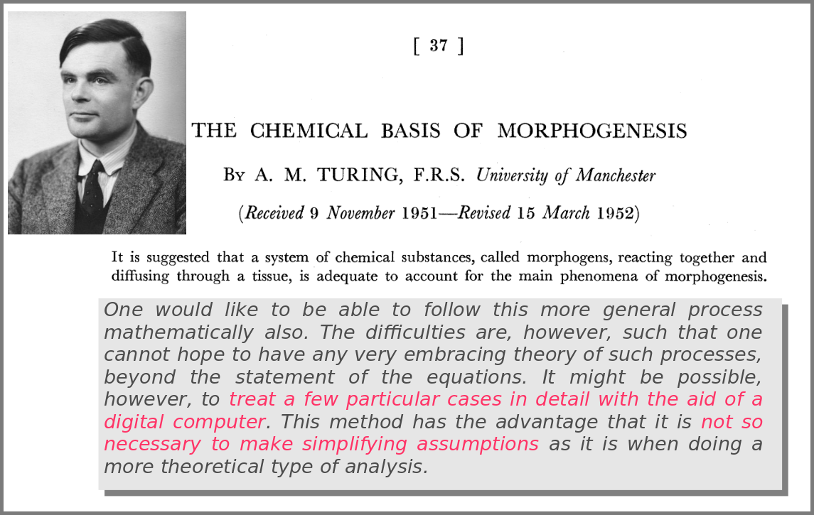
A major shift in the use of mathematical models was the introduction of numerical simulations, made feasible by the invention of computers. The benefits have been laid out by one of the inventors of such computers in an article that indeed contained complex mathematical models but no simulations. In his famous 1952 paper introducing morphogens, Alan Turing suggested that using a digital computer to simulate specific cases of a biological system would allow avoiding the oversimplifications required by analytic solutions.

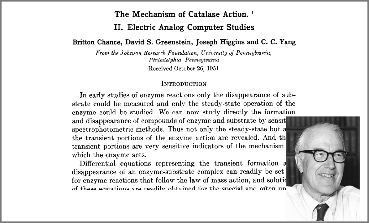
This wish was granted the very same year first by Britton Chance, who built a computer (an analogue one at the time) specifically to solve a differential equation model of a small biochemical pathway.

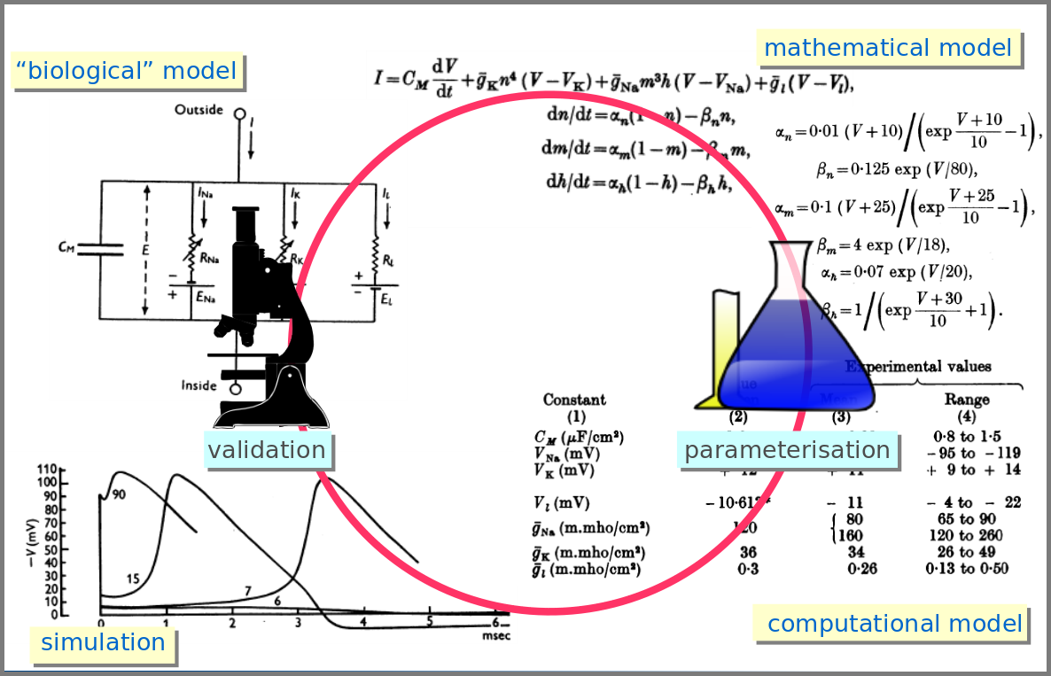
1952 was also when Hodgkin and Huxley published the action potential model mentioned above, a real Annus Mirabilis for computational modelling in the life sciences.

Before going further, we should ask ourselves, “what is a mathematical model”? According to Wikipedia (as of 4th July 2022), A mathematical model is a description of a system using mathematical concepts and language. I consider that three essential categories of components form mathematical models in systems biology.

Variables represent what we want to know or what we want to compare with the observations. They can characterise a physical entity, e.g., the concentration of a substance, the length of an object or the duration of an event, or be derived from the model itself, for instance, the maximum velocity of an enzymatic reaction. 

Relationships mathematically link variables together and represent what we know or what we want to test. They can be static, an affinity constant linked to concentrations or dynamic, such as a rate of change depending on concentrations. Relationships are not necessarily equations. For instance, a sampling might link a variable to a statistical distribution, and logic models use logical statements to attribute values to variables. 

Finally, a much-underestimated category is formed by constraints put on the model. Those represent the context of the modelling project or what we consciously decide to ignore. Some constraints are properties of the world, e.g., a concentration must always be positive, the total energy is conserved, and some are properties of the model, such as boundary conditions and objective functions for optimisation procedures. Initial conditions – the values of variables before starting a numerical simulation – are also crucial since a given model might behave differently with different initial conditions, even if neither variables nor relationships are changed.

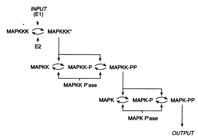
However, the mathematical model itself is only one brick of a systems biology’s modelling and simulation project as in any natural science domain. Since these models aim to be mechanistic, i.e., anchored in underlying molecular, cellular, tissular, and physiological processes, the first step is to conceptualise a “biological model”. For instance, a biochemical pathway will be a collection of chemical reactions. In the case of Hodgkin and Huxley, who did not know the underlying molecules, the mechanism was based on an electrical analogy, ionic channels being represented by electrical conductances. The “mathematical model” is made up of mathematical relationships linking the variables and constraints. A “computational model”, using the “mathematical model” in conjunction with observed or estimated values, is then simulated. The result is compared with observations, and the loop is iterated.

Now let’s explore the different facets of models used in systems biology, and marvel at their diversity

The variables of a model can represent biological reality at different granularities. In some logical models (often wrongly called Boolean networks), a variable can represent a state, such as presence or absence, 1, 2, 3. Detailed models at the “mesoscopic scale” might represent individual molecules, where a separate variable represents every single particle. Variables can also represent discrete populations of molecules, for instance, the number of molecules of a given chemical class, whose evolution is simulated by stochastic algorithms. In chemical kinetics, the variables whose change is determined using ordinary differential equations often represent continuous concentrations. Finally, some models gloss over the physical parts altogether and use fields to represent what could happen to them.

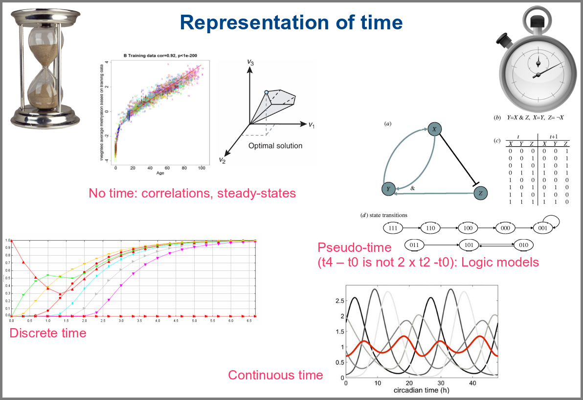
Numerical simulations most often represent the evolution of variable values over “time”. However, the granularity of this “time” may vary. At an extreme, we have models with no representation of time, such as regression models, or implicit representation of time, such as steady-states models. In logical models, as in Petri Net, simulations usually progress along a pseudo-time, where one cannot compare numbers of steps. Time can be discrete, numerical simulations computing a system’s state at fixed intervals, for instance, one second. Finally, models can consider time as continuous, simulations being iterated at various timepoints decided by numerical solvers (note that software might still return results at fixed intervals).

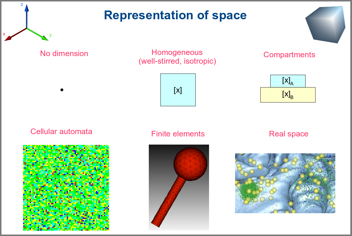
Spacetime being a thing, we also have as many different representations of space. Starting with no space at all, for instance, in noncompartmental analyses of pharmacokinetic models. Space can also be represented by a single homogenous (well-stirred) and isotropic compartment or several of them connected by variables and relationships (multi-compartment models, a.k.a. bathtub models). Cellular automata constitute a particular case, where each compartment is also a model variable whose status depends on its neighbours’. An extension of the multi-compartment modelling represents realistic biological structures using finite elements, each considered homogeneous and isotropic. Finally, space might be represented by continuous variables, where the trajectory of each molecule can be simulated.

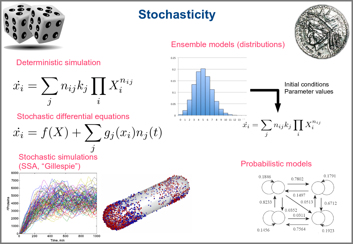
Variability and noise are unavoidable parts of any observation of the natural world, including living systems. Variability can be extrinsic (e.g., due to technical variability), or intrinsic (e.g., actual differences between cells or samples). True noise depends on the size of the system. Taking all those into account in the models can thus be important, and different approaches present different levels and types of stochasticity. As with the other modalities above, stochasticity might be entirely absent, models and simulations being deterministic. One can add different and arbitrary types of noise to simulations with stochastic differential equations. The stochastic aspect might instead emerge directly from the structure of the model, as with the Stochastic Simulation Algorithms (a.k.a. algorithms of the “Gillespie” type). Variability can also be taken into account prior to the simulations, for instance, by sampling initial conditions from distributions, as with ensemble modelling. Finally, in probabilistic models such as Markov models, the entire iteration of the system is based on the probabilities of switching states.

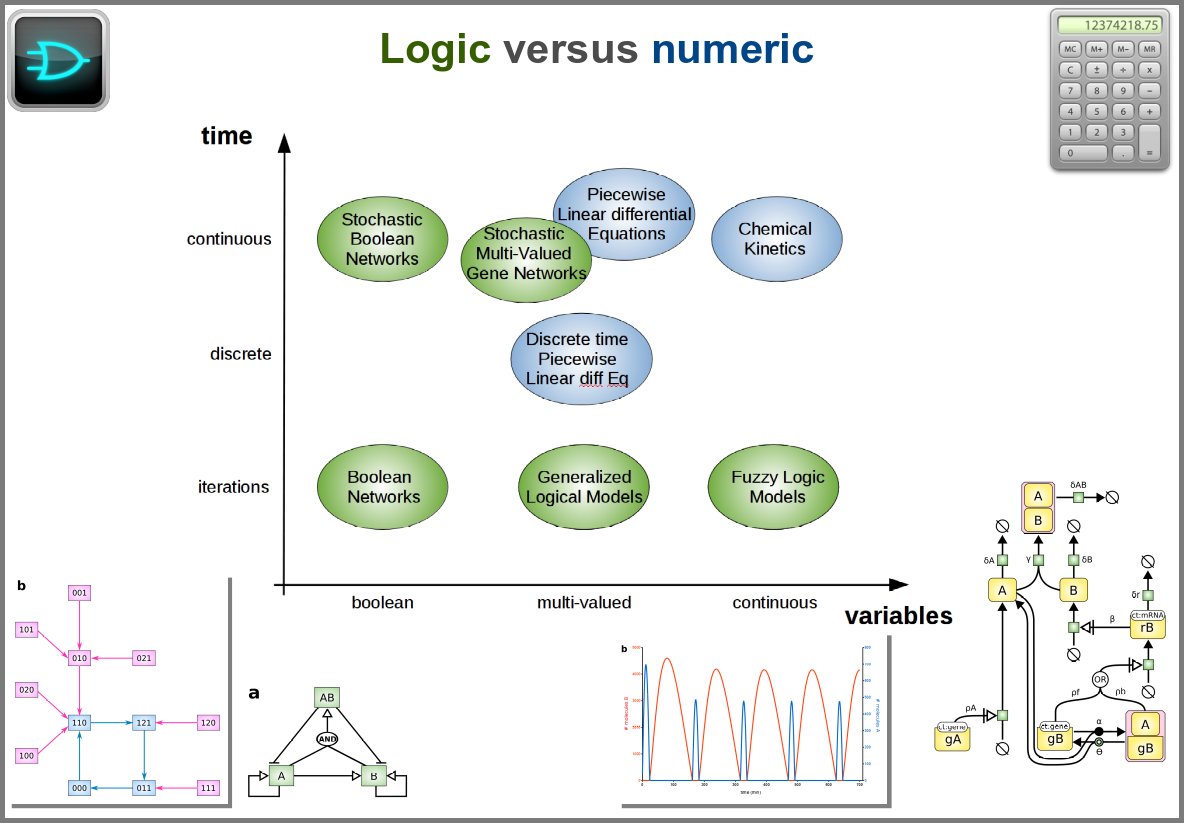
Finally, there are two large families of models based on the type of algorithms used to update the variables. One can compute a variable’s new value by calculating its value either using numerical combinations of previous variables’ values or logic rules taking into account other variable states. Contrary to widespread belief, not all logic models use pseudo-time and Boolean variables. Stochastic Boolean networks can use continuous time, and fuzzy logic models can base their decision on continuous variable values.

Those modalities can be combined in many ways to produce an extremely rich toolkit of modelling approaches. One of the most frequent sources of pain when modelling biological systems is to start with a methodological a priori, often because we are comfortable with an approach, we have the necessary software, or we don’t know better. Doing so can result in under-determined models, endless iterations and failure to get any result.  The choice of a modelling approach should be first and foremost based on:
1) the question asked, and
2) the data available to build and validate the model.

References

Chance, B., Greenstein, D. S., Higgins, J. & Yang, C. C. (1952) The mechanism of catalase action. II. Electric analog computer studies. Arch. Biochem. Biophys. 37: 322–339. doi:10.1016/0003-9861(52)90195-1

Hodgkin, A.L., Huxley, A.F. (1952). A quantitative description of membrane current and its application to conduction and excitation in nerve. The Journal of Physiology117 (4): 500–44. doi:10.1113/jphysiol.1952.sp004764

Stanislas Leibler; Elowitz, Michael B. (2000-01-20). “A synthetic oscillatory network of transcriptional regulators”. Nature 403 (6767): 335–338. doi:10.1038/35002125.

Thompson, D. W., 1917. On Growth and Form. Cambridge University Press.

Turing, A. M. (1952). “The chemical basis of morphogenesis”. Philosophical Transactions of the Royal Society of London B237 (641): 37–72. doi:10.1098/rstb.1952.0012.

Vaccin efficace sur toutes les sous-populations mais apparemment pas sur l’ensemble de la population – le paradoxe de Simpson

Par Nicolas Gambardella

Les dernières statistiques d’Israël et du Royaume-Uni sur la covid-19 dans les populations vaccinées et non vaccinées sont devenues virales. L’une des principales raisons de ce succès dans certains milieux est qu’elles montrent apparemment que les vaccins contre le virus de la covid ne sont plus efficaces ! Ce n’est bien entendu pas le cas. Si les anticorps circulants produits par une vaccination complète semblent diminuer avec une demi-vie d’environ six mois, la protection reste très forte contre la maladie, qu’elle soit modérée ou sévère. La protection contre l’infection reste également robuste pendant les premiers mois suivant la vaccination, quel que soit le variant. Comment expliquer dès lors le résultat apparemment paradoxal selon lequel le taux de mortalité par covid est le même dans les populations vaccinées et non vaccinées ? Plusieurs facteurs peuvent être mis en cause. Par exemple, dans la plupart des ensembles de données utilisés pour calculer l’efficacité, les personnes pré-infectées non vaccinées ne sont pas retirées. Cependant, je voudrais aujourd’hui mettre en avant une autre raison car je pense qu’il s’agit d’un piège dans lequel les apprentis analystes de données tombent très fréquemment : Le paradoxe de Simpson.

Le paradoxe de Simpson se produit quand une tendance présente dans plusieurs sous-populations disparaît, voire s’inverse, lorsque toutes ces populations sont aggrégées. Cela est souvent dû à des facteurs de confusion cachés. La situation est bien illustrée dans la figure suivante obtenue de Wikimedia commons. Alors que la corrélation entre Y et X est positive dans chacune des cinq sous-populations, cette corrélation devient négative si l’on ne distingue pas les sous-populations.

Qu’en est-il de la vaccination contre le SRAS-CoV-2 ? Jeffrey Morris explique sur son blog l’impact du paradoxe de Simpson sur l’analyse des données d’Israël de manière précise et éclairante, bien mieux que je ne pourrais le faire. Cependant, son excellente explication est assez longue et détaillée, et en anglais. J’ai donc pensé que je pourrais en donner une version courte ici, avec une population imaginaire, simplifiée, bien que réaliste.

Comme évoqué dans un précédent billet, la donnée cruciale ici est la structure de la population par classe d’âge . Pour simplifier, nous prendrons une pyramide des âges assez simple, proche de ce que l’on observe dans les pays développés, c’est-à-dire homogène avec seulement une diminution au sommet, ici 1 million de personnes par décennie, et 1 million pour toutes les personnes de plus de 80 ans.

La première variable importante est le taux de vaccination. Comme les campagnes de vaccination ont commencé avec les populations âgées et que l’hésitation vaccinale diminue fortement avec l’âge, le taux de vaccination est beaucoup plus faible dans les populations plus jeunes.

La deuxième variable importante est le taux de létalité de la maladie (Infection Fatality Rate, IFR) pour chaque tranche d’âge. Là aussi, l’IFR est beaucoup plus faible dans les populations les les plus jeunes. Et c’est là que se trouve le nœud du problème : taux de vaccination et taux de létalité ne sont pas des variables indépendantes ; les deux sont liées à l’âge.

Supposons que notre vaccin ait une efficacité absolue de 90 % et que, pour simplifier, cette efficacité ne dépende pas de l’âge. Le nombre de décès dans la population non vaccinée est :

Deaths unvaccinated = round(unvaccinated * IFR)

La fonction arrondi est pour éviter les fractions de personnes mortes. Le nombre de décès dans la population vaccinée est de :

Deaths vaccinated = round(vaccinated * IFR * 0.1)

0.1 = (100 – efficacy)/100

Maintenant que nous avons le nombre de décès dans chacune de nos populations, vaccinées ou non, nous pouvons calculer les taux de mortalité, c’est-à-dire décès/population, et calculer l’efficacité comme suit :

(death rate unvaccinated – death rate vaccinated)/(death rate unvaccinated)*100

Sans surprise, l’efficacité pour toutes les tranches d’âge est de 90%. Les 100% pour les <20 ans viennent du fait que 0,04 décès est arrondi à 0.

Cependant, si l’on fusionne toutes les tranches d’âge, l’efficacité disparaît complètement ! De plus, il semblerait que le vaccin augmente le taux de mortalité ! Le fait de ne pas être vacciné présente une protection contre le décès de 32% !

Il s’agit bien sûr d’un résultat erroné (nous le savons ; nous avons créé l’ensemble de données avec une efficacité vaccinale réelle de 90% !). Cet exemple utilise l’efficacité d’un vaccin. Cependant, le paradoxe de Simpson guette souvent l’apprenti analyste de données au tournant. Les facteurs de confusion doivent être recherchés avant toute analyse statistique, et les populations doivent être stratifiées en conséquence.

A vaccine effective on all subpopulations but apparently not on the entire population – the Simpson’s paradox

By Nicolas Gambardella

The latest statistics from Israel and the UK on COVID-19 in vaccinated and unvaccinated populations are getting viral. One of the main reasons for this success in some circles is that they apparently show that the vaccines against the COVID-19 virus are no longer effective! This is, of course, not the case. While the circulating antibodies triggered by a vaccination course seem to decline with a half-life of about six months, the protection remains very strong against disease, mild or severe. The protection against infection is also still robust during the first months after vaccination, whatever the variant. What could then explain the apparent paradoxical result that people die from COVID-19 as frequently in vaccinated populations as in unvaccinated ones? Several factors might be involved. For instance, in most datasets used to compute effectiveness, unvaccinated pre-infected people are not removed. However, today I would like to highlight another reason because I think it is a trap in which casual data analysts fall very frequently: The Simpson’s paradox.

The Simpson’s paradox is a situation where a trend present in several subpopulations disappears or even reverts when all those populations are pulled together. This is often due to hidden confounding variables. The situation is well illustrated in the following figure obtained from Wikimedia commons. While the correlation between Y and X is positive in each of the five subpopulations, this correlation becomes negative if we do not distinguish the subpopulations.

What about the vaccination against SARS-CoV-2? Jeffrey Morris explains on his blog the impact of Simpson’s paradox on the analysis of Israel data in a precise and enlighting manner, way better than I could. However, his excellent explanation is relatively long and detailed. So I thought I could give a short version here, with an imaginary, simplified, albeit realistic population.

As discussed in a past post, the crucial data here is the age structure of the population. To simplify, we’ll take a pretty simple age pyramid, close to what we observe in developed countries, i.e., homogenous with only a decrease on top, here 1 million people per decade, and 1 million for everyone over 80.

The first important variable is the rate of vaccination. Because vaccination campaigns started with the elderly populations, and that vaccine hesitancy strongly decreases with age, the vaccination rate is much lower in younger populations.

The second important variable is the disease’s lethality – the Infection Fatality Rate – for each age group. Here as well, the IFR is much lower in the younger group. And here lies the crux of the problem: rate of vaccination and IFR are not independent variables; both are linked to age.

Let’s assume that our vaccine has an absolute efficacy of 90%, and for simplicity, this efficacy does not change with age. The number of deaths in the unvaccinated population is:

Deaths unvaccinated = round(unvaccinated * IFR)

The “round” function is to avoid half-dead people. The number of deaths in the vaccinated population is:

Deaths vaccinated = round(vaccinated * IFR * 0.1)

where 0.1 = (100 – efficacy)/100

Now that we have the number of deaths in each of our populations, vaccinated or not, we can calculate the death rates, i.e. deaths/population, and compute the efficacy as:

(death rate unvaccinated – death rate vaccinated)/(death rate unvaccinated)*100

Unsurprisingly, the efficacy for all age groups is 90%. The 100% for the <20 comes from the fact that 0.04 death is 0.

HOWEVER, if we merge all the age groups together, the efficacy completely disappears! Not only that, it seems that the vaccine actually increases the death rate!!! Being unvaccinated presents an efficacy of 32% against death!

This is of course an artefact (we know that; we created the dataset with an actual vaccine efficacy of 90%!). This example used vaccine efficacy. However, Simpson’s paradox is awaiting the casual data analyst behind any corner. Confounding variables must be tracked down before doing any statistical analysis, and populations must be stratified accordingly.

Variability structure to assess dataset quality – the case of COVID-19 deaths

By Nicolas Gambardella

There are many discussions on classical and social media about the quality of datasets reporting deaths by COVID-19. Of course, depending on the density of healthcare systems and the reporting structures, the reported toll will represent a certain proportion of actual deaths (60% in Mexico, 30% in Russia, between 10 and 20% in India, according to the health authorities of these countries). Moreover, most countries maintain two tallies, one based on deaths within a certain period of a positive test for infection by SARS-CoV-2 and one based on death certificates mentioning COVID-19 as the cause of death. That said, both factors should proportionally affect the numbers and are beyond human intervention. Now, can we detect if datasets have been tampered with or even entirely made up?

One way to do so is to look at how the variability evolves over time and depending on absolute numbers. Below, I used the dataset from Our World in Data (as of 11 September 2021) to look at the reported COVID-19 death tolls for a specific set of countries. In most countries, the main variability comes from the reporting system. As such it should be proportional to the daily deaths (basically a percentage of the reports are coming late). On top of it, we should find an intrinsic variability, which should increase as the square root of the daily deaths. So, the variability should be relatively higher outside the waves.

First, let’s look at the datasets from countries with well-developed and accurate healthcare systems. Below are plotted the standard deviation of the daily death count over seven days against the daily amount of deaths (averaged over seven days) in the United Kingdom, Brazil, France, and the United States.

Although we see that the variability of… the variability is more important in the USA and France, there is a clear linear relationship between the absolute daily number of deaths and its standard deviation. The Pearson correlation coefficient for the UK is 0.97 (Brazil = 0.93, France=0.85, USA = 0.77). If we combine the four datasets, we can see that the relationship is incredibly similar in those five countries. The slope of the curve, representing the coefficient of variation, i.e., the standard deviation divided by the mean, throughout the scale is: UK = 0.35, Brazil = 0.35, France=0.48, USA = 0.26).

Some countries exhibit a different coefficient of variation, meaning a higher reproducibility of reporting. Iran’s reported deaths always looked very smooth to me. Indeed, the CV is 0.078, which indicates a whopping 4.5 more precise reporting. Although I am certain that Iran’s healthcare system is excellent, this figure looks suspiciously low.

When it becomes interesting is when the linear relationship is lost. Turkey’s daily death reports are also very smooth. However, the linearity between the variability is now mostly lost, with a standard deviation that remains almost constant no matter the absolute amount of deaths. If I had to guess, I would say that the data is massaged, albeit by people who did not really think about the reason underpinning the variability and what structure it should have to look natural.

And finally, we reach Russia. From the Russian statistics agency itself, we know that the official death toll from the government bears no relationship whatsoever with reality. What is interesting is that the people producing the daily reporting went further than the Turkish ones and did not even try to produce realistically looking data. On the contrary, the variability was smoothed out even more for the highest absolute death tolls, generating a ridiculous bridge-shaped curve.

Was this always the case? How did the coefficient of variation evolve since the beginning of the pandemics? Looking again at the UK and Brazil, we can see that the average CV stays pretty much steady over time with an increased variability between the big waves. We see nicely that the CV peaks and troughs alternate between Brazil and the UK, corresponding to the offset between waves.

The situation is a bit different for Turkey and Russia. The Turkish dataset shows a CV collapsing after the first six months of the pandemics. And indeed, the daily death reporting between October 2020 and March 2021 is ridiculously smooth. However, it seems someone decided that it was a bit too much and started to add some noise (that was, unfortunately for them, not adequately scaled up.)

Russia followed the opposite path. While during the pandemics’ initial months, the CV was on par with those of western datasets, all that quickly stopped, and the CV collapsed. This trend culminated with the current preposterous death tools, between 780 and 800 deaths every single day for the past two months. The Russian government is basically showing the world the numerical finger.

Âges, vaccination et infections

Par Nicolas Gambardella

Combien de fois voit-on ces jours-ci passer le commentaire suivant sur les réseaux sociaux : « La plupart des cas de covid-19 sont maintenant chez des personnes vaccinées. C’est la preuve que les vaccins ne fonctionnent pas. »

Pas vraiment, non.

Tout dépend des populations relatives de vaccinés et de non-vaccinés. Dans un précédent billet, j’ai présenté un résumé de l’efficacité des vaccins sur les différentes variantes du SARS-CoV-2. Chaque figure représentait l’efficacité globale. Cependant, les taux de vaccination dépendent de l’âge, car la plupart des pays ont commencé à vacciner les personnes âgées en premier. Voyons donc si nous pouvons être plus précis.

Public Health England a récemment publié la dernière version de son SARS-CoV-2 variants of concern and variants under investigation in England. Il présente les détails des infections par les variants identifiés chez les personnes vaccinées et non vaccinées. Concentrons-nous sur le variant Delta.

Mais, mais, mais… chez les personnes de plus de 50 ans, seuls 976 cas ont été recensés chez les non-vaccinés, tandis que 3953 personnes ayant reçu une dose et 3546 personnes entièrement vaccinées ont été infectées ! Ce vaccin n’offre donc aucune protection, CQFD ?

Pas si vite. Voyons si nous pouvons calculer l’efficacité du vaccin, d’accord ? Pour cela, nous avons d’abord besoin du taux de vaccination par tranche d’âge. Heureusement, ce taux est publié chaque semaine par Public Health England. Comme le tableau porte sur les cas déclarés jusqu’au 21 juin, nous utiliserons les données publiées le 24 juin, qui comprenaient les vaccinations jusqu’au 20 juin. Bien sûr, tous les cas Delta ne sont pas apparus le 20 juin. Cependant, la plupart d’entre eux sont apparus au cours des derniers mois. De plus, l’administration de la 2e dose a atteint un plateau pour la population âgée.

Ensuite, nous devons savoir combien de personnes appartiennent à chacune de ces tranches d’âge. Pour cela, nous pouvons utiliser la population de 2020 prévue par l’Office for National Statistics sur la base des chiffres de 2018 (la pyramide des âges indique des pourcentages pour chaque année, mais nous pouvons télécharger les chiffres réels pour chaque tranche de 5 ans d’âge).

Nous pouvons maintenant calculer, pour chaque tranche d’âge, combien de personnes ont reçu deux doses, une seule dose ou ne sont toujours pas vaccinées (j’additionne les hommes et les femmes).

Âge1 dose2 dosesnon-vaccinés
0-17 56230 56584 14033150
18-24605991 726010 4318151
25-29 837303 728416 2924493
30-341587417 847650 2100138
35-39 1786373 10030801628239
40-44 1702290 1268632 1127652
45-491583028 1838131 890384
50-54548632 3378858 690501
55-59 396658 3567857 549185
60-64202651 3272462 387171
65-6995785 2998587 268383
70-7459031 3118291 191577
75-79 41180 2259096 111907
80+84457 3159787 164372
total9587027 28223441 29385301

Ces chiffres font apparaître 24118034 personnes de plus de 50 ans, 21754937 avec deux doses et 2363096 non vaccinées, dix fois plus de personnes complètement vaccinées ! Ainsi, les 3546 et 976 cas représentent 0,0163 % et 0,0413 % des populations respectives. En d’autres termes, la vaccination complète offre une protection de 60,5 % contre le variant Delta.

Le même calcul sur les moins de 50 ans montre une protection encore meilleure, à 70,8 % (ce qui montre encore qu’il faut vacciner les plus jeunes si nous voulons protéger les plus vieux et se débarrasser de ce virus).

Plus la couverture vaccinale est bonne, plus on observera de cas dans la population vaccinée. Cela ne signifie pas que le vaccin n’est pas efficace !

Ages, vaccination and infections

By Nicolas Gambardella

How many times are we seeing the following comment on social media those days: “Most covid-19 cases are now in vaccinated people. This is the proof that vaccines don’t work”.

Not quite.

It all depends on the relative populations of vaccinated versus unvaccinated. In a previous post, I presented a summary of vaccine effectiveness on different SARS-CoV-2 variants. Each figure represented the global effectiveness. However, vaccination rates depend on age since most countries started to vaccinate the elderly first. So let’s see if we can be more precise.

Public Health England recently published its latest SARS-CoV-2 variants of concern and variants under investigation in England. It contains the details of infections by identified variants in vaccinated and unvaccinated people. Let’s focus on the Delta variant.

Whaaaat? In people over 50 years of age, 0nly 976 cases in unvaccinated, while 3953 people with one dose and 3546 fully vaccinated people were infected! Surely this vaccine does not offer any protection, right?

Let’s see if we can compute the vaccine effectiveness, shall we? For that, we need first the vaccination rate per age. Fortunately, this is published by Public Health England every week. Since the table about report cases up to June 21, we will use the vaccinations data published on June 24, including vaccinations up to June 20. Of course, not all the Delta cases have appeared on June 20. However, most of them have appeared in the past few months. Moreover, administration of the 2nd dose has plateaued for the elderly population.

Then, we need to know how many people belong to each of those age groups. For that, we can use the 2020 population predicted by the Office for National Statistics based on the 2018 figure (the age pyramid shows percentages for each year, but we can download actual numbers for each 5-years age group).

We can now compute for each age group how many people had two doses, only one dose, or are still unvaccinated (I sum up males and females).

Age1 dose2 dosesunvaccinated
0-17 56230 56584 14033150
18-24605991 726010 4318151
25-29 837303 728416 2924493
30-341587417 847650 2100138
35-39 1786373 10030801628239
40-44 1702290 1268632 1127652
45-491583028 1838131 890384
50-54548632 3378858 690501
55-59 396658 3567857 549185
60-64202651 3272462 387171
65-6995785 2998587 268383
70-7459031 3118291 191577
75-79 41180 2259096 111907
80+84457 3159787 164372
total9587027 28223441 29385301

These numbers show 24118034 people over 50, 21754937 with two doses and 2363096 unvaccinated, tenfold more fully vaccinated! Thus, the 3546 and 976 cases represent 0.0163% and 0.0413% of the respective populations. In other words, the full vaccination offers 60.5% protection against the Delta variant.

The same calculation on under-50 shows even better protection at 70.8% (This, again, shows that we must vaccinate young people if we want to protect the older ones and get rid of this virus.

The better the vaccine coverage, the more cases will be observed in the vaccinated population. This does not mean the vaccine is not effective!

Getting the best value for a model parameter

By Nicolas Gambardella

A crucial part of any computational modelling is getting parameter values right. By computational model, I mean a mathematical description of a set of processes that we can then numerically simulate to reproduce or predict a system’s behaviour. There are many other kinds of computational or mathematical models used in computational biology, such as 3D models of macromolecules, statistical models, machine learning models and more. While some concepts dealt with in this blog post would actually be relevant, I want to limit the scope of this post to what is sometimes called “systems biology” models.

So, we have a model that describes chemical reactions (for instance). The model behaviour will dictate the values of some variables, e.g. substrate or product concentrations. We call those variables “dependent” (“independent variables” are variables whose values are decided before any numerical simulation or whose values do not depend on the mathematical model, such as “time” for standard chemical kinetics model). Another essential set of values that we have to fix before a simulation consists of the initial conditions, such as initial concentrations.

The quickest way to get cracking is to gather the variable values from previous models (found for instance in BioModels), from databases of biochemical parameters such as Brenda or SABIO-RK, or from patiently sieving scientific literature. But what if we want to improve the values of the variables? This blog post will explore a few possible ways forward using the modelling software tool COPASI, namely, sensitivity analysis, picking up variable values and looking at the results, parameter scans, optimisation, and parameter estimation.

Loading a model in COPASI

First, we need to have a model to play with. The post will use the model of MAPK signalling published by Huang and Ferrell in 1996. You can find it in BioModels where can download the SBML version and import it in COPASI. Throughout this post, I will assume the reader masters the basic usage of COPASI (create reactions, run simple simulations, etc.). You will find some introductory videos about this user-friendly, versatile, and powerful tool on their website.

The model presents the three-level cascade activating MAP kinase. MAPK, MAPKK, and MAPKKK mean Mitogen-activated protein kinase, Mitogen-activated protein kinase kinase, and Mitogen-activated protein kinase kinase kinase, respectively. Each curved arrow below represents three elementary reactions: binding and unbinding of the protein to an enzyme, and catalysis (addition or removal of a phosphate).

The top input E1 (above) is called MAPKKK activator in the model. To visualise the results, we will follow the normalised values for the active (phosphorylated) forms of the enzymes K_PP_norm, KK_PP_norm and K_P_norm, that are just the sums of all the molecular species containing the active forms divided by the sums of all the molecular species containing the enzymes (NB: Throughout the screenshots, the red dots are added by myself and not part of COPASI’s GUI).

Let’s run a numerical simulation of the model. Below you see the activation of the three enzymes, with the swift and supra-linear activation of the bottom one, MAPK, one of the hallmarks of the cascade (the others being an amplification of the signal and an ultrasensitive dose-response which allows to fully activate MAPK with only a touch of MAPKKK activation).

Sensitivity analysis

The first question we can ask ourselves is “What are the parameters that values affect the most the output of our system?”. To do so, we can run a sensitivity analysis. COPASI will vary a bit all the parameters and measure the consequences of these changes on the results of a selected task, here the steady-state of the non-constant concentrations of species.

We see that the most important effect is the impact of MAPKKK activator binding constant (k1) on the concentration of PP-MAPK, which happens to be the final output of the signalling cascade. This is quite relevant since the MAPKKK activator binding constant basically transmits the initial signal at the top of the cascade. You can click the small spreadsheet icon on the right to access coloured matrices of numerical results.

Testing values

All right, now we know which parameter we want to fiddle with. The first thing we can do is visually look at the effect of modifying the value. We can do that interactively with a “slider“. Once in the timecourse panel, click on the slider icon in the toolbar. You can then create as many sliders as you want to set values manually. Here, I created a slider that can vary logarithmically (advised for most model parameters) between 1 and 1 million. The initial value, used to create the timecourse above, was 1000. We see that sliding to 100 changes the model’s behaviour quite dramatically, with very low enzyme activations. Moving it well above 1000 will show that we increase the speed of activation of the three enzymes, increase the activation of the top enzyme, albeit without significant gain on K-PP, our interesting output.

Parameter scans

Playing with sliders is great fun. But this is not very precise. And if we want to evaluate the effect of changing several parameters simultaneously, this can be extremely tedious. However, we can do that automatically thanks to COPASI’s parameter scans. We can actually repeat the simulation with the same value (useful to repeat stochastic simulations), systematically scan parameter values within a range, or sampling them from statistical distributions (and nest all of these). Below, I run a scan over the range defined above and observe the same effect. To visualise the scan’s results, I created a graph that plotted the active enzyme’s steady-state versus the activator binding constant.

Optimisation

All that is good, but I still have to look at curves or numerical results to find out the best value for my parameter. Ideally, I would like COPASI to hand me directly the value. This is the role of optimisation. Optimisation if made up of two parts: the result I want to optimise and the parameter to change to optimise it. I will not discuss the possibility to optimise a value. There are many cases for which optimisation is just not possible. For instance, it is not possible to optimise the production of phosphorylated MAPK. Whatever upper bound we would fix for the activator binding constant, the optimal value would end up on this boundary. In this example, I decided to maximise the steady-state concentration of K_PP for a given concentration of KKK_P, i.e. getting the most bang for my buck. As before, the parameter I want to explore is the MAPKKK activator binding constant. I fix the same lower and upper bound as before. COPASI offers many algorithms to explore parameter values. Here, I chose Evolutionary Programming, which offers a good balance between accuracy and speed.

The optimal result is 231. Indeed, if we look at the parameter scan plot, we can see that with a binding constant of 231, we get an almost maximal activation of MAPK with minimal activation of MAPKKK. Why is this important? All those enzymes are highly connected and will act on downstream targets right, left, and centre. In order to minimise side effects, I want to activate (or inhibit) protein as little as necessary. Being efficient at low doses also helps with suboptimal bioavailability. And of course, using 100 times less of the stuff to get the same effect is certainly cheaper, particularly for biologics such as antibodies.

Parameter estimation

We are now reaching the holy grail of parameter search, which is parameter estimation from observed results. As with optimisation, this is not always possible. It is known as the identifiability problem. Using the initial model, I created a fake noisy set of measurements, which would, for instance, represent the results of Western blot or ELISA using antibodies against phosphorylated and total forms of RAF, MEF, and ERK, which are specific MAPKKK, MAPKK, and MAPK.

I can load this file (immuno.txt on the screenshot) in COPASI, and map the experimental values (automatically recognised by COPASI) to variables of the model. Note that we can load several files, and each file can contain several experiments.

I can then list the parameters I want to explore, here the usual activator binding constant, between 1 and 1 million. Note that we can use only some of the experiments in the estimation of given parameters. This allows building extremely powerful and flexible parameter estimations.

We can use the same algorithms used in optimisation to explore the parameter space. The plot represents the best solution. Dashed lines link experimental values, continuous lines represent the fitting values, and circles are the error values.

The value estimated by COPASI for the binding constant is 1009. The “experiment” was created with a value of 1000. Not bad.

This concludes our overview of parameter exploration with COPASI. Note that this only brushes up the topic and I hope I picked your curiosity enough for you to read more about it.

Do you have a model that you want to improve? Do you need to model a biological system but do not know the best method or software tool to use? Drop me a message and I will be happy to have a chat.

Covid-19 arguing, are we all talking about the same thing?

By Nicolas Gambardella

[French version]

Covid-19 affects all of us on a daily basis and discussions about the disease stir passions, whether among politicians, health professionals, scientists, or the general public. Commentary and debate, particularly about the seriousness of the pandemic and how to counter it, are often tainted by inaccuracy and even bad faith due to confusion between different concepts and misunderstanding of some of them. People talk about different things, compare things that are not comparable, and misrepresent what others are saying.

I’m not a doctor or an epidemiologist. My opinions are my own, and I am certainly not in a position to provide advice. This post is not intended to take a position, but to provide some clarity on concepts that have been thrown around in pieces of news and in raging tweets.

Are Covid-19 and SARS-CoV-2 the same thing?

No, Covid-19 and SARS-CoV-2 are not two names for the same thing. Covid-19 is a “disease“, which is a set of symptoms related to an identified common cause (as opposed to a “syndrome“, which is a set of symptoms with an unknown, uncertain, or irrelevant cause). This disease is due to the infection of humans with the SARS-CoV-2 virus. This infection is the cause of the disease, not the disease itself. A large part of the population shows no symptoms after SARS-Cov-2 infection, people are said to be “asymptomatic”. In other words, these people are not sick. According to studies, this population is estimated to be between one-third of those infected to several times the number of people having the disease.

So we can see that there is a big difference in seriousness depending on whether we’re talking about the virus infection or the disease. SARS-CoV-2 infection is generally not very serious compared, for example, to Ebola or rabies viral infections. On the other hand, because of the severe respiratory symptoms and the lack of treatment, Covid-19 disease is actually more dangerous than rabies.

The disease is diagnosed on the basis of symptoms, before hospitalization, during hospitalization, or post-mortem. Only a certain proportion of patients are tested for the presence of the virus. It is generally accepted that for all patients with symptoms of Covid-19 and positive for the virus, the virus is the triggering factor for the disease. But it must be remembered that we are all permanently infected with several viruses (sometimes several strains of the same virus). For patients who are not tested for the presence of the virus, the decision depends on local policies. Hence, for example, the debates on the very low mortality from Covid-19 in Russia, or the real extent of deaths in care homes.

To summarise, not all persons infected with SARS-CoV-2 are sick with Covid-19, and it is possible that in a small proportion of persons diagnosed as sick with Covid-19 (especially in post-mortem diagnoses) the disease was in fact not triggered by SARS-CoV-2.

Above, I used the word “mortality”. So it’s time for a little vocabulary check.

Mortality, Lethality, Case Fatality Rate, Infection Fatality Rate

The “mortality” of a disease is the number of people killed by that disease in a given population, including those without the disease. The “lethality” of a disease is the number of people killed by the disease in patients with the disease. The lethality of a disease does not depend on its “prevalence“, while this is the case with mortality. In most countries, seasonal flu has a much higher mortality rate than Ebola hemorrhagic fever, although the latter has a much higher case fatality rate.

In order to estimate the fatality rate of a given infectious disease, the observed values of deaths in the sick population must be matched. The observed value is the Case Fatality Ratio (CFR). The estimated value is the Infection Fatality Ratio (IFR). One would think that with a well-constructed and careful assessment these numbers are close. They are not. The first reason is described in the previous paragraph (the difference between infection detection and disease diagnosis). The second is that the case-fatality rate changes over time. The first patients diagnosed usually have severe forms, with high mortality. The observed case-fatality rate is therefore very high (an extreme case being 100% if the first patient dies). As the diagnosis is extended to a larger population, and as the management of patients improves, the proportion of people surviving the disease increases. And the case-fatality rate tends to the infection fatality rate i.e., the “true” case fatality rate. This evolution can be seen in the image below, representing the outcome of Covid-19 diseases in Spain (Source https://www.worldometers.info/coronavirus/country/spain/, 23 May 2020). The first patient recovered, and then for a period of time 50% of the patients died, which corresponds approximately to the fraction of deaths of Covid-19 patients on ventilators. Then, the recovery rate increases more or less steadily.

It is very important to understand that if 10% of the patients diagnosed with Covid-19 in a given area and at a given time die from the disease, it absolutely does not mean that 10% of the people infected with the virus will die from it.

Can lethality be compared between countries? Influence of testing policies

In order to assess infection-fatality rates, it is, of course, necessary to measure case fatality rates and to be able to detect cases. There are two types of tests.

So-called serological tests detect the presence of antibodies in the blood that target the virus. These tests can tell if a person has been infected in the past. There are two main problems with these tests. First, at the moment we do not know exactly what proportion of infected people create antibodies. In the case of infected people who have developed Covid-19, it seems that the amount of antibodies is related to the severity of symptoms (probably because symptoms are related to the amount of virus, the “viral load“). The big unknown is for people who have not developed the disease. Second, these tests are generally not very reliable, and in particular, their “sensitivity” is not high enough (more details in this post).

The other type of test detects the presence of the virus in actively infected people. The problem with these tests is that they have to be repeated over and over again. For a few days after infection, the viral load is not sufficient to be detected. Also, after a few weeks, the virus is no longer detectable. A person who had symptoms of Covid-19 can now be negative. Nevertheless, this is the type of test used to calculate case fatality rates. It is therefore clear that the testing policy will influence the calculations. If a country only tests people entering the hospital, the case fatality rate will be higher than if a country tests the whole population. It is therefore not surprising that there is a very clear correlation between case-fatality rates and the number of tests performed per million inhabitants. The graph below is based on Worldometer data from 10 April 2020.

Can lethality be compared between countries? Influence of age structure

Different studies have attempted to calculate an overall lethality rate of Covid-19 for the whole population, see for example here, here, and here. These estimates are based on data obtained by different methods (e.g. disease diagnosis, virus detection, detection of antibodies to the virus) in disparate regions, and analysed in a variety of ways. Not surprisingly, the results are, to say the least, heterogeneous. What they have in common is the desire to determine a “universal” rate. Trying to determine a single lethality for a disease is a justifiable exercise. However, this rate can only be valid for a homogeneous population and will necessarily vary between populations, making comparisons difficult, if not irrelevant.

The first factor is the effect of age. Most respiratory diseases disproportionately affect the elderly. As a result, infections with the viruses that trigger these diseases, such as influenza, show highly age-dependent mortality. Similarly, an estimate of the lethality rate of Covid-19 in China was 0.0016% for children aged 0-9 years and gradually increased to 7.8% for those over 80 years of age, an increase of almost 5,000 times.

If lethality depends on age, so does mortality. However, the relationship is not direct because of the distribution of the population by age group (the population pyramid). There are many more people aged 60 to 85 than there are aged 85 to 110. Although Covid-19 is much more lethal in the latter population, there are more deaths in the former. Since different countries have different age pyramids, this will affect their overall estimated lethality, as shown in the figure below (borrowed from https://theconversation.com/the-coronavirus-looks-less-deadly-than-first-reported-but-its-definitely-not-just-a-flu-133526)

However, beware, things are not that simple. As the UN showed as early as 1955, the global mortality curve is affected by life expectancy. Mortality at age 25 in a country with a life expectancy of 60 is similar to mortality at age 45 in a country with a life expectancy of 70. This is due to the underlying causes of lower life expectancy. Which brings us to the comorbidities.

Can lethality be compared between countries? Influence of comorbidities

Stricto-sensu, comorbidities are the other disorders that will affect the outcome of the disease. However, for this post, I mean all the factors not related to SARS-CoV-2 infection that will affect the lethality of Covid-19. One research paper studied many of these factors in a large cohort of over 96,000 patients from six continents (the purpose of the study was to study the effect of drugs on Covid-19, but that is not our point here). If each year of life increases the risk of Covid-19 death by 1%, one BMI point increases it by 6%, having diabetes by 20%, smoking by 27% and being Hispanic by 50%! These different factors are of course not independent (and therefore not additive).

The impact of ethnicity may come in part from genetic predisposing factors, as well as environmental conditions. For example, it is clear that the transmission of SARS-CoV-2 is affected by temperature and humidity as well as air pollution. It is not impossible that the outcome of the disease may also be affected (possibly via respiratory co-morbidities).

Finally, the state of health systems has a considerable impact on the number of Covid-19 deaths. While most patients have only mild symptoms (let alone asymptomatic people), a fraction of patients requires respiratory assistance. In the worst case, these people need to be intubated. A large fraction of these people survive. In health care systems with insufficient ventilator capacity, all of these patients die. This is regardless of the policies undertaken to contain or eradicate the disease. However, these policies are important to keep the number of patients with severe Covid-19 below the limits of the health care system (“flattening the curve”).

Herd immunity collective or lockdown policies

One of the inexhaustible sources of sterile and acrimonious debate is the battle between advocates of “herd immunity” and those of “isolation”. The latter notion is familiar to everyone and fairly simple to understand. If people are isolated, through social distancing and confinement, they cannot be contaminated or contaminate others. Moreover, if we quarantine the sick long enough for them to recover and get rid of the virus, we can eradicate it. Obviously, in the case of SARS-CoV-2, the goal is no longer to eradicate it, as the number of infected people is too large and their geographical distribution too wide. The aim is to reduce the number of severe diseases as much as possible while waiting for a vaccine.

Herd immunity means that a sufficient portion of the population is exposed to the virus and develops an immune response so that the chance of an unexposed person encountering an infected person is very low. For many viruses, the required proportion of the population is just over 80%. Note that this principle of herd immunity is a key aspect of vaccination campaigns. In order for a campaign to keep disease at bay, a certain portion of the population must be vaccinated. Building up such herd immunity also goes hand in hand with isolating vulnerable people until the required % of immunized people are reached (no one suggests, as is sometimes written, that the herd immunity strategy means sacrificing a % of the population corresponding to the IFR, i.e. almost 1% of the world’s population).

Estimates of the % of the population that has developed immunity to SARS-CoV-2 infection vary between 1% and 25% depending on the study. A cohort study in Geneva observed a growth rate of 3% per week. This percentage is obviously far from sufficient for a society to rely on herd immunity. Does this mean that the idea of herd immunity is invalidated? Not at all. At best, it reflects the success of isolation policies. In the long term, the consequences of isolation policies might outweigh the consequences of SARS-CoV-2 infection, especially if effective vaccination or treatments, whether curative or prophylactic, are not forthcoming.

The important thing is that the two approaches are incompatible and therefore the consequences of the application of one cannot be used to judge the other. Moreover, between absolute quarantine and uncontrolled exposure, there is a continuum of possibility. For example, an interesting approach, based on the fact that Covid-19 is mainly severe in elderly subjects or those with co-morbidities, is the concept controlled avalanche based on voluntary infections.

Of course, this post only deals with some of the concepts underpinning the heated debates about Covid-19. However, I hope you will use it as a starting point to explore the diversity of opinions available and avoid the pitfall of snap judgements. Everyone is in the same boat and is looking for the same thing: a resolution to this crisis with the fewest possible casualties and consequences.

Débats sur Covid-19, parle-t-on de la même chose ?

Par Nicolas Gambardella

[English version]

Covid-19 nous affecte tous de manière quotidienne et les discussions autour de la maladie déchaînent les passions, que ce soit chez les politiques, les professionnels de la santé, les scientifiques ou le grand public. Commentaires et débats, en particulier en ce qui concerne la gravité de la pandémie et la façon de la contrer, sont souvent entachés d’inexactitude voire de mauvaise foi du fait de la confusion entre différents concepts et de l’incompréhension de certains d’entre eux. On parle de choses différentes, on compare des choses qui ne sont pas comparables et on détourne les propos des autres.

Je ne suis ni médecin ni épidémiologiste. Mes opinions n’engagent que moi, et je ne suis certainement pas en position de fournir des conseils. Ce billet n’a donc pas pour vocation de prendre position mais d’apporter une certaine clarté sur les concepts balancés de-ci de-là au gré des articles de presse et des tweets rageurs.

Covid-19 et SRAS-CoV-2, est-ce la même chose ?

Non, Covid-19 et SRAS-CoV-2, ne sont pas deux noms désignant la même chose. En effet, Covid-19 est une « maladie », c’est-à-dire un ensemble de symptômes reliés à une cause commune identifiée (par opposition à un « syndrome » qui serait un ensemble de symptômes dont la cause est inconnue, incertaine ou non pertinente). Cette maladie est due à l’infection des humains par le virus SRAS-CoV-2. Cette infection est la cause déclenchant la maladie, ce n’est pas la maladie. Une partie importante de la population n’exhibe aucun symptôme après l’infection par SRAS-Cov-2, on dit que les personnes sont « asymptomatiques ». En d’autres termes, ces personnes ne sont pas malades. Selon les études, cette population est estimée entre un tiers des personnes infectées à plusieurs fois les personnes déclenchant la maladie.

On voit donc qu’il y a une grande différence de gravité selon qu’on parle de l’infection par le virus ou de la maladie. L’infection par le SRAS-CoV-2 n’est globalement pas très grave, comparée par exemple aux infections par le virus Ebola ou le virus de la rage. En revanche, du fait des symptômes respiratoires sévères et de l’absence de traitements, la maladie Covid-19 est plus dangereuse que la rage.

La maladie est diagnostiquée sur la base des symptômes, avant hospitalisation, durant l’hospitalisation or post-mortem. Seule une certaine proportion des patients est testée pour la présence du virus. Il est généralement admis que chez tous les patients présentant les symptômes de Covid-19 et positifs pour le virus, celui-ci est le facteur déclenchant de la maladie. Mais il faut se rappeler que nous sommes tous infectés en permanence pas plusieurs virus (parfois plusieurs souches du même virus). Pour les patients non-testés pour la présence du virus, la décision dépend des politiques locales. D’où par exemple les débats sur la très faible mortalité par Covid-19 en Russie, ou sur la place des décès en maisons de retraite.

En conclusion, toutes les personnes infectées par SRAS-CoV-2 ne sont pas malades de Covid-19, et il est possible que chez une petite partie des personnes diagnostiquées comme malades de Covid-19 (en particulier dans les diagnostics post-mortem) la maladie n’ait pas été déclenchée par SRAS-CoV-2.

Plus haut, j’ai utilisé de mot « mortalité ». Il est donc temps de faire un petit point sur le vocabulaire.

Mortalité, Létalité, taux de létalité par cas, taux de létalité par infection

La « mortalité » d’une maladie représente le nombre de personnes tuées par cette maladie dans une population donnée, incluant les personnes non atteintes de la maladie. La « létalité » d’une maladie représente le nombre de personnes tuées par cette maladie au sein des patients atteints. La létalité d’une maladie ne dépend pas de sa « prévalence », ce qui est le cas de la mortalité. Dans la plupart des pays, la grippe saisonnière a un taux de mortalité beaucoup plus élevé que la fièvre hémorragique due à Ebola, bien que cette dernière ait un taux de létalité bien plus élevé.

Afin d’estimer le taux de létalité d’une maladie infectieuse, il faut mettre en correspondance les valeurs observées de décès dans la population malade. La valeur observée est le taux de létalité par cas (CFR, pour Case Fatality Ratio). La valeur estimée est le taux de létalité par infection (IFR, pour Infection Fatality Ratio). On pourrait croire qu’avec une évaluation bien construite et attentive ces nombres sont proches. Il n’en ait rien. La première raison est décrite dans le paragraphe précédent (différence entre détection de l’infection et diagnostic de la maladie). La seconde est que le taux de létalité par cas évolue au cours du temps. Les premiers malades diagnostiqués présentent généralement des formes sévères, avec une mortalité élevée. Le taux de létalité observée est donc très élevé (un cas extrême étant 100 % si le premier malade meurt). Au fur et à mesure que le diagnostic est étendu à une population plus large, et que la prise en charge des malades s’améliore, la proportion de personnes survivant à la maladie augmente. Et le taux de létalité par cas se rapproche du taux de létalité par infection, autrement dit du « vrai » taux de létalité. On peut observer cette évolution sur l’image ci-dessous, représentant l’issue des maladies Covid-19 en Espagne (Source https://www.worldometers.info/coronavirus/country/spain/, le 23 mai 2020). Le premier malade a guéri, puis pendant toute une période, 50 % des malades sont décédés, ce qui correspond à peu près à la fraction de décès des patients Covid-19 sous ventilateurs. Le taux de rétablissement augmente dès lors de manière plus ou moins régulière.

Il est très important de comprendre que si 10 % des patients diagnostiqués pour Covid-19 dans une région donnée et à une période donnée décèdent de la maladie, cela ne signifie absolument pas que 10 % des personnes infectées par le virus vont en décéder.

Peut-on comparer la létalité entre pays ? Influence des politiques de test

Afin d’évaluer les taux de létalité par infection, il faut bien entendu mesurer les taux de létalité par cas, et pour ce, être à même de détecter les cas. Il y a deux types de test.

Les tests dits sérologiques détectent la présence dans le sang d’anticorps ciblant le virus. Ces tests permettent de savoir si une personne a été infectée par le passé. Ils présentent deux problèmes principaux. Premièrement, à l’heure actuelle, on ne sait pas exactement quelle proportion des personnes infectées crée des anticorps. Pour les personnes infectées ayant développé Covid-19, il semble que la quantité d’anticorps soit liée à la sévérité des symptômes (probablement car ces derniers sont liés à la quantité de virus, la « charge virale »). La grande inconnue concerne les personnes n’ayant pas développé la maladie. Deuxièmement, ces tests ne sont généralement pas très fiables, et en particulier leur « sensibilité » n’est pas suffisamment élevée (plus de détails dans ce billet).

L’autre type de test consiste à détecter la présence du virus chez les gens activement infectés. Le problème de ces tests est qu’il faut les refaire continuellement. Pendant quelques jours après l’infection, la charge virale n’est pas suffisante pour être détectée. De plus, après quelques semaines, le virus n’est plus détectable. Une personne ayant présenté des symptômes de Covid-19 peut maintenant être négative. Ce type de test est néanmoins celui utilisé pour calculer les taux de létalité par cas. Il est dès lors clair que la politique de test va influencer les calculs. Si un pays ne test que les personnes entrant à l’hôpital, le taux de létalité va être plus important que si un pays teste la population dans son ensemble. Il n’est donc pas surprenant qu’on observe une corrélation très nette entre les taux de létalité par cas et le nombre de tests effectués par million d’habitants. Le graphe ci-dessous est basé sur les données de Worldometer du 10 avril 2020.

Peut-on comparer la létalité entre pays ? Influence de l’espérance de vie

Différentes études ont tenté de calculer un taux de global de létalité de Covid-19 pour l’ensemble de la population, voir par exemple ici, ici, et ici. Ces estimations sont basées sur des données obtenues par différentes méthodes (par exemple, diagnostic de la maladie, détection du virus, détection des anticorps contre le virus) dans des régions disparates, et analysées de manière variées. Il n’est pas surprenant que les résultats soient pour le moins hétérogènes. Ce qu’elles ont en commun est de vouloir déterminer un taux « universel ». Vouloir attacher à une maladie un taux de létalité unique, est une opération toute à faire justifiable. Cependant, ce taux ne peux être valable que pour une population homogène et va nécessairement varier entre populations, rendant les comparaisons difficiles, voire non pertinentes.

Le premier facteur est l’effet de l’âge. La plupart des maladies respiratoires affectent de manière disproportionnée les personnes âgées. De ce fait, les infections par les virus déclenchant ces maladies, comme les grippes, montre une mortalité extrêmement dépendante de l’âge. De manière similaire, une estimation du taux de létalité de Covid-19 en Chine était de 0,0016 % pour les enfants de 0 à 9 ans et croissait progressivement jusqu’à 7,8 % pour les plus de 80 ans, soit un accroissement de près de 5000 fois.

Si la létalité dépend le l’âge, c’est bien également le cas de la mortalité. Cependant, la relation n’est pas directe du fait de la distribution de la population par classe d’âge (la « pyramide des âges »). Il y a beaucoup plus de personnes âgées de 60 à 85 ans que de 85 à 110 ans. Bien que Covid-19 soit beaucoup plus létale dans la seconde population, il y a plus de mort dans la première. Différents pays ayant des pyramides des âges différentes, cela affectera leur taux de létalité estimé global, comme le montre la figure ci-dessous (empruntée de https://theconversation.com/the-coronavirus-looks-less-deadly-than-first-reported-but-its-definitely-not-just-a-flu-133526)

Oui, mais attention, ce raisonnement n’est pas si simple. Comme le montrait déjà l’ONU en 1955, la courbe de mortalité globale est affectée par l’espérance de vie. La mortalité à 25 ans dans un pays dont l’espérance de vie est de 60 ans, est la même que la mortalité à 45 ans dans un pays dont l’espérance de vie est de 70 ans. Cela est dû aux causes sous-jacentes de l’espérance de vie plus faible. Ce qui nous amène aux comorbidités.

Peut-on comparer la létalité entre pays ? Influence des comorbidités

Stricto-sensu, les comorbidités sont les autre troubles qui vont affecter l’issue de la maladie. Mais ici j’entends par là tous les facteurs non liés à l’infection par SRAS-CoV-2 qui vont affecter le taux de létalité de Covid-19. Un papier a étudié un grand nombre de ces facteurs sur une grande cohorte de plus de 96000 patients venant de six continents (le but de l’étude était d’étudier l’effet de médicaments sur Covid-19, mais cela n’est pas le propos ici). Si chaque année de vie accroît le risque de décès par Covid-19 de 1 %, un point d’indice de masse corporelle l’accroît de 6 %, avoir du diabète de 20 %, fumer de 27 % et être d’origine hispanique de 50 % ! Ces différents facteurs ne sont bien entendu pas indépendants (et du coup non additifs).

L’impact de l’origine ethnique peut venir en partie des facteurs de prédisposition génétiques, ainsi que des conditions environnementales. Il est par exemple clair que la transmission de SRAS-CoV-2 est affectée par la température et l’humidité ainsi que la pollution atmosphérique. Il n’est pas impossible que l’issue de la maladie en soit également affectée (possiblement via des comorbidités respiratoires).

Enfin, l’état des systèmes de santé a un impact considérable sur le nombre de décès par Covid-19. Si la plupart des malades n’ont que des symptômes légers (sans même parler des personnes asymptomatiques), une fraction des patients nécessitent une aide respiratoire. Dans le pire des cas, ces personnes doivent être intubées. Une fraction importante de ces dernières survivent. Dans les systèmes de santé n’ayant pas une capacité de ventilateurs suffisante, tous ces patients décèdent. Et ce indépendamment des politiques entreprises pour contenir ou éradiquer la maladie. Cependant, ces politiques sont importantes pour maintenir le nombre de malades atteints de la forme sévère de Covid-19 en deça des limites du système de santé (« aplanir la courbe »).

Immunité collective ou politiques d’isolation

Une des sources inépuisable de débat stériles et acrimonieux est la bataille entre partisans de l’« immunité collective » (aussi appelée immunité grégaire ou de groupe) et ceux de l’«isolement». Cette dernière notion est familière à tout le monde, et assez simple à comprendre. Si on isole les gens, via les gestes barrières et le confinement, ils ne peuvent être contaminés ou contaminer les autres. Si de plus on met les malades en quarantaine suffisamment longtemps pour qu’ils guérissent et se débarrassent du virus, on peut l’éradiquer. Il est bien évident que dans le cas du SRAS-CoV-2, le but n’est plus de l’éradiquer, le nombre de personnes infectées étant trop grand et leur répartition géographique trop large. L’objectif est de diminuer au maximum le nombre de maladies sévères en attendant un vaccin.

L’immunité collective signifie qu’une partie suffisante de la population est exposée au virus et développe une réponse immunitaire pour que la chance qu’une personne non-exposée rencontre une personne contaminée soit très faible. Pour une grande partie des virus, la proportion requise de la population est légèrement supérieure à 80 %. À noter que ce principe d’immunité collective est un aspect clé des campagnes de vaccinations. Pour qu’une campagne tienne une maladie à distance, il faut qu’une certaine partie de la population se fasse vacciner. La construction d’une telle immunité collective va également de pair avec l’isolement des personnes vulnérables jusqu’à ce que le % requis de personnes immunisées soit atteint (personne ne suggère, comme on peut parfois le lire, que la stratégie de l’immunité collective signifie qu’il s’agit de laisser mourir un % de la population correspondant à l’IFR, à savoir près de 1 % de la population mondiale).

L’estimation du % de la population ayant développé une immunité contre l’infection par SRAS-CoV-2 varie selon les études entre 1 % et 25 %. Une étude suivant une cohorte à Genève a observé qu’elle croît de 3 % par semaine. Ce pourcentage est évidemment loin d’être suffisant pour qu’une société puisse se reposer sur une immunité collective. Cela signifie-t-il que l’idée d’une immunité collective est invalidée ? Pas du tout. Au mieux, cela reflète le succès des politiques d’isolement. Dans le long terme, les conséquences des politiques d’isolement pourraient dépasser les conséquences de l’infection par SRAS-CoV-2, surtout si une vaccination ou des traitements efficaces, curatifs ou prophylactiques, ne voient pas le jour bientôt.

L’important est de comprendre que les deux approches sont incompatibles et ne peuvent donc pas engendrer des conséquences permettant d’évaluer l’autre. De plus entre la quarantaine absolue et l’exposition non contrôlée, il existe un continuum de possibilité. Par exemple, une approche intéressante, basée sur le fait que Covid-19 est principalement sévère chez les sujets âgés ou possédant des comorbidités, est l’avalanche contrôlée, reposant sur des infections volontaires.

Ce billet n’aborde bien évidemment qu’une partie des concepts à l’origine des débats houleux sur Covid-19. Mais j’espère qu’il vous servira de point de départ pour explorer la diversité des opinions disponibles et éviter l’écueil du jugement à l’emporte-pièce. Tout le monde est dans le même bateau, et recherche la même chose, à savoir une résolution de cette crise avec le moins de victimes et de conséquences possibles.

Pourquoi utiliser un test détectant 90 % des cas peut parfois être du Pile ou Face

Par Nicolas Gambardella

[Version anglaise]

Les tests sont au cœur de la plupart, sinon de la totalité, des stratégies proposées pour lutter contre la pandémie de Covid-19. La famille d’approches « identifier et éliminer » repose sur l’identification des cas de personnes infectées par le virus du SRAS-CoV-2 et sur leur isolement ou leur traitement. La famille d’approches « acquérir une immunité » repose sur l’identification des personnes qui ont été infectées par le passé et qui sont maintenant immunisées contre la maladie, afin de pouvoir les libérer. Enfin, les stratégies de dépistage influent également sur l’estimation de la létalité de cette maladie (voir remarque à la fin de ce billet).

Au moment où j’écris ces lignes (13 avril 2020), le gouvernement britannique vient de rejeter tous les tests d’anticorps sanguins qu’il a testés, c’est-à-dire les tests qui identifient les personnes ayant été en contact avec le virus dans le passé, et supposées être immunisées. Au même moment, on peut lire de nombreux rapports de « tests peu fiables », ne détectant « qu’un tiers des cas ». Comment se fait-il que des professionnels aient conçu des tests si « mauvais » ? Quelle doit être la qualité d’un test pour qu’il soit utile ? Et pourquoi un test qui repère correctement 90 % des personnes infectées ne vaut-il pas mieux qu’un pile ou face pour dire si vous êtes réellement infecté ou non ?

Allons droit au but afin que vous puissiez arrêter de lire et reprendre des activités de confinement plus agréables, si vous le souhaitez. Puis nous introduirons les maths.

Si nous disposons d’un test qui identifie correctement 90 % des personnes infectées (une sensibilité de 90 %), et qui signale correctement comme négatif 90 % des personnes non infectées (une spécificité de 90 %), mais qu’en même temps 90 % de l’ensemble de la population n’a jamais été infectée (une prévalence de 10 %), et que nous testons ensuite un échantillon aléatoire de cette population, nous obtiendrons la même quantité de vrais et faux positifs. En d’autres termes, si vous êtes testé positif, les chances que vous soyez réellement immunisé sont… 50 % ! Vous pouvez facilement comprendre ça avec l’image suivante.

Le fond bleu pâle représente la population qui n’a pas été infectée, tandis que le fond rose pâle représente la population qui a été infectée (la prévalence). Le test des personnes roses est positif, tandis que celui des personnes bleues est négatif. Comme vous pouvez le voir, il y a le même nombre de personnes roses (9) sur les fonds rose pâle et bleu pâle. Oui, le test est positif pour 9 personnes infectées sur 10, alors qu’il n’est positif que pour 1 personne non infectée sur 10. Mais il y a 9 personnes non infectées pour chaque personne infectée, ce qui fait pencher la balance dans l’autre sens.

Ce n’était qu’un exemple, simplifié puisque j’ai supposé des sensibilité et spécificité égales. Pour un test détectant la présence de quelque chose, la sensibilité serait généralement inférieure à la spécificité (manquer quelque chose sera plus probable que signaler quelque chose qui n’est pas là). Par ailleurs, comment les chiffres changent-ils lorsque nous modifions la prévalence, c’est-à-dire la proportion de la population qui a été infectée ? Venons-en aux maths.

Le calcul est basé sur le théorème de Bayes, du nom du révérend Thomas Bayes. Ce billet ne porte pas sur le théorème lui-même, sa signification ou sa démonstration. Si vous souhaitez en savoir plus, la chaîne YouTube 3Blue1Brown propose d’excellentes vidéos sur le sujet (en anglais) :

The quick proof of Bayes’ theorem

Bayes theorem

Pour aujourd’hui, acceptez juste l’affirmation suivante :

Vos chances d’être vraiment infecté si votre test est positif sont égales aux chances d’être infecté multipliées par les chances d’obtenir un test positif si vous être infecté, proportionnellement à la population dont le test est revenu positif (que les personnes aient été infectées ou non).

En mathématiques, on écrirait (P(X) étant la « probabilité de X » et la barre verticale « | » représentant une probabilité conditionnelle, à savoir la probabilité que le terme de gauche soit vrai si le terme de droite l’est) :

P(Infecté | Positif) = P(Infecté) x P(Positif | Infecté) / P(Positif)

Cette équation, le théorème de Bayes, vient du fait que :
P(Positif) x P(Infecté | Positif) = P(Infecté) x P(Positif | Infecté)
C’est évident si l’on considère l’image ci-dessous. Qu’on dessine le cercle de gauche d’abord, puis celui de droite ou le contraire, on obtient la même intersection.

Le dénominateur, P(Positif), représentant toutes les personnes testées positives, est la somme des personnes ayant correctement été testées positives après infection et de celles ayant incorrectement été testées positives alors qu’elles n’étaient pas infectées :

P(Positif) = P(Infecté) x P(Positif | Infecté) + P(NonInfecté) x P(Positif | NonInfecté)

Cette probabilité, P(Infecté | Positif), est particulièrement importante dans le cas des tests d’anticorps. Personne ne veut dire à une personne qu’elle est immunisée si elle ne l’est pas !

De la même façon, nous pouvons calculer les chances que quelqu’un ayant un test négatif ne soit effectivement pas infecté. Ceci est très important au début de l’épidémie, lorsque l’on veut éviter la propagation de la maladie par les gens infectés.

P(NonInfecté | Négatif) = P(NonInfecté) x P(Négatif | NonInfecté) / P(Négatif)

Le dénominateur, P(Négatif), représentant toutes les personnes testées négatives, est la somme des personnes ayant correctement été testées négatives en n’étant pas infectées et de celles ayant incorrectement été testées négatives bien qu’étant infectées :

P(Négatif) = P(NonInfecté) x P(Négatif | NonInfecté) + P(Infecté) x P(Négatif | Infecté)

Voyons ce que l’on obtient avec des valeurs numériques. Nous avons trois paramètres et leurs compléments. Disons que nous avons une maladie affectant 5 % de la population (la prévalence).
P(Infecté) = 0,05
P(NonInfecté) = 0,95

80 % des personnes infectées sont reconnues par le test (la sensibilité).
P(Positif | Infecté) = 0,8
P(Négatif | Infecté) = 0,2

95 % des personnes qui ne sont pas infectées ne présentent pas de test positif (la spécificité).
P(Négative | NonInfecté) = 0,95
P(Positif | NonInfecté) = 0,05

Alors, si vous êtes testé positif, quelles sont les chances que vous soyez vraiment immunisé ?

0,05 x 0,8 / (0,05 x 0,8 + 0,95 x 0,05) = 0,457

46 % ! En d’autres termes, il y 54 % de chances que vous ne soyez pas immunisé, bien que votre test soit positif… De la même manière, si votre test est négatif, les chances que vous soyez infectés sont de 0,2 %. Cela paraît négligeable, mais cela peut être suffisant pour laisser sortir un patient infectieux. De plus, ce chiffre augmente avec la prévalence. De combien ? Le graphique ci-dessous décrit l’évolution des probabilités d’être correctement testé positif ou négatif alors que la proportion de la population infectée augmente.

C’est plutôt déprimant. Une façon d’améliorer les résultats est évidemment de disposer de meilleurs tests. Cependant, le « retour sur investissement » s’amenuise à mesure que la qualité des tests s’améliore. Une autre solution, consiste à multiplier les tests, si possible avec des tests différents. C’est, par exemple, la base du test combiné pour la trisomie 21. Je vous laisse calculer les probabilités dans le cas de deux tests fournissant des résultats identiques.

Une remarque sur la létalité de Covid-19

Pourquoi ai-je écrit plus haut que la précision des tests était pertinente pour estimer la létalité de la maladie ? Vous trouverez ci-dessous un graphique du rapport entre le nombre de décès par nombre de cas et le nombre de tests par million de personnes, pour tous les pays ayant déclaré au moins un décès et au moins dix tests (données du 10 avril 2020).

Il est assez clair qu’il existe une corrélation. Plus les tests sont nombreux, plus le nombre de décès estimé est faible. Cela montre que nous surestimons probablement la létalité de la maladie, et que nous sous-estimons sa prévalence (et donc son infectiosité). Que ce résultat soit exact ou non, la capacité à déduire correctement le nombre réel de personnes infectées ou immunisées est assez cruciale. En outre, la sensibilité et la spécificité des tests utilisés par les différents pays doivent être prises en compte lors de l’estimation de la prévalence et du taux de létalité.