Grant application tip: Aim, Objective, Task; what are they? when to use them?

By Nicolas Gambardella

Aim, objective, goal, target, and purpose, those words are used mostly interchangeably in everyday speech. However, when writing a grant application, they cover different concepts, often at odds with the subtle differences you would expect from common usage. The most used words to describe mandatory application elements are aim and objective; even if within the text, goal and purpose are also frequently found. Briefly and approximately, the aim is the why, the objectives are the what, and the tasks are the how. The aim represents the purpose, the target, while the objectives represent the means to reach it. Think about the objective of a microscope or a riffle. It is true that in everyday language, you aim at the target, the aim being the cross you need to align with the target to reach it. But words may have different meanings, based not only on the official definition found in dictionaries but also on usage in given contexts. Note that some funding agencies swap the concepts behind aim and objectives (e.g., the Israeli Cancer Research Fund), using them in a sense closer to everyday meaning. However, after reading this post, you will quickly identify which is which, and adapt consequently. The task is a third concept we need to differentiate from the aim and the objectives.

[Note that while this post uses examples from scientific activities, the distinction between the three terms holds true for any grant application. I’ll let the reader have the task of drafting examples for humanities.]

The aim of the project is its overall purpose. This is why the funding agency or foundation should fund the project. In the “impact onion” (expect a future post on that concept), the aim with lead to the overall scientific or societal impacts. Accordingly, the aim should not be expressed in a language that can be understood only by the experts of your field but rather by the wider impacted population. More importantly, the aim should not be expressed in a language that can be understood only by the reviewers or your introducing members (the panel members specifically in charge of your application, often chosen for their knowledge of the topic) but by all members of the funding panel. The last point is essential since most panels – even specialist ones such as the ERC Advanced Grant panels – are made up of people with different backgrounds who have often been isolated in their research echo chamber for decades. In domains as close as Machine learning in genomics, Pharmacometrics, and Systems Biology, words such as model, compartment, or noise have fairly different meanings. This is even more important if you apply to an interdisciplinary scheme whose panel will feature people from different backgrounds. An extreme example would be the Sinergia funding from the Swiss National Science Foundation, which comprises people as diverse as historians, literature and art experts, sociologists, mathematicians, physicists, engineers, ecologists, biologists and clinicians (Mind you, this does not mean the language can be approximate and the content of the aim fuzzy! Never waffle in a grant application, no matter the section and its perceived importance).

An example of aim could be:

We will treat cancer of the left buttock cheek.

The project’s objectives are the steps you will build to reach your aim. They could be seen as sub-aims or subprojects. In the impact onion, the objectives might impact science and society at large, but their outcomes might profit mainly to the relevant scientific field. Accordingly, objectives can be expressed in a more domain-specific language if necessary. However, you should still endeavour to make them accessible to all panel members. Ideally, objectives should describe achievements resulting from the project activities rather than describing how the work will be performed. Note that the objectives are not necessarily aligned with work packages, which are sets of related tasks (more on that later). objectives are also not necessarily disjoints because an activity performed during the project can contribute to several objectives. Moreover, work towards different objectives can proceed in parallel.

Examples of objectives for the aim presented above could be:

1) we will define a molecular portrait of the cancer of the left buttock cheek;
2) we will look for molecules able to inhibit oncogenes or stimulate tumour suppressors;
3) we will validate the promising molecules.

A task is a research project’s simplest, more explicit element. It describes an activity or a set of activities contributing to one or more objectives of the project. A task possesses a defined start and a defined end; and, thus, a duration. Specific people contribute to a task during part or all of it, resulting in an effort often expressed in person·months (not person/month or person-month. The dot is a product. The effort is the number of contributors multiplied by the number of months spent by contributor). The results of a task are often dubbed deliverables. Such a deliverable can be a conclusion (delivered as a report), a dataset, an artefact, etc. These deliverables may have an immediate impact on very specific populations in the inner layer of the impact onion, such as people working in the same field as the project partners. If performing a task depends on the successful achievement of another task, we say that those task are linked by a dependency. Related tasks are often grouped into work packages. Tasks are the elements represented on Gantt charts and should also be the elements of PERT diagram. However, complex projects sometimes simplify the latter by using work packages (if a project is structured correctly, PERT diagrams with tasks and work packages should exhibit the same connectivity).

Examples of tasks for our cancer project could be:

T1.1) sequence the genomes and transcriptomes of left buttock cheeks from patients and controls;
T1.2) compare the transcriptomes;
T1.3) look for eQTLs explaining the differences observed in T1.1.

T2.1) analyse the function of differentially expressed proteins and proteins containing eQTLs;
T2.2) screen the public data resources for possible molecules targeting the proteins studied in T2.1;
T2.3) filter the list obtained in T2.3 for availability, desirable chemical properties, ADME profile, and possible side effects.

T3.1) study the pharmacological profile of the best hits from T2.3 on relevant cell lines;
T3.2) build animal models of the cancer of the left buttock cheek using the mutated targets of T2.3;
T3.3) test on the animal model the molecules presenting an adequate profile in T3.1.

In our simple example, all the tasks are linked by dependencies and can only be performed sequentially. In a real-world setting, the situation would, of course, be more complex, with some tasks running in parallel, linked through intermediate or continuous results, etc.

The aim is the why, the objectives are the what, and the tasks are the how.

10 beginner tips to improve your presentations

By Nicolas Gambardella

Slides are ubiquitous visual supports for scientific presentations, whether to present results in conferences, report progresses for periodic reviews, or apply to a position or funding. While science is (should be?) paramount, the quality of the slides bears a disproportionate effect on the audience. Here, I will present ten beginner tips – or ten mistakes to avoid – to improve the delivery of your presentation. They aim to improve understanding by making your message clearer, faster, and easier to grasp.

1) One slide should present one point (one idea, one experiment). A slide is not a poster. You might use several panels to illustrate a given point. However, the slide should be entirely dedicated to this one point. A point you are trying to make might be obfuscated by unrelated visuals presenting themselves to the audience’s attention. This might even create confusion if the visuals present related – albeit different –points or experiments, the audience being able to see illustrations that differ from what you are discussing.

2) Avoid slides with only textual content. In particular, except for quotes, do not write down what you are saying. The audience will be torn between listening to you and reading the slide content. Moreover, slightly changing how you express a point might create dissonance, generating confusion.

3) Bullet points constitute an exception to the tip above since they can be the sole content of a slide. If you use bullet points, highlight the current point while keeping the previous ones visible. Some people might need time to process them. Depending on the presentation, it can also maintain the logic of the demonstration in everyone’s mind.

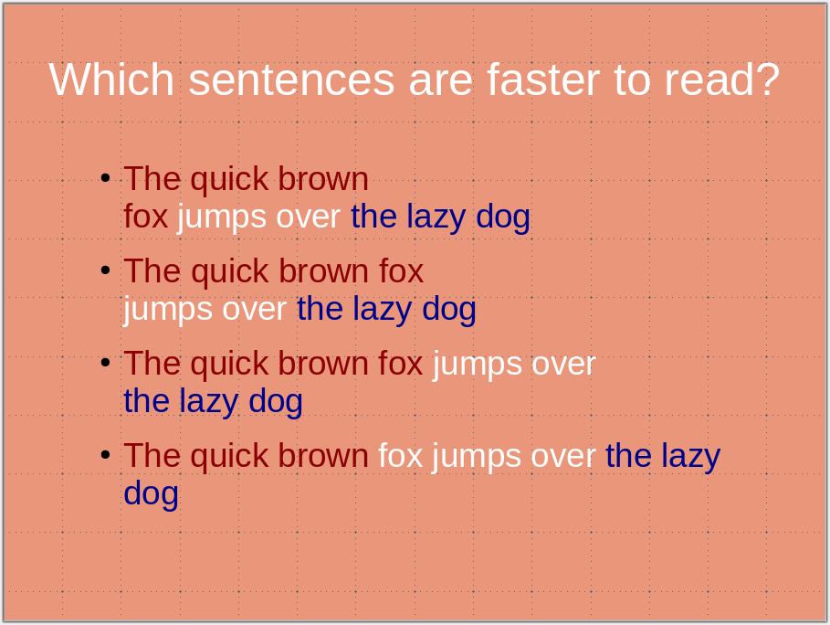
4) Use carriage returns wisely and do not cut expressions or statements. This would slow down the reader, who focuses on the odd break instead of the message. (Also, for the sake of future processing, do not use hard return [new paragraphs ¶] within a sentence or a statement. Use soft returns [line break ↵] instead).

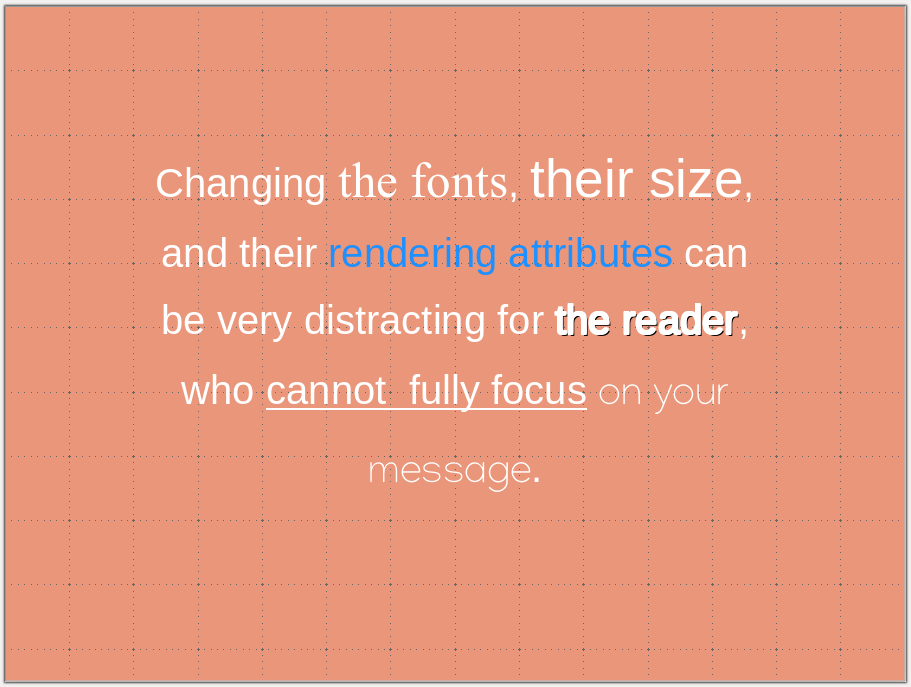
5) Maintain a consistent visual style, including colour codes and fonts. Changing the style distracts the audience. You want all their attention focused on your message rather than following meaningless visual cues. If possible, use the same font size in the same context. If you cannot, it might signal that you have too much text on the slide.

6) Use colour-blind-friendly palettes. About 5% of the population presents some form of colour-blindness, most often red-green. Showing images with green and red fluorescences or a PCA/tSNE/UMAP with red and green points might be a significant strategic error. Not only could your message be lost, but you might also aggravate some audience members (particularly critical in case of a job interview or grant application). There are many resources available providing advice and palettes, such as
https://davidmathlogic.com/colorblind
https://thenode.biologists.com/data-visualization-with-flying-colors/research/
http://mkweb.bcgsc.ca/colorblind/

Note that changing an image’s hue is perfectly acceptable as it does not alter the signal’s dynamic range or add or remove information. The colours of most biological imaging are artificially added by the acquisition software anyway.

7) Use sans-serif fonts. While serif fonts (Palatino, Times new roman, Computer modern) are still quite frequent in text documents. However, sans-serif versions (Arial, Helvetica, Calibri) are crispier and easier to read in presentations.

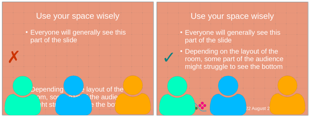
8) Do not put critical information at the bottom of the slide. Depending on the settings of the room where you give the presentation, the bottom of the slide might be hard to see or even masked by the heads of people in the front rows. Use the bottom part of the slide to put logos, date, etc.

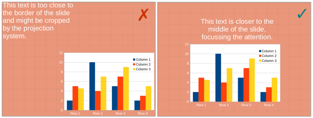
9) Do not put information close to the borders. Some projectors might crop your slides, and you will lose information. Margins also focus the vision, insulating your visual from the surroundings. 

10) Finally, and most importantly, proofread, debug, and test your presentation. Test it yourself, trying very hard to be in the position of an audience not knowing its content, and test it with critical friends who are not too familiar with its content but can understand it.

De la ponctuation des listes, Une Règle pour les Gouverner Toutes

Par Nicolas Gambardella

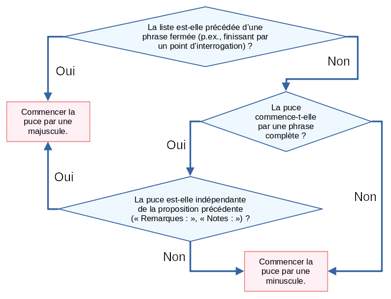
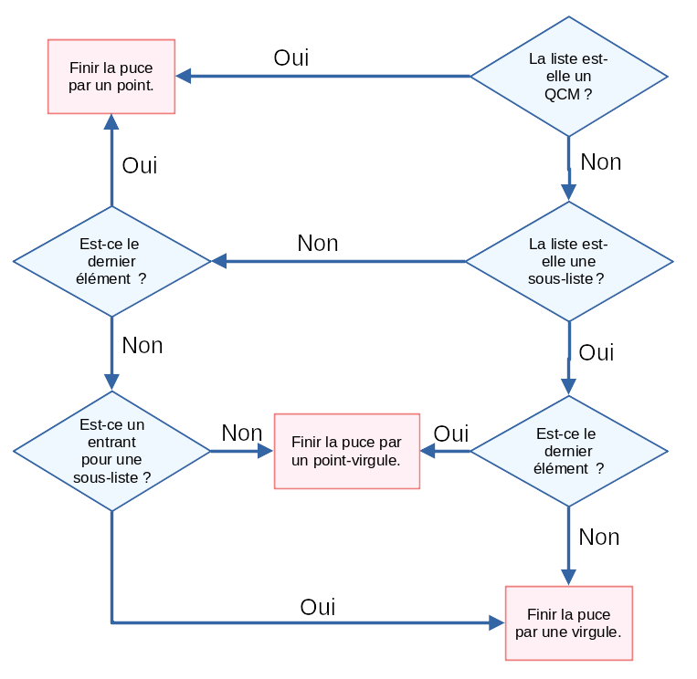
Quelle ponctuation utiliser dans les listes à puces ou numérotées ? Si l’on essaie de comprendre les règles en accumulant les exemples, le découragement vient rapidement, car il semble que le hasard règne en maître. Si l’on trouve une liste de ces règles, le soulagement est de courte durée tant celles-ci semblent arbitraires et les exceptions nombreuses. Je vais proposer à la fin de ce billet un algorithme graphique en deux parties, pour vous aider à choisir la casse des premières lettres des éléments de liste et la ponctuation à la fin de chaque élément. Mais avant, ça je vais fusionner toutes les règles en une seule, et présenter des exemples vous aidant à la comprendre.

Avertissement : ce billet ne concerne que les listes insérées dans des textes. S’il s’agit de listes insérées dans des diapositives de présentations, la rapidité de lecture et la facilité de mise en page doit être prise en compte, et on préférera souvent commencer chaque élément par une majuscule et omettre la ponctuation à la fin de celui-ci.

Revenons à cette fameuse unique Règle pour les Gouverner Toutes ; quelle est-elle ? C’est tout simple :

Si on supprime le formatage de la liste, à savoir, passages à la ligne et puces,
la ponctuation du texte résultant doit rester correcte.

Prenons une liste simple.

Le cerveau comporte trois grandes parties :
le prosencéphale ;
le mésencéphale ;
le rhombencéphale.

Si l’on supprime le formatage de la liste ci-dessus, on obtient :

Le cerveau comporte trois grandes parties : le prosencéphale ; le mésencéphale ; le rhombencéphale.

La ponctuation de cette phrase est tout à fait correcte puisqu’elle commence par une majuscule, ne contient pas de majuscules au milieu, suivant les deux-points et les point-virgules, et se termine par un point.

Aparté : le tiret commençant l’entrée d’une liste est un tiret semi-cadratin « – ». Ce n’est ni un trait d’union « - », ni un tiret cadratin « — », ni bien sûr le symbole mathématique moins « − ». Ce tiret est suivi d’une espace insécable, comme il l’est quand il précède une incise. Fin de l’aparté.

On ferme chaque élément par une ponctuation non fermante, sauf le dernier. On aurait pu remplacer les point-virgules par des virgules. Dans ce cas, on aurait également pu ajouter la conjonction de coordination « et » après le pénultième élément (après la virgule !).

Le cerveau comporte trois grandes parties :
– le prosencéphale,
– le mésencéphale, et
– le rhombencéphale.

L’absence de ponctuation à la fin de chaque élément, comme l’utilisation d’un point rend la ponctuation incorrecte :

Le cerveau comporte trois grandes parties : le prosencéphale le mésencéphale le rhombencéphale

Le cerveau comporte trois grandes parties : le prosencéphale. le mésencéphale. le rhombencéphale.

Ce serait également le cas si nous avions commencé chaque élément par une majuscule.

Le cerveau comporte trois grandes parties : Le prosencéphale ; Le mésencéphale ; Le rhombencéphale.

Dans la liste précédente, les éléments ne sont pas indépendants de la phrase d’entrée. Ce n’est parfois pas le cas, par exemple si cette dernière est du type « Remarques : » ou « À noter : » (mais pas « À noter que : »). Dans ces cas-là, les éléments de la liste sont des phrases complètes, indépendantes non seulement de la phrase d’entrée, mais également l’une de l’autre. Elles sont ponctuées en conséquence.

Remarques :
– Le prosencéphale  contient la vaste majorité des neurones du cerveau des êtres humains.
– Le mésencéphale est atteint dans la maladie de Parkinson.
– Le rhombencéphale contrôle les fonctions vitales et autonomes.

Remarques : Le prosencéphale  contient la vaste majorité des neurones du cerveau des êtres humains. Le mésencéphale est atteint dans la maladie de Parkinson. Le rhombencéphale contrôle les fonctions vitales et autonomes.

Les listes ci-dessus étaient précédées d’une phrase ouverte, se terminant par deux-points. Cela aurait également été le cas si elle s’était terminée par un point-virgule ou une virgule (voir plus bas le cas des listes emboîtées). Si la phrase d’entrée est fermée, c’est-à-dire qu’elle se termine par un point, un point d’exclamation ou un point d’interrogation, les règles sont différentes, car les éléments sont eux-mêmes des phrases.

Laquelle des informations suivantes est erronée ?
– Le prosencéphale  est la partie la plus antérieure du cerveau.
– Le mésencéphale est atteint dans le diabète sucré.
– Le rhombencéphale contrôle les fonctions vitales et autonomes.

Laquelle des informations suivantes est erronée ? Le prosencéphale  est la partie la plus antérieure du cerveau. Le mésencéphale est atteint dans le diabète sucré. Le rhombencéphale contrôle les fonctions vitales et autonomes.

On voit bien que débuter les éléments par des minuscules et les achever par un point virgule ou une virgule produirait ici une structure incorrecte.

Laquelle des informations suivantes est erronée ? le prosencéphale  est la partie la plus antérieure du cerveau, le mésencéphale est atteint dans le diabète sucré, le rhombencéphale contrôle les fonctions vitales et autonomes.

Ce qui nous amène aux questions à choix multiples (QCM). Cette situation est quelque peu différente, car les éléments de la liste sont des alternatives.

Quelle est la partie du cerveau la plus développée chez l’être humain ?
– Le prosencéphale.
– Le mésencéphale.
– Le rhombencéphale.

La liste peut dès lors être pliée en phrases différentes, correspondant à chaque élément.

Quelle est la partie du cerveau la plus développée chez l’être humain ? Le prosencéphale.

Quelle est la partie du cerveau la plus développée chez l’être humain ? Le mésencéphale.

Quelle est la partie du cerveau la plus développée chez l’être humain ? Le rhombencéphale.

Pour finir, abordons le sujet des listes emboîtées. Les règles restent les mêmes. Le dernier élément d’une liste de niveau supérieur joue toutefois le rôle de phrase entrante pour la liste de niveau inférieur. On utilisera des ponctuations différentes pour les éléments de niveaux différente. Typiquement, une virgule terminera des éléments au sein d’un élément terminé par un point-virgule.

Le cerveau comporte trois grandes parties :
– le prosencéphale qui est la partie la plus antérieure formée de deux parties,
  • le télencéphale qui est responsable des fonctions supérieures,
 • le diencéphale qui relaie les entrées sensorielles ;
– le mésencéphale ;
– le rhombencéphale qui est la partie postérieure formée de deux parties,
  • le métencéphale qui comprend le cervelet,
  • le myélencéphale qui est aussi appelé bulbe rachidien.

Si l’on supprime les listes de second niveau, on obtient la ponctuation correcte suivante :

Le cerveau comporte trois grandes parties :
– le prosencéphale qui est la partie la plus antérieure formée de deux parties, le télencéphale qui est responsable des fonctions supérieures, le diencéphale qui relaie les entrées sensorielles ;
– le mésencéphale ;
– le rhombencéphale qui est la partie postérieure formée de deux parties, le métencéphale qui comprend le cervelet, le myélencéphale qui est aussi appelé bulbe rachidien.

La liste entièrement pliée devient :

Le cerveau comporte trois grandes parties : le prosencéphale qui est la partie la plus antérieure formée de deux parties, le télencéphale qui est responsable des fonctions supérieures, le diencéphale qui relaie les entrées sensorielles ; le mésencéphale ; le rhombencéphale qui est la partie postérieure formée de deux parties, le métencéphale qui comprend le cervelet, le myélencéphale qui est aussi appelé bulbe rachidien.

Essayons de construire un algorithme qui nous permet de trouver à coup sûr quelle casse et quelle ponctuation utiliser. Commençons par la casse de début d’élément.

Nous pouvons ensuite nous tourner vers la ponctuation terminant les entrées. Notons que je ne considère ici qu’un seul niveau d’imbrication. L’algorithme pourrait être généralisé en remplaçant points-virgules et virgules par ponctuation ouverte de niveau n et n+1.

Et voilà ! Vous pouvez maintenant être confiant·e dans le formatage de votre liste !

Événement indésirable, effet indésirable, effet secondaire

Par Nicolas Gambardella

[English version]

Comme nous l’a montré le déluge de communication autour des vaccins contre la covid-19, la terminologie de pharmacovigilance (le suivi de la sécurité des médicaments, à savoir leur innocuité et leur tolérabilité) peut entraîner de la confusion, voire nourrir les acteurs de la désinformation. l’Organisation mondiale de la santé (OMS) fournit des définitions claires de termes précis qui sont malheureusement souvent détournés de leur sens premier.

Les événements indésirables (adverse event en anglais) recouvrent tout ce dont souffrent les personnes dans les périodes suivant l’administration d’un traitement (qu’il soit prophylactique ou thérapeutique). Les périodes concernées peuvent varier très largement. Un des principaux outils de pharmacovigilance est le recueil des signalements de tels événements indésirable. C’est par exemple le rôle du VAERS (Vaccine Adverse Event Reporting System) des Centers for Disease Control and Prevention (CDC) et de la Food and Drug Administration (FDA) aux États-unis, de l’ANSM (Agence nationale de sécurité du médicament et des produits de santé) en France, ou encore de la MHRA (Medicines & Healthcare products Regulatory Agency) au Royaume-Uni. La survenue ou l’incidence de ces événements ne sont pas nécessairement liées au traitement. Par exemple, dans les cas des vaccins contre la covid-19, la MHRA répertoriait les chutes, les électrocutions, les morsures d’insectes et les accidents de voitures. Bien que l’incidence de ces événements puisse être affectée par certains médicaments, il est peu probable que ce soit le cas pour des vaccins.

Si l’événement peut engager le pronostic vital, on parle d’événement indésirable grave (serious adverse event en anglais). Rappelons la différence entre sévère et grave (severe et serious en anglais). La sévérité est liée à l’intensité d’un phénomène. La gravité est liée aux conséquences de ce phénomène. Un symptôme ou un signe clinique peut être sévère sans être avoir de conséquences majeurs sur la santé et vice-versa. À noter que la gravité dépend du contexte personnel et environnemental. Selon les antécédents du patient et ses circonstances, un événement peut être bénin ou grave.

Quand l’événement indésirable est prouvé être directement en rapport avec le traitement, qu’il soit entraîné par le traitement lui-même ou par les circonstances de son administration, on parle d’événement indésirable associé aux soins (treatment-emergent adverse event en anglais)

Un effet indésirable (adverse effect ou adverse reaction en anglais) est un événement indésirable directement causé par le traitement. Il est à noter que tous les événements indésirables d’un certain type ne sont pas dus au traitement et donc des effets indésirable. Par exemple, les événements thromboemboliques et les myocardites sont des événements relativement fréquents et qui sont parmi les complications principales de la covid-19. Bien que les vaccins à adénovirus et à ARNm, respectivement, aient montré un accroissement de leur incidence dans certaines populations, des analyses statistiques poussées ont été nécessaires

Un effet secondaire (side effect en anglais) est un effet directement dû au traitement, mais qui n’est pas nécessairement indésirable. Par exemple, l’inhibition de l’agrégation plaquettaire par l’aspirine est utilisée pour prévenir la formation de caillots sanguins.

Adverse event, adverse effect, side effect

by Nicolas Gambardella

[Version en français]

As the deluge of communication around the covid-19 vaccines has shown us, the terminology of pharmacovigilance (the monitoring of drug safety, i.e. safety and tolerability) can lead to confusion and even feed the actors of misinformation. The World Health Organization (WHO) provides clear definitions of specific terms, unfortunately often misused.

Adverse events (événements indésirables in French) are anything that people suffer in the periods following the administration of a treatment (whether prophylactic or therapeutic). The periods involved can vary widely. One of the main tools of pharmacovigilance is the collection of reports of such adverse events. This is, for example, the role of the VAERS (Vaccine Adverse Event Reporting System) of the Centers for Disease Control and Prevention (CDC) and the Food and Drug Administration (FDA) in the United States, of the ANSM (Agence nationale de sécurité du médicament et des produits de santé) in France and of the
MHRA (Medicines & Healthcare products Regulatory Agency) in the UK. The occurrence or incidence of these events is not necessarily related to the treatment. For example, in the cases of covid-19 vaccines, the MHRA listed falls, electrocutions, insect bites and car accidents. Although the incidence of these events may be affected by some drugs, this is unlikely to be the case for vaccines.

If the event is life-threatening, it is called a serious adverse event (événement indésirable grave in French). Remember the difference between severe and serious (sévère et grave in French). Severity is linked to the intensity of a phenomenon. Seriousness is related to the consequences of this phenomenon. A symptom or clinical sign can be severe without having significant implications on health and vice versa. We should note that severity depends on the personal and environmental context. Depending on the patient’s history and circumstances, an event may be mild or severe.

When the adverse event is proven to be directly related to the treatment, whether it is caused by the treatment itself or by the circumstances of its administration, it is called a treatment-emergent adverse event (événement indésirable associé aux soins in French)

An adverse effect or adverse reaction (effet indésirable in French) is an undesirable event directly caused by the treatment. Let’s note that not all adverse events of a particular type are caused by the treatment and are therefore adverse reactions. For example, thromboembolic events and myocarditis are relatively common events and are among the main complications of covid-19. Although adenovirus and mRNA vaccines, respectively, have shown an increased incidence in specific populations, further statistical analysis was required

A side effect (effet secondaire en français) is an effect that is directly caused by the treatment but is not necessarily adverse. For example, platelet aggregation inhibition by aspirin is used to prevent blood clots.

Scientists, do not make assumptions about your audience!

This is a post I could have written thirty years ago. The tendency of scientists (or any specialist really) to write texts assuming a similar level of background knowledge from their audience has always been a curse. However, with the advent of open access and open data, the consequences have become dearer. Recently, in what is probably one of the worst communication exercises of the COVID-19 pandemics, the CDC published an online message ominously entitled:

“Lab Alert: Changes to CDC RT-PCR for SARS-CoV-2 Testing”

Of course, this text meant to target a particular audience, as specified on the web page:

“Audience: Individuals Performing COVID-19 Testing”

However, the text was accessible to everyone; including many people who could not properly understand it. What did this message say?

“After December 31, 2021, CDC will withdraw the request to the U.S. Food and Drug Administration (FDA) for Emergency Use Authorization (EUA) of the CDC 2019-Novel Coronavirus (2019-nCoV) Real-Time RT-PCR Diagnostic Panel, the assay first introduced in February 2020 for detection of SARS-CoV-2 only. CDC is providing this advance notice for clinical laboratories to have adequate time to select and implement one of the many FDA-authorized alternatives.”

This sent people already questioning the tests into overdrive. “We’ve always told you. PCR tests do not work. This entire pandemic is a lie. We’ve been termed conspiracy theorists, but we were right all this time.” The CDC message is currently circulated all over the social networks to demonstrate their point.

Of course, this is not at all what the CDC meant. The explanation comes in the subsequent paragraph.

“In preparation for this change, CDC recommends clinical laboratories and testing sites that have been using the CDC 2019-nCoV RT-PCR assay select and begin their transition to another FDA-authorized COVID-19 test. CDC encourages laboratories to consider adoption of a multiplexed method that can facilitate detection and differentiation of SARS-CoV-2 and influenza viruses. Such assays can facilitate continued testing for both influenza and SARS-CoV-2 and can save both time and resources as we head into influenza season.”

The CDC really means that rather than using separate tests to detect SAR-COV-2 and influenza virus infections, the labs should use a single test that detects both simultaneously, hence the name “multiplex”. 

I have to confess that it took me a couple of readings to properly understand what they meant. What did the CDC do wrong?

First, calling those messages “Lab Alert”. For any regular citizen fed by Stephen King’s The Stand and movies like Contagion, the words “Lab Alert” mean “Pay attention, this is an apocalypse-class message”. What about “New recommendation” or “Lab communication”?

Second, the CDC should not have been assumed that everyone knew what the “CDC 2019-nCoV RT-PCR assay” was. Out there, people understood that the CDC was talking about all the RT-PCR assays meant to detect the presence of SARS-CoV-2, not just the specific test previously recommended by the CDC*.

Third, the authors should have clarified that “the many FDA-authorized alternatives” included other PCR tests, and the message was not meant to say that the CDC recommended ditching the RT-PCR tests altogether.

Finally, they should have clarified what a “multiplexed method” was. I received messages from people who believed a “multiplexed method” was an alternative to a PCR test, while it is just a PCR that detects several things simultaneously (in this example SARS-CoV-2 and flu viruses).

In conclusion, you can, of course, and should, think about your intended audience. However, you should not neglect the unintended audiences. This is more important than you think and not restricted to general communications. Whether a research article or a grant application, whatever scientific piece you write will reach three audience types. 

  • The first comprises the tiny circle sharing the same knowledge background, typically reviewers (if the editors do their job properly…). 
  • The second will be made up of the population at large, who will not understand a word, and frankly, are not interested in whatever you are babbling about.
  • The third is the dangerous one. It is made of people who have a certain scientific background, sufficient to globally understand the context of your text but lack the advanced knowledge to precisely grasp your idea, its novelty, its consequences. These people will read your text and believe they understood your points. The risk is that they did not. Misunderstand your point might be worse than not understanding it.

It is always good to get your texts read by someone belonging to this third population before submitting them to the journals of funding agencies.

*There is actually another very interesting story related to this topic when, at the beginning of the pandemic, many labs proposed to use their own PCR tests but could not because only the CDC-recommended test could be used, delaying the implementation of mass testing by many weeks.

Get your documents checked before getting them translated

By Nicolas Gambardella

In some domains, the most challenging part of language translation (in a broad sense) is the translation itself (in a narrow sense), i.e., converting the words from one language to the other while accurately conveying the meaning and the tone of the original document. In the scientific and technical domains, this is not always the case. It is not unfrequent that most of the time I spend on a text is, in fact, devoted to understanding the source in English. 

The main reason is that many of those documents are not written by domain specialists proficient in the good William’s language (Shakespeare, not The Conqueror). Most people working in highly technical domains, such as biomedical and pharmaceutical, have been reading, writing, and speaking English for many years. They have produced research publications, technical reports, grant applications, and lectures for international audiences. Communicating with others in English has never been a problem. When times come to write a brochure, a presentation for HCPs or patients, or a website, they naturally assume their usual English level is sufficient. Rather than spending time speaking with a professional writer, who would struggle to understand the technical subtleties and cost money, isn’t it quicker to do the job yourself? After all, who knows better than yourself what you want to say?

I think this is true. The initial raw material should come from the horse’s mouth. However, we should all be acutely aware that being able to converse with our colleagues is rarely sufficient when producing patient- or consumer-ready documents. During a conversation, half the meaning is conveyed through body language, visual support, and implicit shared knowledge. Your English colleague knows what you truly mean when you use those dozens of anglicised French words (replace by your own native language). They might even find that charming. Much less charming will it be for a potential client or your poor translator. The former might be put off by what could be perceived as a lack of professionalism. The latter might mistranslate your document, with potentially dire consequences.

I recently finished reviewing a medical marketing brochure for a foreign company. Many sentences were grammatically incorrect, to the point of becoming meaningless. Most sentences were convoluted, too long, repetitive. The paragraphs were heavy and hard to read. A significant amount of words were slightly off, definitely not what a native English marketing brochure would have used (or any native text for that matter). Finally, the formatting was completely inconsistent (e.g., usage of capitals or abbreviations). 

I do not think this brochure reflected well on an otherwise excellent company. I believe that if the foreign person who wrote the English text had taken the time to reverse-translate it with a tool like DeepL, they would have been horrified to see that the result was not at all what they intended. I hope the French translation will alleviate some of the issues. I also provided a complimentary list of suggestions for the English version, as I often do when translating such documents.

We should always ask someone else to edit and proofread our texts. If possible, this should be someone with no in-depth knowledge of the subject. Ideally, the pipeline would comprise several verification layers, possibly combined in fewer individuals or, on the contrary, repeated with several people:

  • Verification of the technical content. Are you even using the correct English words?
  • Marketing and localisation. The US is not the UK. Patients are not HCPs. HCPs are not researchers.
  • Proofreading. Itself with three subcategories: language correctness (grammar, punctuation, and spelling); elegance and fluidity; terminology and visual consistency throughout the document(s).

Now, to finish on a lighter note, some language-specific advice for scientists:

Starting, of course, by the Frenchs. My dear fellow countrymen, the fact that English and French share the same sentence structure does not mean you can replace the words one by one and keep the French term if you do not know the English equivalent.

It would be best if Italians gave a subject to all verbs, who feel lonely otherwise.

As bothersome as it seems, Russians must use articles in front of nouns, at least from time to time.

Chinese should realise that spelling in Latin is as essential as the correct stroke in Hànzì. Vowels are not interchangeable.

While the pursuit of accuracy is laudable, German writing in English should seek to limit the number of words in their sentence to double digits.

To finish, I would love to hear all your comments, corrections, and criticisms regarding this post.

Less is More

By Nicolas Gambardella

In scientific texts, less is often more. Less figures and tables mean more clarity; Less experiments and results mean more impact. This might seem counter-intuitive since more information should always be better, right? Moreover, whether as preliminary data in a grant application or as results in a research paper, we all want to describe all the great experiments we ran, the clever analyses we came with, and the conclusions we derived. However, we also want – and need – to convey excellence.

Except for truly groundbreaking research papers, where a single result matters, overshadowing everything else, the final impact of a paper or a grant application on the reader will reflect the average quality of every independent result. If you performed three or four excellent experiments, and they are sufficient to demonstrate your point, every additional result of less novelty or perfection will decrease the average final impact. Here are five points you should reflect on when writing a scientific text.

1) Put yourself in your reader’s shoes

When producing any kind of material for public consumption, whether text or other types of documents, in science or any other field, we should never forget that the content should be geared toward the audience, not ourselves. As such, when writing an article or a grant application, we should always keep the potential reader in mind.

  • What is interesting for you is not necessarily interesting for them
  • You do not want to bore them stiff
  • You do not want to make important facts or conclusions hard to find
  • You want them to remember the main message
  • You want them to remember the WOW feeling they had when reading
  • You do not want them to think meh at any time, about any result

2) Do not describe the entire journey that led to the final set of results.

Imagine you ordered a wedding cake. The baker experienced three mishaps before getting it well. The first mix was wrong, and was not baked properly; another one was overcooked; the design of the third one failed. Do you expect the baker to deliver all four attempts on the wedding day or only the fourth one?

Each scientific text tells a story and unfolds along a storyline. This is necessary to bring the reader to the conclusions we want to share. However, this storyline is a logical construct, built to make the point clearer and easier to understand. It does not need to be the actual story, as it happened in the lab. There is no need to describe all the false starts, the dead ends, the mishaps, all the iterations with optimization (see below). Just tell the readers what you found, using the final or best experiments you performed.

3) Do not clutter the main body with negative results

Negative results are important, and we should not hide them. However, there is no need to put them in the main body of a text, except if they are revealing new insights. The overall message of a paper or grant application should always be positive, optimistic and forward-looking. If you want to report negative results, or warn others of dead ends, to spare their time, energy, and expenses, why not put these results in supplementary materials, on your website or deposit them in the relevant public database?

4) Do not clutter the text with sup-par, or trivial results

There is no need to explore exhaustively a question in the main text of a research paper. You should choose your main message, and build-up the best case for it, using only what is necessary to demonstrate your point. Yes, I am sure there are many other interesting aspects worth presenting and discussing in your experiments or your datasets. However, by devoted too much space to those secondary questions, you will dilute the primary conclusion, and make it more difficult to identify, and less impactful.

5) Do not load the main text with set-up procedures

You should mention the tests you performed and the validation procedures you put in place. This is important. But is it crucial to show all of them in the main body of your text? You probably ran dozens of experiments to find the right dose for your drug or marker, to optimize your buffers or culture medium. This took lots of effort and time. But is it as important for the reader as the final dose or culture medium? After all, like all professionals, we assume that you performed due diligence. Would you list all the search expressions you used in PubMed to perform the necessary bibliographic search during the project?

Remember, the people you want to impress most are editors and reviewers (for a paper) and members of grant panels (for an application). These people are often senior scientists, which means they have a limited amount of time available for each text. Furthermore, they are not always technical experts on the very question tackled in each of these texts (whether this is a pathological or desirable feature of modern research assessment is beyond the scope of this post). Most of them will only read the main meat, and probably quickly so. If you want to provide background information, provide them in supplementary materials or on a website.

In conclusion, in order to maximize impact, build a story as long as necessary and as short as possible. Remember: The perceived excellence of a piece of work is the average of the excellence of each of its components.

10 tips to improve your research articles

By Nicolas Gambardella

Since an important part of our activity is to assist researchers by improving their documents, whether grant applications, research publications or project reports, this blog will come back to this topic on a regular basis. We will write in depth about every aspects of scientific writing in turn. In this initial post let’s go wide and list a few general rules to improve research papers (although most of those apply to grant applications too).

1) Find your message

Of course, any body of scientific research brings about multiple results, that in turns affect the way we understand several aspects of reality, or can lead to a few technical developments. However, in order to maximize the impact of your account, you must choose an angle. What is the main point you want people to remember? What would be the sentence accompanying a tweet linking to your paper?

2) Know your audience

Once you have settled on your message, you need to select the population you want to “sell it too”, on which you expect the maximum impact. By audience, we mean first and foremost the editor and the reviewers. Yes, your ultimate aim is to spread the news through your community. But the paper needs to be published first … Knowing who you are talking to will help you structure the paper, as much as the instructions to authors. What will you put in the main body of the paper and what will you demote to supplementary materials? What should you present in detail or on the contrary gloss over? How will you present the methods and the results? Experimental biologists tend to dislike equations. Biochemists do not care much about the illustrating experiment, but want quantitative tables. Molecular biologists love histograms, and they like to have one illustrating experiment such as a a western blot or a microscopy field.

3) Build a storyline

Keeping in mind both the message you chose and the audience you want to sell it to, create a progressive demonstration that brings the reader to the same conclusions as yours, keeping them focused until the final bang. This is not necessarily how things really happened, in particular chronologically. We all know that scientific research is a complex process, that includes iterative explorations, validations and controls, explode dead ends etc. There is no need to list everything path you explored, every experiment you did. A paper is not a laboratory notebook. However, as you progress towards in your narrative, each step need to naturally lead to the next, while the controls you describe preclude wandering off-path.

4) Keep facts and ideas where they belong

Do not mix Introduction, Materials and Methods, Results and Discussion (in some article structures, the last two can be included in the same section, but the relevant bits are generally in different paragraph). The Introduction should only present and discuss what was known before your work, and only what is needed to understand your work and its context. Similarly, the Materials and Methods section should not describe new techniques or materials. And finally, all your results should be in the Results section (if separate from the Discussion). As a rule, if you remove everything but the Results section, you should not affect the storyline described above. Our advice is to start writing the Results, the add the necessary Materials and Methods as you go, write the Discussion, and finish by the Introduction. You cannot write an effective introduction if you do not know what you want to introduce. Moreover, writing the introduction is often used as a procrastination device …

5) Build modules

Use one paragraph for one idea, if possible linked to one experiment, and illustrated by one figure (whether the figure ends up in the main body or in supplementary materials does not matter). This is sometime challenging when the idea or the experiment are complex. But even if, in the end, paragraphs are merged or split, adopting this approach is useful during the initial writing stage. This will help building the storyline and will enable easy restructuring later. Give a title to each module. Try drawing a flowchart representing your results, and annotate it with experiments and figures.

6) Do not assume knowledge but do not state the obvious

Moving from the structure to the style now. It is always difficult to decide what is common knowledge and therefore should not be explicit, and what is specialized knowledge required to understand your story and accept your message. Do not rely on your own knowledge. Go back to point 2), and make a real effort to put yourself in the shoes of the intended readership. Then a guideline can be to introduce factual knowledge but not common – in your audience’s domain – technical knowledge. For instance, if you write for biologists, you should not assume that people know the Kd between PKA and cAMP is 0.1 micromolar. However, you may assume that readers know increased affinity means lower Kd.

7) Do not repeat information

Building your text following 5) should preclude the description of the same information twice. When you refer to a piece of information described before, you do not need to restate it. This goes for details of experiments as well. If you already stated that an experiment took place in a chemical reactor, there is no need to mention it all the time, as “the solution in the chemical reactor” “the temperature in the chemical reactor” etc.

8) Write clearly, concisely and elegantly

I strongly recommend reading, and keeping a copy at hand, “Style: Lessons in Clarity and Grace“. There are many simple habits you can use to improve the readability of a text. Avoid passive forms. Keep verbs for actions and nouns for what perform or is affected by such actions. Try to stick to one proposition per sentence, twice at most (and well articulated). Do not add words needlessly. Instead of writing “the oxidation of the metal”, write “metal oxidation”. A shorter text is read faster and is easier to memorize.

9) Avoid casual writing

A scientific article is not a diary (or a blog post …). Your reader is neither your mate nor your student. Avoid talking to them directly, e.g. “you can do this” or indirectly as “let’s consider this first”. This is not a huge deal, but it might be irritating for some people. In general, adopt the style commonly used in the most respectable journals of the community you are targeting.

10) Chase grammatical errors and spelling mistakes

They are less important than the scientific facts, and hopefully they will disappear during the proof-reading stage. However, they give a hint of sloppiness, and they will annoy the reviewers. Even if those reviewers do not belong to the type focusing on such things, unconscious biases can taint even the fairer person. So read your manuscript again and again, slowly and aloud. More importantly ask someone else, if possible not a co-author, to read it as well.